shadcn.io is not affiliated with official shadcn/ui
Ripple Shader sends rings outward from three points that slowly circle the center, plus a faster, tighter source at the center itself. Where the rings meet they add up into bright, rounded lobes or cancel into thin dark lines, so a five-petal knot forms around a glowing dot, turns and reshapes, while wavy bands flow out to the darker edges. It's drawn in one color on a dark ground of the same hue, computed for every pixel by a WGSL fragment shader on WebGPU.
Use it behind a hero, a "listening" state for a voice or audio feature, or any section that should feel calm and alive in your brand color. For the same rings in plain CSS, use the Ripple background; for a water surface, Water Shader; for neon interference cells on black, Ripples in Black Shader. It runs only while it's on screen, holds a still frame with reduced motion, and shows a radial gradient in the same color in browsers without WebGPU.
Installation
Usage
import { RippleShader } from "@/components/ui/ripple-shader";<RippleShader className="flex min-h-[32rem] items-center justify-center">
<h1 className="text-5xl font-semibold text-white">Listening</h1>
</RippleShader>Ripple Shader is a container: your content sits on top of the ripples, in normal flow. It fills its own box, so give it a height or content. For a backdrop behind the whole page, render it empty with className="fixed inset-0 -z-10". The ripples are dark in both color schemes, so put white text over them.
Demos
Theme color
color="var(--primary)" draws the ripples in your theme's primary color, and follows a theme switch. sources={5} adds two more sources to the circle, so the knot becomes a rounder, more even rosette of smaller lobes.
In a card
sources={2} and frequency={0.7} give a small box fewer, wider rings, so the pattern stays legible at card size.
Performance
About 0.1 ms of GPU time a frame at 1280×720 on an M2 Max laptop, among the cheapest shaders in the collection; slower GPUs take several times longer, which still leaves plenty of room. The animation stops when the shader scrolls out of view, and the browser pauses it in a hidden tab. Every shader on a page shares one GPU device and one frame loop, and vgpu (about 50 KB gzipped) loads only when the first one mounts.
Browser support
The shader needs WebGPU: Chrome and Edge, Safari 26 and later, and Firefox on Windows and macOS. Elsewhere, and until the first frame, the box shows a radial gradient with faint rings in the same color, so the layout never jumps. data-state on the root reads unsupported there, if you want to style around it. See Shader Canvas.
Accessibility
The ripples are decoration: they're hidden from assistive tech and let every click through to your content. With reduced motion it draws one still frame and stops. Nothing flashes: the rings flow outward smoothly, and the knot turns about once every 20 seconds. At the default color, white text has a contrast of about 11:1 on half the frame and above 7.7:1 on three quarters of it. The middle is brighter: there, white text is about 7:1 on half and drops below 3:1 on the brightest lobes and the center dot, so make a centered headline large and bold, or set intensity below 1 for smaller text.
FAQ
How does the wave interference work?
Each source sends out a sine wave that weakens with distance. Every pixel adds up the waves from all the sources at its distance from each. Where crests meet crests, or troughs meet troughs, the sum is large and the pixel is bright; where a crest meets a trough they cancel, which draws the thin dark lines. As the sources circle, the meeting points move, so the pattern turns and reshapes.
How many sources can I use?
From 1 to 5, set with sources; values outside are clamped, and fractions round to the nearest whole number. One source makes a calm, lopsided set of rings; three, the default, the five-petal knot; five, a round, even rosette of smaller lobes. The center source is always there.
How do I change the color?
color takes any CSS color, so "#22c55e", "oklch(0.7 0.2 150)" or var(--primary) all work, and it follows a theme switch. The background, the lobes and the glow are all shades of it, so the whole shader takes its hue. Lighter colors give brighter lobes; very light ones wash the lobes out to white.
What do frequency and intensity do?
frequency sets how close the rings are: 2 packs them twice as tight, 0.5 spreads them out. intensity scales the waves before they're shaded: above 1 the lobes get brighter and the dark lines sharper, below 1 the pattern flattens toward the dark background, which helps text read.
API Reference
RippleShader
data-slot="ripple-shader"
color?string
The ripples' color, from the dark background to the bright crests. Any CSS color. @default "#3399ff".
- Default
"#3399ff"
fallback?string
What shows until the first frame and in browsers without WebGPU: a CSS
background value (gradients, sizes, a colour) that looks like the
shader. It can use the colour props' --shader-<field> variables.
frequency?number
How close the rings are, from 0.5 (wide) to 2 (tight). @default 1.
- Default
1
intensity?number
How bright and contrasted the ripples are, from 0 (flat) to 2. @default 1.
- Default
1
interactive?boolean
Whether u.pointer follows the pointer. @default false.
paused?boolean
Holds the current frame. @default false.
quality?number
Render scale, from 0.25 to 1, of the screen's pixels (capped at 2×). @default 1.
sources?number
How many sources circle the center, from 1 to 5. @default 3.
- Default
3
speed?number
Animation speed: 1 is normal, 0 holds the frame. @default 1.
time?number
A fixed moment, in seconds: draws it and doesn't animate.
render?ReactElement | ((props: object, state: object) => ReactElement)
Replace the host element or compose it with another component.
- Type
ReactElement | ((props: object, state: object) => ReactElement)
className?string
Forwarded to the part.
Related
- Pro
Water Shader
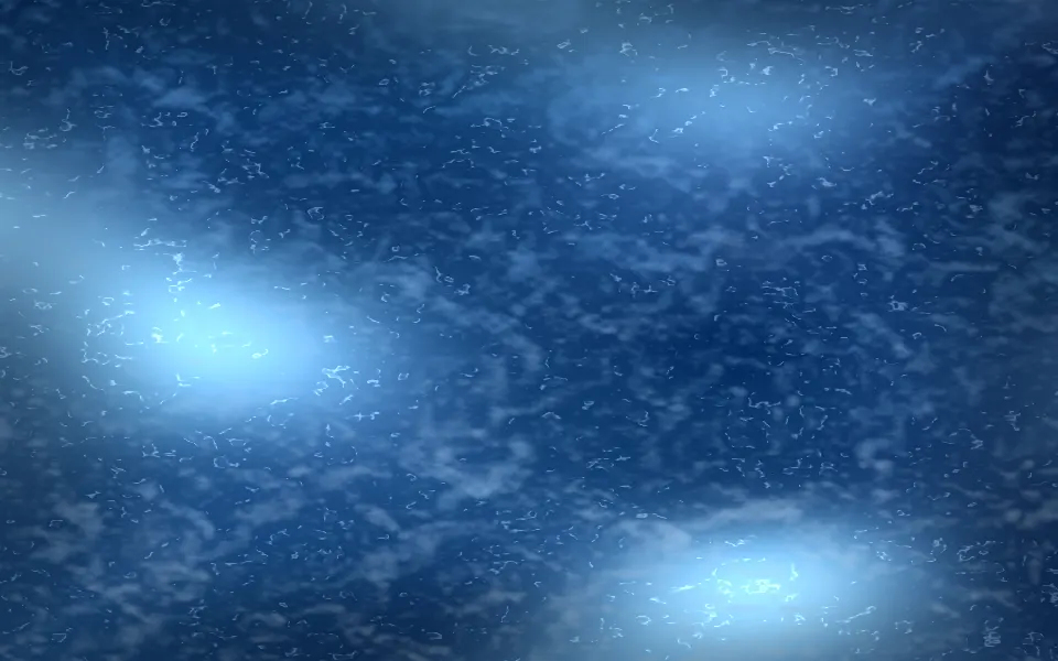
Water & landscapesA water surface from above
- Pro
Ripples in Black Shader
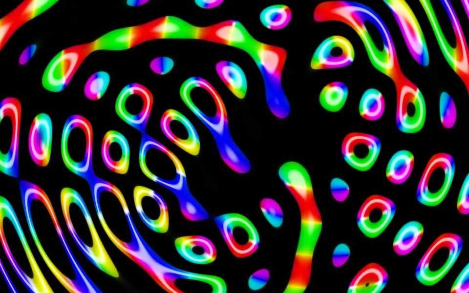
Water & landscapesNeon interference cells on black
Waves Shader
Water & landscapesPastel waves with glowing crests, free
- Pro
Moire Shader
GeometryTwo gratings beating into fringes
- Pro
Breathing Dots Shader
GeometryA dot sheet that ripples under the pointer
- Pro
Spectrogram Shader
Digital & retroLive signal for an audio feature