shadcn.io is not affiliated with official shadcn/ui
Shadcn Blocks, Templates & Components Built for AI Agents, in React, Vue, Svelte and Solid, on TypeScript, Tailwind CSS and Lucide
Premium shadcn/ui and Tailwind CSS blocks, templates and components for React, Vue, Svelte and Solid. Designed with taste, installable via CLI or MCP.
Add shadcn.io to your AI agent. · Pro It adds any component, in your stack, from a prompt, with Pro.
Set up MCPEvery section a site or app needs
From the hero to the settings page, every block shares one look and takes your theme, on all seven stacks.
Templates, ready to launch
Startups, agencies, apps and portfolios: whole sites, every page designed, yours to edit.
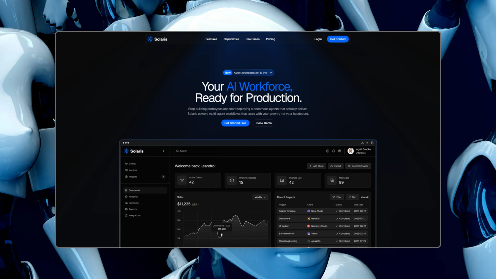
Solaris
AI agent startup
- High-conversion hero section
- Agent orchestration UI
- Integrated dashboard preview
In every Pro plan, from $32/mo billed yearly.
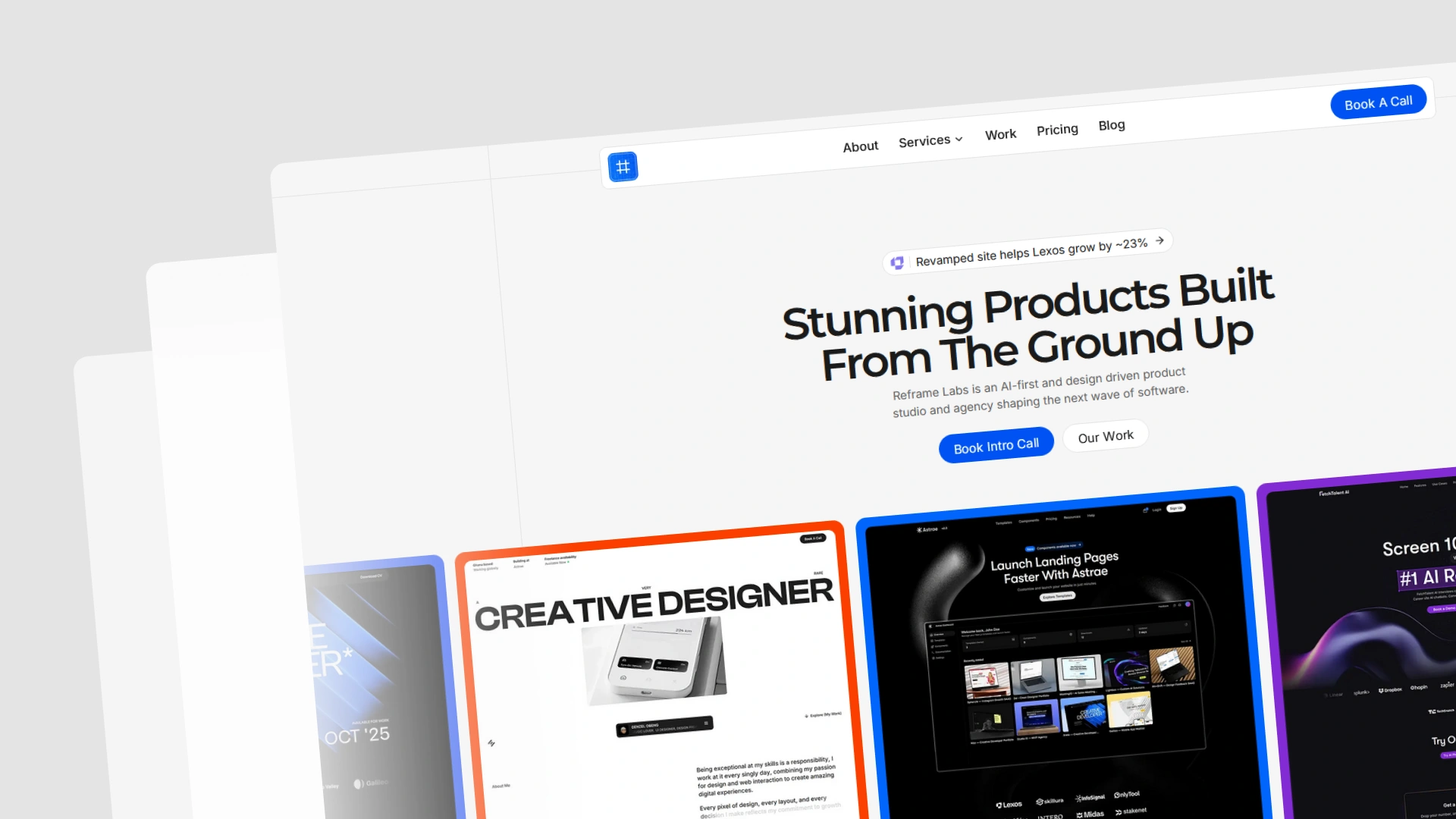
Reframe Labs
Creative agency
- Dynamic hero section
- Proof-driven components
- Project showcase
In every Pro plan, from $32/mo billed yearly.
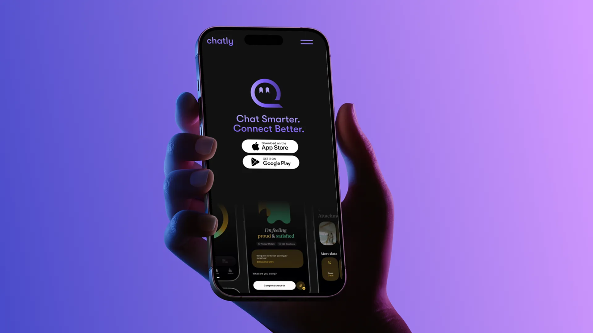
Chatly
AI messaging app
- Gradient-typography hero
- AI-assist feature grid
- Privacy-first section
In every Pro plan, from $32/mo billed yearly.
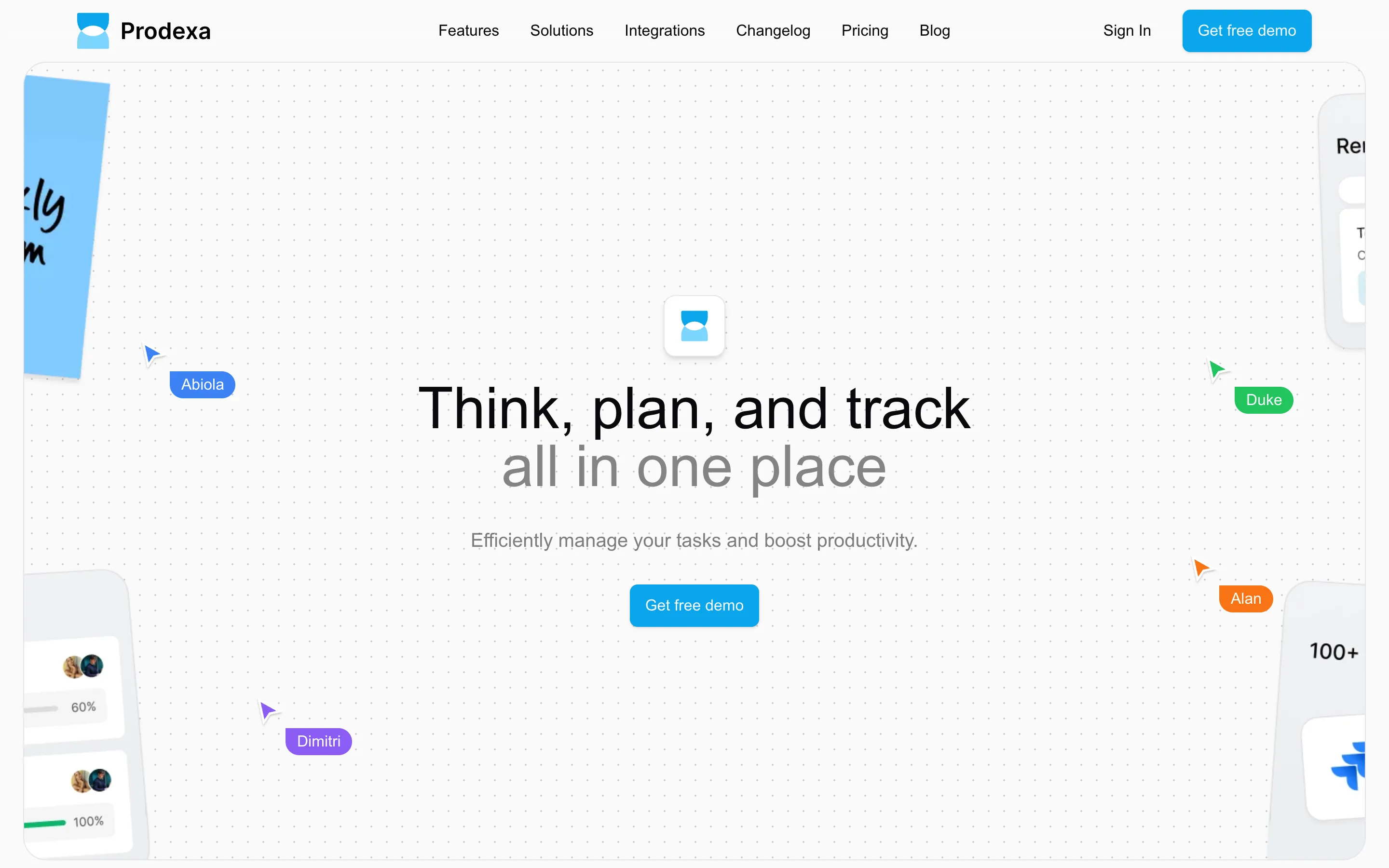
Prodexa
Productivity SaaS
- Dashboard-preview hero
- Solutions × features split
- Integrations wall
In every Pro plan, from $32/mo billed yearly.
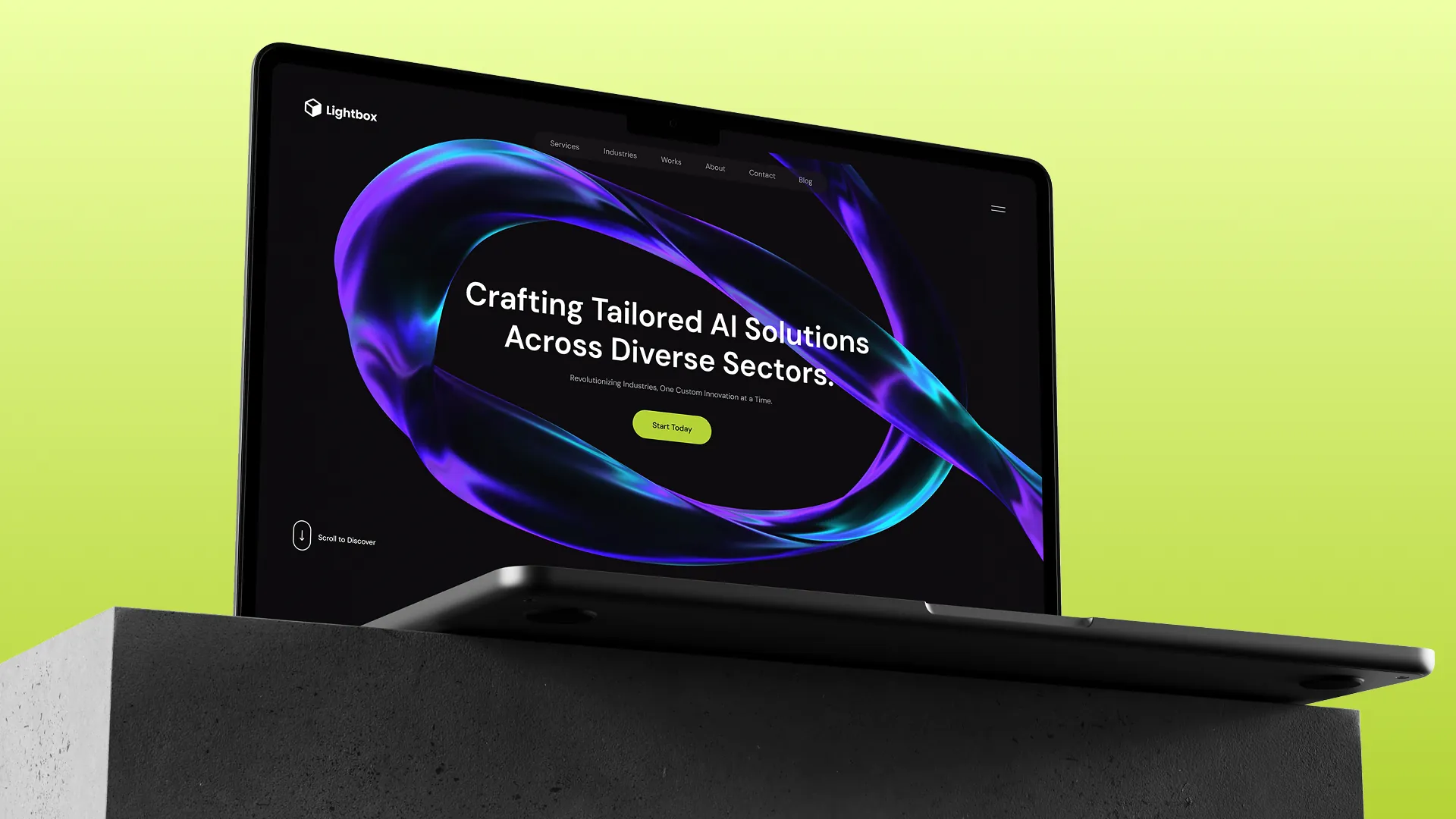
Lightbox
Custom AI solutions
- Sector-spanning hero
- Multi-service grid
- “How does it work?” process flow
In every Pro plan, from $32/mo billed yearly.
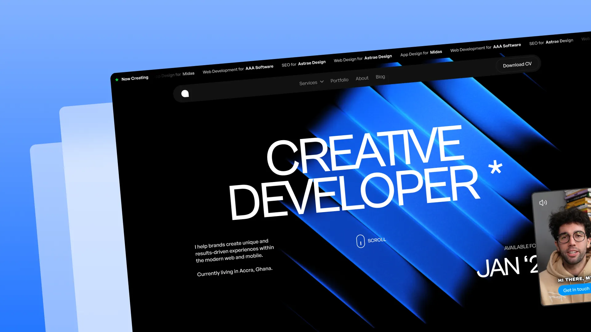
Arete
Freelance creative developer
- Magazine-scale hero
- “How can I help you?” services
- Esteemed clients roster
In every Pro plan, from $32/mo billed yearly.
Seven stacks, one look
Four React UI libraries, and Vue, Svelte and Solid on Ark UI. The same Tooltip on each, written the way each one writes it.
The same look and theme on all four. The code shows how each one composes.
Tooltip · Base UI
import { Button } from "@/components/ui/button";
import {
  Tooltip,
  TooltipContent,
  TooltipProvider,
  TooltipTrigger,
} from "@/components/ui/tooltip";

const TooltipDemo = () => (
  <TooltipProvider>
    <Tooltip>
      <TooltipTrigger render={<Button variant="outline" />}>
        Hover
      </TooltipTrigger>
      <TooltipContent>
        <p>Add to library</p>
      </TooltipContent>
    </Tooltip>
  </TooltipProvider>
);
Tooltip · Radix UI
import { Button } from "@/components/ui/button";
import {
  Tooltip,
  TooltipContent,
  TooltipTrigger,
} from "@/components/ui/tooltip";

<Tooltip>
  <TooltipTrigger asChild>
    <Button variant="outline">Hover</Button>
  </TooltipTrigger>
  <TooltipContent>
    <p>Add to library</p>
  </TooltipContent>
</Tooltip>
Tooltip · React Aria
import { Button } from "@/components/ui/button";
import { Tooltip, TooltipTrigger } from "@/components/ui/tooltip";

const TooltipDemo = () => (
  <TooltipTrigger>
    <Button variant="outline">Hover</Button>
    <Tooltip>
      <p>Add to library</p>
    </Tooltip>
  </TooltipTrigger>
);
Tooltip · Ark UI
import { Button } from "@/components/ui/button";
import {
  Tooltip,
  TooltipContent,
  TooltipTrigger,
} from "@/components/ui/tooltip";

<Tooltip>
  <TooltipTrigger asChild>
    <Button variant="outline">Hover</Button>
  </TooltipTrigger>
  <TooltipContent>
    <p>Add to library</p>
  </TooltipContent>
</Tooltip>UI library
Ark UI@ark-ui/vue
Vue components are ported from React's Ark UI ones: the same parts, the same look.
100components in Vue
Browse Vue componentsTooltip · Vue
<script setup lang="ts">
import { Button } from "@/components/ui/button";
import {
  Tooltip,
  TooltipContent,
  TooltipTrigger,
} from "@/components/ui/tooltip";
</script>

<template>
  <Tooltip>
    <TooltipTrigger as-child>
      <Button variant="outline">Hover</Button>
    </TooltipTrigger>
    <TooltipContent>
      <p>Add to library</p>
    </TooltipContent>
  </Tooltip>
</template>UI library
Ark UI@ark-ui/svelte
Svelte components are ported from React's Ark UI ones: the same parts, the same look.
100components in Svelte
Browse Svelte componentsTooltip · Svelte
<script lang="ts">
import { Button } from "@/components/ui/button";
import {
  Tooltip,
  TooltipContent,
  TooltipTrigger,
} from "@/components/ui/tooltip";
</script>

<Tooltip>
  <TooltipTrigger>
    {#snippet asChild(props)}
      <Button {...props()} variant="outline">Hover</Button>
    {/snippet}
  </TooltipTrigger>
  <TooltipContent>
    <p>Add to library</p>
  </TooltipContent>
</Tooltip>UI library
Ark UI@ark-ui/solid
Solid components are ported from React's Ark UI ones: the same parts, the same look.
100components in Solid
Browse Solid componentsTooltip · Solid
import { Button } from "@/components/ui/button";
import {
  Tooltip,
  TooltipContent,
  TooltipTrigger,
} from "@/components/ui/tooltip";

<Tooltip>
  <TooltipTrigger
    asChild={(props) => (
      <Button {...props()} variant="outline">Hover</Button>
    )}
  />
  <TooltipContent>
    <p>Add to library</p>
  </TooltipContent>
</Tooltip>- TypeScript on every stack
- Styled with Tailwind CSS v4
- No animation library
- Copied in, yours to edit
Every stack, one plan. Pro adds blocks on all seven, plus templates and the MCP.
Get ProLet your AI agent install it
Connect the shadcn.io MCP server to Claude Code or Cursor, and your agent finds the right component for your stack and installs it.
- shadcn.io MCP connected · 18 tools
MCP call: search_components({ query: "color picker" })Returns: Color Picker, in InputsMCP call: get_component({ name: "color-picker", include: ["install", "usage"] })Returns: npx shadcn add …/r/color-picker.json, and its usageAgent step: Ran npx shadcn addReturns: The Color Picker and what it uses, in components/ui
In your project
Color Picker
- Real props, from its docs
- Area, hue, alpha and swatches
1 prompt → 2 MCP calls
Set up in about a minute. Paste your MCP URL into any editor. Your code stays on your machine.
Get ProYour brand, on every component
Themes are CSS variables, so one preset styles every stack, and shadcn/ui themes work as they are.
- Styles
- 8
- Nova, Vega, Maia and more
- Themes
- 18
- The primary color
- Base colors
- 8
- The grays under it
- Radius
- 5
- None to large
Invite your team
They join with the role you pick.
- OMOwner
Olivia Martin
olivia@northwind.dev
- JL
Jackson Lee
jackson@northwind.dev
Input · Native Select · Button · Avatar
- OM
Email alerts
Only what needs you.
The moment a build breaks.
With the preview link.
Every Monday, one email.
Switch · Field
Check your email
Enter the code we sent to olivia@northwind.dev.
4821No code?
Input OTP
Usage this month
The plan resets on November 1.
Build minutesBandwidthWarn me at
50%100%
Progress · Slider
Leave a comment
On deploy #412, for Jackson Lee.
⌘Enterto send
Toggle Group · Textarea · Kbd · Button
Release 2.4
Goes out Thursday at 10:00.
New12 fixesDocsBadge · Checkbox · Label
Make it yours, then ship it. Pro blocks take your theme as they are.
Get ProAccessible out of the box
Base UI, Radix, React Aria and Ark UI do the hard parts: focus, keyboard and ARIA, by the WAI-ARIA patterns.
Every key, documented
68 components list every key they answer, and what each one does.
Focus that behaves
Dialogs hold focus while they're open and hand it back when they close.
Heard right
Roles, names and states follow the WAI-ARIA patterns, so screen readers say what's there.
Right to left
56 components ship a right-to-left demo, and layouts use logical sides. RTL guide.
Calm on request
Animated buttons, text and backgrounds stop looping for reduced motion.
Tab to it, then use your keys.
- SpaceorEnter
- Activates/Selects the highlighted item.
- Arrow Down
- Highlights the next item in the menu.
- Arrow Up
- Highlights the previous item in the menu.
- Arrow RightorArrow Left
- When focus is on trigger, opens or closes the submenu depending on reading direction.
- Escape
- Closes the menu and moves focus to the trigger.
- Home
- Go to the start.
- End
- Go to the end.
Pro is built from the same parts. Every block uses these components, keyboard and all.
Get ProGet everything with Pro
Every block, the premium templates, the MCP server and the Pro animated pieces, for you or your whole team.
4.9/5 out of 5 · 150+ reviewsfrom 150+ founders and developers.
Billing
Billed once a year in USD. Cancel anytime.
- How many people can use the license.
- Client work, SaaS products and anything you charge for.
- Production-ready React sections: hero, pricing, features, dashboards and more.
- Complete multi-page sites you can ship as they are.
- React icons from every major library, installable with one command.
- Presets that restyle every block, in light and dark.
- Lets your AI editor search, preview and install blocks for you.
- Priority requests are answered first.
Individual
For personal projects & open source
$32instead of $49/mo
$389 billed yearly
- Seats: 1 seat
- Commercial use: Personal & open source only
- Pro blocks: 6,000+ blocks
- Templates: All 14 templates
- React icons: 294k+ icons
- Themes: All 59 themes
- MCP server: Basic usage
- Support: Standard
Team
Most popularFor freelancers, agencies & startups
$66instead of $99/mo
$789 billed yearly · ≈ $13/dev/mo
- Seats: Up to 5 seats
- Commercial use: Included
- Pro blocks: 6,000+ blocks
- Templates: All 14 templates
- React icons: 294k+ icons
- Themes: All 59 themes
- MCP server: High usage
- Support: Priority
Organization
For companies with larger teams
$132instead of $199/mo
$1,589 billed yearly
- Seats: Unlimited seats
- Commercial use: Included
- Pro blocks: 6,000+ blocks
- Templates: All 14 templates
- React icons: 294k+ icons
- Themes: All 59 themes
- MCP server: Unlimited usage
- Support: Priority
Billed once a year in USD. Cancel anytime.
Individual
For personal projects & open source
$32instead of $49/mo
$389 billed yearly
- How many people can use the license.Seats: 1 seat
- Client work, SaaS products and anything you charge for.Commercial use: Personal & open source only
- Production-ready React sections: hero, pricing, features, dashboards and more.Pro blocks: 6,000+ blocks
- Complete multi-page sites you can ship as they are.Templates: All 14 templates
- React icons from every major library, installable with one command.React icons: 294k+ icons
- Presets that restyle every block, in light and dark.Themes: All 59 themes
- Lets your AI editor search, preview and install blocks for you.MCP server: Basic usage
- Priority requests are answered first.Support: Standard
Team
Most popularFor freelancers, agencies & startups
$66instead of $99/mo
$789 billed yearly · ≈ $13/dev/mo
Everything in Individual, plus
- How many people can use the license.Seats: Up to 5 seats
- Client work, SaaS products and anything you charge for.Commercial use: Included
- Lets your AI editor search, preview and install blocks for you.MCP server: High usage
- Priority requests are answered first.Support: Priority
Organization
For companies with larger teams
$132instead of $199/mo
$1,589 billed yearly
Everything in Team, plus
- How many people can use the license.Seats: Unlimited seats
- Lets your AI editor search, preview and install blocks for you.MCP server: Unlimited usage
- Secure checkout via Stripe
- Code lives in your repo
- Keep what you've shipped if you cancel
- License terms
Devs love shadcn.io
We've been blown away by the love & support from users.
“Beautiful landing page design with perfect balance and flow. The color palette combined with the animations creates an exceptional user experience.”
AOAlan Obeng-PeprahSenior Designer @ NativeXAI “The templates are not just visually stunning but also incredibly well-structured. Saved us weeks of development time.”
ABAbiola BraimahDeveloper @ Studio IX “shadcn.io templates have completely transformed how we approach new client projects. The code quality is exceptional and the designs are truly world-class.”
DGDanny G.Founder of DevStack “I've used many template libraries before, but shadcn.io stands out for its attention to performance optimization and clean code architecture.”
IDIan D.CTO at Wavelength “I appreciate how modular and well-documented these components are. We've been able to mix and match pieces from different templates seamlessly.”
GPGarrett P.Frontend Lead at TechFusion “The ROI on shadcn.io templates is incredible. We've dramatically reduced our development time while delivering higher quality sites to our clients.”
XCXavier C.Agency Owner
Ship like they do. Blocks, templates and the MCP, in every Pro plan.
Get ProEverything in one registry
Components, hooks and examples are free with an account. Blocks, templates and the MCP come with Pro.
- Components105FreeComponents for any stack
- Hooks35FreeTyped React hooks
- Examples1,103FreeComponents in real use
- Blocks3,188ProPage sections, ready to drop in
- Templates22914 in Pro, the rest open source
- MCP server18 toolsProMCP server for AI editors
- Buttons35Animated buttons, 9 free
- Text effects97Animated text effects, 10 free
- Backgrounds100Animated backgrounds, 10 free
- Shaders100GPU shader backgrounds, 19 free
- Icons294kFreeFrom 222 libraries
- DESIGN.md500FreeBrand design systems for AI
Questions
What it is and which stacks it runs on, how accessible it is, and what Pro adds.
Build on the stack you already use
The components are free, for React, Vue, Svelte and Solid. Pro adds every block, the templates and the MCP: monthly, yearly or lifetime.