shadcn.io is not affiliated with official shadcn/ui
One short line shows on hover or focus, then it goes away. Don't put a link in it.
Use it when the control doesn't already say what it does, like an icon button. If the pointer should enter the content, use a Hover Card. In Solid, Ark UI opens it on hover and keyboard focus, and a phone user can miss it.
Installation
Anatomy
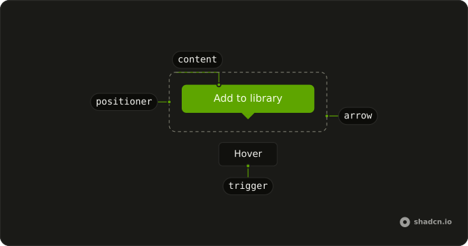
TooltipTrigger
TooltipArrow
└── TooltipArrowTip
TooltipContent
└── TooltipPositioner
Usage
import { Button } from "@/components/ui/button";
import {
  Tooltip, TooltipContent, TooltipTrigger,
} from "@/components/ui/tooltip";<Tooltip>
<TooltipTrigger
asChild={(props) => (
<Button {...props()} variant="outline">Hover</Button>
)}
/>
<TooltipContent>
<p>Add to library</p>
</TooltipContent>
</Tooltip>Accessibility
- Tab
- Opens/closes the tooltip without delay.
- Escape
- If open, closes the tooltip without delay.
- Enter
- Activate the focused item.
- Space
- Activate the focused control.
Demos
Sides
The same label, Add to library, opens on the left, the top, the bottom, and the right. The default is the top, and it should flip when there is no room, but you pin a side when the default would cover the thing the person is editing. Pick the side with empty space, not the side that looks balanced on an empty page.
Keyboard
The button is only a save icon. Its accessible name is Save Changes, and the tooltip repeats that name next to the S shortcut. Use this when an icon button has a keyboard equivalent worth advertising. The shortcut shown here is a hint, not the binding, so you still register the key yourself.
Disabled
A disabled button receives no hover or focus, so a tooltip wrapped around it never opens. Here the trigger is a span around the button, and that span takes the pointer. The label says the feature is unavailable. Wrap like this when people need the reason, and otherwise leave the button focusable and ignore the click.
Rtl
The first of two rows is the physical sides, labeled in Arabic. The second is labeled as the start and the end of the line, while the placement values are still left and right, so you can see those edges under a right-to-left page. The tooltip text is Arabic too. Set direction on the container when the page itself is not already right to left.
FAQ
How do I change the Tooltip delay in Solid?
Set the delay where the base reads it; a provider sets it once for every tooltip inside it.
Use openDelay and closeDelay on Tooltip, or delay and closeDelay on a TooltipProvider around a group.
Do I need a TooltipProvider with Ark UI?
No, it is optional: wrap a group of tooltips in a TooltipProvider to share one delay between them, as the default demo does.
How do I change which side the Tooltip appears on?
It opens on top by default and flips when there is not enough room; the Sides demo shows all four sides.
Pass positioning with a placement such as bottom to Tooltip.
Does the Tooltip work on mobile and touch screens?
Not as a hover hint: touch screens have no hover, so a Tooltip mostly shows when its trigger gets focus. For information people must be able to read on a phone, use a Toggle Tooltip, which opens on tap.
Is the Tooltip accessible to keyboard and screen reader users?
Yes. It opens when its trigger gets keyboard focus and closes on Escape, as the Keyboard demo shows. Keep tooltip text short and never put links or buttons inside it. Its text is linked to the trigger as its description, so screen readers read it after the trigger's name.
API Reference
Tooltip
data-slot="tooltip"
open?boolean
The controlled open state of the tooltip.
defaultOpen?boolean
The initial open state of the tooltip when rendered. Use when you don't need to control the open state of the tooltip.
onOpenChange?(details: OpenChangeDetails) → void
Function called when the tooltip is opened.
- Type
(details: OpenChangeDetails) → void- Parameters
details– { open: boolean }- Returns
void
triggerValue?string | null
The controlled trigger value.
- Type
string | null
defaultTriggerValue?string | null
The initial trigger value when rendered. Use when you don't need to control the trigger value.
- Type
string | null
onTriggerValueChange?(details: TriggerValueChangeDetails) → void
Function called when the trigger value changes.
- Type
(details: TriggerValueChangeDetails) → void- Parameters
details– { value: string | null; triggerElement: HTMLElement | null }- Returns
void
closeDelay?number
The close delay of the tooltip. Ark default: 150.
- Default
provider.closeDelay
closeOnClick?boolean
Whether the tooltip should close on click.
- Default
true
closeOnEscape?boolean
Whether to close the tooltip when the Escape key is pressed.
- Default
true
closeOnPointerDown?boolean
Whether to close the tooltip on pointerdown.
- Default
true
closeOnScroll?boolean
Whether the tooltip should close on scroll.
- Default
true
dir?"ltr" | "rtl"
The document's text/writing direction.
- Type
"ltr" | "rtl"- Default
"ltr"
disabled?boolean
Whether the tooltip is disabled.
hideMode?"display-none" | "activity"
How to hide content when mounted but not present.
- display-none: HTML hidden attribute. Effects stay alive.
- activity: React 19 <Activity mode="hidden">. Effects pause. Requires React 19+.
- Type
"display-none" | "activity"- Default
"display-none"
id?string
The unique identifier of the machine.
ids?object
The ids of the elements in the tooltip. Useful for composition.
- Type
{ trigger?: string | ((value?: string) → string); content?: string; arrow?: string; positioner?: string }
interactive?boolean
Whether the tooltip's content is interactive. In this mode, the tooltip will remain open when user hovers over the content.
- Default
false
lazyMount?boolean
Whether to enable lazy mounting. Ark default: false.
- Default
true
openDelay?number
The open delay of the tooltip. Ark default: 400.
- Default
provider.openDelay
positioning?object
The user provided options used to position the popover content.
- Type
{ restoreStyles?: boolean; applyStyles?: boolean; hideWhenDetached?: boolean; strategy?: "absolute" | "fixed"; placement?: Placement; offset?: { mainAxis?: number; crossAxis?: number; }; gutter?: number; shift?: number; overflowPadding?: number; arrowPadding?: number; flip?: boolean | Placement[]; slide?: boolean; overlap?: boolean; sameWidth?: boolean; fitViewport?: boolean; sizeMiddleware?: boolean; boundary?: (() → Boundary) | Boundary | "clipping-ancestors"; listeners?: boolean | AutoUpdateOptions; onComplete?: (data: ComputePositionReturn) → void; onPositioned?: ((data: { placed: boolean; }) → void); getAnchorElement?: () → HTMLElement | VirtualElement | null; getAnchorRect?: (element: HTMLElement | VirtualElement | null) → AnchorRect | null; updatePosition?: ((data: { updatePosition: () → Promise<void>; floatingElement: HTMLElement | null; }) → void | Promise<void>) }- Default
{ gutter: 4, placement: "top" }
skipAnimationOnMount?boolean
Whether to allow the initial presence animation.
- Default
false
unmountOnExit?boolean
Whether to unmount on exit. Ark default: false.
- Default
true
asChild?(props: ParentProps) => JSX.Element
Render your own element: a function that gets the part's props to spread on it.
- Type
(props: ParentProps) => JSX.Element
TooltipTrigger
<button> data-slot="tooltip-trigger"
value?string
The value that identifies this specific trigger.
asChild?(props: ParentProps) => JSX.Element
Render your own element: a function that gets the part's props to spread on it.
- Type
(props: ParentProps) => JSX.Element
data-current?string
Present when current.
data-expanded?string
Present when expanded.
data-state"open" | "closed"
"open" or "closed".
- Type
"open" | "closed"
data-value?string
The value of the item.
TooltipArrow
<div> data-slot="tooltip-arrow"
asChild?(props: ParentProps) => JSX.Element
Render your own element: a function that gets the part's props to spread on it.
- Type
(props: ParentProps) => JSX.Element
class?string
Merged with the part's classes.
--arrow-backgroundstring
Use this variable to style the arrow background.
--arrow-offsetstring
The offset position of the arrow.
--arrow-sizestring
The size of the arrow.
--arrow-size-halfstring
Half the size of the arrow.
TooltipArrowTip
<div>
asChild?(props: ParentProps) => JSX.Element
Render your own element: a function that gets the part's props to spread on it.
- Type
(props: ParentProps) => JSX.Element
TooltipPositioner
<div> data-slot="tooltip-positioner"
asChild?(props: ParentProps) => JSX.Element
Render your own element: a function that gets the part's props to spread on it.
- Type
(props: ParentProps) => JSX.Element
--available-heightstring
The available height in viewport.
--available-widthstring
The available width in viewport.
--reference-heightstring
The height of the root.
--reference-widthstring
The width of the reference element.
--transform-originstring
The transform origin for animations.
--xstring
The x position for transform.
--ystring
The y position for transform.
--z-indexstring
The z-index value.
TooltipContent
<div> data-slot="tooltip-content"
asChild?(props: ParentProps) => JSX.Element
Render your own element: a function that gets the part's props to spread on it.
- Type
(props: ParentProps) => JSX.Element
class?string
Merged with the part's classes.
data-instant?string
Present when instant is true.
data-placementstring
The placement of the content.
data-side"top" | "right" | "bottom" | "left"
The side of the trigger that the content is positioned on.
- Type
"top" | "right" | "bottom" | "left"
data-state"open" | "closed"
"open" or "closed".
- Type
"open" | "closed"
--transform-originstring
Where the content scales from, on its trigger's side.
TooltipProvider
closeDelay?number
Close delay in ms. Maps to Ark closeDelay on nested tooltips.
- Default
100
delay?number
Open delay in ms. Maps to Ark openDelay / Base UI delay.
- Default
0
useTooltip
open?boolean
The controlled open state of the tooltip.
defaultOpen?boolean
The initial open state of the tooltip when rendered. Use when you don't need to control the open state of the tooltip.
onOpenChange?(details: OpenChangeDetails) → void
Function called when the tooltip is opened.
- Type
(details: OpenChangeDetails) → void- Parameters
details– { open: boolean }- Returns
void
triggerValue?string | null
The controlled trigger value.
- Type
string | null
defaultTriggerValue?string | null
The initial trigger value when rendered. Use when you don't need to control the trigger value.
- Type
string | null
onTriggerValueChange?(details: TriggerValueChangeDetails) → void
Function called when the trigger value changes.
- Type
(details: TriggerValueChangeDetails) → void- Parameters
details– { value: string | null; triggerElement: HTMLElement | null }- Returns
void
closeDelay?number
The close delay of the tooltip.
- Default
150
closeOnClick?boolean
Whether the tooltip should close on click.
- Default
true
closeOnEscape?boolean
Whether to close the tooltip when the Escape key is pressed.
- Default
true
closeOnPointerDown?boolean
Whether to close the tooltip on pointerdown.
- Default
true
closeOnScroll?boolean
Whether the tooltip should close on scroll.
- Default
true
disabled?boolean
Whether the tooltip is disabled.
id?string
The unique identifier of the machine.
ids?object
The ids of the elements in the tooltip. Useful for composition.
- Type
{ trigger?: string | ((value?: string) → string); content?: string; arrow?: string; positioner?: string }
interactive?boolean
Whether the tooltip's content is interactive. In this mode, the tooltip will remain open when user hovers over the content.
- Default
false
openDelay?number
The open delay of the tooltip.
- Default
400
positioning?object
The user provided options used to position the popover content.
- Type
{ restoreStyles?: boolean; applyStyles?: boolean; hideWhenDetached?: boolean; strategy?: "absolute" | "fixed"; placement?: Placement; offset?: { mainAxis?: number; crossAxis?: number; }; gutter?: number; shift?: number; overflowPadding?: number; arrowPadding?: number; flip?: boolean | Placement[]; slide?: boolean; overlap?: boolean; sameWidth?: boolean; fitViewport?: boolean; sizeMiddleware?: boolean; boundary?: (() → Boundary) | Boundary | "clipping-ancestors"; listeners?: boolean | AutoUpdateOptions; onComplete?: (data: ComputePositionReturn) → void; onPositioned?: ((data: { placed: boolean; }) → void); getAnchorElement?: () → HTMLElement | VirtualElement | null; getAnchorRect?: (element: HTMLElement | VirtualElement | null) → AnchorRect | null; updatePosition?: ((data: { updatePosition: () → Promise<void>; floatingElement: HTMLElement | null; }) → void | Promise<void>) }
With other components
Button
ButtonsIcon-only toolbar labels
Kbd
TypographyShortcut in the hint
Toggle
SelectionWhy this is pressed
Sidebar
NavigationCollapsed nav labels
Input Group
InputsTrailing help icon
Badge
FeedbackStatus needs a sentence
Related
Hover Card
OverlaysRicher preview on hover
Popover
OverlaysClick to keep it open
Dropdown Menu
MenusActions, not a hint
Button Group
ButtonsCluster of icon actions
Avatar
MediaName on a face
Hint
FeedbackAnchored inside the parent