shadcn.io is not affiliated with official shadcn/ui
Steps that point at one control at a time. A step that never points at a control is just a dialog.
Use it when a first visit should show the next control. For one hint with no sequence, use a Tooltip. In Solid, Ark UI follows the steps you pass.
Installation
Anatomy
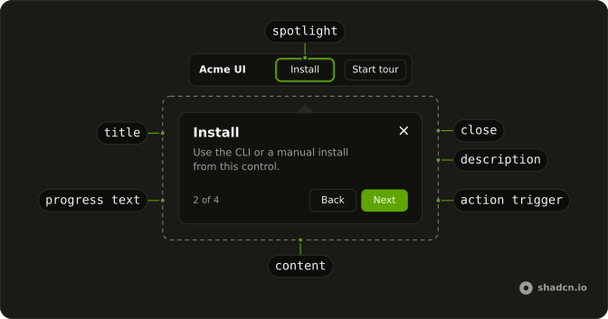
TourContent
TourActionTrigger
TourClose
TourProgressText
TourTitle
TourDescription
TourPositioner
TourArrow
└── TourArrowTip
TourOverlay
TourSpotlight
Usage
import React from "react";
import { Button } from "@/components/ui/button";
import {
  Tour, TourContent, TourDescription, TourFooter, TourHeader,
  TourNextStep, TourPreviousStep, TourProgressText, type TourStepType,
  TourTitle, TourTrigger,
} from "@/components/ui/tour";
const TourDemo = () => {
const installRef = React.useRef<HTMLButtonElement>(null);
const usageRef = React.useRef<HTMLDivElement>(null);
const steps = React.useMemo<TourStepType[]>(
() => [
{
actions: [{ action: "next", label: "Start tour" }],
description:
"This walkthrough stays inside the preview. Next steps highlight pieces of this mini app.",
id: "welcome",
title: "Welcome",
type: "dialog",
},
{
actions: [
{ action: "prev", label: "Back" },
{ action: "next", label: "Next" },
],
description: "Use the CLI or a manual install from this control.",
id: "install",
placement: "bottom",
target: () => installRef.current,
title: "Install",
type: "tooltip",
},
{
actions: [
{ action: "prev", label: "Back" },
{ action: "next", label: "Next" },
],
description:
"Usage notes live next to install so you can copy a snippet.",
id: "usage",
placement: "top",
target: () => usageRef.current,
title: "Usage",
type: "tooltip",
},
{
actions: [{ action: "dismiss", label: "Done" }],
description:
"The overlay, spotlight, and popover are clipped to this frame.",
id: "done",
title: "That’s it",
type: "dialog",
},
],
[]
);
return (
<Tour steps={steps}>
<div class="flex w-full max-w-lg flex-col overflow-hidden rounded-xl border bg-background shadow-sm">
<header class="flex items-center justify-between gap-3 border-b px-3 py-2.5">
<span class="font-semibold text-sm">Acme UI</span>
<div class="flex items-center gap-1">
<Button ref={installRef} size="sm" type="button" variant="ghost">
Install
</Button>
<TourTrigger
asChild={(props) => (
<Button {...props()} size="sm">Start tour</Button>
)}
/>
</div>
</header>
<div class="grid gap-3 p-4 sm:grid-cols-2">
<div class="rounded-lg border bg-muted/40 p-3">
<p class="font-medium text-sm">Install</p>
<p class="mt-1 text-muted-foreground text-xs">
Add the component with the CLI, then import it.
</p>
</div>
<div class="rounded-lg border bg-muted/40 p-3" ref={usageRef}>
<p class="font-medium text-sm">Usage</p>
<p class="mt-1 text-muted-foreground text-xs">
Compose steps, then call start() from a trigger.
</p>
</div>
</div>
</div>
<TourContent>
<TourHeader>
<TourProgressText />
<TourTitle />
<TourDescription />
</TourHeader>
<TourFooter>
<TourPreviousStep />
<TourNextStep />
</TourFooter>
</TourContent>
</Tour>
);
};
Accessibility
- Arrow Right
- Moves to the next step in the tour.
- Arrow Left
- Moves to the previous step in the tour.
- Escape
- Closes the tour.
- Enter
- Activate the focused control.
- Space
- Activate the focused control.
Demos
Async
The second step fetches a GitHub profile before it will appear. Until the response arrives the step stays hidden, still titled as loading. effect then updates the title and description with the name, the public repo count, and the follower count, and calls show. A failed request fills the step with an error instead of leaving it blank, and leaving the step aborts the fetch.
Custom Spacing
The step panel uses a tighter --space than the default, set on TourContent through the spacing scale. Header and footer padding both follow that variable, so one token restyles the panel. Use a smaller value when the tour is cramped inside a preview. The same variable can grow at a wider breakpoint without new styles on each part.
Events
A log under the targets records onStepChange with the step id and onStatusChange with the tour status, appending a line as you move forward, back, and finish. Use the callbacks when you need to remember that someone finished the walkthrough, or to keep another part of the page in sync with the current step. The log is your markup. The tour does not render one.
Keyboard Navigation
keyboardNavigation is turned on, and the line under the button says how: the right arrow advances, the left arrow goes back, and Escape closes. The steps are tooltips on three targets. Turn this on when people should move through the tour without aiming at Next. Leave it off when those arrow keys already do something else on the page.
Progress
Four tooltip steps, plus a bar along the bottom of the panel whose width is the tour progress percent. TourProgressText still prints the count above the title. Read the percent from the tour context when you want a graphic rather than only that count. The bar is your own element, pinned to the bottom of the content, and it does not ship with the component.
Skip
The early steps offer Skip beside Next. Skip is an action whose action is dismiss, so it closes the tour immediately. The last step says Finish and dismisses the same way. Add a skip when the walkthrough is optional, and keep Back on the later steps so closing is not the only way out.
Step Types
The opening and closing steps use type dialog: centered, with no target. Between them, a tooltip step anchors to the target element, and a floating step sits at placement bottom-end with no element at all. Use dialog for a welcome or a goodbye, tooltip when you are pointing at a control, and floating when the note should hold a corner while the page stays visible.
Wait For Click
Add, then Edit, then Delete, and none of those steps has a Next button. effect shows the step, waits for a click on that target, and only then moves on. Use this when the lesson is the click itself, not a paragraph about the click. The closing dialog is the first step that offers Finish, after all three buttons have been used.
Wait For Element
Clicking Add Item appends a row, and the next step stays hidden until that row exists. The wait looks for an element marked data-item new, and it gives up after five seconds. Use this when the next target is created by the previous action, such as a row or a panel that was not in the page yet. Pointing earlier would highlight nothing.
Wait For Input
The name step moves on only after the field has at least two characters. The email step waits for an address shape, and the terms step waits until the checkbox is checked. Each one listens for input or change and tests the element before advancing. Use this when continuing on an empty or invalid value would skip the lesson.
FAQ
How do I build a product tour or onboarding walkthrough in Solid?
Describe the tour as an array of steps, each with an id, a title, a description, a type and its actions, pass it to Tour, and start it with a TourTrigger, as the default demo does. Steps of type tooltip point at an element with target.
How do I highlight a specific element in a Tour step?
Give the step a target, a function that returns the element, and a placement such as bottom. The Tour scrolls it into view, spotlights it with an overlay and places the step next to it.
What step types does the Tour support?
Three, shown in the Step Types demo: dialog for a centered step with no target, like a welcome screen; tooltip for a step attached to an element; and floating for a step pinned to a corner of the screen.
How do I wait for the user to click a button before the next Tour step?
Use the step's effect: it receives next, target and show, so it can wait for an event and then call next. Ark's waitForEvent helper does the waiting, as the Wait For Click and Wait For Input demos do, and waitForElement waits for an element to appear, as the Wait For Element demo does.
How do I load data before showing a Tour step?
Do the work in the step's effect and call show once it is done, or update to change the step's content, as the Async demo does. The step stays hidden while it loads.
How do I let users skip or close the Tour?
Add an action with action set to dismiss, labeled Skip or Done, as the Skip demo does. Escape and a click outside also close it, unless you turn off closeOnEscape or closeOnInteractOutside.
API Reference
Tour
data-slot="tour"
stepsTourStepDetails[]
The steps to display in the tour.
- Default
[]
onStepsChange?(details: StepsChangeDetails) → void
Callback when the steps change.
- Type
(details: StepsChangeDetails) → void- Parameters
details– { steps: StepDetails[] }- Returns
void
idstring
The unique identifier of the machine.
closeOnEscape?boolean
Whether to close the tour when the user presses the escape key.
- Default
true
closeOnInteractOutside?boolean
Whether to close the tour when the user clicks outside the tour.
- Default
true
dir?"ltr" | "rtl"
The document's text/writing direction.
- Type
"ltr" | "rtl"- Default
"ltr"
hideMode?"display-none" | "activity"
How to hide content when mounted but not present.
- display-none: HTML hidden attribute. Effects stay alive.
- activity: React 19 <Activity mode="hidden">. Effects pause. Requires React 19+.
- Type
"display-none" | "activity"- Default
"display-none"
ids?object
The ids of the elements in the tour. Useful for composition.
- Type
{ content?: string; title?: string; description?: string; positioner?: string; backdrop?: string; arrow?: string }
keyboardNavigation?boolean
Enable arrow key navigation between steps.
lazyMount?boolean
Whether to enable lazy mounting. Ark default: false.
- Default
true
onFocusOutside?(event: FocusOutsideEvent) → void
Function called when the focus is moved outside the component.
- Type
(event: FocusOutsideEvent) → void- Parameters
event– FocusOutsideEvent- Returns
void
onInteractOutside?(event: InteractOutsideEvent) → void
Function called when an interaction happens outside the component.
- Type
(event: InteractOutsideEvent) → void- Parameters
event– InteractOutsideEvent- Returns
void
onPointerDownOutside?(event: PointerDownOutsideEvent) → void
Function called when the pointer is pressed down outside the component.
- Type
(event: PointerDownOutsideEvent) → void- Parameters
event– PointerDownOutsideEvent- Returns
void
onStatusChange?(details: { status: string }) → void
Called when the tour status changes.
- Type
(details: { status: string }) → void- Parameters
details– { status: string }- Returns
void
onStepChange?(details: { stepId: string | null }) → void
Called when the current step changes.
- Type
(details: { stepId: string | null }) → void- Parameters
details– { stepId: string | null }- Returns
void
preventInteraction?boolean
Prevents interaction with the rest of the page while the tour is open.
- Default
false
skipAnimationOnMount?boolean
Whether to allow the initial presence animation.
- Default
false
spotlightOffset?object
The offsets to apply to the spotlight.
- Type
{ x: number; y: number }- Default
"{ x: 10, y: 10 }"
spotlightRadius?number
The radius of the spotlight clip path.
- Default
4
stepId?string | null
The id of the currently highlighted step.
- Type
string | null
translations?object
The translations for the tour.
- Type
{ progressText?: (details: ProgressTextDetails) → string; nextStep?: string; prevStep?: string; close?: string; skip?: string }
unmountOnExit?boolean
Whether to unmount on exit. Ark default: false.
- Default
true
asChild?(props: ParentProps) => JSX.Element
Render your own element: a function that gets the part's props to spread on it.
- Type
(props: ParentProps) => JSX.Element
TourContent
<div> data-slot="tour-content"
showCloseButton?boolean
Show close button at the top right corner.
- Default
true
asChild?(props: ParentProps) => JSX.Element
Render your own element: a function that gets the part's props to spread on it.
- Type
(props: ParentProps) => JSX.Element
class?string
Merged with the part's classes.
data-has-nested?string
Present when another popover is nested inside it.
data-nested?string
Present when it's nested inside another popover.
data-placementstring
The placement of the content.
data-side"top" | "right" | "bottom" | "left"
The side of the trigger that the content is positioned on.
- Type
"top" | "right" | "bottom" | "left"
data-state"open" | "closed"
"open" or "closed".
- Type
"open" | "closed"
data-stepstringdata-typestring
The type of the item.
--layer-indexstring
The index of the dismissable in the layer stack.
--nested-layer-countstring
The number of nested tours.
TourActionTrigger
<button> data-slot="tour-action-trigger"
actionobject
The step action it runs: its label and what it does.
- Type
{ label: string; action?: StepActionType | StepActionFn; attrs?: Record<string, any> }
asChild?(props: ParentProps) => JSX.Element
Render your own element: a function that gets the part's props to spread on it.
- Type
(props: ParentProps) => JSX.Element
data-disabled?string
Present when disabled.
data-type"next"
The type of the item.
- Default
"next"
TourClose
<button> data-slot="tour-close-trigger"
asChild?(props: ParentProps) => JSX.Element
Render your own element: a function that gets the part's props to spread on it.
- Type
(props: ParentProps) => JSX.Element
data-typestring
The type of the item.
TourProgressText
<div> data-slot="tour-progress-text"
asChild?(props: ParentProps) => JSX.Element
Render your own element: a function that gets the part's props to spread on it.
- Type
(props: ParentProps) => JSX.Element
class?string
Merged with the part's classes.
TourTitle
<h2> data-slot="tour-title"
asChild?(props: ParentProps) => JSX.Element
Render your own element: a function that gets the part's props to spread on it.
- Type
(props: ParentProps) => JSX.Element
class?string
Merged with the part's classes.
data-placementstring
The placement of the title.
data-side"top" | "right" | "bottom" | "left"
The side of the trigger that the title is positioned on.
- Type
"top" | "right" | "bottom" | "left"
TourDescription
<div> data-slot="tour-description"
asChild?(props: ParentProps) => JSX.Element
Render your own element: a function that gets the part's props to spread on it.
- Type
(props: ParentProps) => JSX.Element
class?string
Merged with the part's classes.
data-placementstring
The placement of the description.
data-side"top" | "right" | "bottom" | "left"
The side of the trigger that the description is positioned on.
- Type
"top" | "right" | "bottom" | "left"
TourPositioner
<div> data-slot="tour-positioner"
asChild?(props: ParentProps) => JSX.Element
Render your own element: a function that gets the part's props to spread on it.
- Type
(props: ParentProps) => JSX.Element
class?string
Merged with the part's classes.
data-placementstring
The placement of the positioner.
data-side"top" | "right" | "bottom" | "left"
The side of the trigger that the positioner is positioned on.
- Type
"top" | "right" | "bottom" | "left"
data-typestring
The type of the item.
--available-heightstring
The available height in viewport.
--available-widthstring
The available width in viewport.
--reference-heightstring
The height of the root.
--reference-widthstring
The width of the reference element.
--tour-layerstring
The tour layer value for the Positioner.
--transform-originstring
The transform origin for animations.
--xstring
The x position for transform.
--ystring
The y position for transform.
--z-indexstring
The z-index value.
TourOverlay
<div> data-slot="tour-overlay"
asChild?(props: ParentProps) => JSX.Element
Render your own element: a function that gets the part's props to spread on it.
- Type
(props: ParentProps) => JSX.Element
class?string
Merged with the part's classes.
data-state"open" | "closed"
"open" or "closed".
- Type
"open" | "closed"
data-typestring
The type of the item.
--layer-indexstring
The index of the dismissable in the layer stack.
--tour-layerstring
The tour layer value for the Backdrop.
TourSpotlight
<div> data-slot="tour-spotlight"
asChild?(props: ParentProps) => JSX.Element
Render your own element: a function that gets the part's props to spread on it.
- Type
(props: ParentProps) => JSX.Element
class?string
Merged with the part's classes.
--spotlight-heightstring
The height of the Spotlight.
--spotlight-widthstring
The width of the Spotlight.
--spotlight-xstring
The spotlight x value for the Spotlight.
--spotlight-ystring
The spotlight y value for the Spotlight.
--tour-layerstring
The tour layer value for the Spotlight.
TourTrigger
<button> data-slot="tour-trigger"
asChild?(props: ParentProps) => JSX.Element
Render your own element: a function that gets the part's props to spread on it.
- Type
(props: ParentProps) => JSX.Element
TourBody
data-slot="tour-body"
scrollFade?boolean
Add a fade effect to the scroll area.
- Default
false
asChild?(props: ParentProps) => JSX.Element
Render your own element: a function that gets the part's props to spread on it.
- Type
(props: ParentProps) => JSX.Element
TourHeader
data-slot="tour-header"
description?string
The description of the dialog.
title?string
The title of the dialog.
asChild?(props: ParentProps) => JSX.Element
Render your own element: a function that gets the part's props to spread on it.
- Type
(props: ParentProps) => JSX.Element
TourFooter
<div>
showCloseButton?boolean
Show a close button in the footer.
- Default
false
asChild?(props: ParentProps) => JSX.Element
Render your own element: a function that gets the part's props to spread on it.
- Type
(props: ParentProps) => JSX.Element
TourActions
<div>
children(actions: StepAction[]) → JSX.Element
A function that gets actions and returns what it renders.
- Type
(actions: StepAction[]) → JSX.Element- Parameters
actions– StepAction[]- Returns
ReactNode
showCloseButton?boolean
Show a close button in the footer.
- Default
false
asChild?(props: ParentProps) => JSX.Element
Render your own element: a function that gets the part's props to spread on it.
- Type
(props: ParentProps) => JSX.Element
class?string
Merged with the part's classes.
TourPreviousStep
actionobject
The step action it runs: its label and what it does.
- Type
{ label: string; action?: StepActionType | StepActionFn; attrs?: Record<string, any> }
asChild?(props: ParentProps) => JSX.Element
Render your own element: a function that gets the part's props to spread on it.
- Type
(props: ParentProps) => JSX.Element
TourNextStep
actionobject
The step action it runs: its label and what it does.
- Type
{ label: string; action?: StepActionType | StepActionFn; attrs?: Record<string, any> }
asChild?(props: ParentProps) => JSX.Element
Render your own element: a function that gets the part's props to spread on it.
- Type
(props: ParentProps) => JSX.Element