shadcn.io is not affiliated with official shadcn/ui
Walk a wizard or a checkout one step at a time, with Back and Next under the current step.
Use them when later steps depend on earlier ones. Panels with no required order are Tabs. In Solid, Ark UI tracks the index from zero, including which steps are complete.
Installation
Anatomy
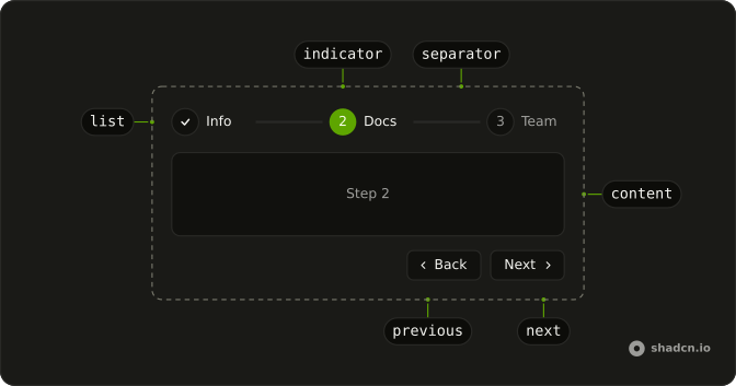
Steps
├── StepsList
├── StepsItem
├── StepsTrigger
├── StepsIndicator
├── StepsSeparator
├── StepsContent
├── StepsNext
├── StepsPrevious
└── StepsProgress
Usage
import { ChevronLeftIcon, ChevronRight } from "lucide-solid";
import { Button } from "@/components/ui/button";
import {
  Steps, StepsCompletedContent, StepsContent, StepsIndicator, StepsItem,
  StepsList, StepsNext, StepsPrevious, StepsSeparator, StepsTrigger,
} from "@/components/ui/steps";
const steps = Array.from({ length: 3 }, (_, index) => index + 1);
const StepsDemo = () => (
<Steps class="size-full max-w-md" count={steps.length}>
<StepsList>
{steps.map((step) => (
<StepsItem index={step - 1} key={step}>
<StepsTrigger>
<StepsIndicator>{step}</StepsIndicator>
</StepsTrigger>
<StepsSeparator />
</StepsItem>
))}
</StepsList>
{steps.map((step) => (
<StepsContent
class="flex h-full items-center justify-center rounded-md border"
index={step - 1}
key={step}
>
<p class="text-muted-foreground text-sm">Step {step}</p>
</StepsContent>
))}
<StepsCompletedContent class="flex h-full items-center justify-center rounded-md border">
<p class="text-muted-foreground text-sm">
All steps completed. You're all set!
</p>
</StepsCompletedContent>
<div class="flex flex-row-reverse gap-2">
<StepsNext
asChild={(props) => (
<Button {...props()}>
Next
<ChevronRight />
</Button>
)}
/>
<StepsPrevious
asChild={(props) => (
<Button {...props()} variant="outline">
<ChevronLeftIcon />
Back
</Button>
)}
/>
</div>
</Steps>
);
Accessibility
- Tab
- Moves focus onto the list's one stop: the current step's trigger, or the last trigger once every step is done. The content isn't a stop of its own.
- Arrow Right
- Moves focus to the next enabled trigger in horizontal orientation (the previous one in right-to-left), wrapping round.
- Arrow Left
- Moves focus to the previous enabled trigger in horizontal orientation (the next one in right-to-left), wrapping round.
- Arrow Down
- Moves focus to the next enabled trigger in vertical orientation, wrapping round.
- Arrow Up
- Moves focus to the previous enabled trigger in vertical orientation, wrapping round.
- Home
- Moves focus to the first enabled trigger.
- End
- Moves focus to the last enabled trigger.
- Enter
- Opens the focused trigger's step, or activates the focused control.
- Space
- Opens the focused trigger's step, or activates the focused control.
Demos
Controlled
Your details, company details, then invite your team. Back, Next, and Reset are ordinary buttons that store the index in step. Control it when a parent, a query param, or a save has to move the wizard. The built-in next and previous parts are enough when nothing outside cares, and Reset returns to index zero, the first step.
Description
Each trigger has a title and a short description: Info with Personal, Docs with Company, Team with Create. StepsTitle and StepsDescription live on the list, so a step says what it holds before it opens. Keep the description to a couple of words, because a sentence in the trigger wraps the row. Longer copy belongs in the step body, which is not part of this list.
Icon
Indicators show a person, a drive, and a card instead of numbers. An icon helps when the step is recognizable: account, then storage, then payment. There is no title beside the icon, which suits a compact rail and fails if the picture is ambiguous. Add StepsTitle when the metaphor is unclear, and hide the icon once a title names the step.
Loading
The first indicator spins, the others stay numbers, and every trigger is disabled. That is a step saving or checking before anyone may move on. Put the loader in the indicator instead of a second spinner beside the wizard. Disabled triggers block a later step while the request runs, and they should come back on when the check finishes.
Title
Numbers plus a name: Info, Docs, and Team. StepsTitle is the smallest label that explains a sequence without opening each step. Use it when position alone is not obvious, because three bare circles force a guess and there is no second line to help. If one word is not enough, add a short description rather than stretching the title into a sentence.
Vertical
The list stacks, separators run between the steps, and the current content sits beside that list. Set orientation to vertical for a side column next to a preview. Across the top of a narrow form, horizontal wastes less height. Next and Back stay with the content, and a completed message replaces the panel after the last step.
FAQ
How do I build a multi-step form wizard with Steps in Solid?
Set count to the number of steps, render a StepsContent with an index for each step's fields, and add StepsPrevious and StepsNext to move between them. StepsCompletedContent shows once the last step is done, as in the default demo.
How do I control the current step of Steps?
Keep the step index in state and pass it as step; it starts at 0. Use defaultStep instead when you only need the starting step.
onStepChange receives details.step, as in the Controlled demo.
How do I stop Steps from moving forward until a step is valid?
Pass isStepValid, a function of the step index that returns whether that step is complete. While it returns false, the Steps stay on that step and onStepInvalid is called, so you can show the errors.
Can users skip ahead to a later step?
By default they can click any step's trigger. Set linear to make them go through the steps in order, and use isStepSkippable to mark optional steps they may pass over.
How do I show Steps vertically?
Set orientation="vertical": the list stacks the steps and the separators run between them, as in the Vertical demo. It suits a side column next to the content of the current step.
API Reference
Steps
<div> data-slot="steps"
step?number
The controlled value of the stepper.
defaultStep?number
The initial value of the stepper when rendered. Use when you don't need to control the value of the stepper.
onStepChange?(details: StepChangeDetails) → void
Callback to be called when the value changes.
- Type
(details: StepChangeDetails) → void- Parameters
details– { step: number }- Returns
void
count?number
The total number of steps.
dir?"ltr" | "rtl"
The document's text/writing direction.
- Type
"ltr" | "rtl"- Default
"ltr"
id?string
The unique identifier of the machine.
ids?object
The custom ids for the stepper elements.
- Type
{ root?: string; list?: string; triggerId?: (index: number) → string; contentId?: (index: number) → string }
isStepSkippable?(index: number) → boolean
Whether a step can be skipped during navigation. Skippable steps are bypassed when using next/prev.
- Default
() => false- Parameters
index– number- Returns
boolean
isStepValid?(index: number) → boolean
Whether a step is valid. Invalid steps block forward navigation in linear mode.
- Default
() => true- Parameters
index– number- Returns
boolean
linear?boolean
If true, the stepper requires the user to complete the steps in order.
onStepComplete?VoidFunction
Callback to be called when a step is completed.
onStepInvalid?(details: StepInvalidDetails) → void
Called when navigation is blocked due to an invalid step.
- Type
(details: StepInvalidDetails) → void- Parameters
details– { step: number; action: "next" | "set"; targetStep?: number }- Returns
void
orientation?"horizontal" | "vertical"
The orientation of the stepper.
- Type
"horizontal" | "vertical"- Default
"horizontal"
asChild?(props: ParentProps) => JSX.Element
Render your own element: a function that gets the part's props to spread on it.
- Type
(props: ParentProps) => JSX.Element
class?string
Merged with the part's classes.
data-orientation"horizontal" | "vertical"
The orientation of the steps.
- Type
"horizontal" | "vertical"
--percentstring
The percent value for the Root.
StepsList
<div> data-slot="steps-list"
asChild?(props: ParentProps) => JSX.Element
Render your own element: a function that gets the part's props to spread on it.
- Type
(props: ParentProps) => JSX.Element
class?string
Merged with the part's classes.
data-orientation"horizontal" | "vertical"
The orientation of the list.
- Type
"horizontal" | "vertical"
StepsItem
<div> data-slot="steps-item"
indexnumber
The item's position in its list.
asChild?(props: ParentProps) => JSX.Element
Render your own element: a function that gets the part's props to spread on it.
- Type
(props: ParentProps) => JSX.Element
class?string
Merged with the part's classes.
data-orientation"horizontal" | "vertical"
The orientation of the item.
- Type
"horizontal" | "vertical"
data-skippable?string
Present when skippable is true.
StepsTrigger
<button> data-slot="steps-trigger"
asChild?(props: ParentProps) => JSX.Element
Render your own element: a function that gets the part's props to spread on it.
- Type
(props: ParentProps) => JSX.Element
class?string
Merged with the part's classes.
data-complete?string
Present when the trigger value is complete.
data-current?string
Present when current.
data-incomplete?string
Present when incomplete is true.
data-orientation"horizontal" | "vertical"
The orientation of the trigger.
- Type
"horizontal" | "vertical"
data-state"open" | "closed"
"open" or "closed".
- Type
"open" | "closed"
StepsIndicator
<div> data-slot="steps-indicator"
asChild?(props: ParentProps) => JSX.Element
Render your own element: a function that gets the part's props to spread on it.
- Type
(props: ParentProps) => JSX.Element
class?string
Merged with the part's classes.
data-complete?string
Present when the indicator value is complete.
data-current?string
Present when current.
data-incomplete?string
Present when incomplete is true.
--steps-icon-sizestring--steps-sizestringStepsSeparator
<div> data-slot="steps-separator"
asChild?(props: ParentProps) => JSX.Element
Render your own element: a function that gets the part's props to spread on it.
- Type
(props: ParentProps) => JSX.Element
class?string
Merged with the part's classes.
data-complete?string
Present when the separator value is complete.
data-current?string
Present when current.
data-incomplete?string
Present when incomplete is true.
data-orientation"horizontal" | "vertical"
The orientation of the separator.
- Type
"horizontal" | "vertical"
--steps-gutterstring--steps-sizestringStepsContent
<div> data-slot="steps-content"
indexnumber
The content's position in its list.
asChild?(props: ParentProps) => JSX.Element
Render your own element: a function that gets the part's props to spread on it.
- Type
(props: ParentProps) => JSX.Element
class?string
Merged with the part's classes.
data-orientation"horizontal" | "vertical"
The orientation of the content.
- Type
"horizontal" | "vertical"
data-state"open" | "closed"
"open" or "closed".
- Type
"open" | "closed"
StepsNext
<button> data-slot="steps-next"
asChild?(props: ParentProps) => JSX.Element
Render your own element: a function that gets the part's props to spread on it.
- Type
(props: ParentProps) => JSX.Element
StepsPrevious
<button> data-slot="steps-previous"
asChild?(props: ParentProps) => JSX.Element
Render your own element: a function that gets the part's props to spread on it.
- Type
(props: ParentProps) => JSX.Element
StepsTitle
<span> data-slot="steps-title"
asChild?(props: ParentProps) => JSX.Element
Render your own element: a function that gets the part's props to spread on it.
- Type
(props: ParentProps) => JSX.Element
class?string
Merged with the part's classes.
data-orientation"horizontal" | "vertical"
Mirrors the orientation prop.
- Type
"horizontal" | "vertical"
StepsDescription
<span> data-slot="steps-description"
asChild?(props: ParentProps) => JSX.Element
Render your own element: a function that gets the part's props to spread on it.
- Type
(props: ParentProps) => JSX.Element
class?string
Merged with the part's classes.
data-orientation"horizontal" | "vertical"
Mirrors the orientation prop.
- Type
"horizontal" | "vertical"
StepsCompletedContent
<div> data-slot="steps-completed-content"
asChild?(props: ParentProps) => JSX.Element
Render your own element: a function that gets the part's props to spread on it.
- Type
(props: ParentProps) => JSX.Element
class?string
Merged with the part's classes.
useSteps
step?number
The controlled value of the stepper.
defaultStep?number
The initial value of the stepper when rendered. Use when you don't need to control the value of the stepper.
onStepChange?(details: StepChangeDetails) → void
Callback to be called when the value changes.
- Type
(details: StepChangeDetails) → void- Parameters
details– { step: number }- Returns
void
count?number
The total number of steps.
id?string
The unique identifier of the machine.
ids?object
The custom ids for the stepper elements.
- Type
{ root?: string; list?: string; triggerId?: (index: number) → string; contentId?: (index: number) → string }
isStepSkippable?(index: number) → boolean
Whether a step can be skipped during navigation. Skippable steps are bypassed when using next/prev.
- Default
() => false- Parameters
index– number- Returns
boolean
isStepValid?(index: number) → boolean
Whether a step is valid. Invalid steps block forward navigation in linear mode.
- Default
() => true- Parameters
index– number- Returns
boolean
linear?boolean
If true, the stepper requires the user to complete the steps in order.
onStepComplete?VoidFunction
Callback to be called when a step is completed.
onStepInvalid?(details: StepInvalidDetails) → void
Called when navigation is blocked due to an invalid step.
- Type
(details: StepInvalidDetails) → void- Parameters
details– { step: number; action: "next" | "set"; targetStep?: number }- Returns
void
orientation?"horizontal" | "vertical"
The orientation of the stepper.
- Type
"horizontal" | "vertical"- Default
"horizontal"
With other components
Button
ButtonsBack and next
Progress
FeedbackHow far through
Card
LayoutThe current step
Field
InputsThe step's fields
Separator
LayoutBetween the steps
Badge
FeedbackThe step number
Related
Tabs
NavigationAny panel, any order
Accordion
DisclosureSections stacked
Pagination
NavigationPages of a list
Breadcrumb
NavigationWhere they are in a site
Dialog
OverlaysOne step in a modal
Tour
OverlaysA sequence over the page