shadcn.io is not affiliated with official shadcn/ui
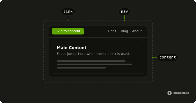
Hide a link until keyboard focus, then jump past the header to the main content. Mouse users never see it.
Use one pair when the first Tab would walk a long menu. For a section inside the article, use a TOC. In Solid, Ark UI uses an anchor and a focusable target, not a popup.
Installation
Anatomy
Usage
import { SkipNavContent, SkipNavLink } from "@/components/ui/skip-nav";<>
<SkipNavLink class="focus:absolute" id="demo-content" />
<SkipNavContent
class="max-w-sm rounded-lg border bg-card p-4 focus:ring-2"
id="demo-content"
tabIndex={undefined}
>
<h2 class="mb-2 font-semibold">Main Content</h2>
<p class="text-muted-foreground text-sm">
This is the main content area. When users press Tab and then Enter on
the skip link, focus jumps here.
</p>
</SkipNavContent>
</>Accessibility
- Enter
- Activate the focused control.
FAQ
How does Skip Nav work in Solid?
Skip Nav lets keyboard users jump past repeated navigation. Tab until SkipNavLink is focused, then press Enter. Focus moves to SkipNavContent. The link is hidden until it is focused, then it appears at the top start of the viewport, above the rest of the page.
How do I point Skip Nav at my main content with Ark UI?
SkipNavLink and SkipNavContent must use the same id. The default id is skip-nav-content, so a single pair works with no extra props. Pass the same other id to both when the target is a different element, or when the page has more than one skip link. The content is focusable without being in the tab order, which is what lets the link move focus there.
How do I change the Skip Nav label?
The default link text is Skip to content. Pass children to change it, for example to Skip to search. Keep the text short, because it appears as a small button when focused. The focused link uses the primary background so it stays visible on top of the page.
Where do I put Skip Nav in the page?
Render SkipNavLink first in the document, before the header and the navigation, so it is the first thing Tab reaches. Point it at the main region, not at a heading buried halfway down the page. One pair is enough for most sites. A second pair needs its own id on both the link and the target.
How do I style the focused Skip Nav link?
Edit the skip-nav file under components/ui. The link stays visually hidden until focus, then it is fixed at the start edge, so right-to-left pages still place it at the start. It uses a high layer while focused so the header does not cover it. The content itself only clears the outline so the focus ring from the browser is not doubled.
Which keys activate Skip Nav?
Tab moves to the link, because it is the first focusable control when it is rendered first. Enter follows the link and moves focus to the content. The content is not a second tab stop, so the next Tab continues with the first control inside the main region. Space is not required, and Enter is the key the Accessibility section lists.
How do I install Skip Nav in Solid?
Run the command in the Installation section above. It adds Skip Nav to your ui folder. Import from that folder when the command finishes, instead of copying the source by hand, and rerun the command later if you want the latest files. The command uses the shadcn CLI.
API Reference
SkipNavLink
<a> data-slot="skip-nav-link"
id?string
The id of the element to skip to. Ark default: skip-nav-content.
- Default
SKIP_NAV_ID
asChild?(props: ParentProps) => JSX.Element
Render your own element: a function that gets the part's props to spread on it.
- Type
(props: ParentProps) => JSX.Element
class?string
Merged with the part's classes.
SkipNavContent
<div> data-slot="skip-nav-content"
id?string
The id that SkipNavLink links to. Ark default: skip-nav-content.
- Default
SKIP_NAV_ID
class?string
Merged with the part's classes.
With other components
Sidebar
NavigationThe nav people skip
Table of Contents
NavigationThe outline they can skip
Navigation Menu
NavigationThe bar at the top
Button
ButtonsThe skip control itself
Breadcrumb
NavigationThe trail under the bar
Kbd
TypographyThe key that focuses it
Related
Pagination
NavigationMove through pages
Tabs
NavigationMove between panels
Menubar
MenusCommands at the top
Bottom Navigation
NavigationA bar at the bottom
Link Overlay
NavigationA card that is a link
Command
OverlaysJump by searching