shadcn.io is not affiliated with official shadcn/ui
A command menu narrows its actions as you type.
Use it to run an action or jump to a place. If the list is a form value you must store, use a Combobox. In Solid, Ark UI filters the collection you passed in.
Installation
Anatomy
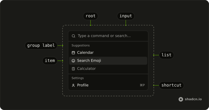
CommandRoot
├── CommandClearTrigger
├── CommandContent
├── CommandControl
├── CommandInput
├── CommandItem
│   ├── CommandGroup
│   │   └── CommandGroupLabel
│   ├── CommandItemIndicator
│   └── CommandItemText
├── CommandLabel
├── CommandList
├── CommandPositioner
└── CommandTrigger
Usage
import { useListCollection } from "@ark-ui/solid/collection";
import { useFilter } from "@ark-ui/solid/locale";
import {
  CalculatorIcon, CalendarIcon, CreditCardIcon, SettingsIcon, SmileIcon,
  UserIcon,
} from "lucide-solid";
import { Fragment } from "react";
import {
  Command, CommandContent, CommandEmpty, CommandGroup, CommandInput,
  CommandItem, CommandList, CommandSeparator, CommandShortcut,
} from "@/components/ui/command";
const initialItems = [
{
group: "Suggestions",
icon: CalendarIcon,
label: "Calendar",
value: "calendar",
},
{
group: "Suggestions",
icon: SmileIcon,
label: "Search Emoji",
value: "emoji",
},
{
disabled: true,
group: "Suggestions",
icon: CalculatorIcon,
label: "Calculator",
value: "calculator",
},
{
group: "Settings",
icon: UserIcon,
label: "Profile",
shortcut: "⌘P",
value: "profile",
},
{
group: "Settings",
icon: CreditCardIcon,
label: "Billing",
shortcut: "⌘B",
value: "billing",
},
{
group: "Settings",
icon: SettingsIcon,
label: "Settings",
shortcut: "⌘S",
value: "settings",
},
];
const CommandDemo = () => {
const { contains } = useFilter({ sensitivity: "base" });
const { collection, filter } = useListCollection({
filter: contains,
groupBy: (item) => item.group,
initialItems,
});
const handleInputValueChange = (details: { inputValue: string }) => {
filter(details.inputValue);
};
return (
<Command
class="max-w-sm rounded-lg border"
collection={collection}
onInputValueChange={handleInputValueChange}
>
<CommandInput placeholder="Type a command or search..." />
<CommandContent>
<CommandList>
<CommandEmpty>No results found.</CommandEmpty>
{collection.group().map(([group, items], index) => (
<Fragment key={group}>
{index > 0 && <CommandSeparator />}
<CommandGroup heading={group}>
{items.map((item) => {
const Icon = item.icon;
return (
<CommandItem item={item} key={item.value}>
<Icon aria-hidden="true" />
<span>{item.label}</span>
{!!item.shortcut && (
<CommandShortcut>{item.shortcut}</CommandShortcut>
)}
</CommandItem>
);
})}
</CommandGroup>
</Fragment>
))}
</CommandList>
</CommandContent>
</Command>
);
};
Accessibility
- Arrow Down
- Move down.
- Arrow Up
- Move up.
- Home
- Go to the start.
- End
- Go to the end.
- Enter
- Activate the focused item.
- Escape
- Dismiss.
- Space
- Activate the focused control.
- Arrow Left
- Move left.
- Arrow Right
- Move right.
Demos
Basic
Open Menu puts a short list in a dialog: Calendar, Search Emoji, and Calculator, plus a field that filters them. There are no icons and no shortcut hints. An empty state replaces the rows when nothing matches. Use the dialog when the menu should cover the page, and keep the inline list, like the one at the top of this page, when it should stay put.
Shortcuts
Profile, Billing, and Settings, each with an icon and a shortcut hint at the end of the row. The hint is only a label, and nothing here listens for those keys. Show a shortcut when the action is also bound somewhere else, and attach that binding yourself. The dialog still opens from a button, the same way the basic menu does.
Groups
Suggestions and Settings, split by a separator, with an icon on every row and shortcut hints only on the settings rows. Each item carries a group, and the collection builds the headings from that, so you are not hand-writing two lists. Use groups once commands fall into more than one kind. A single list is easier to scan only while it is short.
Scrollable
Navigation, Actions, View, Account, and Tools, enough rows that the dialog has to scroll. The list already overflows on its own, so a second scroll container would fight it. Filtering still removes what does not match, which matters more at this length. Keep the headings, because a long run of unlabeled icons is harder to scan than the field is to type into.
Palette
Command-K or Control-K toggles the dialog from anywhere on the page, and the Search button does the same for a pointer. Pages and Actions are grouped, a few rows show shortcut hints, and the footer names the arrow keys, Enter, and Escape. Picking an item writes its name under the button and closes the dialog. The value stays empty so choosing that same item again still runs.
Rtl
The inline menu from the top of the page, with dir set to rtl on the command and on the input. Headings, labels, the placeholder, and the empty state are Arabic, and the disabled calculator is still disabled. Shortcut hints sit at the inline end of the row. Use this to check the filter and the separator when the line runs right to left.
FAQ
How do I open the Command palette with Cmd+K in Solid?
Listen for the key yourself: on keydown, when the key is k and metaKey or ctrlKey is pressed, toggle the open state you pass to CommandDialog. The Palette demo has the whole handler, plus a "Search…" button for touch screens.
How do I run an action when a Command item is selected?
Handle onValueChange on Command, which receives the chosen item's value, and keep value empty so every choice fires. Close the dialog in the same handler.
The Palette demo shows the selection on the page.
Should I use a Command or a Combobox?
Use a Command to run an action or jump somewhere, like a command palette or a searchable action menu. Use a Combobox when the choice is a value that stays in a form field.
Why doesn't pressing a Command shortcut do anything?
CommandShortcut is only a label at the end of an item: it shows the keys but doesn't bind them. Listen for those keys yourself, the same way the palette listens for Cmd+K.
How do I show a message when no Command results match?
Put a CommandEmpty with the text in the list: it only shows when the search leaves nothing.
How do I group Command items under headings?
Wrap related items in a CommandGroup with a heading, and put a CommandSeparator between groups, as in the Groups demo. Group by task, like Pages and Actions, rather than by where things live.
API Reference
Command
<div> data-slot="command"
inputValue?string
The controlled value of the combobox's input.
defaultInputValue?string
The initial value of the combobox's input when rendered. Use when you don't need to control the value of the combobox's input.
- Default
""
onInputValueChange?(details: InputValueChangeDetails) → void
Function called when the input's value changes.
- Type
(details: InputValueChangeDetails) → void- Parameters
details– { inputValue: string; reason?: InputValueChangeReason }- Returns
void
open?boolean
The controlled open state of the combobox.
defaultOpen?boolean
The initial open state of the combobox when rendered. Use when you don't need to control the open state of the combobox.
onOpenChange?(details: OpenChangeDetails) → void
Function called when the popup is opened.
- Type
(details: OpenChangeDetails) → void- Parameters
details– { open: boolean; reason?: OpenChangeReason; value: string[] }- Returns
void
value?string[]
The controlled value of the combobox's selected items.
defaultValue?string[]
The initial value of the combobox's selected items when rendered. Use when you don't need to control the value of the combobox's selected items.
- Default
[]
onValueChange?(details: ValueChangeDetails<T>) → void
Function called when a new item is selected.
- Type
(details: ValueChangeDetails<T>) → void- Parameters
details– ValueChangeDetails<T>- Returns
void
collectionListCollection<T>
The collection of items.
- Type
ListCollection<T>
allowCustomValue?boolean
Whether to allow typing custom values in the input.
alwaysSubmitOnEnter?boolean
Whether to always submit on Enter key press, even if popup is open. Useful for single-field autocomplete forms where Enter should submit the form.
- Default
false
autoFocus?boolean
Whether to autofocus the input on mount.
closeOnSelect?boolean
Whether to close the combobox when an item is selected.
- Default
false
composite?boolean
Whether the combobox is a composed with other composite widgets like tabs.
- Default
true
defaultHighlightedValue?string | null
The initial highlighted value of the combobox when rendered. Use when you don't need to control the highlighted value of the combobox.
- Type
string | null
dir?"ltr" | "rtl"
The document's text/writing direction.
- Type
"ltr" | "rtl"- Default
"ltr"
disabled?boolean
Whether the combobox is disabled.
disableLayer?boolean
Whether to disable registering this a dismissable layer.
form?string
The associate form of the combobox.
hideMode?"display-none" | "activity"
How to hide content when mounted but not present.
- display-none: HTML hidden attribute. Effects stay alive.
- activity: React 19 <Activity mode="hidden">. Effects pause. Requires React 19+.
- Type
"display-none" | "activity"- Default
"display-none"
highlightedValue?string | null
The controlled highlighted value of the combobox.
- Type
string | null
id?string
The unique identifier of the machine.
ids?object
The ids of the elements in the combobox. Useful for composition.
- Type
{ root?: string; label?: string; control?: string; input?: string; content?: string; trigger?: string; clearTrigger?: string; item?: (id: string, index?: number) → string; positioner?: string; itemGroup?: (id: string | number) → string; itemGroupLabel?: (id: string | number) → string }
inputBehavior?"autohighlight" | "autocomplete" | "none"
Defines the auto-completion behavior of the combobox.
- autohighlight: The first focused item is highlighted as the user types
- autocomplete: Navigating the listbox with the arrow keys selects the item and the input is updated Ark default: none.
- Type
"autohighlight" | "autocomplete" | "none"- Default
autohighlight
invalid?boolean
Whether the combobox is invalid.
lazyMount?boolean
Whether to enable lazy mounting. Ark default: false.
- Default
true
loopFocus?boolean
Whether to loop the keyboard navigation through the items. Ark default: true.
- Default
false
multiple?boolean
Whether to allow multiple selection.
**Good to know:** When multiple is true, the selectionBehavior is automatically set to clear.
It is recommended to render the selected items in a separate container.
name?string
The name attribute of the combobox's input. Useful for form submission.
navigate?((details: NavigateDetails) → void) | null
Function to navigate to the selected item.
- Type
((details: NavigateDetails) → void) | null- Parameters
(details– { value: string; node: HTMLAnchorElement; href: string }- Returns
void) | null
onFocusOutside?(event: FocusOutsideEvent) → void
Function called when the focus is moved outside the component.
- Type
(event: FocusOutsideEvent) → void- Parameters
event– FocusOutsideEvent- Returns
void
onHighlightChange?(details: HighlightChangeDetails<T>) → void
Function called when an item is highlighted using the pointer or keyboard navigation.
- Type
(details: HighlightChangeDetails<T>) → void- Parameters
details– HighlightChangeDetails<T>- Returns
void
onInteractOutside?(event: InteractOutsideEvent) → void
Function called when an interaction happens outside the component.
- Type
(event: InteractOutsideEvent) → void- Parameters
event– InteractOutsideEvent- Returns
void
onPointerDownOutside?(event: PointerDownOutsideEvent) → void
Function called when the pointer is pressed down outside the component.
- Type
(event: PointerDownOutsideEvent) → void- Parameters
event– PointerDownOutsideEvent- Returns
void
onSelect?(details: SelectionDetails) → void
Function called when an item is selected.
- Type
(details: SelectionDetails) → void- Parameters
details– { value: string[]; itemValue: string }- Returns
void
openOnChange?boolean | ((details: InputValueChangeDetails) → boolean)
Whether to show the combobox when the input value changes.
- Type
boolean | ((details: InputValueChangeDetails) → boolean)- Default
true
openOnClick?boolean
Whether to open the combobox popup on initial click on the input.
- Default
false
openOnKeyPress?boolean
Whether to open the combobox on arrow key press.
- Default
true
placeholder?string
The placeholder text of the combobox's input.
positioning?object
The positioning options to dynamically position the menu.
- Type
{ restoreStyles?: boolean; applyStyles?: boolean; hideWhenDetached?: boolean; strategy?: "absolute" | "fixed"; placement?: Placement; offset?: { mainAxis?: number; crossAxis?: number; }; gutter?: number; shift?: number; overflowPadding?: number; arrowPadding?: number; flip?: boolean | Placement[]; slide?: boolean; overlap?: boolean; sameWidth?: boolean; fitViewport?: boolean; sizeMiddleware?: boolean; boundary?: (() → Boundary) | Boundary | "clipping-ancestors"; listeners?: boolean | AutoUpdateOptions; onComplete?: (data: ComputePositionReturn) → void; onPositioned?: ((data: { placed: boolean; }) → void); getAnchorElement?: () → HTMLElement | VirtualElement | null; getAnchorRect?: (element: HTMLElement | VirtualElement | null) → AnchorRect | null; updatePosition?: ((data: { updatePosition: () → Promise<void>; floatingElement: HTMLElement | null; }) → void | Promise<void>) }- Default
{ placement: "bottom-start" }
readOnly?boolean
Whether the combobox is readonly. This puts the combobox in a "non-editable" mode but the user can still interact with it
required?boolean
Whether the combobox is required.
scrollToIndexFn?(details: ScrollToIndexDetails) → void
Function to scroll to a specific index.
- Type
(details: ScrollToIndexDetails) → void- Parameters
details– { index: number; immediate?: boolean; getElement: () → HTMLElement | null }- Returns
void
selectionBehavior?"clear" | "replace" | "preserve"
The behavior of the combobox input when an item is selected
- replace: The selected item string is set as the input value
- clear: The input value is cleared
- preserve: The input value is preserved Ark default: replace.
- Type
"clear" | "replace" | "preserve"- Default
clear
skipAnimationOnMount?boolean
Whether to allow the initial presence animation.
- Default
false
translations?object
Specifies the localized strings that identifies the accessibility elements and their states.
- Type
{ triggerLabel?: string; clearTriggerLabel?: string }
unmountOnExit?boolean
Whether to unmount on exit. Ark default: false.
- Default
true
asChild?(props: ParentProps) => JSX.Element
Render your own element: a function that gets the part's props to spread on it.
- Type
(props: ParentProps) => JSX.Element
class?string
Merged with the part's classes.
data-invalid?string
Present when invalid.
data-readonly?string
Present when read-only.
CommandContent
<div> data-slot="command-content"
asChild?(props: ParentProps) => JSX.Element
Render your own element: a function that gets the part's props to spread on it.
- Type
(props: ParentProps) => JSX.Element
class?string
Merged with the part's classes.
data-empty?string
Present when the content is empty.
data-has-nested?string
Present when another listbox is nested inside it.
data-nested?string
Present when it's nested inside another listbox.
data-placementstring
The placement of the content.
data-side"top" | "right" | "bottom" | "left"
The side of the trigger that the content is positioned on.
- Type
"top" | "right" | "bottom" | "left"
data-state"open" | "closed"
"open" or "closed".
- Type
"open" | "closed"
--available-heightstring
The height left between the anchor and the viewport's edge.
--layer-indexstring
The index of the dismissable in the layer stack.
--nested-layer-countstring
The number of nested comboboxs.
CommandInput
<input>
size?InputProps["size"]
The size of the input.
- Default
"md"
asChild?(props: ParentProps) => JSX.Element
Render your own element: a function that gets the part's props to spread on it.
- Type
(props: ParentProps) => JSX.Element
class?string
Merged with the part's classes.
data-autofocus?string
Present when autoFocus is true.
data-invalid?string
Present when invalid.
data-state"open" | "closed"
"open" or "closed".
- Type
"open" | "closed"
CommandItem
<div> data-slot="command-item"
itemany
The item to render.
persistFocus?boolean
Whether hovering outside should clear the highlighted state.
asChild?(props: ParentProps) => JSX.Element
Render your own element: a function that gets the part's props to spread on it.
- Type
(props: ParentProps) => JSX.Element
class?string
Merged with the part's classes.
data-disabled?string
Present when disabled.
data-highlighted?string
Present when highlighted.
data-state"checked" | "unchecked"
"checked" or "unchecked".
- Type
"checked" | "unchecked"
data-valueboolean
The value of the item.
CommandGroup
<div> data-slot="command-group"
heading?string | JSX.Element
The heading of the group.
- Type
string | JSX.Element
asChild?(props: ParentProps) => JSX.Element
Render your own element: a function that gets the part's props to spread on it.
- Type
(props: ParentProps) => JSX.Element
class?string
Merged with the part's classes.
data-empty?string
Present when the content is empty.
CommandGroupLabel
<div> data-slot="command-group-label"
asChild?(props: ParentProps) => JSX.Element
Render your own element: a function that gets the part's props to spread on it.
- Type
(props: ParentProps) => JSX.Element
class?string
Forwarded to the part.
CommandDialog
open?boolean
The controlled open state of the dialog.
defaultOpen?boolean
The initial open state of the dialog when rendered. Use when you don't need to control the open state of the dialog.
- Default
false
onOpenChange?(details: OpenChangeDetails) → void
Function to call when the dialog's open state changes.
- Type
(details: OpenChangeDetails) → void- Parameters
details– { open: boolean; reason?: OpenChangeReason; value: string[] }- Returns
void
triggerValue?string | null
The controlled active trigger value.
- Type
string | null
defaultTriggerValue?string | null
The initial active trigger value when rendered. Use when you don't need to control the active trigger value.
- Type
string | null
onTriggerValueChange?(details: TriggerValueChangeDetails) → void
Function to call when the active trigger changes.
- Type
(details: TriggerValueChangeDetails) → void- Parameters
details– { value: string | null; triggerElement: HTMLElement | null }- Returns
void
closeOnEscape?boolean
Whether to close the dialog when the escape key is pressed.
- Default
true
closeOnInteractOutside?boolean
Whether to close the dialog when the outside is clicked.
- Default
true
dir?"ltr" | "rtl"
The document's text/writing direction.
- Type
"ltr" | "rtl"- Default
"ltr"
finalFocusEl?() → MaybeElement
Element to receive focus when the dialog is closed.
- Returns
MaybeElement
hideMode?"display-none" | "activity"
How to hide content when mounted but not present.
- display-none: HTML hidden attribute. Effects stay alive.
- activity: React 19 <Activity mode="hidden">. Effects pause. Requires React 19+.
- Type
"display-none" | "activity"- Default
"display-none"
id?string
The unique identifier of the machine.
ids?object
The ids of the elements in the dialog. Useful for composition.
- Type
{ root?: string; label?: string; control?: string; input?: string; content?: string; trigger?: string; clearTrigger?: string; item?: (id: string, index?: number) → string; positioner?: string; itemGroup?: (id: string | number) → string; itemGroupLabel?: (id: string | number) → string }
initialFocusEl?() → MaybeElement | false
Element to receive focus when the dialog is opened.
Return false to skip moving focus, or null to use the default.
- Type
() → MaybeElement | false- Returns
MaybeElement | false
lazyMount?boolean
Whether to enable lazy mounting.
- Default
false
modal?boolean
Whether to prevent pointer interaction outside the element and hide all content below it.
- Default
true
onEscapeKeyDown?(event: KeyboardEvent) → void
Function called when the escape key is pressed.
- Parameters
event– { altKey: boolean; charCode: number; ctrlKey: boolean; code: string; getModifierState: (key: string) → boolean; key: string; keyCode: number; locale: string; location: number; metaKey: boolean; repeat: boolean; shiftKey: boolean; which: number }- Returns
void
onFocusOutside?(event: FocusOutsideEvent) → void
Function called when the focus is moved outside the component.
- Type
(event: FocusOutsideEvent) → void- Parameters
event– FocusOutsideEvent- Returns
void
onInteractOutside?(event: InteractOutsideEvent) → void
Function called when an interaction happens outside the component.
- Type
(event: InteractOutsideEvent) → void- Parameters
event– InteractOutsideEvent- Returns
void
onPointerDownOutside?(event: PointerDownOutsideEvent) → void
Function called when the pointer is pressed down outside the component.
- Type
(event: PointerDownOutsideEvent) → void- Parameters
event– PointerDownOutsideEvent- Returns
void
onRequestDismiss?(event: LayerDismissEvent) → void
Function called when this layer is closed due to a parent layer being closed.
- Type
(event: LayerDismissEvent) → void- Parameters
event– LayerDismissEvent- Returns
void
persistentElements?Array<() → Element | null>
Returns the persistent elements that: - should not have pointer-events disabled - should not trigger the dismiss event
- Type
Array<() → Element | null>
preventScroll?boolean
Whether to prevent scrolling behind the dialog when it's opened.
- Default
true
restoreFocus?boolean
Whether to restore focus to the element that had focus before the dialog was opened.
role?"dialog" | "alertdialog"
The dialog's role.
- Type
"dialog" | "alertdialog"- Default
"dialog"
skipAnimationOnMount?boolean
Whether to allow the initial presence animation.
- Default
false
trapFocus?boolean
Whether to trap focus inside the dialog when it's opened.
- Default
true
unmountOnExit?boolean
Whether to unmount on exit.
- Default
false
asChild?(props: ParentProps) => JSX.Element
Render your own element: a function that gets the part's props to spread on it.
- Type
(props: ParentProps) => JSX.Element
data-invalid?string
Present when invalid is true.
data-readonly?string
Present when readOnly is true.
CommandDialogTrigger
data-slot="command-dialog-trigger"
value?string
The value that identifies this specific trigger.
asChild?(props: ParentProps) => JSX.Element
Render your own element: a function that gets the part's props to spread on it.
- Type
(props: ParentProps) => JSX.Element
data-invalid?string
Present when invalid is true.
data-readonly?string
Present when readOnly is true.
CommandDialogContent
<div> data-slot="command-dialog-content"
bottomStickOnMobile?boolean
Stick the dialog to the bottom of the screen on mobile.
- Default
true
description?string
The description of the dialog.
- Default
"Search for a command to run..."
positionerClassName?string
Class names on the positioner (the viewport-fixed wrapper).
showCloseButton?boolean
Show close button at the top right corner.
- Default
true
size?"2xl" | "3xl" | "4xl" | "5xl" | "6xl" | "fullscreen" | "lg" | "md" | "sm" | "xl"
Ark default: md.
- Type
"2xl" | "3xl" | "4xl" | "5xl" | "6xl" | "fullscreen" | "lg" | "md" | "sm" | "xl"- Default
"lg"
title?string
The title of the dialog.
- Default
"Command Palette"
asChild?(props: ParentProps) => JSX.Element
Render your own element: a function that gets the part's props to spread on it.
- Type
(props: ParentProps) => JSX.Element
class?string
Merged with the part's classes.
data-empty?string
Present when the content is empty.
data-has-nested?string
Present when another listbox is nested inside it.
data-nested?string
Present when it's nested inside another listbox.
data-placementstring
The placement of the content.
data-side"top" | "right" | "bottom" | "left"
The side of the trigger that the content is positioned on.
- Type
"top" | "right" | "bottom" | "left"
data-state"open" | "closed"
"open" or "closed".
- Type
"open" | "closed"
--layer-indexstring
The index of the dismissable in the layer stack.
--nested-layer-countstring
The number of nested comboboxs.
CommandList
data-slot="command-list"
asChild?(props: ParentProps) => JSX.Element
Render your own element: a function that gets the part's props to spread on it.
- Type
(props: ParentProps) => JSX.Element
class?string
Merged with the part's classes.
data-invalid?string
Present when invalid is true.
data-readonly?string
Present when readOnly is true.
CommandEmpty
data-slot="command-empty"
asChild?(props: ParentProps) => JSX.Element
Render your own element: a function that gets the part's props to spread on it.
- Type
(props: ParentProps) => JSX.Element
class?string
Merged with the part's classes.
data-invalid?string
Present when invalid is true.
data-readonly?string
Present when readOnly is true.
CommandSeparator
data-slot="command-separator"
class?string
Merged with the part's classes.
data-invalid?string
Present when invalid is true.
data-readonly?string
Present when readOnly is true.
CommandShortcut
data-slot="command-shortcut"
asChild?(props: ParentProps) => JSX.Element
Render your own element: a function that gets the part's props to spread on it.
- Type
(props: ParentProps) => JSX.Element
class?string
Merged with the part's classes.
data-invalid?string
Present when invalid is true.
data-readonly?string
Present when readOnly is true.
CommandFooter
<div> data-slot="command-footer"
class?string
Merged with the part's classes.
CommandRootProvider
<div> data-slot="command"
valueUseComboboxReturn<T>
What useCommand() returns: the state and API, made outside the component to control it.
- Type
UseComboboxReturn<T>
hideMode?"display-none" | "activity"
How to hide content when mounted but not present.
- display-none: HTML hidden attribute. Effects stay alive.
- activity: React 19 <Activity mode="hidden">. Effects pause. Requires React 19+.
- Type
"display-none" | "activity"- Default
"display-none"
lazyMount?boolean
Whether to enable lazy mounting. Ark default: false.
- Default
true
skipAnimationOnMount?boolean
Whether to allow the initial presence animation.
- Default
false
unmountOnExit?boolean
Whether to unmount on exit. Ark default: false.
- Default
true
asChild?(props: ParentProps) => JSX.Element
Render your own element: a function that gets the part's props to spread on it.
- Type
(props: ParentProps) => JSX.Element
class?string
Merged with the part's classes.
data-invalid?string
Present when invalid is true.
data-readonly?string
Present when readOnly is true.
useCommand
CommandContext
CommandItemContext
With other components
Dialog
OverlaysPalette in a modal
Button
ButtonsOpens the palette
Kbd
TypographyShortcut on the row
Popover
OverlaysCommand as a picker
Combobox
SelectionType to pick one
Separator
LayoutSplit the groups
Related
Dropdown Menu
MenusShortcuts in a menu
Context Menu
MenusRight-click the same actions
Menubar
MenusApp menu shortcuts
Input
InputsSearch without a list
Empty
FeedbackNo matches, full page
Listbox
SelectionThe list stays on the page