shadcn.io is not affiliated with official shadcn/ui
Item actions show up beside the pointer. Right-click opens them on a desktop, and a long press opens them on a phone.
Use it when those commands belong to the item you clicked and there is no room for a trigger on every row. If the actions can live on one button, a Dropdown Menu is easier to find. In Solid, Ark UI opens the menu at the pointer, so keep another way to reach the same actions.
Installation
Anatomy
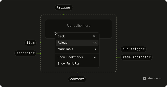
ContextMenuArrow
└── ContextMenuArrowTip
ContextMenuTrigger
ContextMenuIndicator
ContextMenuQuickItem
└── ContextMenuGroup
    ├── ContextMenuSubContent
    │   └── ContextMenuPositioner
    └── ContextMenuGroupLabel
ContextMenuItemIndicator
ContextMenuItemText
ContextMenuSeparator
ContextMenuTrigger
└── ContextMenuSubTrigger
Usage
import {
  ContextMenu, ContextMenuCheckboxItem, ContextMenuContent,
  ContextMenuGroup, ContextMenuGroupLabel, ContextMenuItem,
  ContextMenuRadioGroup, ContextMenuRadioItem, ContextMenuSeparator,
  ContextMenuShortcut, ContextMenuSub, ContextMenuSubContent,
  ContextMenuSubTrigger, ContextMenuTrigger,
} from "@/components/ui/context-menu";
<ContextMenu>
<ContextMenuTrigger class="flex aspect-video w-full max-w-xs items-center justify-center rounded-xl border border-dashed text-sm">
<span class="pointer-fine:inline-block hidden">Right click here</span>
<span class="pointer-coarse:inline-block hidden">
Long press here
</span>
</ContextMenuTrigger>
<ContextMenuContent class="w-48">
<ContextMenuGroup>
<ContextMenuItem value="back">
Back
<ContextMenuShortcut>⌘[</ContextMenuShortcut>
</ContextMenuItem>
<ContextMenuItem disabled value="forward">
Forward
<ContextMenuShortcut>⌘]</ContextMenuShortcut>
</ContextMenuItem>
<ContextMenuItem value="reload">
Reload
<ContextMenuShortcut>⌘R</ContextMenuShortcut>
</ContextMenuItem>
<ContextMenuSub>
<ContextMenuSubTrigger>More Tools</ContextMenuSubTrigger>
<ContextMenuSubContent class="w-44">
<ContextMenuGroup>
<ContextMenuItem value="save-page">Save Page...</ContextMenuItem>
<ContextMenuItem value="create-shortcut">
Create Shortcut...
</ContextMenuItem>
<ContextMenuItem value="name-window">
Name Window...
</ContextMenuItem>
</ContextMenuGroup>
<ContextMenuSeparator />
<ContextMenuGroup>
<ContextMenuItem value="developer-tools">
Developer Tools
</ContextMenuItem>
</ContextMenuGroup>
<ContextMenuSeparator />
<ContextMenuGroup>
<ContextMenuItem value="delete" variant="destructive">
Delete
</ContextMenuItem>
</ContextMenuGroup>
</ContextMenuSubContent>
</ContextMenuSub>
</ContextMenuGroup>
<ContextMenuSeparator />
<ContextMenuGroup>
<ContextMenuCheckboxItem checked value="show-bookmarks">
Show Bookmarks
</ContextMenuCheckboxItem>
<ContextMenuCheckboxItem checked={false} value="show-full-urls">
Show Full URLs
</ContextMenuCheckboxItem>
</ContextMenuGroup>
<ContextMenuSeparator />
<ContextMenuGroup>
<ContextMenuRadioGroup value="pedro">
<ContextMenuGroupLabel>People</ContextMenuGroupLabel>
<ContextMenuRadioItem value="pedro">
Pedro Duarte
</ContextMenuRadioItem>
<ContextMenuRadioItem value="colm">Colm Tuite</ContextMenuRadioItem>
</ContextMenuRadioGroup>
</ContextMenuGroup>
</ContextMenuContent>
</ContextMenu>
Accessibility
- Space
- Activates/Selects the highlighted item.
- Enter
- Activates/Selects the highlighted item.
- Arrow Down
- Highlights the next item in the menu.
- Arrow Up
- Highlights the previous item in the menu.
- Arrow Right
- When focus is on trigger, opens or closes the submenu depending on reading direction.
- Arrow Left
- When focus is on trigger, opens or closes the submenu depending on reading direction.
- Escape
- Closes the context menu.
- Home
- Go to the start.
- End
- Go to the end.
Demos
Basic
Back, Forward, and Reload, with Forward disabled because it does not apply yet. This is the smallest menu worth shipping: a trigger area, a few items, and no icons or nested lists. Start here, then add structure once the actions are settled. A disabled item stays visible so people can see the command exists.
Submenu
More Tools opens a second menu: save the page, create a shortcut, name the window, plus developer tools and a delete action set apart at the bottom. Nest a group when the top menu would get long, and keep it to one level so the pointer has less path to lose. The trigger shows that more actions exist before anyone commits to them.
Shortcuts
Each item ends with a key hint, such as the chord for Back or Save. The hint is only a label. It does not listen for the keys, so the shortcut has to be wired up on the page or it will look like a promise you did not keep. Forward stays disabled, hint and all, when the action does not apply.
Groups
File and Edit are labeled sections, and a separator splits those from clipboard commands and from Delete at the end. Group a long menu so people scan chunks instead of one flat list. The label names the section. The line is enough between groups that do not need a heading, and the dangerous action stays last.
Icons
Copy, Cut, Paste, and Delete each lead with an icon, and the icon is hidden from assistive tech because the word is already there. Icons help when the labels are familiar and the menu is scanned more than read. They are a poor idea when the action is obscure, since a picture will not explain it. Delete stays in its own group.
Checkboxes
Show Bookmarks Bar, Show Full URLs, and Show Developer Tools are checkbox items, each with its own checked state. Several can be on at once, which is what you want for view settings that combine. A plain item is the better row when the action runs once, such as Reload, and should leave the menu. Store the checked values if they need to survive the menu closing.
Radio
People and Theme are separate radio groups, so picking a person does not clear the theme. Inside a group only one item stays selected, which is the right model for a mode rather than a command. The labels sit above each group so the two lists do not blur together. Keep unrelated actions as plain items outside the group.
Destructive
Edit and Share are ordinary items. Delete is separated and marked destructive, with a trash icon, so the dangerous action is not just another row. Use that variant for something hard to undo, keep it last, and remember the color is not a confirmation. If the delete is truly costly, follow it with a dialog rather than running it from the menu.
Sides
Four triggers pin the menu to a different side: top, right, bottom, and left. The usual placement sits near the pointer, which fails when the trigger is already against an edge and the menu would open off the screen. Pin a side in that case. The items themselves stay the same, so this is only about where the panel lands.
Rtl
The trigger and the menus are in Arabic, with dir set to rtl on the menu and on each panel. Submenus, shortcuts, and the check marks follow the reading direction instead of staying glued to the left. Use this when the page is right to left, and set the direction on the nested content too, or a submenu can open back toward the wrong side.
FAQ
Should I use a Context Menu or a Dropdown Menu?
Use a Context Menu for actions on the thing under the pointer, like a file, a table row or a canvas shape, opened with a right-click. Use a Dropdown Menu when the actions hang off a visible button. Many apps offer both for the same actions, since a right-click is easy to miss.
How do I handle a Context Menu item click in Ark UI?
Give each item a value and handle onSelect on ContextMenu, which receives { value }.
The menu closes after the action runs.
How do I keep the Context Menu open after toggling a checkbox item?
Set closeOnSelect to false on the ContextMenuCheckboxItem.
The Checkboxes demo shows the toggles.
Why doesn't the Context Menu shortcut do anything?
ContextMenuShortcut is only a label at the end of an item: it shows the keys but doesn't bind them. Listen for those keys yourself so the shortcut works without opening the menu.
Does the Context Menu work on phones and tablets?
Yes: a long press on the trigger opens it.
On touch screens a hidden menu is hard to discover, so also offer the same actions from a visible button, for example a Dropdown Menu or a Sheet.
API Reference
ContextMenu
data-slot="context-menu"
open?boolean
The controlled open state of the menu.
defaultOpen?boolean
The initial open state of the menu when rendered. Use when you don't need to control the open state of the menu.
onOpenChange?(details: OpenChangeDetails) → void
Function called when the menu opens or closes.
- Type
(details: OpenChangeDetails) → void- Parameters
details– { open: boolean }- Returns
void
triggerValue?string | null
The controlled trigger value.
- Type
string | null
defaultTriggerValue?string | null
The initial trigger value when rendered. Use when you don't need to control the trigger value.
- Type
string | null
onTriggerValueChange?(details: TriggerValueChangeDetails) → void
Function called when the trigger value changes.
- Type
(details: TriggerValueChangeDetails) → void- Parameters
details– { value: string | null; triggerElement: HTMLElement | null }- Returns
void
anchorPoint?Point | null
The positioning point for the menu. Can be set by the context menu trigger or the button trigger.
- Type
Point | null
closeOnSelect?boolean
Whether to close the menu when an option is selected.
- Default
true
composite?boolean
Whether the menu is a composed with other composite widgets like a combobox or tabs.
- Default
true
defaultHighlightedValue?string | null
The initial highlighted value of the menu item when rendered. Use when you don't need to control the highlighted value of the menu item.
- Type
string | null
dir?"ltr" | "rtl"
The reading direction. Inherits the nearest DirectionProvider when unset.
- Type
"ltr" | "rtl"
hideMode?"display-none" | "activity"
How to hide content when mounted but not present.
- display-none: HTML hidden attribute. Effects stay alive.
- activity: React 19 <Activity mode="hidden">. Effects pause. Requires React 19+.
- Type
"display-none" | "activity"- Default
"display-none"
highlightedValue?string | null
The controlled highlighted value of the menu item.
- Type
string | null
id?string
The unique identifier of the machine.
ids?object
The ids of the elements in the menu. Useful for composition.
- Type
{ trigger?: string | ((value?: string) → string); contextTrigger?: string | ((value?: string) → string); content?: string; groupLabel?: (id: string) → string; group?: (id: string) → string; positioner?: string; arrow?: string }
lazyMount?boolean
Whether to enable lazy mounting. Ark default: false.
- Default
true
loopFocus?boolean
Whether to loop the keyboard navigation.
- Default
false
navigate?((details: NavigateDetails) → void) | null
Function to navigate to the selected item if it's an anchor element.
- Type
((details: NavigateDetails) → void) | null- Parameters
(details– { value: string; node: HTMLAnchorElement; href: string }- Returns
void) | null
onEscapeKeyDown?(event: KeyboardEvent) → void
Function called when the escape key is pressed.
- Parameters
event– { altKey: boolean; charCode: number; ctrlKey: boolean; code: string; getModifierState: (key: string) → boolean; key: string; keyCode: number; locale: string; location: number; metaKey: boolean; repeat: boolean; shiftKey: boolean; which: number }- Returns
void
onFocusOutside?(event: FocusOutsideEvent) → void
Function called when the focus is moved outside the component.
- Type
(event: FocusOutsideEvent) → void- Parameters
event– FocusOutsideEvent- Returns
void
onHighlightChange?(details: HighlightChangeDetails) → void
Function called when the highlighted menu item changes.
- Type
(details: HighlightChangeDetails) → void- Parameters
details– { highlightedValue: string | null }- Returns
void
onInteractOutside?(event: InteractOutsideEvent) → void
Function called when an interaction happens outside the component.
- Type
(event: InteractOutsideEvent) → void- Parameters
event– InteractOutsideEvent- Returns
void
onPointerDownOutside?(event: PointerDownOutsideEvent) → void
Function called when the pointer is pressed down outside the component.
- Type
(event: PointerDownOutsideEvent) → void- Parameters
event– PointerDownOutsideEvent- Returns
void
onRequestDismiss?(event: LayerDismissEvent) → void
Function called when this layer is closed due to a parent layer being closed.
- Type
(event: LayerDismissEvent) → void- Parameters
event– LayerDismissEvent- Returns
void
onSelect?(details: SelectionDetails) → void
Function called when a menu item is selected.
- Type
(details: SelectionDetails) → void- Parameters
details– { value: string }- Returns
void
positioning?object
The options used to dynamically position the menu.
- Type
{ restoreStyles?: boolean; applyStyles?: boolean; hideWhenDetached?: boolean; strategy?: "absolute" | "fixed"; placement?: Placement; offset?: { mainAxis?: number; crossAxis?: number; }; gutter?: number; shift?: number; overflowPadding?: number; arrowPadding?: number; flip?: boolean | Placement[]; slide?: boolean; overlap?: boolean; sameWidth?: boolean; fitViewport?: boolean; sizeMiddleware?: boolean; boundary?: (() → Boundary) | Boundary | "clipping-ancestors"; listeners?: boolean | AutoUpdateOptions; onComplete?: (data: ComputePositionReturn) → void; onPositioned?: ((data: { placed: boolean; }) → void); getAnchorElement?: () → HTMLElement | VirtualElement | null; getAnchorRect?: (element: HTMLElement | VirtualElement | null) → AnchorRect | null; updatePosition?: ((data: { updatePosition: () → Promise<void>; floatingElement: HTMLElement | null; }) → void | Promise<void>) }
skipAnimationOnMount?boolean
Whether to allow the initial presence animation.
- Default
false
typeahead?boolean
Whether the pressing printable characters should trigger typeahead navigation.
- Default
true
unmountOnExit?boolean
Whether to unmount on exit. Ark default: false.
- Default
true
asChild?(props: ParentProps) => JSX.Element
Render your own element: a function that gets the part's props to spread on it.
- Type
(props: ParentProps) => JSX.Element
ContextMenuArrow
<div> data-slot="context-menu-arrow"
asChild?(props: ParentProps) => JSX.Element
Render your own element: a function that gets the part's props to spread on it.
- Type
(props: ParentProps) => JSX.Element
class?string
Merged with the part's classes.
--arrow-backgroundstring
Use this variable to style the arrow background.
--arrow-offsetstring
The offset position of the arrow.
--arrow-sizestring
The size of the arrow.
--arrow-size-halfstring
Half the size of the arrow.
ContextMenuArrowTip
<div>
asChild?(props: ParentProps) => JSX.Element
Render your own element: a function that gets the part's props to spread on it.
- Type
(props: ParentProps) => JSX.Element
ContextMenuSubContent
<div> data-slot="context-menu-sub-content"
asChild?(props: ParentProps) => JSX.Element
Render your own element: a function that gets the part's props to spread on it.
- Type
(props: ParentProps) => JSX.Element
class?string
Merged with the part's classes.
data-has-nested?string
Present when another menu is nested inside it.
data-instant?stringdata-nested?string
Present when it's nested inside another menu.
data-placementstring
The placement of the content.
data-side"top" | "right" | "bottom" | "left"
The side of the trigger that the content is positioned on.
- Type
"top" | "right" | "bottom" | "left"
data-state"open" | "closed"
"open" or "closed".
- Type
"open" | "closed"
--available-heightstring
The height left between the anchor and the viewport's edge.
--layer-indexstring
The index of the dismissable in the layer stack.
--nested-layer-countstring
The number of nested menus.
--transform-originstring
Where the content scales from, on its trigger's side.
ContextMenuTrigger
<button> data-slot="context-menu-trigger"
asChild?(props: ParentProps) => JSX.Element
Render your own element: a function that gets the part's props to spread on it.
- Type
(props: ParentProps) => JSX.Element
class?string
Merged with the part's classes.
data-current?string
Present when current.
data-state"open" | "closed"
"open" or "closed".
- Type
"open" | "closed"
data-value?string
The value of the item.
ContextMenuQuickItem
<div> data-slot="context-menu-quick-item"
valuestring
The unique value of the menu item option.
checked?boolean
Whether it's checked.
disabled?boolean
Whether the menu item is disabled.
valueText?string
The textual value of the option. Used in typeahead navigation of the menu. If not provided, the text content of the menu item will be used.
variant?"default" | "destructive"
The visual style.
- Type
"default" | "destructive"- Default
"default"
asChild?(props: ParentProps) => JSX.Element
Render your own element: a function that gets the part's props to spread on it.
- Type
(props: ParentProps) => JSX.Element
class?string
Merged with the part's classes.
data-disabled?string
Present when disabled.
data-highlighted?string
Present when highlighted.
data-ownedbystring
Id of the content part.
data-valuestring
The value of the item.
data-valuetextstring
The human-readable value.
data-variant?string
Mirrors variant.
ContextMenuGroup
<div> data-slot="context-menu-group"
heading?string
A label shown above the group's items.
asChild?(props: ParentProps) => JSX.Element
Render your own element: a function that gets the part's props to spread on it.
- Type
(props: ParentProps) => JSX.Element
ContextMenuGroupLabel
<div> data-slot="context-menu-group-label"
asChild?(props: ParentProps) => JSX.Element
Render your own element: a function that gets the part's props to spread on it.
- Type
(props: ParentProps) => JSX.Element
class?string
Merged with the part's classes.
ContextMenuItemIndicator
<div>
asChild?(props: ParentProps) => JSX.Element
Render your own element: a function that gets the part's props to spread on it.
- Type
(props: ParentProps) => JSX.Element
data-disabled?string
Present when disabled.
data-highlighted?string
Present when highlighted.
data-statestring
"checked"
ContextMenuItemText
<div>
asChild?(props: ParentProps) => JSX.Element
Render your own element: a function that gets the part's props to spread on it.
- Type
(props: ParentProps) => JSX.Element
data-disabled?string
Present when disabled.
data-highlighted?string
Present when highlighted.
data-statestring
"checked"
ContextMenuContent
<div> data-slot="context-menu-positioner"
asChild?(props: ParentProps) => JSX.Element
Render your own element: a function that gets the part's props to spread on it.
- Type
(props: ParentProps) => JSX.Element
class?string
Merged with the part's classes.
data-has-nested?string
Present when the positioner has nested menus.
data-instant?stringdata-nested?string
Present when the positioner is nested within another menu.
--available-heightstring
The available height in viewport.
--available-widthstring
The available width in viewport.
--reference-heightstring
The height of the root.
--reference-widthstring
The width of the reference element.
--transform-originstring
The transform origin for animations.
--xstring
The x position for transform.
--ystring
The y position for transform.
--z-indexstring
The z-index value.
ContextMenuSeparator
<hr> data-slot="context-menu-separator"
asChild?(props: ParentProps) => JSX.Element
Render your own element: a function that gets the part's props to spread on it.
- Type
(props: ParentProps) => JSX.Element
class?string
Merged with the part's classes.
ContextMenuSubTrigger
<div> data-slot="context-menu-sub-trigger"
asChild?(props: ParentProps) => JSX.Element
Render your own element: a function that gets the part's props to spread on it.
- Type
(props: ParentProps) => JSX.Element
class?string
Merged with the part's classes.
ContextMenuItem
<div> data-slot="context-menu-item"
valuestring
The unique value of the menu item option.
checked?boolean
Whether it's checked.
disabled?boolean
Whether the menu item is disabled.
valueText?string
The textual value of the option. Used in typeahead navigation of the menu. If not provided, the text content of the menu item will be used.
variant?"default" | "destructive"
The visual style.
- Type
"default" | "destructive"- Default
"default"
asChild?(props: ParentProps) => JSX.Element
Render your own element: a function that gets the part's props to spread on it.
- Type
(props: ParentProps) => JSX.Element
class?string
Merged with the part's classes.
data-disabled?string
Present when disabled.
data-highlighted?string
Present when highlighted.
data-ownedbystring
Id of the content part.
data-valuestring
The value of the item.
data-valuetextstring
The human-readable value.
data-variant?string
Mirrors variant.
ContextMenuCheckboxItem
<div> data-slot="context-menu-checkbox-item"
valuestring
The value of the option.
closeOnSelect?boolean
Whether the menu should be closed when the option is selected.
disabled?boolean
Whether the menu item is disabled.
valueText?string
The textual value of the option. Used in typeahead navigation of the menu. If not provided, the text content of the menu item will be used.
asChild?(props: ParentProps) => JSX.Element
Render your own element: a function that gets the part's props to spread on it.
- Type
(props: ParentProps) => JSX.Element
class?string
Merged with the part's classes.
ContextMenuRadioGroup
<div> data-slot="context-menu-radio-group"
heading?string
A label shown above the group's items.
asChild?(props: ParentProps) => JSX.Element
Render your own element: a function that gets the part's props to spread on it.
- Type
(props: ParentProps) => JSX.Element
ContextMenuRadioItem
<div> data-slot="context-menu-radio-item"
valuestring
The value of the option.
closeOnSelect?boolean
Whether the menu should be closed when the option is selected.
disabled?boolean
Whether the menu item is disabled.
valueText?string
The textual value of the option. Used in typeahead navigation of the menu. If not provided, the text content of the menu item will be used.
asChild?(props: ParentProps) => JSX.Element
Render your own element: a function that gets the part's props to spread on it.
- Type
(props: ParentProps) => JSX.Element
class?string
Merged with the part's classes.
ContextMenuSub
data-slot="context-menu-sub"
open?boolean
The controlled open state of the menu.
defaultOpen?boolean
The initial open state of the menu when rendered. Use when you don't need to control the open state of the menu.
onOpenChange?(details: OpenChangeDetails) → void
Function called when the menu opens or closes.
- Type
(details: OpenChangeDetails) → void- Parameters
details– { open: boolean }- Returns
void
triggerValue?string | null
The controlled trigger value.
- Type
string | null
defaultTriggerValue?string | null
The initial trigger value when rendered. Use when you don't need to control the trigger value.
- Type
string | null
onTriggerValueChange?(details: TriggerValueChangeDetails) → void
Function called when the trigger value changes.
- Type
(details: TriggerValueChangeDetails) → void- Parameters
details– { value: string | null; triggerElement: HTMLElement | null }- Returns
void
anchorPoint?Point | null
The positioning point for the menu. Can be set by the context menu trigger or the button trigger.
- Type
Point | null
closeOnSelect?boolean
Whether to close the menu when an option is selected.
- Default
true
composite?boolean
Whether the menu is a composed with other composite widgets like a combobox or tabs.
- Default
true
defaultHighlightedValue?string | null
The initial highlighted value of the menu item when rendered. Use when you don't need to control the highlighted value of the menu item.
- Type
string | null
dir?"ltr" | "rtl"
The reading direction. Inherits the nearest DirectionProvider when unset.
- Type
"ltr" | "rtl"
hideMode?"display-none" | "activity"
How to hide content when mounted but not present.
- display-none: HTML hidden attribute. Effects stay alive.
- activity: React 19 <Activity mode="hidden">. Effects pause. Requires React 19+.
- Type
"display-none" | "activity"- Default
"display-none"
highlightedValue?string | null
The controlled highlighted value of the menu item.
- Type
string | null
id?string
The unique identifier of the machine.
ids?object
The ids of the elements in the menu. Useful for composition.
- Type
{ trigger?: string | ((value?: string) → string); contextTrigger?: string | ((value?: string) → string); content?: string; groupLabel?: (id: string) → string; group?: (id: string) → string; positioner?: string; arrow?: string }
lazyMount?boolean
Whether to enable lazy mounting.
- Default
false
loopFocus?boolean
Whether to loop the keyboard navigation.
- Default
false
navigate?((details: NavigateDetails) → void) | null
Function to navigate to the selected item if it's an anchor element.
- Type
((details: NavigateDetails) → void) | null- Parameters
(details– { value: string; node: HTMLAnchorElement; href: string }- Returns
void) | null
onEscapeKeyDown?(event: KeyboardEvent) → void
Function called when the escape key is pressed.
- Parameters
event– { altKey: boolean; charCode: number; ctrlKey: boolean; code: string; getModifierState: (key: string) → boolean; key: string; keyCode: number; locale: string; location: number; metaKey: boolean; repeat: boolean; shiftKey: boolean; which: number }- Returns
void
onFocusOutside?(event: FocusOutsideEvent) → void
Function called when the focus is moved outside the component.
- Type
(event: FocusOutsideEvent) → void- Parameters
event– FocusOutsideEvent- Returns
void
onHighlightChange?(details: HighlightChangeDetails) → void
Function called when the highlighted menu item changes.
- Type
(details: HighlightChangeDetails) → void- Parameters
details– { highlightedValue: string | null }- Returns
void
onInteractOutside?(event: InteractOutsideEvent) → void
Function called when an interaction happens outside the component.
- Type
(event: InteractOutsideEvent) → void- Parameters
event– InteractOutsideEvent- Returns
void
onPointerDownOutside?(event: PointerDownOutsideEvent) → void
Function called when the pointer is pressed down outside the component.
- Type
(event: PointerDownOutsideEvent) → void- Parameters
event– PointerDownOutsideEvent- Returns
void
onRequestDismiss?(event: LayerDismissEvent) → void
Function called when this layer is closed due to a parent layer being closed.
- Type
(event: LayerDismissEvent) → void- Parameters
event– LayerDismissEvent- Returns
void
onSelect?(details: SelectionDetails) → void
Function called when a menu item is selected.
- Type
(details: SelectionDetails) → void- Parameters
details– { value: string }- Returns
void
positioning?object
The options used to dynamically position the menu.
- Type
{ restoreStyles?: boolean; applyStyles?: boolean; hideWhenDetached?: boolean; strategy?: "absolute" | "fixed"; placement?: Placement; offset?: { mainAxis?: number; crossAxis?: number; }; gutter?: number; shift?: number; overflowPadding?: number; arrowPadding?: number; flip?: boolean | Placement[]; slide?: boolean; overlap?: boolean; sameWidth?: boolean; fitViewport?: boolean; sizeMiddleware?: boolean; boundary?: (() → Boundary) | Boundary | "clipping-ancestors"; listeners?: boolean | AutoUpdateOptions; onComplete?: (data: ComputePositionReturn) → void; onPositioned?: ((data: { placed: boolean; }) → void); getAnchorElement?: () → HTMLElement | VirtualElement | null; getAnchorRect?: (element: HTMLElement | VirtualElement | null) → AnchorRect | null; updatePosition?: ((data: { updatePosition: () → Promise<void>; floatingElement: HTMLElement | null; }) → void | Promise<void>) }
skipAnimationOnMount?boolean
Whether to allow the initial presence animation.
- Default
false
typeahead?boolean
Whether the pressing printable characters should trigger typeahead navigation.
- Default
true
unmountOnExit?boolean
Whether to unmount on exit.
- Default
false
asChild?(props: ParentProps) => JSX.Element
Render your own element: a function that gets the part's props to spread on it.
- Type
(props: ParentProps) => JSX.Element
ContextMenuShortcut
<span> data-slot="context-menu-shortcut"
asChild?(props: ParentProps) => JSX.Element
Render your own element: a function that gets the part's props to spread on it.
- Type
(props: ParentProps) => JSX.Element
class?string
Merged with the part's classes.
ContextMenuRootProvider
data-slot="context-menu"
valueobject
What useContextMenu() returns: the state and API, made outside the component to control it.
- Type
{ api: menu.Api<PropTypes>; service: menu.Service }
hideMode?"display-none" | "activity"
How to hide content when mounted but not present.
- display-none: HTML hidden attribute. Effects stay alive.
- activity: React 19 <Activity mode="hidden">. Effects pause. Requires React 19+.
- Type
"display-none" | "activity"- Default
"display-none"
lazyMount?boolean
Whether to enable lazy mounting. Ark default: false.
- Default
true
skipAnimationOnMount?boolean
Whether to allow the initial presence animation.
- Default
false
unmountOnExit?boolean
Whether to unmount on exit. Ark default: false.
- Default
true
asChild?(props: ParentProps) => JSX.Element
Render your own element: a function that gets the part's props to spread on it.
- Type
(props: ParentProps) => JSX.Element
useContextMenu
ContextMenuContext
ContextMenuItemContext
With other components
Dropdown Menu
MenusClick, not right-click
Dialog
OverlaysRename from an item
Alert Dialog
OverlaysConfirm a delete
Kbd
TypographyPaint the shortcut
Table
DataRight-click a row
Separator
LayoutSplit file from edit