shadcn.io is not affiliated with official shadcn/ui
Rows and columns for data people compare, like invoices or payments. The header looks clickable, but sorting is not built in.
Use a table when people scan values down a column. A handful of labeled fields, not a grid, is a Data List. In Solid, Ark UI supplies the table styles, and you render the rows yourself.
Installation
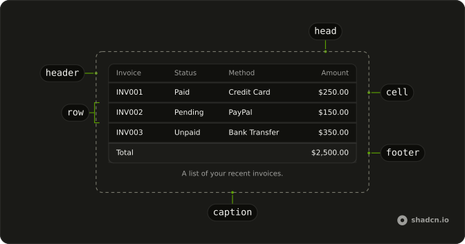
Anatomy
Usage
import {
  Table, TableBody, TableCaption, TableCell, TableFooter, TableHead,
  TableHeader, TableRow,
} from "@/components/ui/table";
const invoices = [
{
invoice: "INV001",
paymentMethod: "Credit Card",
paymentStatus: "Paid",
totalAmount: "$250.00",
},
{
invoice: "INV002",
paymentMethod: "PayPal",
paymentStatus: "Pending",
totalAmount: "$150.00",
},
{
invoice: "INV003",
paymentMethod: "Bank Transfer",
paymentStatus: "Unpaid",
totalAmount: "$350.00",
},
{
invoice: "INV004",
paymentMethod: "Credit Card",
paymentStatus: "Paid",
totalAmount: "$450.00",
},
{
invoice: "INV005",
paymentMethod: "PayPal",
paymentStatus: "Paid",
totalAmount: "$550.00",
},
{
invoice: "INV006",
paymentMethod: "Bank Transfer",
paymentStatus: "Pending",
totalAmount: "$200.00",
},
{
invoice: "INV007",
paymentMethod: "Credit Card",
paymentStatus: "Unpaid",
totalAmount: "$300.00",
},
];
const TableDemo = () => (
<Table>
<TableCaption>A list of your recent invoices.</TableCaption>
<TableHeader>
<TableRow>
<TableHead class="w-[100px]">Invoice</TableHead>
<TableHead>Status</TableHead>
<TableHead>Method</TableHead>
<TableHead class="text-right">Amount</TableHead>
</TableRow>
</TableHeader>
<TableBody>
{invoices.map((invoice) => (
<TableRow key={invoice.invoice}>
<TableCell class="font-medium">{invoice.invoice}</TableCell>
<TableCell>{invoice.paymentStatus}</TableCell>
<TableCell>{invoice.paymentMethod}</TableCell>
<TableCell class="text-right">{invoice.totalAmount}</TableCell>
</TableRow>
))}
</TableBody>
<TableFooter>
<TableRow>
<TableCell colSpan={3}>Total</TableCell>
<TableCell class="text-right">$2,500.00</TableCell>
</TableRow>
</TableFooter>
</Table>
);
Demos
Footer
TableFooter holds a summary row, a Total label spanning the first columns and the amount in the last cell. The body above it is a few invoices, so the total is not another record in disguise. Use a footer for a sum, a count, or a balance that should look different from the data, and keep real records in TableBody. A footer that repeats the column headers does not help.
Actions
Each product row ends in a menu: Edit, Duplicate, and a destructive Delete. The trigger is an icon button named Open menu, so it is not an unlabeled ellipsis. Use a per-row menu when the actions belong to that one record and would not fit as buttons in the cell. Actions on many selected rows belong in an Action Bar, and this column should stay narrow.
Rtl
dir is rtl on the table, with an Arabic caption, headers, and statuses, and the amount stays in the last column. Use it when the table's language is right-to-left. Setting dir here does not flip the rest of the page. Set direction on the document when every region should follow, and on the table when only this grid is right-to-left.
FAQ
How do I add sorting, filtering and pagination to the Table in Solid?
The Table only styles rows and cells, so sort, filter and page your data before you render it. Keep the rows in state, sort or slice them, and render the result; add a Pagination under the Table for pages.
How do I make the Table responsive on mobile?
The Table sits in a container that scrolls sideways when the columns do not fit, so wide tables stay readable on small screens. Keep the first column short, and hide less important columns with classes like hidden md:table-cell.
To let a keyboard scroll it, give the Table tabIndex={0} and a name (aria-label or aria-labelledby): the container takes the tab stop and becomes a region with the table's name.
How do I make a striped Table with Ark UI?
Set variant="striped" on the Table to shade every other row. Rows highlight on hover by default; set isHoverable to false to turn that off.
How do I add an actions menu to each Table row?
Put a button in the last TableCell of each row that opens a Dropdown Menu, as the Actions demo does. Give the button an aria-label that names the row, like "Actions for Ada".
Can I select rows in the Table?
Yes: keep the selected rows in state and add a Checkbox to a first column, bound to that state.
API Reference
Table
<table> data-slot="table-container"
isHoverable?boolean
Whether the table rows are hoverable.
- Default
true
variant?"plain" | "striped"
The variant of the table.
- Type
"plain" | "striped"- Default
"plain"
asChild?(props: ParentProps) => JSX.Element
Render your own element: a function that gets the part's props to spread on it.
- Type
(props: ParentProps) => JSX.Element
class?string
Merged with the part's classes.
data-hoverable?string
"true" when isHoverable is true, otherwise "false".
data-variant?string
Mirrors variant.
TableHeader
<thead> data-slot="table-header"
asChild?(props: ParentProps) => JSX.Element
Render your own element: a function that gets the part's props to spread on it.
- Type
(props: ParentProps) => JSX.Element
class?string
Merged with the part's classes.
TableBody
<tbody> data-slot="table-body"
asChild?(props: ParentProps) => JSX.Element
Render your own element: a function that gets the part's props to spread on it.
- Type
(props: ParentProps) => JSX.Element
class?string
Merged with the part's classes.
TableFooter
<tfoot> data-slot="table-footer"
asChild?(props: ParentProps) => JSX.Element
Render your own element: a function that gets the part's props to spread on it.
- Type
(props: ParentProps) => JSX.Element
class?string
Merged with the part's classes.
TableRow
<tr> data-slot="table-row"
asChild?(props: ParentProps) => JSX.Element
Render your own element: a function that gets the part's props to spread on it.
- Type
(props: ParentProps) => JSX.Element
class?string
Merged with the part's classes.
TableHead
<th> data-slot="table-head"
asChild?(props: ParentProps) => JSX.Element
Render your own element: a function that gets the part's props to spread on it.
- Type
(props: ParentProps) => JSX.Element
class?string
Merged with the part's classes.
TableCell
<td> data-slot="table-cell"
asChild?(props: ParentProps) => JSX.Element
Render your own element: a function that gets the part's props to spread on it.
- Type
(props: ParentProps) => JSX.Element
class?string
Merged with the part's classes.
TableCaption
<caption> data-slot="table-caption"
asChild?(props: ParentProps) => JSX.Element
Render your own element: a function that gets the part's props to spread on it.
- Type
(props: ParentProps) => JSX.Element
class?string
Merged with the part's classes.
With other components
Checkbox
SelectionSelect rows in bulk
Badge
FeedbackStatus in a cell
Dropdown Menu
MenusPer-row action menu
Button
ButtonsEdit or delete
Pagination
NavigationPages under the table
Skeleton
FeedbackRows while it loads
Related
Empty
FeedbackNo rows to show
Card
LayoutFrame around the table
Item
LayoutOne row, not columns
Data List
DataPairs, not a grid
Action Bar
OverlaysActions for the selection
Scroll Area
LayoutA wide table