shadcn.io is not affiliated with official shadcn/ui
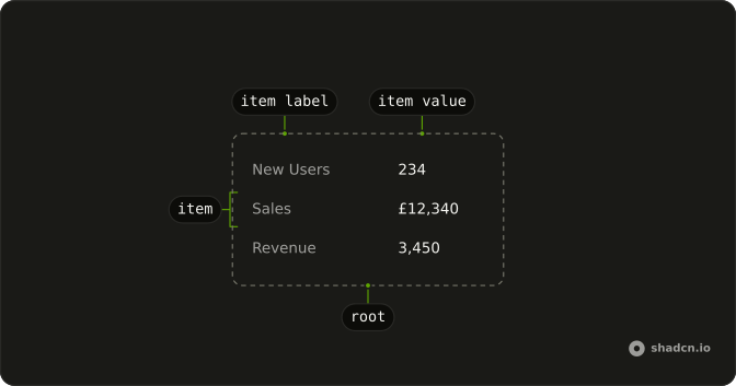
Each fact on a record gets its own caption, like the fields on an invoice.
Use it on a detail view with a handful of fields people read from top to bottom. Records you compare down a column belong in a Table. In Solid, Ark UI renders a description list, so each caption is announced with its fact.
Installation
Anatomy
Usage
import {
  DataList, DataListItem, DataListItemLabel, DataListItemValue,
} from "@/components/ui/data-list";
const data = [
{ label: "New Users", value: "234" },
{ label: "Sales", value: "£12,340" },
{ label: "Revenue", value: "3,450" },
];
const DataListDemo = () => (
<DataList>
{data.map((item) => (
<DataListItem key={item.label}>
<DataListItemLabel>{item.label}</DataListItemLabel>
<DataListItemValue>{item.value}</DataListItemValue>
</DataListItem>
))}
</DataList>
);Demos
Info Tip
A metric name is not always self-explanatory. The label keeps an info button, and a Toggle Tooltip holds the definition, such as what sales counts. It also opens on tap, which a hover-only hint misses on a phone, and the button needs its own aria-label. Use this when one sentence of help is enough and a paragraph under every row would bury the values.
Orientation Horizontal
Captions sit beside values. orientation horizontal is the default, and it suits a profile or a short invoice where each value is a word or two. The caption takes one side and the value takes the rest of the row. Switch to vertical when the value is a long email, or the card is too narrow for two columns.
Orientation Vertical
The caption stacks above the value. Set orientation to vertical for a narrow card, a phone detail view, or a value that wraps, such as an email address. Each pair is still one item, so the association does not change. Horizontal is the better read when you have the width and the values are short.
Separator
A contact record with five rows, and divide-y on DataList so a line sits between pairs. Use that when the list is long enough to lose your place, an address under a name, and the default gap is not a clear boundary. It is a border on the list, not a separate separator component. Skip it for three short rows, where the lines become noise.
With Badge
A value does not have to be a string. Status and plan are a Badge, and region stays plain text, in the same list. Use a badge when people scan for a state and the color does some of the reading. Keep ordinary facts as text so the badges stay rare enough to mean something, and the same slot will take a link or a button.
FAQ
What is a Data List used for?
A Data List shows label and value pairs, like the details of an order, a profile or a server. It renders a description list (dl, dt and dd), so screen readers announce each label with its value.
How do I put Data List labels beside or above their values?
Set orientation on DataList: horizontal, the default, puts each label beside its value, and vertical stacks the label above the value, which suits narrow screens and long values. The Orientation Horizontal and Orientation Vertical demos compare them.
Should I use a Data List or a Table?
Use a Data List to describe one thing with a handful of fields. When you show many records that share the same columns, and people compare or sort them, use a Table.
Can a Data List value contain a badge, a link or a button?
Yes. DataListItemValue takes any content, so you can put a Badge for a status, a link, or a copy button next to the text, as in the With Badge demo.
How do I add dividers between Data List items?
Add divide-y to the DataList class: Tailwind draws a line between each pair of items, as in the Separator demo. Adjust the spacing on the items in the data list file in your components/ui folder.
How do I add an info tooltip to a Data List label?
Put a small icon button in DataListItemLabel and wrap it in a Toggle Tooltip, so the hint also opens with a tap on touch screens. Give the button an aria-label, as the Info Tip demo does.
API Reference
DataList
<dl> data-slot="data-list"
orientation?"horizontal" | "vertical"
Layout of each item. The list itself is always stacked.
horizontal places label and value in a row.
vertical stacks label above value.
- Type
"horizontal" | "vertical"- Default
"horizontal"
asChild?(props: ParentProps) => JSX.Element
Render your own element: a function that gets the part's props to spread on it.
- Type
(props: ParentProps) => JSX.Element
class?string
Merged with the part's classes.
data-orientation?string
Mirrors orientation.
DataListItem
<div> data-slot="data-list-item"
asChild?(props: ParentProps) => JSX.Element
Render your own element: a function that gets the part's props to spread on it.
- Type
(props: ParentProps) => JSX.Element
class?string
Merged with the part's classes.
DataListItemLabel
<dt> data-slot="data-list-item-label"
asChild?(props: ParentProps) => JSX.Element
Render your own element: a function that gets the part's props to spread on it.
- Type
(props: ParentProps) => JSX.Element
class?string
Merged with the part's classes.
DataListItemValue
<dd> data-slot="data-list-item-value"
asChild?(props: ParentProps) => JSX.Element
Render your own element: a function that gets the part's props to spread on it.
- Type
(props: ParentProps) => JSX.Element
class?string
Merged with the part's classes.