shadcn.io is not affiliated with official shadcn/ui
Muted blocks stand in for an avatar, text, or rows while that content is still loading. The layout stays put when the real content shows up.
Use them on a list, a card, or a profile whose shape you already know. A Spinner fits a button, or anywhere the finished size is still a guess. In Solid, Ark UI marks the known shape, not how long is left.
Installation
Anatomy
Usage
import { Skeleton } from "@/components/ui/skeleton";<div class="flex items-center gap-4">
<Skeleton class="h-12 w-12 rounded-full" />
<div class="space-y-2">
<Skeleton class="h-4 w-[250px]" />
<Skeleton class="h-4 w-[200px]" />
</div>
</div>Demos
Avatar
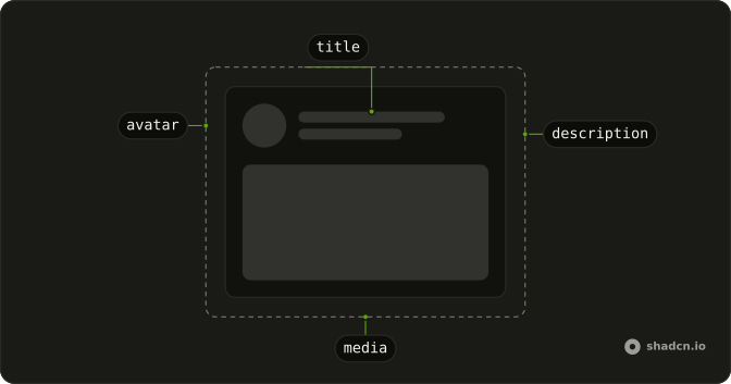
A circle at the avatar size, then a longer line for the name and a shorter one for the subtitle. That is a person row or a comment while the profile loads. Match the circle to the real avatar, and the widths to a typical name, so the swap does not shove the layout. Stop at two lines, since a third starts to look like a paragraph.
Card
The placeholders sit inside a card: two header lines for a title and a description, then a wide media block at video ratio. Use this while a post, a product, or an article preview is fetching, when you know there will be a picture and a couple of lines. The card frame stays, so the page does not collapse to empty space and then pop open.
Text
Three bars stand in for a paragraph, and the last one stops early so it reads as a ragged line rather than another full row. Stack them with a small gap, and match the height to the real text line. Use this for a bio, a comment, or any block whose words are not here yet. A single bar looks like a title, not body copy.
Form
Two fields are sketched as a short label over a full-width input, and a small bar at the bottom stands in for the submit button. Use it while a settings form or a checkout step is waiting on data that will fill those inputs. Keep the gaps close to the finished form. A skeleton is not a status message, so the page should still say that something is loading.
Table
Five rows, three cells each: a flexible first column and two short ones. It stands in for a table while the rows are fetched, and the widths should match the real columns so a header you already rendered does not jump. Use a row of bars per record rather than one big rectangle, so people can tell a table is coming.
Rtl
The same circle and two lines, with dir set to rtl on the row. The avatar leads from the right and the text bars follow, which is what you want to check on a right-to-left page. The pulse itself has no direction. Lay the row out with logical spacing so the blocks follow the document, and do not mirror the animation.
FAQ
How do I build a text Skeleton in Solid?
Stack several Skeleton elements with a small gap, as the Text demo does. Give each line a height and a width, and make the last line shorter so it reads as a paragraph. Match those sizes to the real text so the layout does not jump when the content arrives.
How do I show an avatar Skeleton?
Make one Skeleton a circle and put two short lines beside it, as the Avatar demo does. Match the circle to the real avatar size. The Card, Form, and Table demos use the same idea: bars where the title, fields, or rows will be.
When should I use a Skeleton instead of a Spinner in Ark UI?
Use a Skeleton while the layout is loading and you already know the shape of the content. Use a Spinner for a compact busy state on a button, or on a region that has no stable shape. A skeleton is a placeholder, not a progress value.
Should a Skeleton be hidden from assistive tech?
Yes, when nearby text already says that content is loading, because Skeleton is decorative. Set aria-hidden on it so the pulse is not announced as an empty image. Do not use a skeleton as the only loading message. A text status, or a spinner with a name, should carry that.
How do I change the Skeleton animation or color?
The pulse comes from the classes on Skeleton. Edit the skeleton file under components/ui to change the color or the animation. The root is data-slot skeleton. Size and radius belong on each placeholder, so a circle and a text line can differ.
Does a Skeleton follow right-to-left text?
The blocks themselves are not directional. The Rtl demo places them in a right-to-left page, and the row of avatar plus lines follows the document direction if you lay it out with logical utilities. You do not mirror the pulse.
How do I install Skeleton in Solid?
Run the command in the Installation section above. It adds Skeleton to your ui folder. Import from that folder when the command finishes, instead of copying the source by hand, and rerun the command later if you want the latest files. The command uses the shadcn CLI.
API Reference
Skeleton
<div> data-slot="skeleton"
asChild?(props: ParentProps) => JSX.Element
Render your own element: a function that gets the part's props to spread on it.
- Type
(props: ParentProps) => JSX.Element
class?string
Merged with the part's classes.
SkeletonCircle
<div> data-slot="skeleton-circle"
asChild?(props: ParentProps) => JSX.Element
Render your own element: a function that gets the part's props to spread on it.
- Type
(props: ParentProps) => JSX.Element
class?string
Merged with the part's classes.
SkeletonText
<div> data-slot="skeleton-text"
lines?number
The number of lines of the skeleton text. Ark default: 1.
- Default
2
asChild?(props: ParentProps) => JSX.Element
Render your own element: a function that gets the part's props to spread on it.
- Type
(props: ParentProps) => JSX.Element
class?string
Merged with the part's classes.