shadcn.io is not affiliated with official shadcn/ui
A toast for a result, such as a saved change or an error. Mount the toaster once, then call toast from the handler.
Use it when the reader only needs to see that the work finished, not make a choice. If you would rather build the notice from the same parts as the rest of the kit, use Toast. In React, Ark UI themes the toaster, including light and dark.
Installation
Anatomy
Usage
Add Toaster once, then call toast.
import { toast } from "sonner";
import { Button } from "@/components/ui/button";
import { Toaster } from "@/components/ui/sonner";
<>
<Toaster />
<Button
variant="outline"
onClick={() => toast("Event has been created")}
>
Show Toast
</Button>
</>Demos
Types
Plain toast is a neutral line, and the success, info, warning, and error helpers add the icon that matches the outcome. toast.promise keeps a single notice up, loading first, then the success or error text once the request settles. Use the helpers when the icon matters, and the promise when you would otherwise dismiss one toast just to fire the next.
Description
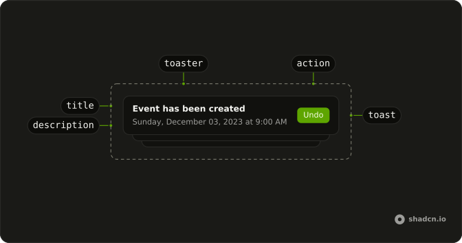
The title is the outcome, and description is the detail under it, here the day and the time of the event. Keep the title short enough to scan, and put anything someone might need on a second look into that option. Two sentences crammed into the title wrap badly, while the description already has a style meant for supporting text.
Position
Pass position on a single toast when that notice should land in a corner, or at the top or bottom center, somewhere the others do not. Set it on Toaster instead when every notice shares a spot. Corners stay out of the work more reliably than center on a wide page, so pick the shared one deliberately.
FAQ
How do I set up Sonner toasts in React?
Render Toaster once, near the root of your app, then call toast("Saved") from anywhere. The Toaster here wraps the sonner package with this theme's colors, and follows the system light or dark mode.
How do I show a success or error toast with Sonner?
Call toast.success, toast.error, toast.warning, toast.info or toast.loading with the message; each gets its own icon. Pass a second argument with description for a line of detail under the title.
How do I show a loading toast that updates when a request finishes?
Use toast.promise: pass the promise and the loading, success and error messages. Sonner shows the loading state, then swaps in the result when the promise settles, in the same toast.
How do I add an Undo button to a Sonner toast?
Pass an action with a label and an onClick in the toast's options: the button sits in the toast and closes it when clicked. For a second button, use cancel the same way.
How do I change where Sonner toasts appear?
Set position on Toaster, for example top-center or bottom-right. richColors, expand, closeButton and duration are also set there, once for every toast.
Should I use Sonner or the Toast component?
Use Sonner for the quickest setup, a single toast() call with no store of your own. Use Toast when you want the toasts built on your project's primitives and styled like the rest of the components. Sonner is React only; Vue, Svelte and Solid use Toast.
API Reference
Toaster
data-slot="toaster"
closeButton?boolean
Whether each toast shows a close button.
containerAriaLabel?string
The toasts region's label for screen readers, before its hotkey: Notifications when unset.
customAriaLabel?string
The toasts region's whole label for screen readers, in place of containerAriaLabel and the hotkey.
dir?"rtl" | "ltr" | "auto"
The reading direction. Inherits the nearest DirectionProvider when unset.
- Type
"rtl" | "ltr" | "auto"
duration?number
How long each toast stays, in milliseconds.
expand?boolean
Whether the toasts show expanded instead of stacked.
gap?number
The space between expanded toasts, in px.
hotkey?string[]
The keys that move focus to the toasts: altKey and KeyT when unset.
icons?object
The icon for each kind of toast: success, info, warning, error, loading and close.
- Type
{ success?: React.ReactNode; info?: React.ReactNode; warning?: React.ReactNode; error?: React.ReactNode; loading?: React.ReactNode; close?: React.ReactNode }
id?string
The element's id.
invert?boolean
Whether the toasts take the other theme's colors.
mobileOffset?{ top?: string | number
The distance from the screen's edges on small screens: px, or one per side.
- Type
{ top?: string | number
offset?{ top?: string | number
The distance from the screen's edges: px, or one per side.
- Type
{ top?: string | number
position?"top-left" | "top-right" | "bottom-left" | "bottom-right" | "top-center" | "bottom-center"
Where the toasts show: top-left, top-center, top-right, bottom-left, bottom-center or bottom-right.
- Type
"top-left" | "top-right" | "bottom-left" | "bottom-right" | "top-center" | "bottom-center"
richColors?boolean
Whether success, info, warning and error toasts get their own colors.
style?React.CSSProperties
Inline styles for the list that holds the toasts.
swipeDirections?SwipeDirection[]
The directions a toast can be swiped away in.
theme?"light" | "dark" | "system"
The color theme: light, dark or system.
- Type
"light" | "dark" | "system"
toastOptions?object
Defaults for every toast: its class names, styles, duration and more.
- Type
{ className?: string; closeButton?: boolean; descriptionClassName?: string; style?: React.CSSProperties; cancelButtonStyle?: React.CSSProperties; actionButtonStyle?: React.CSSProperties; duration?: number; unstyled?: boolean; classNames?: ToastClassnames; closeButtonAriaLabel?: string; toasterId?: string }
visibleToasts?number
How many toasts show at once.
className?string
Merged with the part's classes.
With other components
Button
ButtonsFire it from a click
Field
InputsSaved, or it failed
Progress
FeedbackUpload just finished
Attachment
MediaFile is done
Spinner
FeedbackPromise still loading
Table
DataBulk action result
Related
Alert
FeedbackStays on the page
Dialog
OverlaysThey have to answer
Alert Dialog
OverlaysDelete cannot undo
Tooltip
OverlaysHover hint only
Empty
FeedbackNothing happened
Announcement
FeedbackA notice that stays