shadcn.io is not affiliated with official shadcn/ui
A small notice with a title, a short detail, and an optional undo button. It leaves on its own.
Use a toast for the result of an action people just took. An Alert stays in the layout when they have to deal with the message before continuing. In React, Ark UI announces the notice in a live region and does not move focus.
Installation
Anatomy
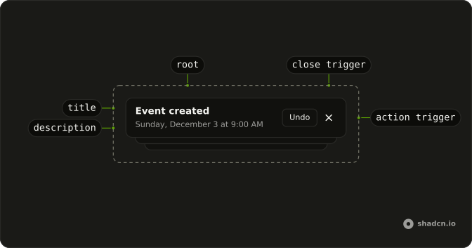
ToastItem
├── ToastGroup
├── ToastTitle
├── ToastDescription
├── ToastActionTrigger
└── ToastCloseTrigger
Usage
import { Button } from "@/components/ui/button";
import { createToaster, Toaster } from "@/components/ui/toast";
const toast = createToaster({
overlap: true,
placement: "bottom-end",
});
const ToastDemo = () => {
const handleShowToast = () => {
const id = toast.create({
action: {
label: "Undo",
onClick() {
toast.dismiss(id);
},
},
description: "Sunday, December 3 at 9:00 AM",
title: "Event created",
});
};
return (
<>
<Toaster toaster={toast} />
<Button onClick={handleShowToast} variant="outline">
Show Toast
</Button>
</>
);
};Accessibility
- Enter
- Activate the focused control.
- Space
- Activate the focused control.
Demos
Types
Five buttons fire five notices: a plain one, then success, info, warning, and error. The typed ones carry a status icon and a color, and the sentence is the whole message. Use a type when the outcome is not neutral, so a glance tells success from failure. Do not rely on the color alone, because the words still have to say what happened.
Promise
Create Event starts a notice that says it is creating the event, waits two seconds, then updates that same notice to say the event was created. The error copy is there for when the promise rejects, though this request always resolves. Use a promise toast for a request the person is waiting on. A static success toast is enough when you already know the result.
FAQ
How do I show a toast in React?
Render the Toaster once near the root of your app, then call the toaster from any event handler.
Create a toaster with createToaster, render Toaster with it as its toaster prop, and call toast.create with a title and a description, as the default demo does.
How do I show a success or error toast with Ark UI?
Each type gets its own icon and color; the Types demo shows them all.
Pass type to toast.create: success, error, warning, info or loading.
How do I show a loading toast that updates when a request finishes?
Use toast.promise with the promise and a loading, a success and an error message, as the Promise demo does. The same toast shows the loading state, then the result once the promise settles.
How do I close a toast from code?
Keep the id the call returns and close that toast with it, for example from an Undo button in its action.
Call toast.dismiss with the id; without an id it closes them all.
How do I change where toasts appear?
Set placement when you create the toaster, for example bottom-end or top; max caps how many show at once.
Are toasts accessible to screen readers?
Yes. Toasts are announced through a live region without taking focus, so the page keeps working. Keep the title short, and do not put the only way to do something in a toast that disappears on its own.
Should I use Toast or Sonner?
Use Toast for toasts built on your project's primitives, on every framework. Use Sonner on React for the quickest setup, a single toast() call with nothing to configure.
API Reference
ToastItem
<div> data-slot="toast"
parentService<ToastGroupSchema>
The parent toast group service. Required when using toast as a child of a group.
- Type
Service<ToastGroupSchema>
toastArkToast.Options
The toast item data.
action?object
The action of the toast.
- Type
{ label: string; onClick: VoidFunction }
closable?boolean
Whether the toast is closable.
description?T
The description of the toast.
dir?"ltr" | "rtl"
The direction of the toast.
- Type
"ltr" | "rtl"
duration?number
The duration the toast will be visible.
gap?number
The gap of the toast.
id?string
The unique id of the toast.
index?number
The index of the toast in the group.
meta?Record<string, any>
The metadata of the toast.
- Type
Record<string, any>
onStatusChange?(details: StatusChangeDetails) → void
Function called when the toast is visible.
- Type
(details: StatusChangeDetails) → void- Parameters
details– { status: Status; src?: string }- Returns
void
priority?1 | 2 | 3 | 4 | 5 | 6 | 7 | 8
The priority of the toast (1 = highest, 8 = lowest).
- Type
1 | 2 | 3 | 4 | 5 | 6 | 7 | 8
removeDelay?number
The duration for the toast to kept alive before it is removed. Useful for exit transitions.
title?T
The title of the toast.
translations?object
Specifies the localized strings that identifies the accessibility elements and their states.
- Type
{ closeTriggerLabel?: string }
type?"success" | "error" | "loading" | "info" | "warning" | (string & {})
The type of the toast.
- Type
"success" | "error" | "loading" | "info" | "warning" | (string & {})
asChild?boolean
Use the provided child element as the default rendered element, combining their props and behavior.
className?string
Merged with the part's classes.
data-align"start" | "center" | "end"
How the content aligns to its trigger.
- Type
"start" | "center" | "end"
data-first?string
Present when frontmost is true.
data-mounted?string
Present when mounted.
data-overlap?string
Present when overlapping.
data-paused?string
Present when paused.
data-placementstring
The placement of the toast.
data-sibling?string
Present when frontmost is false.
data-side"top" | "right" | "bottom" | "left"
The side of the trigger that the toast is positioned on.
- Type
"top" | "right" | "bottom" | "left"
data-stack?string
Present when stacked is true.
data-state"open" | "closed"
"open" or "closed".
- Type
"open" | "closed"
data-typestring
The type of the item.
--opacitystring--scalestring--viewport-offset-leftstring--widthstring
The measured width, for animating open and closed.
--xstring
The horizontal position.
--ystring
The vertical position.
--z-indexstring
The stacking order.
ToastTitle
<div> data-slot="toast-title"
asChild?boolean
Use the provided child element as the default rendered element, combining their props and behavior.
--opacitystring--scalestring--viewport-offset-leftstring--widthstring
The measured width, for animating open and closed.
--xstring
The horizontal position.
--ystring
The vertical position.
--z-indexstring
The stacking order.
ToastDescription
<div> data-slot="toast-description"
asChild?boolean
Use the provided child element as the default rendered element, combining their props and behavior.
--opacitystring--scalestring--viewport-offset-leftstring--widthstring
The measured width, for animating open and closed.
--xstring
The horizontal position.
--ystring
The vertical position.
--z-indexstring
The stacking order.
ToastActionTrigger
<button> data-slot="toast-action-trigger"
asChild?boolean
Use the provided child element as the default rendered element, combining their props and behavior.
--opacitystring--scalestring--viewport-offset-leftstring--widthstring
The measured width, for animating open and closed.
--xstring
The horizontal position.
--ystring
The vertical position.
--z-indexstring
The stacking order.
ToastCloseTrigger
<button> data-slot="toast-close-trigger"
asChild?boolean
Use the provided child element as the default rendered element, combining their props and behavior.
--opacitystring--scalestring--viewport-offset-leftstring--widthstring
The measured width, for animating open and closed.
--xstring
The horizontal position.
--ystring
The vertical position.
--z-indexstring
The stacking order.
Toaster
data-slot="toaster"
dir?"ltr" | "rtl"
The document's text/writing direction.
- Type
"ltr" | "rtl"- Default
"ltr"
label?string
The human-readable label for the toast region.
- Default
"Notifications"
toaster?CreateToasterReturn<any>
Toaster instance.
- Type
CreateToasterReturn<any>
asChild?boolean
Use the provided child element as the default rendered element, combining their props and behavior.
className?string
Merged with the part's classes.
data-align"start" | "center" | "end"
How the content aligns to its trigger.
- Type
"start" | "center" | "end"
data-first?string
Present when frontmost is true.
data-mounted?string
Present when mounted is true.
data-overlap?string
Present when stacked is false.
data-paused?string
Present when paused is true.
data-placementstring
The content's placement on its trigger, such as bottom-start.
data-sibling?string
Present when frontmost is false.
data-side"top" | "right" | "bottom" | "left"
The side of the trigger the content sits on.
- Type
"top" | "right" | "bottom" | "left"
data-stack?string
Present when stacked is true.
data-state"open" | "closed"
"open" or "closed".
- Type
"open" | "closed"
data-typestring
Mirrors type.
--viewport-offset-leftstring--viewport-offset-rightstring--widthstring
The measured width, for animating open and closed.