shadcn.io is not affiliated with official shadcn/ui
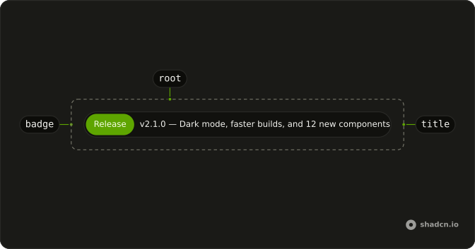
Put a badge beside the title. The title truncates, so write one sentence.
Use it on a landing page for a release, an outage, or a trial. A problem with the form in front of the reader belongs in an Alert. In React, Ark UI gives it a status role, so it doesn't interrupt like an alarm.
Installation
Anatomy
Usage
import { Badge } from "@/components/ui/badge";
import {
  Announcement, AnnouncementTitle,
} from "@/components/ui/announcement";<Announcement>
<Badge>Release</Badge>
<AnnouncementTitle>
v2.1.0 — Dark mode, faster builds, and 12 new components
</AnnouncementTitle>
</Announcement>Demos
Variant Default
The badge sets variant to default and says Release, beside a version line about dark mode and new components. That chip is the neutral one, the same weight as an ordinary badge elsewhere. Use it for changelog news that is not a failure and not a deadline. Whether the line is also a link is a separate decision from the color.
Variant Destructive
The badge is destructive, with a warning icon and the words Payment failed, and the title tells the reader to update billing. This color is for something already broken, not for a trial that is merely running out. Keep the remedy in the title, because the line truncates. If they can wait until tomorrow, it is not this variant.
Variant Info
info on the badge, the word Maintenance, and a downtime window that says no action is needed, with no icon. Use info when the fact deserves a glance and the reader should not feel scolded. A failed payment does not belong here, even if you phrase it softly. The neutral default is for ordinary product news.
Variant Success
success, a check icon, and the whole line is a link, with an arrow after the build time. The badge says the deploy finished, and the link is how someone opens the logs. Use that pairing when the good news has a place to go. The arrow is hidden from assistive tech, because the title already says what happened.
Variant Warning
warning, a triangle icon, and a trial that ends in three days. Nothing has failed yet, which is the difference from destructive. Use it for a deadline the reader can still meet, and once the date has passed, change the color and the verb. Do not spend warning on a generic tip that has no clock attached.
With Icon
An info badge carries a sparkles icon and the words New features, then the title names dark mode and the component set. The icon is aria-hidden, because the badge text already says what kind of news this is. Add an icon when the chip is scanned more often than it is read. Skip it when the label is already a single obvious word.
With Link
The announcement is the link: the badge says Latest update, the title says a feature was added, and an arrow follows the words. The arrow is decorative. Make the whole pill the link when the line is a teaser into a changelog or a post. If the news is complete where it stands, leave it as text so it does not look clickable.
Without Badge
No chip: the title is the whole line, with a decorative arrow, and this one is not a link. Drop the badge when a category would be fake, or when every line on the page would repeat the same word. Add the arrow only if the line actually goes somewhere. Otherwise it promises a click that is not there.
FAQ
How do I make the whole Announcement a link in React?
Pass asChild and put your link inside, such as a Next.js Link: the announcement's styles move onto it, as in the With Link demo.
How do I change the Announcement color?
Set the variant of its Badge: info, success, warning and destructive tint the badge, as the variant demos show. The announcement itself stays neutral, so the badge carries the meaning.
Can I use an Announcement without a badge or with an icon?
Yes. The Without Badge demo shows the title alone, and With Icon puts an icon in the badge. An arrow icon after the title, marked aria-hidden, tells readers the line is a link.
Does the Announcement read out to screen readers?
It renders with role="status", a polite live region: screen readers announce it when it appears without interrupting. Pass role="alert" only for something urgent, and for an announcement that is on the page from the start, the role can stay as it is.
How do I install the Announcement in React?
Run the command in the Installation section above: it adds announcement to your components/ui folder with the Badge it uses. React and Solid use the shadcn CLI, Vue uses shadcn-vue and Svelte uses shadcn-svelte, each after its one-time setup.
API Reference
Announcement
<div> data-slot="announcement"
role?"status" | "alert"
The ARIA role of the announcement. With asChild it has none: the
link or button it renders as keeps its own. Ark default: status.
- Type
"status" | "alert"- Default
(asChild ? undefined : "status")
asChild?boolean
Use the provided child element as the default rendered element, combining their props and behavior.
className?string
Merged with the part's classes.
AnnouncementTitle
<span> data-slot="announcement-title"
asChild?boolean
Use the provided child element as the default rendered element, combining their props and behavior.
className?string
Merged with the part's classes.