shadcn.io is not affiliated with official shadcn/ui
Profile photo in a circle, with initials when the image is missing.
Use it wherever a screen names a person. If the photo should open a profile, put it on a Hover Card trigger. In React, Ark UI swaps in those initials while the image loads or if it is missing.
Installation
Anatomy
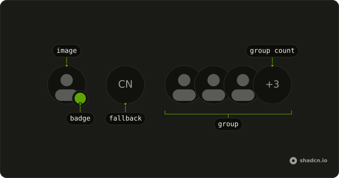
Avatar
├── AvatarImage
└── AvatarFallback
Usage
import {
  Avatar, AvatarBadge, AvatarFallback, AvatarGroup, AvatarGroupCount,
  AvatarImage,
} from "@/components/ui/avatar";
<div className="flex flex-row flex-wrap items-center gap-6 md:gap-12">
<Avatar>
<AvatarImage
alt="@shadcn"
className="grayscale"
height={32}
src="https://github.com/shadcn.png"
width={32}
/>
<AvatarFallback>CN</AvatarFallback>
</Avatar>
<Avatar>
<AvatarImage
alt="@evilrabbit"
height={32}
src="https://github.com/evilrabbit.png"
width={32}
/>
<AvatarFallback>ER</AvatarFallback>
<AvatarBadge className="bg-green-600 dark:bg-green-800" />
</Avatar>
<AvatarGroup className="grayscale">
<Avatar>
<AvatarImage
alt="@shadcn"
height={32}
src="https://github.com/shadcn.png"
width={32}
/>
<AvatarFallback>CN</AvatarFallback>
</Avatar>
<Avatar>
<AvatarImage
alt="@maxleiter"
height={32}
src="https://github.com/maxleiter.png"
width={32}
/>
<AvatarFallback>LR</AvatarFallback>
</Avatar>
<Avatar>
<AvatarImage
alt="@evilrabbit"
height={32}
src="https://github.com/evilrabbit.png"
width={32}
/>
<AvatarFallback>ER</AvatarFallback>
</Avatar>
<AvatarGroupCount>+3</AvatarGroupCount>
</AvatarGroup>
</div>
Demos
Basic
One photo and the initials behind it. AvatarFallback is what remains when src is missing or the request fails, so the circle is never an empty hole, and the grayscale here is only the picture treatment. Start with this pair. Every other avatar on the page is the same two parts with a badge, a group, or a menu added.
Badge
A green dot on the corner, from AvatarBadge with a background class and no icon, which reads as presence. The color is yours to pick, and on the small size the badge stays a plain dot. Use it for online, away, or busy. A count of people who did not fit belongs on the group, not in this corner.
Badge Icon
The same corner badge, with a plus icon inside instead of a bare dot. Use it when the mark means an action, such as adding a photo, rather than a status color. The icon is hidden from assistive tech, so a clickable plus needs a button and a name of its own. A green dot with no icon is the presence version.
Group
Three faces overlapped in AvatarGroup, and nobody is left out, so there is no count. Use it when the whole set fits, such as the people on a small pull request, and a row of full circles would waste the line. Add AvatarGroupCount once someone is hidden. The grayscale is optional, and the overlap is the point.
Group Count
The same pile, plus a +3 in AvatarGroupCount for the people who did not fit. You pass that text, and it is not counted from the children. Use it on a member list or a share row where showing every face would wrap. If the last slot should invite someone instead of reporting a number, put an icon there.
Group Count Icon
The last slot holds a plus icon rather than a number, at the end of the pile, which reads as invite or add rather than a hidden headcount. Use it when the trailing item is an action. The icon in this file is decorative, so wrap the slot in a button with a label before it actually invites anyone, or the plus is only a picture.
Size
sm, the default, and lg, with the bitmap matched to the circle: 24, 32, and 40 pixels here. Use small in a dense table, the default beside a comment, and large on a profile header. A mismatch between size and the image dimensions is how the photo goes soft. The fallback initials follow the same prop.
Dropdown
The avatar sits inside a round ghost button, and that button opens the menu: profile, billing, settings, and log out. Use this for the account control in a header. Keep the Dropdown Menu trigger on the button so the hit target and the accessible name stay on a real control. The avatar is the face inside it, not the trigger itself.
Rtl
dir is rtl on the row, so the status dot and the overlap move to the other side, and the overflow count uses an Arabic-Indic numeral. Use this when the surrounding page is right to left. The photos themselves are not mirrored. Only the pile, the badge corner, and the count follow the direction.
FAQ
How do I show initials when the Avatar image fails to load?
Add an AvatarFallback with initials or an icon next to AvatarImage. It shows whenever the image is missing or fails to load, so the reader never sees an empty circle. The Basic demo pairs a photo with its initials.
How do I stop the Avatar fallback from flashing before the image loads?
The fallback shows until the image has loaded, and this version has no delay option. Keep it quiet, such as initials on a muted background, so the swap to the photo isn't jarring.
How do I add an online status dot to an Avatar?
Put an AvatarBadge inside the Avatar and give it a color class, such as bg-green-500. It sits at the bottom corner with a ring, and on the sm size it shows as a plain dot, without its icon. The Badge and Badge Icon demos show both.
How do I show a group of Avatars with a +N count?
Wrap the avatars in AvatarGroup and end with AvatarGroupCount, such as +9, for the people you don't show. Three or four faces are usually enough; the Group Count demo shows the pattern.
What sizes does the Ark UI Avatar come in?
size takes sm, default or lg, and the badge and group count scale with it. Use sm in comments, the default in lists and lg in a profile header; the Size demo compares them.
API Reference
Avatar
<div> data-slot="avatar"
dir?"ltr" | "rtl"
The document's text/writing direction.
- Type
"ltr" | "rtl"- Default
"ltr"
id?string
The unique identifier of the machine.
ids?object
The ids of the elements in the avatar. Useful for composition.
- Type
{ root?: string; image?: string; fallback?: string }
onStatusChange?(details: StatusChangeDetails) → void
Functional called when the image loading status changes.
- Type
(details: StatusChangeDetails) → void- Parameters
details– { status: LoadStatus }- Returns
void
size?"default" | "sm" | "lg"
The size.
- Type
"default" | "sm" | "lg"- Default
"default"
asChild?boolean
Use the provided child element as the default rendered element, combining their props and behavior.
className?string
Merged with the part's classes.
data-size?string
Mirrors size.
AvatarImage
<img> data-slot="avatar-image"
asChild?boolean
Use the provided child element as the default rendered element, combining their props and behavior.
className?string
Merged with the part's classes.
data-state"visible" | "hidden"
"visible" or "hidden".
- Type
"visible" | "hidden"
AvatarFallback
<span> data-slot="avatar-fallback"
asChild?boolean
Use the provided child element as the default rendered element, combining their props and behavior.
className?string
Merged with the part's classes.
data-state"hidden" | "visible"
"hidden" or "visible".
- Type
"hidden" | "visible"
AvatarBadge
<span> data-slot="avatar-badge"
asChild?boolean
Use the provided child element as the default rendered element, combining their props and behavior.
className?string
Merged with the part's classes.
AvatarGroup
<div> data-slot="avatar-group"
asChild?boolean
Use the provided child element as the default rendered element, combining their props and behavior.
className?string
Merged with the part's classes.
AvatarGroupCount
<div> data-slot="avatar-group-count"
asChild?boolean
Use the provided child element as the default rendered element, combining their props and behavior.
className?string
Merged with the part's classes.
AvatarRootProvider
<div> data-slot="avatar"
valueUseAvatarReturn
What useAvatar() returns: the state and API, made outside the component to control it.
size?"default" | "sm" | "lg"
The size.
- Type
"default" | "sm" | "lg"- Default
"default"
asChild?boolean
Use the provided child element as the default rendered element, combining their props and behavior.
className?string
Merged with the part's classes.
data-size?string
Mirrors size.
useAvatar
id?string
The unique identifier of the machine.
ids?object
The ids of the elements in the avatar. Useful for composition.
- Type
{ root?: string; image?: string; fallback?: string }
onStatusChange?(details: StatusChangeDetails) → void
Functional called when the image loading status changes.
- Type
(details: StatusChangeDetails) → void- Parameters
details– { status: LoadStatus }- Returns
void
AvatarContext
loadedboolean
Whether the image is loaded.
setErrorVoidFunction
Function to set error state.
setLoadedVoidFunction
Function to set loaded state.
setSrc(src: string) → void
Function to set new src.
- Parameters
src– string- Returns
void
With other components
Dropdown Menu
MenusAccount menu trigger
Button
ButtonsGhost icon trigger
Tooltip
OverlaysName on hover
Hover Card
OverlaysProfile on hover
Item
LayoutFace in a list row
Message
MediaSender in a thread