shadcn.io is not affiliated with official shadcn/ui
The viewport can sit on a chosen turn and follow a reply while it streams. You can jump back to an earlier message without losing your place.
Use it for a chat or a streaming assistant. A Scroll Area is enough when people read a finished log from the top. In React, Ark UI lets the provider decide if new lines pull the scroll.
Installation
Anatomy
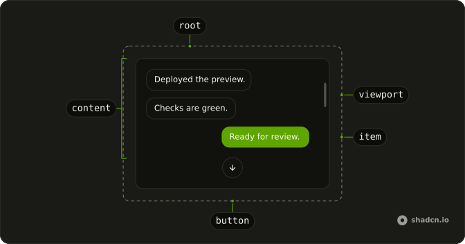
MessageScrollerProvider
└── MessageScroller
    ├── MessageScrollerViewport
    │   └── MessageScrollerContent
    │       └── MessageScrollerItem
    └── MessageScrollerButton
Usage
import {
  MessageScroller, MessageScrollerButton, MessageScrollerContent,
  MessageScrollerItem, MessageScrollerProvider, MessageScrollerViewport,
} from "@/components/ui/message-scroller";<MessageScrollerProvider>
<MessageScroller className="max-w-full min-w-0">
<MessageScrollerViewport>
<MessageScrollerContent>
<MessageScrollerItem messageId="1" scrollAnchor>
{/* message */}
</MessageScrollerItem>
</MessageScrollerContent>
</MessageScrollerViewport>
<MessageScrollerButton />
</MessageScroller>
</MessageScrollerProvider>Demos
Group Chat
Adding the next person is two steps. The first inserts a join marker with scrollAnchor, so that event is the turn to hold, and the second adds their message under the marker. An earlier ping is anchored too. Put scrollAnchor on the system row when the join should land on screen, not only on bubbles, and reset remounts the thread so you can watch it again.
Opening Position
Three landings for a saved transcript: the first message, the latest line, or the last user turn. Those user rows carry scrollAnchor and a messageId, and the last-anchor tab brings that id to the start of the viewport. Use defaultScrollPosition on the provider when the thread should open in one of those places with no tabs. The control here is only for comparing them.
Scrollable
The transcript opens at the top, and a line under it changes as you move: only down at the start, both ways in the middle, only up at the latest message, or a note that every row already fits. Use that when a hint is enough. The booleans are older content above and newer content below. The next preview draws them as chips when you build your own chrome.
State
Twelve messages open at the start, with four chips over the list: at the top, at the bottom, older above, and newer below. They read the same signals as the footer above, and they update without rerendering every row. Use the booleans for a jump button or your own status, not a sentence. scrollAnchor on a user row marks a turn, and it is not this flag.
FAQ
How do I anchor a turn in a Message Scroller?
Set scrollAnchor on the MessageScrollerItem that starts the turn, and give that item a messageId when you need to jump back to it. defaultScrollPosition on the provider is start, end, or last-anchor. end is the default and opens at the latest content. last-anchor opens at the latest anchored item.
How do I make a Message Scroller follow new messages in React?
Set autoScroll on MessageScrollerProvider. It is off by default, so the view stays put while content grows, and with it on the view keeps to the bottom as a reply streams until scrolling away stops the follow. The jump button shows when its direction still has somewhere to go. useMessageScroller returns scrollToMessage, scrollToStart, and scrollToEnd, and you call them under the provider.
How do I read whether a Message Scroller can scroll?
The provider tracks whether more content sits above or below the viewport, separate from the message rows, so a status line can update without rerendering every message in the transcript. The State demo reads that pair from a child of the provider. useMessageScrollerScrollable returns start and end: start means older content is above, and end means newer content is below.
Why does my Message Scroller never scroll?
The root fills its parent and will not scroll if that parent grows with the messages. Give an ancestor a fixed height, and let the scroller sit in a flex child whose minimum height is zero, as the demos do. The viewport is the element that overflows. The button is positioned inside the scroller, not in a portal.
How do I prepend older rows in a Message Scroller?
Leave preserveScrollOnPrepend on, which defaults to true on the viewport, so inserting rows above does not yank the reader to a different message. Turn it off only when a prepend should move the view. Rows added at the end are separate, and autoScroll is what follows those.
Is a Message Scroller keyboard accessible?
The viewport is a focusable region named Messages, so once it has focus, arrow keys, Home, End, Page Up, and Page Down scroll it. The jump button's text alternative is Scroll to end or Scroll to start, matching direction, which defaults to end and can be set to start for the other way.
How do I style a Message Scroller with Ark UI?
Edit the message scroller file under components/ui. The viewport sets data-autoscrolling during an automatic scroll, which fades the scrollbar thumb. The button sets data-direction and data-active, and it is hidden while data-active is false. Keep the button inside the scroller so it scrolls with the transcript's frame, not the page.
How do I install Message Scroller in React?
Run the command in the Installation section on this page. It adds the provider, the scroller, the viewport, the content, the item, and the jump button to your ui folder. Wrap the tree in MessageScrollerProvider or the scroll helpers have no shared state. The command uses the shadcn CLI.
API Reference
MessageScroller
data-slot="message-scroller"
asChild?boolean
Use the provided child element as the default rendered element, combining their props and behavior.
className?string
Merged with the part's classes.
MessageScrollerButton
data-slot="message-scroller-button"
size?"icon-lg" | "icon-md" | "icon-sm" | "icon-xl" | "icon-xs" | "lg" | "md" | "sm" | "xl" | "xs"
Ark default: md.
- Type
"icon-lg" | "icon-md" | "icon-sm" | "icon-xl" | "icon-xs" | "lg" | "md" | "sm" | "xl" | "xs"- Default
"icon-sm"
variant?"default" | "destructive" | "ghost" | "link" | "outline" | "secondary"
Ark default: default.
- Type
"default" | "destructive" | "ghost" | "link" | "outline" | "secondary"- Default
"secondary"
asChild?boolean
Use the provided child element as the default rendered element, combining their props and behavior.
className?string
Merged with the part's classes.
data-direction?string
Mirrors direction.
data-size?string
Mirrors size.
data-variant?string
Mirrors variant.
MessageScrollerContent
data-slot="message-scroller-content"
asChild?boolean
Use the provided child element as the default rendered element, combining their props and behavior.
className?string
Merged with the part's classes.
MessageScrollerItem
data-slot="message-scroller-item"
asChild?boolean
Use the provided child element as the default rendered element, combining their props and behavior.
className?string
Merged with the part's classes.
MessageScrollerViewport
data-slot="message-scroller-viewport"
asChild?boolean
Use the provided child element as the default rendered element, combining their props and behavior.
className?string
Merged with the part's classes.
MessageScrollerProvider
asChild?boolean
Use the provided child element as the default rendered element, combining their props and behavior.
With other components
Message
MediaRows in the transcript
Bubble
MediaSurfaces in each row
Marker
MediaJoin event as an anchor
Attachment
MediaFiles inside a turn
Button
ButtonsJump to latest
Command
OverlaysJump menu from visibility
Related
Scroll Area
LayoutGeneric overflow
Empty
FeedbackNo messages yet
Skeleton
FeedbackWhile history loads
Dropdown Menu
MenusJump to a turn
Input Group
InputsComposer under the thread
Card
LayoutFrame around the chat