shadcn.io is not affiliated with official shadcn/ui
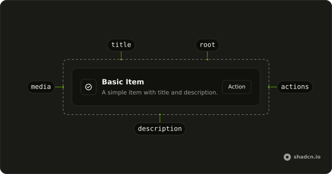
Media on one side, a title and a short line in the middle, and an action on the other.
Use it when each entry is one fact or one decision, like a person to invite. A block with its own header, body, and footer is a Card. In React, selection is not built in, so put the row in a menu that Ark UI already drives from the keyboard.
Installation
Anatomy
Usage
import { BadgeCheckIcon, ChevronRightIcon } from "lucide-react";
import { Button } from "@/components/ui/button";
import {
  Item, ItemActions, ItemContent, ItemDescription, ItemMedia, ItemTitle,
} from "@/components/ui/item";<div className="flex w-full max-w-md flex-col gap-6">
<Item variant="outline">
<ItemContent>
<ItemTitle>Basic Item</ItemTitle>
<ItemDescription>
A simple item with title and description.
</ItemDescription>
</ItemContent>
<ItemActions>
<Button size="sm" variant="outline">
Action
</Button>
</ItemActions>
</Item>
<Item asChild size="sm" variant="outline">
<a href="#">
<ItemMedia>
<BadgeCheckIcon aria-hidden="true" className="size-5" />
</ItemMedia>
<ItemContent>
<ItemTitle>Your profile has been verified.</ItemTitle>
</ItemContent>
<ItemActions>
<ChevronRightIcon aria-hidden="true" className="size-4" />
</ItemActions>
</a>
</Item>
</div>Accessibility
- Enter
- Activate the focused control.
- Space
- Activate the focused control.
Demos
Variant
variant only changes the chrome. default is transparent, for a row inside a list that already has a container. outline adds a border so the row reads as its own control, and muted fills the background for a quieter notice under something louder.
Size
size changes padding and type, not what the row is for. Use default for a settings line someone should read, sm when a panel is full of entries, and xs inside a menu where the default height blows the popup open. The inbox icon stays put so the height is the only difference.
Icon
A security alert does not need a photo. ItemMedia with variant set to icon puts a boxed glyph at the start, and Review sits in the actions. Keep the icon aria-hidden when the title already says what happened, and use this variant for status, not for a person or a picture.
Avatar
People need a face, not a boxed icon, so the avatar goes in ItemMedia on the default media variant. One row is a single person with an icon button to invite them, and that button needs an aria-label because it has no word. The other stacks several faces beside a text Invite, for the team that is not there yet.
Image
Album art uses the image variant of ItemMedia: a thumbnail, not a banner across the top. Each song is the whole link, with the title and album, the artist below, and the duration in a second content block at the end. A picture that should span the row belongs in ItemHeader, not this slot.
Group
ItemGroup stacks the rows at one width and exposes them as a list. These are people you might invite, each an outline row with an avatar, a name, an email, and a round icon button. The group does not track a selection, so it is the wrong wrapper if the point is choosing one person.
Header
The picture is the top of the block, not a thumbnail in the gutter. ItemHeader spans the row above the title, here a square cover for each model, with the name and a one-line description under it in a three-column grid. Use the header for a cover or a preview, and ItemMedia when the image should sit beside the text.
Link
If the title and the description go to one place, the whole row should be the link. One row stays on this site and shows a chevron, and the other sets target to _blank plus rel so it opens in a new tab with an external-link icon. Leave buttons out of that row, or you have a second hit target you did not mean to add.
Dropdown
The row does not move focus or remember a value, so a person picker belongs inside a menu item. Each option is an xs item, avatar plus name plus email, narrow so the popup stays tight, and the menu owns the keyboard. Use it when a single text label would drop the address line you still want on screen.
Rtl
The opening two rows again, in Arabic, with dir set to rtl, so the title, the action, and the icon sit on the reading side without you swapping markup. Set direction on a wrapper or on the document. Physical left and right margins fight that, which is why logical spacing is the one to reach for if the row needs tweaking.
FAQ
How do I change the look of an Item?
Set variant to default, muted, or outline, and size to default, sm, or xs, as the Variant and Size demos show. The root sets data-variant and data-size, which the styles use. ItemMedia has its own variant: default, icon, or image. A row is title plus description in ItemContent, with actions in ItemActions.
How do I make an Item a link in React?
Make the whole row the link when the title and description are one destination, and keep real buttons in ItemActions when they do something else. The Link demo shows an in-page anchor and a new-tab anchor. Item is a div until you turn it into a link.
Set asChild and pass a single anchor as the child.
How do I show an icon, avatar, or image on an Item?
Put the visual in ItemMedia, using variant icon for an icon, image for a picture, and the default for an avatar or other mark, as the Icon, Avatar, and Image demos show. Decorative icons should set aria-hidden. ItemMedia sets data-variant so the size of the slot follows the variant in the component file.
How do I group several Items?
Wrap them in ItemGroup, as the Group demo does, which stacks the rows, and use ItemSeparator for a horizontal rule between them. ItemHeader and ItemFooter span the full row, above or below ItemContent, which is what the Header demo uses. Item does not manage selection, so for a menu of choices compose it inside the menu, as the Dropdown demo does.
Should I use an Item or a Card?
Use an Item for a compact row: media, title, description, and actions. Use a Card when the region is a whole subject with its own header and body, and a Frame to group several panels in a muted shell. Item is not a listbox, and it does not handle arrow keys between rows unless you put it in a widget that does.
How do I restyle an Item?
Edit the Item file in your ui folder. The row uses data-slot item plus data-variant and data-size, and media, content, title, description, actions, header, and footer each have their own data-slot. Title clamps to one line and description to two. Change those rules in the file so every row matches, including rows rendered as links.
How do I install Item in React?
Run the command in the Installation section above. It adds Item and its media, content, title, description, actions, header, footer, group, and separator parts to your ui folder. Install from that section rather than pasting a partial tree, and pair it with Button when the row needs an action that is not the link itself. The command uses the shadcn CLI.
API Reference
Item
<div> data-slot="item"
size?"default" | "sm" | "xs"
The size.
- Type
"default" | "sm" | "xs"- Default
"default"
variant?"default" | "muted" | "outline"
The visual style.
- Type
"default" | "muted" | "outline"- Default
"default"
asChild?boolean
Use the provided child element as the default rendered element, combining their props and behavior.
className?string
Merged with the part's classes.
data-size?string
Mirrors size.
data-variant?string
Mirrors variant.
ItemGroup
<div> data-slot="item-group"
asChild?boolean
Use the provided child element as the default rendered element, combining their props and behavior.
className?string
Merged with the part's classes.
ItemSeparator
data-slot="item-separator"
orientation?"horizontal" | "vertical"
The orientation of the separator. Ark default: horizontal.
- Type
"horizontal" | "vertical"- Default
horizontal
asChild?boolean
Use the provided child element as the default rendered element, combining their props and behavior.
className?string
Merged with the part's classes.
ItemMedia
<div> data-slot="item-media"
variant?"default" | "icon" | "image"
The visual style.
- Type
"default" | "icon" | "image"- Default
"default"
asChild?boolean
Use the provided child element as the default rendered element, combining their props and behavior.
className?string
Merged with the part's classes.
data-variant?string
Mirrors variant.
ItemContent
<div> data-slot="item-content"
asChild?boolean
Use the provided child element as the default rendered element, combining their props and behavior.
className?string
Merged with the part's classes.
ItemTitle
<div> data-slot="item-title"
asChild?boolean
Use the provided child element as the default rendered element, combining their props and behavior.
className?string
Merged with the part's classes.
ItemDescription
<p> data-slot="item-description"
asChild?boolean
Use the provided child element as the default rendered element, combining their props and behavior.
className?string
Merged with the part's classes.
ItemActions
<div> data-slot="item-actions"
asChild?boolean
Use the provided child element as the default rendered element, combining their props and behavior.
className?string
Merged with the part's classes.
ItemHeader
<div> data-slot="item-header"
asChild?boolean
Use the provided child element as the default rendered element, combining their props and behavior.
className?string
Merged with the part's classes.
ItemFooter
<div> data-slot="item-footer"
asChild?boolean
Use the provided child element as the default rendered element, combining their props and behavior.
className?string
Merged with the part's classes.