shadcn.io is not affiliated with official shadcn/ui
Focus stays in a window over the page until the short task is done. Escape or Cancel puts it back on the button that opened the window.
Use it for a task with a start and a finish, like a profile edit or a share link. A destructive confirm that must not close on an outside click belongs in an Alert Dialog. In React, Ark UI traps focus and restores it when the window closes.
Installation
Anatomy
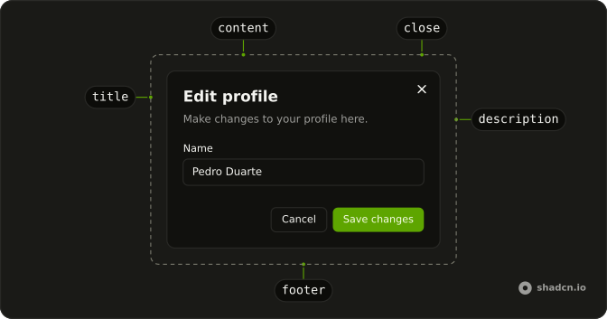
DialogTrigger
DialogOverlay
DialogPositioner
DialogContent
DialogTitle
DialogDescription
DialogClose
Usage
import { Button } from "@/components/ui/button";
import {
  Dialog, DialogClose, DialogContent, DialogDescription, DialogFooter,
  DialogHeader, DialogTitle, DialogTrigger,
} from "@/components/ui/dialog";
import { Field, FieldGroup, FieldLabel } from "@/components/ui/field";
import { Input } from "@/components/ui/input";<Dialog>
<form>
<DialogTrigger asChild>
<Button variant="outline">Open Dialog</Button>
</DialogTrigger>
<DialogContent className="sm:max-w-sm">
<DialogHeader>
<DialogTitle>Edit profile</DialogTitle>
<DialogDescription>
Make changes to your profile here. Click save when you're done.
</DialogDescription>
</DialogHeader>
<FieldGroup>
<Field>
<FieldLabel>Name</FieldLabel>
<Input defaultValue="Pedro Duarte" name="name" type="text" />
</Field>
<Field>
<FieldLabel>Username</FieldLabel>
<Input defaultValue="@peduarte" name="username" type="text" />
</Field>
</FieldGroup>
<DialogFooter>
<DialogClose asChild>
<Button variant="outline">Cancel</Button>
</DialogClose>
<Button type="submit">Save changes</Button>
</DialogFooter>
</DialogContent>
</form>
</Dialog>Accessibility
- Enter
- When focus is on the trigger, opens the dialog.
- Tab
- Moves focus to the next focusable element within the content. Focus is trapped within the dialog.
- Shift+Tab
- Moves focus to the previous focusable element. Focus is trapped within the dialog.
- Escape
- Closes the dialog and moves focus to trigger or the defined final focus element.
- Space
- Activate the focused control.
Demos
Close Button
A share dialog shows a read-only link and a Close button in the footer, wired with DialogClose. The corner icon is still there, and the labeled button is a second dismiss, aligned with the link. Use a labeled close when Close should read as an action, not only as an X. A plain footer button does not dismiss unless it is a DialogClose or you close the dialog yourself.
No Close Button
showCloseButton set to false removes the corner icon. This window has no other buttons, so Escape and an outside click are the way out. Hide the icon when it crowds a short title, not to force a choice. With Escape off too, a dialog that has no action is a trap, so a question people must answer belongs in an Alert Dialog with a real button.
Controlled
open lives in state. Save writes the name shown under the trigger, then closes, while Cancel still goes through DialogClose. Hold the open state when closing depends on a successful save, so a failed request can leave the window up with the error in it. Do not hang the save handler on DialogClose, because that dismisses before you know the request worked.
Sticky Footer
The paragraphs scroll inside a capped region, and the footer sits outside that scroller, so Close stays on screen. Use a sticky footer for terms, a long form, or any window where the action would otherwise scroll away. The header stays put for the same reason: it is not inside the scroller. Give that region a max height, or a dialog that grows with the page stops behaving like one.
Scrollable Content
The same scroll region, without a footer. The title and description stay visible while the paragraphs move. Use it for a note people read and then dismiss with the corner icon or Escape. If there is an action they must reach, pin it in a footer instead of leaving it under the prose, and keep a cap on the scroller so the window stays on screen.
Rtl
The content sets dir to rtl, and the copy is Arabic: title, fields, Cancel, and save. The close icon and the footer follow the inline end. Set dir on DialogContent when the window can be Arabic or Hebrew even if the trigger was drawn left to right. Do not shove the footer with a physical left margin, because logical alignment already moves the actions.
FAQ
Should I use a Dialog or an Alert Dialog?
Use a Dialog for a task: a form, a share link, a settings panel. When the only question is to confirm or cancel, like deleting a file, use an Alert Dialog, which doesn't close on an outside click. For content beside the page, a Sheet fits better.
How do I open and close a Dialog from code in React?
Hold the open state yourself, which also lets you close the dialog after an action, as in the Controlled demo.
Pass open and update it in onOpenChange, which receives { open }.
How do I close a Dialog after a form is saved?
Control the open state, disable the submit button while the request runs, and set the state to closed once it succeeds, so the dialog stays open if the save fails. Don't put the save on DialogClose, which closes before the request finishes.
How do I stop a Dialog from closing on an outside click or Escape?
Set closeOnInteractOutside and closeOnEscape to false on Dialog.
Keep a visible way out, like a Cancel button.
Does a Dialog need a title for accessibility?
Yes. Every dialog needs a DialogTitle, which screen readers announce when it opens. When the design has no visible title, keep it and add the sr-only class. Focus moves into the dialog on open, stays inside while it's open, and goes back to the trigger when it closes.
How do I make a long Dialog scroll with a sticky footer?
Keep the header and footer outside the scrolling part and let the content between them scroll, as in the Sticky Footer and Scrollable Content demos.
Put the scrolling content in a DialogBody, with scrollFade for a fade at its edges.
API Reference
Dialog
open?boolean
The controlled open state of the dialog.
defaultOpen?boolean
The initial open state of the dialog when rendered. Use when you don't need to control the open state of the dialog.
- Default
false
onOpenChange?(details: OpenChangeDetails) → void
Function to call when the dialog's open state changes.
- Type
(details: OpenChangeDetails) → void- Parameters
details– { open: boolean }- Returns
void
triggerValue?string | null
The controlled active trigger value.
- Type
string | null
defaultTriggerValue?string | null
The initial active trigger value when rendered. Use when you don't need to control the active trigger value.
- Type
string | null
onTriggerValueChange?(details: TriggerValueChangeDetails) → void
Function to call when the active trigger changes.
- Type
(details: TriggerValueChangeDetails) → void- Parameters
details– { value: string | null; triggerElement: HTMLElement | null }- Returns
void
closeOnEscape?boolean
Whether to close the dialog when the escape key is pressed.
- Default
true
closeOnInteractOutside?boolean
Whether to close the dialog when the outside is clicked.
- Default
true
dir?"ltr" | "rtl"
The document's text/writing direction.
- Type
"ltr" | "rtl"- Default
"ltr"
finalFocusEl?() → MaybeElement
Element to receive focus when the dialog is closed.
- Returns
MaybeElement
hideMode?"display-none" | "activity"
How to hide content when mounted but not present.
- display-none: HTML hidden attribute. Effects stay alive.
- activity: React 19 <Activity mode="hidden">. Effects pause. Requires React 19+.
- Type
"display-none" | "activity"- Default
"display-none"
id?string
The unique identifier of the machine.
ids?object
The ids of the elements in the dialog. Useful for composition.
- Type
{ trigger?: string | ((value?: string) → string); positioner?: string; backdrop?: string; content?: string; closeTrigger?: string; title?: string; description?: string }
initialFocusEl?() → MaybeElement | false
Element to receive focus when the dialog is opened.
Return false to skip moving focus, or null to use the default.
- Type
() → MaybeElement | false- Returns
MaybeElement | false
lazyMount?boolean
Whether to enable lazy mounting. Ark default: false.
- Default
true
modal?boolean
Whether to prevent pointer interaction outside the element and hide all content below it.
- Default
true
onEscapeKeyDown?(event: KeyboardEvent) → void
Function called when the escape key is pressed.
- Parameters
event– { altKey: boolean; charCode: number; ctrlKey: boolean; code: string; getModifierState: (key: string) → boolean; key: string; keyCode: number; locale: string; location: number; metaKey: boolean; repeat: boolean; shiftKey: boolean; which: number }- Returns
void
onFocusOutside?(event: FocusOutsideEvent) → void
Function called when the focus is moved outside the component.
- Type
(event: FocusOutsideEvent) → void- Parameters
event– FocusOutsideEvent- Returns
void
onInteractOutside?(event: InteractOutsideEvent) → void
Function called when an interaction happens outside the component.
- Type
(event: InteractOutsideEvent) → void- Parameters
event– InteractOutsideEvent- Returns
void
onPointerDownOutside?(event: PointerDownOutsideEvent) → void
Function called when the pointer is pressed down outside the component.
- Type
(event: PointerDownOutsideEvent) → void- Parameters
event– PointerDownOutsideEvent- Returns
void
onRequestDismiss?(event: LayerDismissEvent) → void
Function called when this layer is closed due to a parent layer being closed.
- Type
(event: LayerDismissEvent) → void- Parameters
event– LayerDismissEvent- Returns
void
persistentElements?Array<() → Element | null>
Returns the persistent elements that: - should not have pointer-events disabled - should not trigger the dismiss event
- Type
Array<() → Element | null>
preventScroll?boolean
Whether to prevent scrolling behind the dialog when it's opened. Ark default: true.
- Default
(inPreview ? false : modal)
restoreFocus?boolean
Whether to restore focus to the element that had focus before the dialog was opened.
role?"dialog" | "alertdialog"
The dialog's role.
- Type
"dialog" | "alertdialog"- Default
"dialog"
skipAnimationOnMount?boolean
Whether to allow the initial presence animation.
- Default
false
trapFocus?boolean
Whether to trap focus inside the dialog when it's opened.
- Default
true
unmountOnExit?boolean
Whether to unmount on exit. Ark default: false.
- Default
true
asChild?boolean
Use the provided child element as the default rendered element, combining their props and behavior.
DialogTrigger
<button> data-slot="dialog-trigger"
value?string
The value that identifies this specific trigger.
asChild?boolean
Use the provided child element as the default rendered element, combining their props and behavior.
data-current?string
Present when current.
data-state"open" | "closed"
"open" or "closed".
- Type
"open" | "closed"
data-value?string
The value of the item.
DialogOverlay
<div> data-slot="dialog-overlay"
asChild?boolean
Use the provided child element as the default rendered element, combining their props and behavior.
className?string
Merged with the part's classes.
data-has-nested?string
Present when the backdrop has nested dialogs.
data-nested?string
Present when the backdrop is nested within another dialog.
data-state"open" | "closed"
"open" or "closed".
- Type
"open" | "closed"
--layer-indexstring
The index of the dismissable in the layer stack.
DialogPositioner
<div> data-slot="dialog-positioner"
asChild?boolean
Use the provided child element as the default rendered element, combining their props and behavior.
className?string
Merged with the part's classes.
data-has-nested?string
Present when the positioner has nested dialogs.
data-nested?string
Present when the positioner is nested within another dialog.
DialogContent
<div> data-slot="dialog-content"
bottomStickOnMobile?boolean
Stick the dialog to the bottom of the screen on mobile.
- Default
true
positionerClassName?string
Class names on the positioner (the viewport-fixed wrapper).
showCloseButton?boolean
Show close button at the top right corner.
- Default
true
size?"2xl" | "3xl" | "4xl" | "5xl" | "6xl" | "fullscreen" | "lg" | "md" | "sm" | "xl"
The size.
- Type
"2xl" | "3xl" | "4xl" | "5xl" | "6xl" | "fullscreen" | "lg" | "md" | "sm" | "xl"- Default
"md"
asChild?boolean
Use the provided child element as the default rendered element, combining their props and behavior.
className?string
Merged with the part's classes.
data-has-nested?string
Present when another dialog is nested inside it.
data-nested?string
Present when it's nested inside another dialog.
data-state"open" | "closed"
"open" or "closed".
- Type
"open" | "closed"
--layer-indexstring
The index of the dismissable in the layer stack.
--nested-layer-countstring
The number of nested dialogs.
DialogTitle
<h2> data-slot="dialog-title"
asChild?boolean
Use the provided child element as the default rendered element, combining their props and behavior.
className?string
Merged with the part's classes.
DialogDescription
<div> data-slot="dialog-description"
asChild?boolean
Use the provided child element as the default rendered element, combining their props and behavior.
className?string
Merged with the part's classes.
DialogClose
<button> data-slot="dialog-close"
asChild?boolean
Use the provided child element as the default rendered element, combining their props and behavior.
DialogBody
<div> data-slot="dialog-body"
scrollFade?boolean
Add a fade effect to the scroll area.
- Default
false
asChild?boolean
Use the provided child element as the default rendered element, combining their props and behavior.
className?string
Merged with the part's classes.
--spacestringDialogHeader
<div> data-slot="dialog-header"
description?string
The description of the dialog.
title?string
The title of the dialog.
asChild?boolean
Use the provided child element as the default rendered element, combining their props and behavior.
className?string
Merged with the part's classes.
DialogFooter
<div> data-slot="dialog-footer"
showCloseButton?boolean
Show a close button in the footer.
- Default
false
asChild?boolean
Use the provided child element as the default rendered element, combining their props and behavior.
className?string
Merged with the part's classes.
DialogRootProvider
valueUseDialogReturn
What useDialog() returns: the state and API, made outside the component to control it.
hideMode?"display-none" | "activity"
How to hide content when mounted but not present.
- display-none: HTML hidden attribute. Effects stay alive.
- activity: React 19 <Activity mode="hidden">. Effects pause. Requires React 19+.
- Type
"display-none" | "activity"- Default
"display-none"
lazyMount?boolean
Whether to enable lazy mounting. Ark default: false.
- Default
true
skipAnimationOnMount?boolean
Whether to allow the initial presence animation.
- Default
false
unmountOnExit?boolean
Whether to unmount on exit. Ark default: false.
- Default
true
asChild?boolean
Use the provided child element as the default rendered element, combining their props and behavior.
useDialog
open?boolean
The controlled open state of the dialog.
defaultOpen?boolean
The initial open state of the dialog when rendered. Use when you don't need to control the open state of the dialog.
- Default
false
onOpenChange?(details: OpenChangeDetails) → void
Function to call when the dialog's open state changes.
- Type
(details: OpenChangeDetails) → void- Parameters
details– { open: boolean }- Returns
void
triggerValue?string | null
The controlled active trigger value.
- Type
string | null
defaultTriggerValue?string | null
The initial active trigger value when rendered. Use when you don't need to control the active trigger value.
- Type
string | null
onTriggerValueChange?(details: TriggerValueChangeDetails) → void
Function to call when the active trigger changes.
- Type
(details: TriggerValueChangeDetails) → void- Parameters
details– { value: string | null; triggerElement: HTMLElement | null }- Returns
void
closeOnEscape?boolean
Whether to close the dialog when the escape key is pressed.
- Default
true
closeOnInteractOutside?boolean
Whether to close the dialog when the outside is clicked.
- Default
true
finalFocusEl?() → MaybeElement
Element to receive focus when the dialog is closed.
- Returns
MaybeElement
id?string
The unique identifier of the machine.
ids?object
The ids of the elements in the dialog. Useful for composition.
- Type
{ trigger?: string | ((value?: string) → string); positioner?: string; backdrop?: string; content?: string; closeTrigger?: string; title?: string; description?: string }
initialFocusEl?() → MaybeElement | false
Element to receive focus when the dialog is opened.
Return false to skip moving focus, or null to use the default.
- Type
() → MaybeElement | false- Returns
MaybeElement | false
modal?boolean
Whether to prevent pointer interaction outside the element and hide all content below it.
- Default
true
onEscapeKeyDown?(event: KeyboardEvent) → void
Function called when the escape key is pressed.
- Parameters
event– { altKey: boolean; charCode: number; ctrlKey: boolean; code: string; getModifierState: (key: string) → boolean; key: string; keyCode: number; locale: string; location: number; metaKey: boolean; repeat: boolean; shiftKey: boolean; which: number }- Returns
void
onFocusOutside?(event: FocusOutsideEvent) → void
Function called when the focus is moved outside the component.
- Type
(event: FocusOutsideEvent) → void- Parameters
event– FocusOutsideEvent- Returns
void
onInteractOutside?(event: InteractOutsideEvent) → void
Function called when an interaction happens outside the component.
- Type
(event: InteractOutsideEvent) → void- Parameters
event– InteractOutsideEvent- Returns
void
onPointerDownOutside?(event: PointerDownOutsideEvent) → void
Function called when the pointer is pressed down outside the component.
- Type
(event: PointerDownOutsideEvent) → void- Parameters
event– PointerDownOutsideEvent- Returns
void
onRequestDismiss?(event: LayerDismissEvent) → void
Function called when this layer is closed due to a parent layer being closed.
- Type
(event: LayerDismissEvent) → void- Parameters
event– LayerDismissEvent- Returns
void
persistentElements?Array<() → Element | null>
Returns the persistent elements that: - should not have pointer-events disabled - should not trigger the dismiss event
- Type
Array<() → Element | null>
preventScroll?boolean
Whether to prevent scrolling behind the dialog when it's opened.
- Default
true
restoreFocus?boolean
Whether to restore focus to the element that had focus before the dialog was opened.
role?"dialog" | "alertdialog"
The dialog's role.
- Type
"dialog" | "alertdialog"- Default
"dialog"
trapFocus?boolean
Whether to trap focus inside the dialog when it's opened.
- Default
true
DialogContext
openboolean
Whether the dialog is open.
setOpen(open: boolean) → void
Function to open or close the dialog.
- Parameters
open– boolean- Returns
void
setTriggerValue(value: string | null) → void
Function to set the active trigger value.
- Type
(value: string | null) → void- Parameters
value– string | null- Returns
void
triggerValuestring | null
The active trigger value.
- Type
string | null