shadcn.io is not affiliated with official shadcn/ui
A modal that asks the reader to cancel or continue.
Use it to confirm a destructive step, like deleting an account. A form, or anything they have to fill in, belongs in a Dialog. In React, Ark UI doesn't close it on an outside click.
Installation
Anatomy
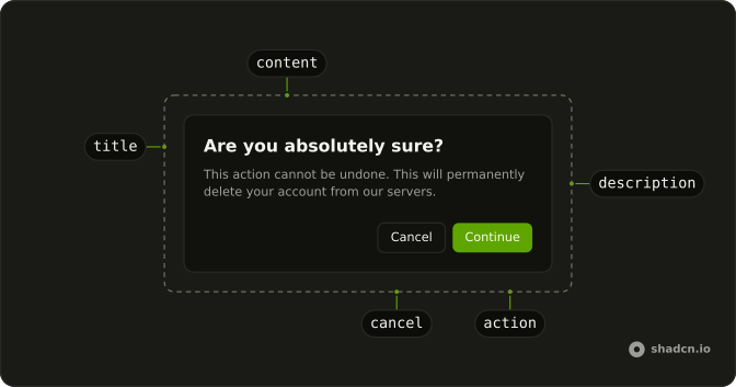
AlertDialogTrigger
AlertDialogOverlay
AlertDialogContent
└── AlertDialogPositioner
AlertDialogTitle
AlertDialogDescription
AlertDialogAction
Usage
import {
  AlertDialog, AlertDialogAction, AlertDialogCancel, AlertDialogContent,
  AlertDialogDescription, AlertDialogFooter, AlertDialogHeader,
  AlertDialogTitle, AlertDialogTrigger,
} from "@/components/ui/alert-dialog";
import { Button } from "@/components/ui/button";<AlertDialog>
<AlertDialogTrigger asChild>
<Button variant="outline">Show Dialog</Button>
</AlertDialogTrigger>
<AlertDialogContent>
<AlertDialogHeader>
<AlertDialogTitle>Are you absolutely sure?</AlertDialogTitle>
<AlertDialogDescription>
This action cannot be undone. This will permanently delete your
account from our servers.
</AlertDialogDescription>
</AlertDialogHeader>
<AlertDialogFooter>
<AlertDialogCancel>Cancel</AlertDialogCancel>
<AlertDialogAction>Continue</AlertDialogAction>
</AlertDialogFooter>
</AlertDialogContent>
</AlertDialog>Accessibility
- Enter
- When focus is on the trigger, opens the dialog.
- Tab
- Moves focus to the next focusable element within the content. Focus is trapped within the dialog.
- Shift+Tab
- Moves focus to the previous focusable element. Focus is trapped within the dialog.
- Escape
- Closes the dialog and moves focus to trigger or the defined final focus element.
- Space
- Activate the focused control.
Demos
Basic
The plain confirmation is a question, one sentence about what is lost, and Cancel then Continue. The title asks if they are sure, and the description names the account and the data, at the default width. Use this when you do not need an icon or a tighter panel, and keep the safer action first so it is the one they reach before the commit.
Small
A USB prompt does not need a wide panel. size set to sm tightens the content around one question, one sentence, and two short buttons, Don't allow and Allow. Use the small size for that kind of permission, and keep longer explanations on the default width so they are not scrolling inside a cramped box.
Media
Sharing a project is easy to mix up with other confirms, so an icon in AlertDialogMedia sits above the title, ahead of the sentence about who gets the link. Hide the icon when the title already names the action. Reach for media when several dialogs would otherwise look identical, not as a replacement for the description.
Small Media
Short copy and a thing people recognize from an icon can take both treatments. size is sm, a Bluetooth mark sits in AlertDialogMedia, and the buttons are Don't allow and Allow. Combine them for a device or a connection, and drop back to the default width, icon included, if the explanation grows into a paragraph.
Destructive
Delete is the verb on the trigger, in the title, and on the action, with variant set to destructive so the button does not look like a safe continue. The trash icon is tinted the same way, inside a small dialog, and the description says the chat is gone for good. Save this treatment for steps that cannot be undone, and repeat the verb so the confirm matches the question.
Rtl
Two confirms in Arabic, the wide account question and the small accessory question with a Bluetooth icon. dir is set to rtl on the wrapper and again on the content, because the panel does not inherit direction from the button that opened it. Title, description, and footer then follow the reading order, with cancel still the dismissal and the other button still the commit.
FAQ
When should I use an Alert Dialog instead of a Dialog?
Use an Alert Dialog when the reader only confirms or cancels, such as deleting a file. If they have to type, pick a date or fill in a form, use a Dialog instead: the Alert Dialog is a short interruption, the Dialog a small page.
How do I keep the Alert Dialog open until my request finishes in React?
Here AlertDialogAction is a plain button that doesn't close the dialog, so control open and set it to false once the request settles. Pass isLoading to the action meanwhile to show a spinner.
Does the Alert Dialog close on Escape or on a click outside?
Escape closes it, but a click outside doesn't, so the choice stays explicit: the reader picks an action or cancels.
Set closeOnInteractOutside to true if a click outside should close it too.
How do I style a delete confirmation in the Alert Dialog?
Pass variant="destructive" to AlertDialogAction and repeat the verb on it, such as Delete. Make the title the action and the object, and the description its consequence in one sentence. The Destructive demo shows the pattern.
Is the Ark UI Alert Dialog accessible?
Yes. It renders with role="alertdialog", traps focus while open and returns it to the trigger when it closes. Always include AlertDialogTitle so screen readers announce what is being confirmed, and add AlertDialogDescription for the consequence.
How do I make a smaller Alert Dialog or add an icon?
Pass size="sm" to AlertDialogContent for a compact dialog, and put an icon in AlertDialogMedia above the title. The Small, Media and Small Media demos show each one.
How do I open an Alert Dialog without a trigger button?
Leave out AlertDialogTrigger and control whether it's open from your own state, for example after a form fails validation or from a menu item.
Use open and onOpenChange.
How do I install the Alert Dialog in React?
Run the command in the Installation section above: it adds alert-dialog to your components/ui folder with the Button it uses. React and Solid use the shadcn CLI, Vue uses shadcn-vue and Svelte uses shadcn-svelte, each after its one-time setup.
API Reference
AlertDialog
data-slot="alert-dialog"
open?boolean
The controlled open state of the dialog.
defaultOpen?boolean
The initial open state of the dialog when rendered. Use when you don't need to control the open state of the dialog.
- Default
false
onOpenChange?(details: OpenChangeDetails) → void
Function to call when the dialog's open state changes.
- Type
(details: OpenChangeDetails) → void- Parameters
details– { open: boolean }- Returns
void
triggerValue?string | null
The controlled active trigger value.
- Type
string | null
defaultTriggerValue?string | null
The initial active trigger value when rendered. Use when you don't need to control the active trigger value.
- Type
string | null
onTriggerValueChange?(details: TriggerValueChangeDetails) → void
Function to call when the active trigger changes.
- Type
(details: TriggerValueChangeDetails) → void- Parameters
details– { value: string | null; triggerElement: HTMLElement | null }- Returns
void
closeOnEscape?boolean
Whether to close the dialog when the escape key is pressed.
- Default
true
closeOnInteractOutside?boolean
Whether to close the dialog when the outside is clicked. Ark default: true.
- Default
false
dir?"ltr" | "rtl"
The document's text/writing direction.
- Type
"ltr" | "rtl"- Default
"ltr"
finalFocusEl?() → MaybeElement
Element to receive focus when the dialog is closed.
- Returns
MaybeElement
hideMode?"display-none" | "activity"
How to hide content when mounted but not present.
- display-none: HTML hidden attribute. Effects stay alive.
- activity: React 19 <Activity mode="hidden">. Effects pause. Requires React 19+.
- Type
"display-none" | "activity"- Default
"display-none"
id?string
The unique identifier of the machine.
ids?object
The ids of the elements in the dialog. Useful for composition.
- Type
{ trigger?: string | ((value?: string) → string); positioner?: string; backdrop?: string; content?: string; closeTrigger?: string; title?: string; description?: string }
initialFocusEl?() → MaybeElement | false
Element to receive focus when the dialog is opened.
Return false to skip moving focus, or null to use the default.
- Type
() → MaybeElement | false- Returns
MaybeElement | false
lazyMount?boolean
Whether to enable lazy mounting. Ark default: false.
- Default
true
modal?boolean
Whether to prevent pointer interaction outside the element and hide all content below it.
- Default
true
onEscapeKeyDown?(event: KeyboardEvent) → void
Function called when the escape key is pressed.
- Parameters
event– { altKey: boolean; charCode: number; ctrlKey: boolean; code: string; getModifierState: (key: string) → boolean; key: string; keyCode: number; locale: string; location: number; metaKey: boolean; repeat: boolean; shiftKey: boolean; which: number }- Returns
void
onFocusOutside?(event: FocusOutsideEvent) → void
Function called when the focus is moved outside the component.
- Type
(event: FocusOutsideEvent) → void- Parameters
event– FocusOutsideEvent- Returns
void
onInteractOutside?(event: InteractOutsideEvent) → void
Function called when an interaction happens outside the component.
- Type
(event: InteractOutsideEvent) → void- Parameters
event– InteractOutsideEvent- Returns
void
onPointerDownOutside?(event: PointerDownOutsideEvent) → void
Function called when the pointer is pressed down outside the component.
- Type
(event: PointerDownOutsideEvent) → void- Parameters
event– PointerDownOutsideEvent- Returns
void
onRequestDismiss?(event: LayerDismissEvent) → void
Function called when this layer is closed due to a parent layer being closed.
- Type
(event: LayerDismissEvent) → void- Parameters
event– LayerDismissEvent- Returns
void
persistentElements?Array<() → Element | null>
Returns the persistent elements that: - should not have pointer-events disabled - should not trigger the dismiss event
- Type
Array<() → Element | null>
preventScroll?boolean
Whether to prevent scrolling behind the dialog when it's opened. Ark default: true.
- Default
!inPreview
restoreFocus?boolean
Whether to restore focus to the element that had focus before the dialog was opened.
role?"dialog" | "alertdialog"
The dialog's role. Ark default: dialog.
- Type
"dialog" | "alertdialog"- Default
alertdialog
skipAnimationOnMount?boolean
Whether to allow the initial presence animation.
- Default
false
trapFocus?boolean
Whether to trap focus inside the dialog when it's opened.
- Default
true
unmountOnExit?boolean
Whether to unmount on exit. Ark default: false.
- Default
true
asChild?boolean
Use the provided child element as the default rendered element, combining their props and behavior.
AlertDialogTrigger
<button> data-slot="alert-dialog-trigger"
value?string
The value that identifies this specific trigger.
asChild?boolean
Use the provided child element as the default rendered element, combining their props and behavior.
data-current?string
Present when current.
data-state"open" | "closed"
"open" or "closed".
- Type
"open" | "closed"
data-value?string
The value of the item.
AlertDialogOverlay
<div> data-slot="alert-dialog-overlay"
asChild?boolean
Use the provided child element as the default rendered element, combining their props and behavior.
className?string
Merged with the part's classes.
data-has-nested?string
Present when the backdrop has nested dialogs.
data-nested?string
Present when the backdrop is nested within another dialog.
data-state"open" | "closed"
"open" or "closed".
- Type
"open" | "closed"
--layer-indexstring
The index of the dismissable in the layer stack.
AlertDialogPositioner
<div>
asChild?boolean
Use the provided child element as the default rendered element, combining their props and behavior.
data-has-nested?string
Present when the positioner has nested dialogs.
data-nested?string
Present when the positioner is nested within another dialog.
AlertDialogContent
<div> data-slot="alert-dialog-content"
size?"default" | "sm"
The size.
- Type
"default" | "sm"- Default
"default"
asChild?boolean
Use the provided child element as the default rendered element, combining their props and behavior.
className?string
Merged with the part's classes.
data-has-nested?string
Present when another dialog is nested inside it.
data-nested?string
Present when it's nested inside another dialog.
data-size?string
Mirrors size.
data-state"open" | "closed"
"open" or "closed".
- Type
"open" | "closed"
--layer-indexstring
The index of the dismissable in the layer stack.
--nested-layer-countstring
The number of nested dialogs.
AlertDialogTitle
<h2> data-slot="alert-dialog-title"
asChild?boolean
Use the provided child element as the default rendered element, combining their props and behavior.
className?string
Merged with the part's classes.
AlertDialogDescription
<div> data-slot="alert-dialog-description"
asChild?boolean
Use the provided child element as the default rendered element, combining their props and behavior.
className?string
Merged with the part's classes.
AlertDialogCancel
<button> data-slot="alert-dialog-cancel"
asChild?boolean
Use the provided child element as the default rendered element, combining their props and behavior.
className?string
Merged with the part's classes.
AlertDialogPortal
data-slot="alert-dialog-portal"
container?RefObject<HTMLElement>
The element it renders into, as a ref. document.body when unset.
- Type
RefObject<HTMLElement>
disabled?boolean
Whether it renders in place instead of in a portal.
AlertDialogHeader
<div> data-slot="alert-dialog-header"
description?string
The description under the title, read out with it.
title?string
The dialog's title, its accessible name.
className?string
Merged with the part's classes.
AlertDialogFooter
<div> data-slot="alert-dialog-footer"
className?string
Merged with the part's classes.
AlertDialogMedia
<div> data-slot="alert-dialog-media"
className?string
Merged with the part's classes.
AlertDialogBody
<div> data-slot="alert-dialog-body"
asChild?boolean
Use the provided child element as the default rendered element, combining their props and behavior.
className?string
Forwarded to the part.
AlertDialogClose
<button> data-slot="alert-dialog-close"
asChild?boolean
Use the provided child element as the default rendered element, combining their props and behavior.
AlertDialogAction
data-slot="alert-dialog-action"
clickEffect?boolean
Apply a click effect to the button.
- Default
true
isLoading?boolean
Show a loading indicator.
- Default
false
pill?boolean
Fully rounded corners.
- Default
false
size?"icon-lg" | "icon-md" | "icon-sm" | "icon-xl" | "icon-xs" | "lg" | "md" | "sm" | "xl" | "xs"
The size.
- Type
"icon-lg" | "icon-md" | "icon-sm" | "icon-xl" | "icon-xs" | "lg" | "md" | "sm" | "xl" | "xs"- Default
"md"
variant?"default" | "destructive"
The variant of the action button.
- Type
"default" | "destructive"- Default
"default"
asChild?boolean
Use the provided child element as the default rendered element, combining their props and behavior.
className?string
Merged with the part's classes.