shadcn.io is not affiliated with official shadcn/ui
A ring shows how much of a known job is done.
Use it in a button, an avatar, or a table cell, when you already know the amount. A transfer that spans the page should be a Progress bar, where length is easier to compare. In React, Ark UI draws the ring from the number you pass.
Installation
Anatomy
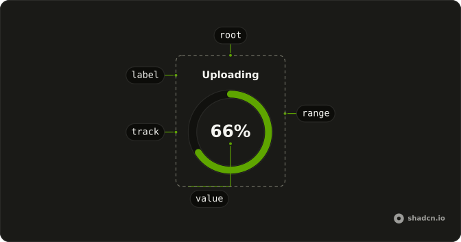
CircularProgress
├── CircularProgressLabel
├── CircularProgressTrack
├── CircularProgressRange
├── CircularProgressValue
├── CircularProgressView
└── CircularProgressTrack
    ├── CircularProgressCircleTrack
    └── CircularProgressCircleRange
Usage
import { useEffect, useState } from "react";
import { CircularProgress } from "@/components/ui/circular-progress";
const Example = () => {
const [progress, setProgress] = useState(24);
useEffect(() => {
const timer = setTimeout(() => {
setProgress(72);
}, 500);
return () => {
clearTimeout(timer);
};
}, []);
return <CircularProgress value={progress} />;
};Demos
Controlled
Plus and minus step the ring by 10, clamped from 0 to 100, starting at 55. Pass value once a button or a request can change the amount, which is almost every real use. The arc animates toward each new number. An uncontrolled ring is only for a figure that never moves.
Indeterminate
No fraction yet, so the ring spins and the label says a connection is being established. Set indeterminate, or pass null, while the duration is unknown, then switch to a number as soon as you have one. Otherwise the spinner never becomes a result. The label is what separates this wait from every other wait on the page.
Min Max
The scale runs from 10 to 30 and the value starts at 20, so the ring is halfway rather than 20 percent of a full scale. Set min and max when work is counted in steps, bytes, or pages. CircularProgressValue still prints a percent of that range, in a circle of size 66 so the digits fit. Leave the defaults when your number is already a percent.
Root Provider
State comes from useCircularProgress, starting at 50, and is passed to CircularProgressRootProvider. A button outside the ring calls setToMax, and the same state is printed above the circle. Use the provider when a sibling needs the value or those helpers. A value prop is enough when nothing outside the ring has to read or change it.
Size
Three diameters, 24, 32, and 40, each with a different value so the stroke is visible at that size. size is the diameter in pixels and the default is 32, about right beside a label. Go smaller only in a dense table, where a larger ring would collide with the next row. Go larger when a percent or a word will be drawn inside, or the text clips the arc.
Thickness
Stroke width is separate from diameter. A 24 pixel ring at thickness 2 stays a hairline, and a 100 pixel ring at thickness 8 reads as a heavy arc. thickness is pixels, default 4, and it should grow with size or a small ring looks like a donut. The pairs here are 24 with 2, 66 with 6, and 100 with 8.
View
Center text follows the state: at 40 it says Loading, at 100 it says Done, and a null value says Wait. Each CircularProgressView sets state to loading, complete, or indeterminate, and only the match is shown. Use that swap when finishing should change the message, not only the arc. If the status is already written beside the ring, skip the views.
With Label
Uploading, plus the percent for a value of 42, share one ring. CircularProgressLabel is the accessible name, which a lone percent does not provide. size 66 leaves room so the word and the number do not collide. Keep the label even when the value is visible, so several rings on one page can say which task moved.
With Value
Only the percentage, no caption. CircularProgressValue formats the number as a percent, which is right when a file name or a heading next to the ring already says what is moving. Pass formatOptions when you need a different number format than the percent. size is 66 and thickness is 5 so two digits sit inside the stroke instead of clipping it.
FAQ
How do I show the percentage inside a Circular Progress?
Put CircularProgressValue inside CircularProgress: it shows the value as a percentage by default. Pass formatOptions (the options of Intl.NumberFormat) to show it another way, and give the circle a size large enough for the text, as in the With Value demo.
How do I update the Circular Progress value in React?
Pass the current number as value and change it as the work moves on: the ring animates to each new value. It runs from min to max, 0 to 100 by default, so set those when your progress is counted in steps or bytes.
How do I make an indeterminate Circular Progress?
Set indeterminate, or set the value to null: the ring spins until you pass a number again, as in the Indeterminate demo. When there is never a measurable value, a Spinner is the lighter choice.
How do I change the size and thickness of a Circular Progress?
Set size for the diameter and thickness for the stroke width, both in pixels: the defaults are 32 and 4. Colors are classes on the track and range parts in the circular progress file in your components/ui folder.
Can a Circular Progress show different content when it completes?
Yes. Add a CircularProgressView for each state you care about, loading, complete or indeterminate, through its state prop: only the one matching the current progress shows. The View demo swaps "Loading" for "Done".
Is the Circular Progress accessible to screen readers?
Yes. The root has role="progressbar" with the current value, so assistive tech reads the progress as it changes. Add a CircularProgressLabel with a short name, like "Uploading", so people know what is loading.
Should I use a Circular Progress or a Progress bar?
Use a Circular Progress where space is tight, like a button, an avatar or a table cell. Use a Progress bar when there is room for a full-width track, like a file upload or a multi-step form, where the length reads more easily.
API Reference
CircularProgress
<div> data-slot="circular-progress"
value?number | null
The controlled value of the progress bar.
- Type
number | null
defaultValue?number | null
The initial value of the progress bar when rendered. Use when you don't need to control the value of the progress bar.
- Type
number | null- Default
50
onValueChange?(details: ValueChangeDetails) → void
Callback fired when the value changes.
- Type
(details: ValueChangeDetails) → void- Parameters
details– { value: number | null }- Returns
void
dir?"ltr" | "rtl"
The document's text/writing direction.
- Type
"ltr" | "rtl"- Default
"ltr"
formatOptions?Intl.NumberFormatOptions
The options to use for formatting the value.
- Default
{ style: "percent" }
id?string
The unique identifier of the machine.
ids?object
The ids of the elements in the progress bar. Useful for composition.
- Type
{ root?: string; track?: string; label?: string; circle?: string }
indeterminate?boolean
Shows indeterminate progress (value={null}). * * @default false.
- Default
false
locale?string
The locale to use for formatting the value.
- Default
"en-US"
max?number
The maximum allowed value of the progress bar.
- Default
100
min?number
The minimum allowed value of the progress bar.
- Default
0
orientation?"horizontal" | "vertical"
The orientation of the element.
- Type
"horizontal" | "vertical"- Default
"horizontal"
size?number
Width and height of the circle, in pixels. Ark default: 32.
- Default
DEFAULT_SIZE
thickness?number
Stroke width of the circle, in pixels. Ark default: 4.
- Default
DEFAULT_THICKNESS
translations?object
The localized messages to use.
- Type
{ value?: (details: ValueTranslationDetails) → string }
asChild?boolean
Use the provided child element as the default rendered element, combining their props and behavior.
className?string
Merged with the part's classes.
data-max?stringdata-orientation?string
The orientation of the progress.
data-state"indeterminate" | "loading" | "complete"
"indeterminate", "loading" or "complete".
- Type
"indeterminate" | "loading" | "complete"
data-value?string
The value of the item.
--circumferencestring
The circumference value for the root.
--offsetstring
The offset position of the element.
--percentstring
The percent value for the root.
--radiusstring
The border radius value.
CircularProgressLabel
<span> data-slot="circular-progress-label"
asChild?boolean
Use the provided child element as the default rendered element, combining their props and behavior.
className?string
Merged with the part's classes.
data-orientation?string
The orientation of the label.
CircularProgressValue
<span> data-slot="circular-progress-value"
asChild?boolean
Use the provided child element as the default rendered element, combining their props and behavior.
className?string
Merged with the part's classes.
--sizestringCircularProgressView
<span> data-slot="circular-progress-view"
state"indeterminate" | "loading" | "complete"
The state it shows in: loading, complete or indeterminate; it renders only then.
- Type
"indeterminate" | "loading" | "complete"
asChild?boolean
Use the provided child element as the default rendered element, combining their props and behavior.
className?string
Merged with the part's classes.
data-state"indeterminate" | "loading" | "complete"
"indeterminate", "loading" or "complete".
- Type
"indeterminate" | "loading" | "complete"
CircularProgressTrack
<svg> data-slot="circular-progress-circle"
size?number
Width and height of the circle, in pixels. Ark default: 32.
- Default
DEFAULT_SIZE
thickness?number
Stroke width of the circle, in pixels. Ark default: 4.
- Default
DEFAULT_THICKNESS
asChild?boolean
Use the provided child element as the default rendered element, combining their props and behavior.
className?string
Merged with the part's classes.
data-max?stringdata-orientation?string
The orientation of the circle.
data-state"indeterminate" | "loading" | "complete"
"indeterminate", "loading" or "complete".
- Type
"indeterminate" | "loading" | "complete"
--circumferencestring--percentstring
The value as a percentage of the range.
CircularProgressCircleTrack
<circle> data-slot="circular-progress-track"
asChild?boolean
Use the provided child element as the default rendered element, combining their props and behavior.
data-orientation?string
The orientation of the circletrack.
--circumferencestringCircularProgressCircleRange
<circle> data-slot="circular-progress-range"
asChild?boolean
Use the provided child element as the default rendered element, combining their props and behavior.
data-state"indeterminate" | "loading" | "complete"
"indeterminate", "loading" or "complete".
- Type
"indeterminate" | "loading" | "complete"
--circumferencestringCircularProgressRootProvider
<div> data-slot="circular-progress"
valueUseProgressReturn
What useCircularProgress() returns: the state and API, made outside the component to control it.
size?number
Width and height of the circle, in pixels. Ark default: 32.
- Default
DEFAULT_SIZE
thickness?number
Stroke width of the circle, in pixels. Ark default: 4.
- Default
DEFAULT_THICKNESS
asChild?boolean
Use the provided child element as the default rendered element, combining their props and behavior.
className?string
Merged with the part's classes.