shadcn.io is not affiliated with official shadcn/ui
The thumb sits on a ring, and the current number sits in the center.
Use it for a hue, a heading, or anything people set by turning. A linear range still belongs on a Slider. In React, Ark UI reports an angle from 0 to 360, which you scale if the setting is a percent.
Installation
Anatomy
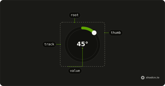
CircularSlider
├── CircularSliderLabel
├── CircularSliderThumb
├── CircularSliderValue
├── CircularSliderContext
├── CircularSliderTrack
└── CircularSliderMarker
    └── CircularSliderMarkerGroup
Usage
import {
  CircularSlider, CircularSliderValue,
} from "@/components/ui/circular-slider";<CircularSlider aria-label="Angle" defaultValue={45}>
<CircularSliderValue suffix="°" />
</CircularSlider>Accessibility
- Arrow Right
- Increments the angle slider based on defined step.
- Arrow Left
- Decrements the angle slider based on defined step.
- Arrow Up
- Decreases the value by the step amount.
- Arrow Down
- Increases the value by the step amount.
- Shift+Arrow Up
- Decreases the value by a larger step.
- Shift+Arrow Down
- Increases the value by a larger step.
- Home
- Sets the value to 0 degrees.
- End
- Sets the value to 360 degrees.
Demos
Context
The number in the middle does not have to be the angle with a unit glued on. CircularSliderContext hands you the live value, so the center can show a mapped range or a unit you format yourself. CircularSliderValue with suffix is the shorter path when the angle itself is the label. Use context when that label is a calculation.
Controlled
The degrees under the ring are the same state the dial is controlled with. Keep the angle yourself when a caption, a reset, or a save handler has to read it. Pass value back on every change, and use defaultValue when nothing else needs the number until the form submits. The ring will not invent a second copy of the state.
Custom Markers
markers can be a list of angles instead of a clock face. These four are the cardinal directions, which is what a compass or a quarter-turn control actually means. The thumb still moves by step between the ticks. Pass true when a regular clock is enough, and pass the list when only a few marks are real.
Disabled
disabled freezes the thumb and fades the ring. The angle stays visible, which is what you want when a preset owns the value or the control is not unlocked yet. Do not use it as the error state. A value the user still has to correct stays enabled and uses invalid instead.
Invalid
invalid switches the ring to the error treatment so a failed check is visible on the control, not only in a toast somewhere else. It does not explain itself. Keep a text message in the form. Turn it on after validation, for example when a required angle was never moved, and leave it off for a value that is merely unusual.
Read Only
readOnly leaves the angle on screen and in the form, but the user cannot change it. That fits a confirmed setting people should still be able to inspect, or a value copied from somewhere else. Prefer disabled when the control should drop out of the way of the rest of the form entirely. Read-only is for looking, not for locking the page.
Root Provider
The ring does not have to own its state. useCircularSlider creates the angle, a button outside calls setValue, and CircularSliderRootProvider shares that state with the readout. Use this when a preset or a neighboring control must move the dial without living inside it. A controlled value is less machinery when only one component needs the number.
Size
size is the diameter in pixels. 180 is nearly twice the default of 100, which is what you want when the dial is the main control, a volume knob or a compass, and not a small field in a form. The thumb and the track scale with it. For a heavier stroke without a larger ring, change thickness instead.
Step
step is 60 degrees here, so the thumb jumps between coarse stops instead of every degree. markers together with markersAtSteps puts a tick on each of those stops, and the ticks follow if you change step. Use that pairing when the angle is a clock hour or another coarse choice. Leave step at 1 when people need a precise angle.
Thickness
thickness is the stroke of the track, in pixels. 14 is a heavy ring against the default of 6, useful when the dial is small and a thin track would disappear, or when the fill itself is what people watch. The diameter stays whatever size is. Change size when the whole control should grow, not just the stroke.
With Label
CircularSliderLabel names the dial, here as hue, and that name is what a screen reader announces. Use it whenever the ring is not sitting next to another caption. aria-label on the root is the alternative when you do not want the word drawn on the control. A color tool usually wants the visible word.
With Markers
markers set to true draws clock ticks every 60 degrees, without you listing angles. Use that for a full turn where people need a sense of position, a timer or a heading, and the ticks are orientation rather than values. Pass a list of angles when only a few marks mean something. The thumb does not snap to the ticks unless step says so.
With Value
The center can hold more than digits. prefix takes an icon and suffix takes the unit, on a slightly larger and thicker ring, which reads as a thermostat. The icon is decorative, because the number and the unit already say what the control is. Use prefix and suffix before reaching for context, unless the text in the middle is a calculation.
FAQ
What value does a Circular Slider return?
An angle in degrees, from 0 to 360. Map it to your own range yourself: for a volume knob from 0 to 100, divide by 3.6. The thumb moves in steps of step, 1 degree by default.
How do I control the Circular Slider value in React?
Hold the angle in state and pass it back on every change, as in the Controlled demo.
Pass value and update it in onValueChange, which receives { value }. Use defaultValue when you only need a starting angle.
How do I run code only when the user releases the Circular Slider?
Use onValueChangeEnd: it fires once when dragging stops, while onValueChange fires on every move. It's the place to save the value or call an API.
How do I add tick marks to a Circular Slider?
Set markers to true for clock ticks every 60 degrees, or pass an array of angles for your own. With markersAtSteps, the ticks follow step instead. The With Markers and Custom Markers demos show both.
Can a Circular Slider be used with the keyboard?
Yes. The thumb has role="slider" and takes focus: the arrow keys move it by step, and Home and End jump to 0 and 360 degrees. Add a CircularSliderLabel so screen readers announce what the angle controls.
API Reference
CircularSlider
<div> data-slot="circular-slider"
value?number
The value of the slider.
defaultValue?number
The initial value of the slider. Use when you don't need to control the value of the slider.
- Default
0
onValueChange?(details: ValueChangeDetails) → void
The callback function for when the value changes.
- Type
(details: ValueChangeDetails) → void- Parameters
details– { value: number; valueAsDegree: string }- Returns
void
dir?"ltr" | "rtl"
The document's text/writing direction.
- Type
"ltr" | "rtl"- Default
"ltr"
disabled?boolean
Whether the slider is disabled.
id?string
The unique identifier of the machine.
ids?object
The ids of the elements in the machine. Useful for composition.
- Type
{ root?: string; thumb?: string; hiddenInput?: string; control?: string; valueText?: string; label?: string }
invalid?boolean
Whether the slider is invalid.
markers?boolean | number[]
Tick marks. true uses clock ticks (every 60°). A number array is custom angles.
- Type
boolean | number[]
markersAtSteps?boolean
When markers is true, place a tick at every step instead of clock ticks.
- Default
false
name?string
The name of the slider. Useful for form submission.
onValueChangeEnd?(details: ValueChangeDetails) → void
The callback function for when the value changes ends.
- Type
(details: ValueChangeDetails) → void- Parameters
details– { value: number; valueAsDegree: string }- Returns
void
readOnly?boolean
Whether the slider is read-only.
size?number
Diameter of the ring, in pixels. Ark default: 100.
- Default
DEFAULT_SIZE
step?number
The step value for the slider.
- Default
1
thickness?number
Stroke width of the ring, in pixels. Ark default: 6.
- Default
DEFAULT_THICKNESS
asChild?boolean
Use the provided child element as the default rendered element, combining their props and behavior.
className?string
Merged with the part's classes.
data-disabled?string
Present when disabled.
data-invalid?string
Present when invalid.
data-readonly?string
Present when read-only.
--anglestring
The angle in degrees.
--valuestring
The current value.
CircularSliderLabel
<label> data-slot="circular-slider-label"
asChild?boolean
Use the provided child element as the default rendered element, combining their props and behavior.
className?string
Merged with the part's classes.
data-disabled?string
Present when disabled.
data-invalid?string
Present when invalid.
data-readonly?string
Present when read-only.
CircularSliderThumb
<div> data-slot="circular-slider-thumb"
asChild?boolean
Use the provided child element as the default rendered element, combining their props and behavior.
className?string
Merged with the part's classes.
data-disabled?string
Present when disabled.
data-invalid?string
Present when invalid.
data-readonly?string
Present when read-only.
--sizestringCircularSliderValue
<span> data-slot="circular-slider-value"
prefix?ReactNode
Shown before the value, such as an icon.
suffix?ReactNode
Shown after the value, such as a unit (°).
asChild?boolean
Use the provided child element as the default rendered element, combining their props and behavior.
className?string
Merged with the part's classes.
CircularSliderMarkerGroup
<div> data-slot="circular-slider-marker-group"
asChild?boolean
Use the provided child element as the default rendered element, combining their props and behavior.
className?string
Merged with the part's classes.
CircularSliderMarker
<span> data-slot="circular-slider-marker"
valuenumber
The value of the marker.
asChild?boolean
Use the provided child element as the default rendered element, combining their props and behavior.
className?string
Merged with the part's classes.
data-disabled?string
Present when disabled.
data-state"under-value" | "over-value" | "at-value"
"under-value", "over-value" or "at-value".
- Type
"under-value" | "over-value" | "at-value"
data-valuestring
The value of the item.
--marker-display-valuestring
The rotation angle for display (mirrored in RTL).
--marker-heightstring--marker-offsetstring--marker-valuestring
The logical marker value (e.g. 0, 45, 90).
--marker-widthstringCircularSliderRootProvider
<svg> data-slot="circular-slider"
valueUseAngleSliderReturn
What useCircularSlider() returns: the state and API, made outside the component to control it.
markers?boolean | number[]
Tick marks. true uses clock ticks (every 60°). A number array is custom angles.
- Type
boolean | number[]
markersAtSteps?boolean
When markers is true, place a tick at every step instead of clock ticks.
- Default
false
size?number
Diameter of the ring, in pixels. Ark default: 100.
- Default
DEFAULT_SIZE
step?number
Used with markersAtSteps to place ticks. Should match the machine step. * * @default 1.
- Default
1
thickness?number
Stroke width of the ring, in pixels. Ark default: 6.
- Default
DEFAULT_THICKNESS
asChild?boolean
Use the provided child element as the default rendered element, combining their props and behavior.
className?string
Merged with the part's classes.
data-disabled?string
Present when disabled is true.
data-invalid?string
Present when invalid is true.
data-readonly?string
Present when readOnly is true.
--anglestring--valuestringuseCircularSlider
CircularSliderContext
With other components
Number Input
InputsType the same value
Field
InputsLabel the dial
Label
InputsName what it sets
Tooltip
OverlaysThe value at the thumb
Card
LayoutA dial on a surface
Button
ButtonsSnap to a preset
Related
Angle Slider
ControlsDegrees around a point
Slider
ControlsA straight track
Rating
SelectionA few fixed steps
Progress
FeedbackShow a value, do not set it
Circular Progress
FeedbackA ring that fills itself
Color Picker
InputsHue around a wheel