shadcn.io is not affiliated with official shadcn/ui
Sliders for hue and opacity, plus a text field if you already know the hex. The eyedropper only works in Chromium, so don't rely on it alone.
Use it when people should see the color as they change it, like a theme or a chart series. If they already know the hex, an Input is enough. In React you store the color as a string, and Ark UI keeps the sliders and the text on the same value.
Installation
Anatomy
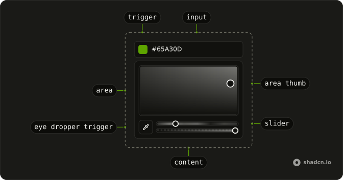
Usage
import {
  ColorPicker, ColorPickerArea, ColorPickerAreaThumb,
  ColorPickerContent, ColorPickerControl, ColorPickerEyeDropperTrigger,
  ColorPickerInput, ColorPickerSlider, ColorPickerSwatchPreview,
  ColorPickerTransparencyGrid, ColorPickerTrigger, ColorPickerView,
} from "@/components/ui/color-picker";
import {
  InputGroup, InputGroupAddon, InputGroupInput,
} from "@/components/ui/input-group";<ColorPicker className="w-full max-w-64" defaultValue="#eb5e41" format="hsla">
<ColorPickerControl>
<InputGroup>
<ColorPickerTrigger asChild>
<InputGroupAddon>
<ColorPickerSwatchPreview />
</InputGroupAddon>
</ColorPickerTrigger>
<ColorPickerInput asChild>
<InputGroupInput />
</ColorPickerInput>
</InputGroup>
</ColorPickerControl>
<ColorPickerContent>
<ColorPickerArea>
<ColorPickerAreaThumb />
</ColorPickerArea>
<ColorPickerView format="hsla">
<div className="flex items-center gap-3">
<ColorPickerEyeDropperTrigger />
<div className="flex flex-1 flex-col gap-2.5">
<ColorPickerSlider channel="hue" />
<ColorPickerSlider channel="alpha">
<ColorPickerTransparencyGrid />
</ColorPickerSlider>
</div>
</div>
</ColorPickerView>
</ColorPickerContent>
</ColorPicker>Accessibility
- Enter
- When focus is on the trigger, opens the color picker. When focus is on a trigger of a swatch, selects the color (and closes the color picker). When focus is on the input or channel inputs, selects the color.
- Arrow Left
- When focus is on the color area, decreases the hue value of the color. When focus is on the channel sliders, decreases the value of the channel.
- Arrow Right
- When focus is on the color area, increases the hue value of the color. When focus is on the channel sliders, increases the value of the channel.
- Arrow Up
- When focus is on the color area, increases the saturation value of the color. When focus is on the channel sliders, increases the value of the channel.
- Arrow Down
- When focus is on the color area, decreases the saturation value of the color. When focus is on the channel sliders, decreases the value of the channel.
- Escape
- Closes the color picker and moves focus to the trigger.
- Space
- Activate the focused control.
- Page Up
- Jump backward.
- Page Down
- Jump forward.
- Home
- Go to the start.
- End
- Go to the end.
Demos
Area Channels
The square is not the usual saturation map. Hue runs across and alpha runs down, so one drag changes the color family and how transparent it is. Pick this when those two channels are the decision and a stack of sliders would be noise. Set xChannel and yChannel on ColorPickerArea, and keep the picker inline.
Area Dots
Same hue and alpha axes, with showDots drawing a grid so a spot is easier to find again. The dots are only paint and do not snap the thumb. Use the grid when people match a color by eye and need landmarks. Skip it once channel inputs already name the position.
Context
ColorPickerContext hands you valueAsString while the field changes, which is how a caption or a second chip stays in step with the input. Nothing here opens a popover. Read the context when something nearby must react and you are not ready to own the value in state. Lift state once a sibling also writes the color.
Custom Spacing
ColorPickerContent sets --space tighter below the sm breakpoint and looser after it. Point your own padding and gap at that variable when one popover has to live in a phone toolbar and a wider desktop panel. The area, eyedropper, hue, and alpha slider match the default field. The variable does nothing unless a style reads it.
Inline
inline leaves the area on the page and drops the trigger. Four swatches sit under it, and a click selects that color, with the indicator on the current one. Put this in a sidebar that is already open, where a popover would cover the preview you are judging. A closed field is better when the page has many other controls.
Input Channel
Four rows, one color model each: RGB, HSB, HSL, and hex plus alpha. Each number is a ColorPickerInput with a channel, and format on the picker matches format on ColorPickerView. Use separate boxes when people think in numbers they can copy. The small ColorPickerSwatchPreview is there so a bad digit is obvious before they leave the row.
Input Compact
Closed, this is one line: a swatch trigger, a hex channel, and an alpha field with a percent mark, split by a Separator. Open, it adds a dotted area plus hue, saturation, lightness, and alpha. Use it when the resting control must stay short, and the full set of channels only matters after someone commits to editing.
Input Controlled
The string is held in state and passed back as value. Under the field, parseColor prints that same color as hex, so you can see the normalized form. Control it when the color is a theme token, saved on blur, or shared with another control. Leave it uncontrolled when the field can keep the value until the form submits.
Input Disabled
disabled on the picker locks the text at the current color, so it cannot be edited or focused into a change. Use that when the token is inherited and this screen may show it but not override it. Disabling only makes sense if the value is still worth reading. If the setting does not apply, remove the field.
Input Invalid
The picker sits in a Field marked invalid, with an empty input and a FieldError under it. The picker does not decide the message: you do, after a parse fails. Use the field error when this color is part of a form submit, so the label, the box, and the reason line up. A toast would make people hunt for which field broke.
Input With Popover
The swatch opens a small panel: the area, and a single hue slider inside ColorPickerView. No alpha, no eyedropper, no channel numbers. Use it when you want fully saturated colors and opacity is not a question the product asks. It is the smallest popover that still lets someone leave a typed hex and wander by hue.
Input With Swatch Preview
The swatch is only a preview. It sits in the input group and does not open a panel, so typing is the whole interaction. Use this beside a string the user already knows, a brand hex from a guideline, where the chip confirms they pasted the right one. Add a trigger only when they also need to explore.
Open Controlled
open is stored outside the picker, and a button flips it. The swatch trigger writes the same state, so the button and the field cannot disagree. Drive open from outside when a toolbar action or a shortcut should reveal the panel. If the swatch is the only way in, leave the popover uncontrolled.
Popover Disabled
disabled on the root stops the trigger, a button with a swatch, from opening the area behind it. The color stays visible so the row does not collapse. Use a disabled picker when a permission or a lock will come back, and the layout should stay put. Hide the control when that user will never be allowed to pick.
Popover Sliders Only
The button opens labeled sliders for hue, saturation, lightness, and alpha, each in a Field, and there is no area. Alpha sits on the transparency grid. Choose sliders when each channel should be edited on its own and a two-axis square would make the change harder to explain. For a first pick from scratch, the area is faster.
Popover With Channel Editing
The panel has the area, a hue slider, and three inputs for red, green, and blue. format is rgba, so the numbers match the model the area is editing. Offer both when some people drag and others paste a channel they measured in a design tool. If you only trust the numbers, drop the area and keep the inputs.
Popover With Swatch Picker
Area, a hue slider, and a row of preset swatches share one popover. A swatch sets the color without a drag, and the area is still there for a color that is not on the list. Use that mix for a brand palette with a few legal options plus an escape hatch. If the list is the whole product, skip the area.
Root Provider
useColorPicker owns the value, and ColorPickerRootProvider passes it to the input. The reset button calls setValue, and the caption reads valueAsString, both from outside the field. Use the provider when a sibling has to write the color, not only display it. Context is enough when you only need to read.
Slider Alpha Channel
One inline slider, channel set to alpha, starting from a half-transparent red, with the checker grid behind the track. format is rgba, so the opacity is part of the stored color. Put this under a swatch when hue is already chosen and the only leftover choice is a highlight, a watermark, or a veil.
Slider Controlled
The hue slider is inline and controlled. value is the color string, and the line under the track prints it as the thumb moves. Control a single channel when the rest of a form object needs the live string, for a preview or a token field. An uncontrolled slider is enough if nothing reads the color until submit.
Slider Disabled
disabled freezes an inline hue slider on the current color. The thumb stays put. Show a frozen slider when hue is derived, for example from a swatch the user already chose, and hiding the channel would make the value look missing. If the channel is irrelevant, do not render it.
Slider Hsba Channels
Hue, saturation, and brightness, inline, with format set to hsba. No alpha track and no area. Use HSB when you are matching a design tool that talks about brightness rather than lightness. If the value you store is HSL or RGB, do not make people edit a model you will only translate on the way out.
Slider Hsl Channels
Hue, saturation, and lightness on three inline tracks, format set to hsla, starting from a green. The layout matches the HSB stack, but the last channel is not brightness. Use HSL when the CSS around the picker already speaks HSL and the stored string should match the stylesheet without a conversion.
Slider Rgb Channels
Red, green, and blue each get a slider, format set to rgba, and there is no alpha track. Use RGB when the color is headed into a canvas, a shader, or an API that wants those three numbers. HSL would only be converted on the way out. Add alpha only if transparency is actually stored.
Slider Vertical
A single hue slider with orientation set to vertical, inside an inline picker that has a fixed height. The thumb travels up and down. Use a vertical hue beside a tall preview, such as a sidebar swatch, where a horizontal track would spend width you do not have. Without a height, the track has nowhere to go.
Swatch Picker
Four presets sit in a ColorPickerSwatchGroup. Each trigger wraps a ColorPickerSwatch and a ColorPickerSwatchIndicator, and inline keeps them on the page. Use swatches when the legal colors are a short list, a brand kit or a status set. Free mixing will produce colors you cannot actually ship.
Swatch Picker Controlled
The chosen swatch is controlled. value holds the color, the caption prints it as hex through parseColor, and a click writes the new string back. Control the group when that selection is the theme token in your state, or when a reset elsewhere must clear it. Uncontrolled is enough for a choice that only matters on submit.
Swatch Picker Custom Indicator
The default check is gone. ColorPickerSwatchIndicator renders a sparkle, so the selected swatch shows that icon instead. Swap the indicator when a check disappears on a bright color, or when selection should reuse an icon you already use for chosen. Keep the icon decorative if the selected state is already announced.
Swatch Picker Custom Radius
Each swatch is its own group, and the corner radius is a class on ColorPickerSwatchTrigger, from a small radius up to a large one. Match the radius to the buttons or cards around the picker when those shapes are part of the brand. One radius for the whole group is the normal case. Different radii are for a deliberate scale.
Swatch Picker Custom Size
The triggers step from size-4 up to size-10, and the smallest omits the indicator while the larger ones show it. Use a big target when the swatches are the main control, especially under a finger, and a small one when they are a hint beside a slider. Mixing sizes only helps if the larger color is actually more important.
Swatch Picker Disabled
disabled on the picker locks every swatch. The colors still render, so a locked brand kit stays visible, but none of them can be selected. Freeze the group when the palette is reference, not a choice. If this user will never pick, hide the row instead of showing controls that do nothing.
With Field
Field, FieldLabel, and FieldHelper wrap a text input, and the helper asks for the brand primary. There is no popover. Use the field chrome whenever this color sits in a form with other inputs, so the label and the hint line up with the rest. A bare input is the right weight in a toolbar, where a helper would just add a line.
FAQ
How do I get the selected color from the Color Picker in React?
Read it in onValueChange: it receives { value, valueAsString }, where valueAsString is the color as text, like #eb5e41. To control the picker, pass that string back as value, as in the Input Controlled demo.
How do I switch the Color Picker between hex, RGB and HSL?
Set format to rgba, hsla or hsba to choose the channels the inputs edit, or defaultFormat for a starting one. Hex is always available through a ColorPickerInput with channel="hex", and parseColor converts any color string, for example with parseColor(value).toString("hex").
Can I show the Color Picker inline instead of in a popover?
Yes. Set inline on ColorPicker and put the area, sliders and inputs directly inside it, without a trigger or content, as in the Inline demo. It's a good fit for a settings panel or a sidebar that is always open.
How do I add preset color swatches to the Color Picker?
Put a ColorPickerSwatchTrigger per color in a ColorPickerSwatchGroup, each with its value and a ColorPickerSwatch inside: clicking one selects that color. The Swatch Picker demos cover sizes, radius and a custom check indicator.
How do I add an opacity slider to the Color Picker?
Add a ColorPickerSlider with channel="alpha": it shows the transparency grid behind the gradient and edits the color's alpha, as in the Slider Alpha Channel demo. Swatches show the alpha too when they have respectAlpha.
Does the Color Picker have an eye dropper?
Yes. Add a ColorPickerEyeDropperTrigger to pick a color from anywhere on the screen. It uses the browser's EyeDropper API, which only Chromium-based browsers support today, so keep the area and inputs available as the main way in.
Does the Color Picker submit with a form?
Yes. Give ColorPicker a name and it submits the color through a hidden input. Set invalid, disabled or readOnly for those states, or wrap it in a Field for a label and an error message, as in the With Field demo.
API Reference
ColorPicker
<div> data-slot="color-picker"
format?"rgba" | "hsla" | "hsba"
The controlled color format to use.
- Type
"rgba" | "hsla" | "hsba"
defaultFormat?"rgba" | "hsla" | "hsba"
The initial color format when rendered. Use when you don't need to control the color format of the color picker.
- Type
"rgba" | "hsla" | "hsba"- Default
"rgba"
onFormatChange?(details: FormatChangeDetails) → void
Function called when the color format changes.
- Type
(details: FormatChangeDetails) → void- Parameters
details– { format: ColorFormat }- Returns
void
open?boolean
The controlled open state of the color picker.
defaultOpen?boolean
The initial open state of the color picker when rendered. Use when you don't need to control the open state of the color picker.
onOpenChange?(details: OpenChangeDetails) → void
Handler that is called when the user opens or closes the color picker.
- Type
(details: OpenChangeDetails) → void- Parameters
details– { open: boolean; value: Color }- Returns
void
value?string
The value of the color picker.
defaultValue?string
The default value of the color picker.
- Default
#000000
onValueChange?(details: ValueChangeDetails) → void
Handler that is called when the value changes, as the user drags.
- Type
(details: ValueChangeDetails) → void- Parameters
details– { value: Color; valueAsString: string }- Returns
void
closeOnSelect?boolean
Whether to close the color picker when a swatch is selected.
- Default
false
dir?"ltr" | "rtl"
The document's text/writing direction.
- Type
"ltr" | "rtl"- Default
"ltr"
disabled?boolean
Whether the color picker is disabled.
hideMode?"display-none" | "activity"
How to hide content when mounted but not present.
- display-none: HTML hidden attribute. Effects stay alive.
- activity: React 19 <Activity mode="hidden">. Effects pause. Requires React 19+.
- Type
"display-none" | "activity"- Default
"display-none"
id?string
The unique identifier of the machine.
ids?object
The ids of the elements in the color picker. Useful for composition.
- Type
{ root?: string; control?: string; trigger?: string; label?: string; input?: string; hiddenInput?: string; content?: string; area?: string; areaGradient?: string; positioner?: string; formatSelect?: string; areaThumb?: string; channelInput?: (id: string) → string; channelSliderTrack?: (id: ColorChannel) → string; channelSliderThumb?: (id: ColorChannel) → string }
initialFocusEl?() → HTMLElement | null | false
The initial focus element when the color picker is opened.
Return false to skip moving focus, or null to use the default.
- Type
() → HTMLElement | null | false- Returns
HTMLElement | null | false
inline?boolean
Whether to render the color picker inline.
invalid?boolean
Whether the color picker is invalid.
lazyMount?boolean
Whether to enable lazy mounting. Ark default: false.
- Default
true
name?string
The name for the form input.
onFocusOutside?(event: FocusOutsideEvent) → void
Function called when the focus is moved outside the component.
- Type
(event: FocusOutsideEvent) → void- Parameters
event– FocusOutsideEvent- Returns
void
onInteractOutside?(event: InteractOutsideEvent) → void
Function called when an interaction happens outside the component.
- Type
(event: InteractOutsideEvent) → void- Parameters
event– InteractOutsideEvent- Returns
void
onPointerDownOutside?(event: PointerDownOutsideEvent) → void
Function called when the pointer is pressed down outside the component.
- Type
(event: PointerDownOutsideEvent) → void- Parameters
event– PointerDownOutsideEvent- Returns
void
onValueChangeEnd?(details: ValueChangeDetails) → void
Handler that is called when the user stops dragging.
- Type
(details: ValueChangeDetails) → void- Parameters
details– { value: Color; valueAsString: string }- Returns
void
openAutoFocus?boolean
Whether to auto focus the color picker when it is opened.
- Default
true
positioning?object
The positioning options for the color picker.
- Type
{ restoreStyles?: boolean; applyStyles?: boolean; hideWhenDetached?: boolean; strategy?: "absolute" | "fixed"; placement?: Placement; offset?: { mainAxis?: number; crossAxis?: number; }; gutter?: number; shift?: number; overflowPadding?: number; arrowPadding?: number; flip?: boolean | Placement[]; slide?: boolean; overlap?: boolean; sameWidth?: boolean; fitViewport?: boolean; sizeMiddleware?: boolean; boundary?: (() → Boundary) | Boundary | "clipping-ancestors"; listeners?: boolean | AutoUpdateOptions; onComplete?: (data: ComputePositionReturn) → void; onPositioned?: ((data: { placed: boolean; }) → void); getAnchorElement?: () → HTMLElement | VirtualElement | null; getAnchorRect?: (element: HTMLElement | VirtualElement | null) → AnchorRect | null; updatePosition?: ((data: { updatePosition: () → Promise<void>; floatingElement: HTMLElement | null; }) → void | Promise<void>) }- Default
{ placement: "top-start" }
readOnly?boolean
Whether the color picker is read-only.
required?boolean
Whether the color picker is required.
skipAnimationOnMount?boolean
Whether to allow the initial presence animation.
- Default
false
unmountOnExit?boolean
Whether to unmount on exit. Ark default: false.
- Default
true
asChild?boolean
Use the provided child element as the default rendered element, combining their props and behavior.
className?string
Merged with the part's classes.
data-disabled?string
Present when disabled.
data-invalid?string
Present when invalid.
data-readonly?string
Present when read-only.
--valuestring
The current value.
ColorPickerLabel
<label> data-slot="color-picker-label"
asChild?boolean
Use the provided child element as the default rendered element, combining their props and behavior.
className?string
Merged with the part's classes.
data-disabled?string
Present when disabled.
data-focus?string
Present when focused.
data-invalid?string
Present when invalid.
data-readonly?string
Present when read-only.
data-required?string
Present when required.
ColorPickerControl
<div> data-slot="color-picker-control"
asChild?boolean
Use the provided child element as the default rendered element, combining their props and behavior.
className?string
Merged with the part's classes.
data-disabled?string
Present when disabled.
data-focus?string
Present when focused.
data-invalid?string
Present when invalid.
data-readonly?string
Present when read-only.
data-state"open" | "closed"
"open" or "closed".
- Type
"open" | "closed"
ColorPickerTrigger
<button> data-slot="color-picker-trigger"
asChild?boolean
Use the provided child element as the default rendered element, combining their props and behavior.
data-disabled?string
Present when disabled.
data-focus?string
Present when focused.
data-invalid?string
Present when invalid.
data-placementstring
The placement of the trigger.
data-readonly?string
Present when read-only.
data-side"top" | "right" | "bottom" | "left"
The side of the trigger that the trigger is positioned on.
- Type
"top" | "right" | "bottom" | "left"
data-state"open" | "closed"
"open" or "closed".
- Type
"open" | "closed"
ColorPickerTransparencyGrid
<div>
size?string
The size (width and height) of the element.
asChild?boolean
Use the provided child element as the default rendered element, combining their props and behavior.
className?string
Merged with the part's classes.
--sizestring
The size (width and height) of the element.
ColorPickerContent
<div> data-slot="color-picker-content"
asChild?boolean
Use the provided child element as the default rendered element, combining their props and behavior.
className?string
Merged with the part's classes.
data-has-nested?string
Present when another popover is nested inside it.
data-nested?string
Present when it's nested inside another popover.
data-placementstring
The placement of the content.
data-side"top" | "right" | "bottom" | "left"
The side of the trigger that the content is positioned on.
- Type
"top" | "right" | "bottom" | "left"
data-state"open" | "closed"
"open" or "closed".
- Type
"open" | "closed"
--layer-indexstring
The index of the dismissable in the layer stack.
--nested-layer-countstring
The number of nested color-pickers.
--transform-originstring
Where the content scales from, on its trigger's side.
ColorPickerView
<div> data-slot="color-picker-view"
format"rgba" | "hsla" | "hsba"
The color format it's for: it renders only while the picker is in it.
- Type
"rgba" | "hsla" | "hsba"
asChild?boolean
Use the provided child element as the default rendered element, combining their props and behavior.
className?string
Merged with the part's classes.
ColorPickerSlider
<div> data-slot="color-picker-channel-slider"
channel"hue" | "saturation" | "brightness" | "lightness" | "red" | "green" | "blue" | "alpha"
The channel it sets, such as hue or alpha.
- Type
"hue" | "saturation" | "brightness" | "lightness" | "red" | "green" | "blue" | "alpha"
orientation?"horizontal" | "vertical"
Horizontal or vertical: the direction it runs.
- Type
"horizontal" | "vertical"
asChild?boolean
Use the provided child element as the default rendered element, combining their props and behavior.
className?string
Merged with the part's classes.
data-channelstring
The color channel of the channelslider.
data-orientation"horizontal" | "vertical"
The orientation of the channelslider.
- Type
"horizontal" | "vertical"
ColorPickerEyeDropperTrigger
<button> data-slot="color-picker-eye-dropper"
asChild?boolean
Use the provided child element as the default rendered element, combining their props and behavior.
data-disabled?string
Present when disabled.
data-invalid?string
Present when invalid.
data-readonly?string
Present when read-only.
ColorPickerSwatchGroup
<div> data-slot="color-picker-swatch-group"
asChild?boolean
Use the provided child element as the default rendered element, combining their props and behavior.
className?string
Merged with the part's classes.
ColorPickerSwatchTrigger
<button> data-slot="color-picker-swatch-trigger"
valuestring | Color
The color value.
- Type
string | Color
disabled?boolean
Whether the swatch trigger is disabled.
asChild?boolean
Use the provided child element as the default rendered element, combining their props and behavior.
className?string
Merged with the part's classes.
data-disabled?string
Present when disabled.
data-state"checked" | "unchecked"
"checked" or "unchecked".
- Type
"checked" | "unchecked"
data-valuestring
The value of the item.
--colorstring
The text color.
ColorPickerSwatch
<div> data-slot="color-picker-swatch"
valuestring | Color
The color value.
- Type
string | Color
respectAlpha?boolean
Whether to include the alpha channel in the color.
asChild?boolean
Use the provided child element as the default rendered element, combining their props and behavior.
className?string
Merged with the part's classes.
data-state"checked" | "unchecked"
"checked" or "unchecked".
- Type
"checked" | "unchecked"
data-valuestring
The value of the item.
--colorstring
The text color.
ColorPickerSwatchIndicator
<div> data-slot="color-picker-swatch-indicator"
asChild?boolean
Use the provided child element as the default rendered element, combining their props and behavior.
className?string
Merged with the part's classes.
ColorPickerValue
<span> data-slot="color-picker-value"
format?ColorHexFormat | ColorFormat | "rgb" | "hsl" | "hsb" | "css"
The format the value is written in.
- Type
ColorHexFormat | ColorFormat | "rgb" | "hsl" | "hsb" | "css"
asChild?boolean
Use the provided child element as the default rendered element, combining their props and behavior.
className?string
Merged with the part's classes.
data-disabled?string
Present when disabled.
data-focus?string
Present when focused.
ColorPickerValueSwatch
<div> data-slot="color-picker-value-swatch"
respectAlpha?boolean
Whether to include the alpha channel in the color.
asChild?boolean
Use the provided child element as the default rendered element, combining their props and behavior.
className?string
Merged with the part's classes.
ColorPickerArea
<div> data-slot="color-picker-area"
showDots?boolean
Lays a dot grid over the area, to read positions against.
- Default
false
xChannel?"hue" | "saturation" | "brightness" | "lightness" | "red" | "green" | "blue" | "alpha"
The channel the area's horizontal axis sets.
- Type
"hue" | "saturation" | "brightness" | "lightness" | "red" | "green" | "blue" | "alpha"
yChannel?"hue" | "saturation" | "brightness" | "lightness" | "red" | "green" | "blue" | "alpha"
The channel the area's vertical axis sets.
- Type
"hue" | "saturation" | "brightness" | "lightness" | "red" | "green" | "blue" | "alpha"
asChild?boolean
Use the provided child element as the default rendered element, combining their props and behavior.
className?string
Merged with the part's classes.
data-disabled?string
Present when disabled.
data-invalid?string
Present when invalid.
data-readonly?string
Present when read-only.
ColorPickerAreaThumb
<div> data-slot="color-picker-area-thumb"
asChild?boolean
Use the provided child element as the default rendered element, combining their props and behavior.
className?string
Merged with the part's classes.
data-disabled?string
Present when disabled.
data-invalid?string
Present when invalid.
data-readonly?string
Present when read-only.
--colorstring
The text color.
ColorPickerInput
<input> data-slot="color-picker-input"
channelColorChannel | "hex" | "css"
The channel it edits, or hex or css for the whole color as text.
- Type
ColorChannel | "hex" | "css"- Default
"hex"
orientation?"horizontal" | "vertical"
The orientation its channel's arrow keys follow.
- Type
"horizontal" | "vertical"
asChild?boolean
Use the provided child element as the default rendered element, combining their props and behavior.
data-channelstring
The color channel of the channelinput.
data-disabled?string
Present when disabled.
data-invalid?string
Present when invalid.
data-readonly?string
Present when read-only.
ColorPickerSwatchPreview
<div>
size?string
The size (width and height) of the element.
asChild?boolean
Use the provided child element as the default rendered element, combining their props and behavior.
className?string
Merged with the part's classes.
--sizestring
The size (width and height) of the element.
ColorPickerRootProvider
<div> data-slot="color-picker"
valueUseColorPickerReturn
What useColorPicker() returns: the state and API, made outside the component to control it.
hideMode?"display-none" | "activity"
How to hide content when mounted but not present.
- display-none: HTML hidden attribute. Effects stay alive.
- activity: React 19 <Activity mode="hidden">. Effects pause. Requires React 19+.
- Type
"display-none" | "activity"- Default
"display-none"
lazyMount?boolean
Whether to enable lazy mounting. Ark default: false.
- Default
true
skipAnimationOnMount?boolean
Whether to allow the initial presence animation.
- Default
false
unmountOnExit?boolean
Whether to unmount on exit. Ark default: false.
- Default
true
asChild?boolean
Use the provided child element as the default rendered element, combining their props and behavior.
className?string
Merged with the part's classes.
data-disabled?string
Present when disabled is true.
data-invalid?string
Present when invalid is true.
data-readonly?string
Present when readOnly is true.
--valuestringuseColorPicker
format?"rgba" | "hsla" | "hsba"
The controlled color format to use.
- Type
"rgba" | "hsla" | "hsba"
defaultFormat?"rgba" | "hsla" | "hsba"
The initial color format when rendered. Use when you don't need to control the color format of the color picker.
- Type
"rgba" | "hsla" | "hsba"- Default
"rgba"
onFormatChange?(details: FormatChangeDetails) → void
Function called when the color format changes.
- Type
(details: FormatChangeDetails) → void- Parameters
details– { format: ColorFormat }- Returns
void
open?boolean
The controlled open state of the color picker.
defaultOpen?boolean
The initial open state of the color picker when rendered. Use when you don't need to control the open state of the color picker.
onOpenChange?(details: OpenChangeDetails) → void
Handler that is called when the user opens or closes the color picker.
- Type
(details: OpenChangeDetails) → void- Parameters
details– { open: boolean; value: Color }- Returns
void
value?Color
The controlled color value of the color picker.
defaultValue?Color
The initial color value when rendered. Use when you don't need to control the color value of the color picker.
- Default
#000000
onValueChange?(details: ValueChangeDetails) → void
Handler that is called when the value changes, as the user drags.
- Type
(details: ValueChangeDetails) → void- Parameters
details– { value: Color; valueAsString: string }- Returns
void
closeOnSelect?boolean
Whether to close the color picker when a swatch is selected.
- Default
false
disabled?boolean
Whether the color picker is disabled.
id?string
The unique identifier of the machine.
ids?object
The ids of the elements in the color picker. Useful for composition.
- Type
{ root?: string; control?: string; trigger?: string; label?: string; input?: string; hiddenInput?: string; content?: string; area?: string; areaGradient?: string; positioner?: string; formatSelect?: string; areaThumb?: string; channelInput?: (id: string) → string; channelSliderTrack?: (id: ColorChannel) → string; channelSliderThumb?: (id: ColorChannel) → string }
initialFocusEl?() → HTMLElement | null | false
The initial focus element when the color picker is opened.
Return false to skip moving focus, or null to use the default.
- Type
() → HTMLElement | null | false- Returns
HTMLElement | null | false
inline?boolean
Whether to render the color picker inline.
invalid?boolean
Whether the color picker is invalid.
name?string
The name for the form input.
onFocusOutside?(event: FocusOutsideEvent) → void
Function called when the focus is moved outside the component.
- Type
(event: FocusOutsideEvent) → void- Parameters
event– FocusOutsideEvent- Returns
void
onInteractOutside?(event: InteractOutsideEvent) → void
Function called when an interaction happens outside the component.
- Type
(event: InteractOutsideEvent) → void- Parameters
event– InteractOutsideEvent- Returns
void
onPointerDownOutside?(event: PointerDownOutsideEvent) → void
Function called when the pointer is pressed down outside the component.
- Type
(event: PointerDownOutsideEvent) → void- Parameters
event– PointerDownOutsideEvent- Returns
void
onValueChangeEnd?(details: ValueChangeDetails) → void
Handler that is called when the user stops dragging.
- Type
(details: ValueChangeDetails) → void- Parameters
details– { value: Color; valueAsString: string }- Returns
void
openAutoFocus?boolean
Whether to auto focus the color picker when it is opened.
- Default
true
positioning?object
The positioning options for the color picker.
- Type
{ restoreStyles?: boolean; applyStyles?: boolean; hideWhenDetached?: boolean; strategy?: "absolute" | "fixed"; placement?: Placement; offset?: { mainAxis?: number; crossAxis?: number; }; gutter?: number; shift?: number; overflowPadding?: number; arrowPadding?: number; flip?: boolean | Placement[]; slide?: boolean; overlap?: boolean; sameWidth?: boolean; fitViewport?: boolean; sizeMiddleware?: boolean; boundary?: (() → Boundary) | Boundary | "clipping-ancestors"; listeners?: boolean | AutoUpdateOptions; onComplete?: (data: ComputePositionReturn) → void; onPositioned?: ((data: { placed: boolean; }) → void); getAnchorElement?: () → HTMLElement | VirtualElement | null; getAnchorRect?: (element: HTMLElement | VirtualElement | null) → AnchorRect | null; updatePosition?: ((data: { updatePosition: () → Promise<void>; floatingElement: HTMLElement | null; }) → void | Promise<void>) }
readOnly?boolean
Whether the color picker is read-only.
required?boolean
Whether the color picker is required.
ColorPickerContext
alphanumber
The alpha value of the color.
draggingboolean
Whether the color picker is being dragged.
format"rgba" | "hsla" | "hsba"
The current color format.
- Type
"rgba" | "hsla" | "hsba"
getChannelValue(channel: ColorChannel) → string
Function to set the color value.
- Parameters
channel– ColorChannel- Returns
string
getChannelValueText(channel: ColorChannel, locale: string) → string
Function to get the formatted and localized value of a specific channel.
- Type
(channel: ColorChannel, locale: string) → string- Parameters
channel– ColorChannellocale– string- Returns
string
getSwatchTriggerState(props: SwatchTriggerProps) → SwatchTriggerState
A swatch trigger's state for its props: its value, and whether it's checked or disabled.
- Type
(props: SwatchTriggerProps) → SwatchTriggerState- Parameters
props– { value: string | Color; disabled?: boolean }- Returns
SwatchTriggerState
inlineboolean
Whether the color picker is rendered inline.
openboolean
Whether the color picker is open.
setAlpha(value: number) → void
Function to set the color alpha.
- Parameters
value– number- Returns
void
setChannelValue(channel: ColorChannel, value: number) → void
Function to set the color value of a specific channel.
- Type
(channel: ColorChannel, value: number) → void- Parameters
channel– ColorChannelvalue– number- Returns
void
setFormat(format: ColorFormat) → void
Function to set the color format.
- Parameters
format– ColorFormat- Returns
void
setOpen(open: boolean) → void
Function to open or close the color picker.
- Parameters
open– boolean- Returns
void
setValue(value: string | Color) → void
Function to set the color value.
- Type
(value: string | Color) → void- Parameters
value– string | Color- Returns
void
valueColor
The current color value (as a string).
valueAsStringstring
The current color value (as a Color object).