shadcn.io is not affiliated with official shadcn/ui
Type a word, then Enter, and it becomes a chip you can delete. Comma adds one too, and backspace removes the last chip.
Use it when the values are free text and a short list is enough. A known catalog that people should search belongs in a Combobox. In React, keep the chip list in state when something else on the page has to change it, and Ark UI renders the chips.
Installation
Anatomy
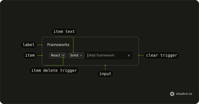
TagsInputContext
├── TagsInputLabel
├── TagsInput
├── TagsInputInput
├── TagsInputClearTrigger
└── TagsInputItem
    ├── TagsInputItemPreview
    ├── TagsInputItemInput
    ├── TagsInputItemText
    └── TagsInputItemDeleteTrigger
Usage
import { Field, FieldLabel } from "@/components/ui/field";
import {
  TagsInput, TagsInputContext, TagsInputItem,
} from "@/components/ui/tags-input";
const defaultValue = ["React", "Solid", "Vue", "Svelte"];
const TagsInputDemo = () => (
<Field className="w-full max-w-sm">
<FieldLabel>Frameworks</FieldLabel>
<TagsInput className="w-full" defaultValue={defaultValue}>
<TagsInputContext>
{({ value }) =>
value.map((value, index) => (
<TagsInputItem index={index} key={value} value={value}>
{value}
</TagsInputItem>
))
}
</TagsInputContext>
</TagsInput>
</Field>
);Accessibility
- Arrow Left
- Moves focus to the previous tag item.
- Arrow Right
- Moves focus to the next tag item.
- Backspace
- Deletes the tag item that has visual focus or the last tag item.
- Enter
- When a tag item has visual focus, it puts the tag in edit mode. When the input has focus, it adds the value to the list of tags.
- Delete
- Deletes the tag item that has visual focus.
- Ctrl+V
- When
addOnPasteis set. Adds the pasted value as a tags. - Arrow Down
- Move down.
- Escape
- Dismiss.
- Space
- Activate the focused control.
Demos
Blur Behavior
Focus leaving the field usually drops whatever is half typed. Set blurBehavior to add and that leftover text becomes a tag, which suits a form people tab through without pressing Enter. The other setting, clear, wipes the input on blur. Choose add when an unfinished word is more often a real tag than a typo.
Combobox
The box is also a combobox of framework names. Typing filters the list, picking one calls addValue, and names already chosen leave the suggestions. allowCustomValue still lets someone commit a name that is not in the catalog, which fits when most tags are known and a few will be invented. A tags input alone is enough when there is nothing to suggest.
Controlled
The chips live in state and come back in through value. onValueChange hands you the next array, so the page can add a tag, remove one, or reset the field without touching the input. Use defaultValue when nothing else edits the list before submit. Control value when a draft, a button, or another field owns the chips.
Controlled Input Value
The text still being typed is separate from the chips. inputValue and onInputValueChange hold that string, and the buttons above write the word React into the box or clear it. Use this when a suggestion, a query string, or a formatter must set the input from outside. The tag list stays on defaultValue.
Custom Delimiter
A comma is the usual break between tags. Here delimiter also treats whitespace as a break, so a space after a word starts a new chip without Enter. Change it when people paste values that are already split on spaces, semicolons, or newlines. Keep the comma if that is the gesture the rest of the product already teaches.
Disable Editing
Once a chip exists, Enter or a double click normally turns it back into text. Set editable to false and the label stays as it was created. Deleting the chip still works, and new tags can still be typed. Use that when the text was checked on the way in, or stands for an id, and rewriting it in place would change the meaning.
Disabled
disabled on the tags input and on the field around it freezes the chips and the text box. Nothing can be added, edited, or removed, and the control fades so it reads as unavailable. Use it when this step is showing the list for context and not taking changes. It is broader than editable, which only blocks rewriting a chip that is already there.
Field
The tags sit under a real label, with a line beneath the control that says to press Enter. Copy this layout when the input is one question in a longer form and the hint should survive after someone starts typing. The description belongs to the Field, so it does not compete with the label. A placeholder alone disappears at the worst time.
Invalid
The field and the tags input are both invalid, so the border takes the error color before anyone opens a message. Use that after submit, when the list breaks a rule the control does not know, such as a required tag that never arrived. Put the reason in text next to the field. A red border does not say what to fix.
Max Length
maxLength is 10, so typing stops once a tag-in-progress hits that many characters. The label states the limit, which is the part people notice. Use a per-tag cap for short tokens, a code, a skill, a slug, where a pasted sentence should never become one chip. How many chips you allow is max, not this prop.
Max Tags
max is 3, and two chips are already present, so one more is accepted and then the field refuses new ones. Use a hard cap when the meaning is up to N, three reviewers or five labels, and an extra tag would be wrong rather than merely a lot. Without allowOverflow the extra text is not kept. Someone has to delete a chip first.
Max With Overflow
The cap is still 3, but allowOverflow lets a further chip in and sets data-invalid on the root. Prefer this when the person should see the extra tag and delete one, instead of watching their typing disappear. The over-limit chip stays on screen so an error can point at it, whereas max alone refuses the extra text and keeps nothing to point at.
Paste Behavior
addOnPaste is on and delimiter is a comma, so pasting a comma-separated line creates one tag per piece instead of a single long chip. The field starts empty, which is the invite-list shape. Turn pasting on when values arrive from a spreadsheet, an email, or another tool. Leave it off when a comma is a normal character inside one tag.
Sanitize Value
sanitizeValue trims the text and lowercases it before the tag is stored, so a capitalized word and a spaced copy collapse to one chip. The field already starts from a lowercase value. Use a sanitizer for emails, slugs, and codes, where case and stray spaces should not count as different tags. It runs as the tag is added, not as a coat of paint on the label.
Size Lg
size set to lg is the tall step. The text box and the chips grow together, which is what you want when this field is the main control on the page and the default height looks slight next to a large button. It does not change how tags are added or removed. Reach for it on a composer or a prominent filter, not on every field in a settings form.
Size Md
size md is the default height, and it lines up with a normal text input and a medium button in the same form. Set it explicitly when size is a variable and a missing value should not surprise you. Denser bars want sm, and a field that should dominate the page wants lg. Adding and removing tags does not change with the height.
Size Sm
size sm is the short step, for a filter bar or a dialog where vertical room is already tight. The chips and the input shrink together, so you do not patch their heights one by one. Keep md in an ordinary form, and use the small size only when the neighbors are small too. A small tags field beside a large button looks like a mismatch.
Validation
validate sees the current tags and the text about to be added. This check wants a non-empty value, no duplicate, at least three characters, and only letters, numbers, and hyphens. Failure leaves the text in the input instead of making a chip. Use a validator for a format rule on the way in, and invalid on submit when the problem is the list as a whole.
FAQ
How do I control the Tags Input value in React?
Keep the tags as an array of strings in state and pass it back with value; use defaultValue for a starting list.
onValueChange receives details.value, the new array.
How do I limit the number of tags or prevent duplicates?
Set max to cap how many tags can be added; it is unlimited by default. Duplicates are refused unless you set allowDuplicates, and maxLength limits the length of each tag.
Can users paste a list of tags into the Tags Input?
Yes, with addOnPaste: pasting "react, vue, svelte" adds three tags, split on the delimiter. Change the delimiter with delimiter, for example a space.
How does the Tags Input submit in a form?
Give it a name: a hidden input submits the tags as one value, joined by a comma and a space. Split that string on the server, or read the array from onValueChange and send it as JSON.
How do I add autocomplete suggestions to the Tags Input?
Combine it with a combobox, as the Combobox demo does: the suggestion list filters as you type, and picking one adds it as a tag. For a closed list of options, a multiple Combobox may suit better.
API Reference
TagsInput
<div> data-slot="tags-input"
inputValue?string
The controlled tag input's value.
defaultInputValue?string
The initial tag input value when rendered. Use when you don't need to control the tag input value.
onInputValueChange?(details: InputValueChangeDetails) → void
Callback fired when the input value is updated.
- Type
(details: InputValueChangeDetails) → void- Parameters
details– { inputValue: string }- Returns
void
value?string[]
The controlled tag value.
defaultValue?string[]
The initial tag value when rendered. Use when you don't need to control the tag value.
onValueChange?(details: ValueChangeDetails) → void
Callback fired when the tag values is updated.
- Type
(details: ValueChangeDetails) → void- Parameters
details– { value: string[] }- Returns
void
addOnPaste?boolean
Whether to add a tag when you paste values into the tag input.
- Default
false
allowDuplicates?boolean
Whether to allow duplicate tags.
- Default
false
allowOverflow?boolean
Whether to allow tags to exceed max. In this case,
we'll attach data-invalid to the root
autoFocus?boolean
Whether the input should be auto-focused.
blurBehavior?"clear" | "add"
The behavior of the tags input when the input is blurred
- "add": add the input value as a new tag
- "clear": clear the input value
- Type
"clear" | "add"
delimiter?string | RegExp
The character that serves has: - event key to trigger the addition of a new tag - character used to split tags when pasting into the input
- Type
string | RegExp- Default
","
dir?"ltr" | "rtl"
The document's text/writing direction.
- Type
"ltr" | "rtl"- Default
"ltr"
disabled?boolean
Whether the tags input should be disabled.
editable?boolean
Whether a tag can be edited after creation, by pressing Enter or double clicking. Ark default: true.
- Default
false
form?string
The associate form of the underlying input element.
id?string
The unique identifier of the machine.
ids?object
The ids of the elements in the tags input. Useful for composition.
- Type
{ root?: string; input?: string; hiddenInput?: string; clearBtn?: string; label?: string; control?: string; item?: (opts: ItemProps) → string; itemDeleteTrigger?: (opts: ItemProps) → string; itemInput?: (opts: ItemProps) → string }
invalid?boolean
Whether the tags input is invalid.
max?number
The max number of tags.
- Default
Infinity
maxLength?number
The max length of the input.
name?string
The name attribute for the input. Useful for form submissions.
onFocusOutside?(event: FocusOutsideEvent) → void
Function called when the focus is moved outside the component.
- Type
(event: FocusOutsideEvent) → void- Parameters
event– FocusOutsideEvent- Returns
void
onHighlightChange?(details: HighlightChangeDetails) → void
Callback fired when a tag is highlighted by pointer or keyboard navigation.
- Type
(details: HighlightChangeDetails) → void- Parameters
details– { highlightedValue: string | null }- Returns
void
onInteractOutside?(event: InteractOutsideEvent) → void
Function called when an interaction happens outside the component.
- Type
(event: InteractOutsideEvent) → void- Parameters
event– InteractOutsideEvent- Returns
void
onPointerDownOutside?(event: PointerDownOutsideEvent) → void
Function called when the pointer is pressed down outside the component.
- Type
(event: PointerDownOutsideEvent) → void- Parameters
event– PointerDownOutsideEvent- Returns
void
onValueInvalid?(details: ValidityChangeDetails) → void
Callback fired when the max tag count is reached or the validateTag function returns false.
- Type
(details: ValidityChangeDetails) → void- Parameters
details– { reason: ValidityState }- Returns
void
placeholder?string
The placeholder text for the input.
readOnly?boolean
Whether the tags input should be read-only.
required?boolean
Whether the tags input is required.
sanitizeValue?(value: string) → string
Function to sanitize the tag value before adding. Useful for trimming whitespace, normalizing case, or stripping special characters.
- Default
(value) => value.trim()- Parameters
value– string- Returns
string
showClear?boolean
Whether to show the clear button.
- Default
true
translations?object
Specifies the localized strings that identifies the accessibility elements and their states.
- Type
{ clearTriggerLabel?: string; deleteTagTriggerLabel?: (value: string) → string; tagSelected?: (value: string) → string; tagAdded?: (value: string) → string; tagsPasted?: (value: string[]) → string; tagEdited?: (value: string) → string; tagUpdated?: (value: string) → string; tagDeleted?: (value: string) → string; noTagsSelected?: string; inputLabel?: (count: number) → string }
validate?(details: ValidateArgs) → boolean
Returns a boolean that determines whether a tag can be added. Useful for preventing duplicates or invalid tag values.
- Type
(details: ValidateArgs) → boolean- Parameters
details– { inputValue: string; value: string[] }- Returns
boolean
asChild?boolean
Use the provided child element as the default rendered element, combining their props and behavior.
className?string
Merged with the part's classes.
data-disabled?string
Present when disabled.
data-empty?string
Present when the content is empty.
data-focus?string
Present when focused.
data-invalid?string
Present when invalid.
data-readonly?string
Present when read-only.
data-size?string
Mirrors size.
TagsInputControl
<div> data-slot="tags-input-control"
showClear?boolean
Whether to show the clear button.
- Default
true
asChild?boolean
Use the provided child element as the default rendered element, combining their props and behavior.
className?string
Merged with the part's classes.
data-disabled?string
Present when disabled.
data-focus?string
Present when focused.
data-invalid?string
Present when invalid.
data-readonly?string
Present when read-only.
TagsInputInput
<input> data-slot="tags-input-input"
asChild?boolean
Use the provided child element as the default rendered element, combining their props and behavior.
className?string
Merged with the part's classes.
data-empty?string
Present when the content is empty.
data-invalid?string
Present when invalid.
data-readonly?string
Present when read-only.
TagsInputClearTrigger
<button> data-slot="tags-input-clear-trigger"
asChild?boolean
Use the provided child element as the default rendered element, combining their props and behavior.
className?string
Merged with the part's classes.
data-readonly?string
Present when read-only.
TagsInputItem
<div> data-slot="tags-input-item"
indexstring | number
The item's position in its list.
- Type
string | number
valuestring
The item's value.
disabled?boolean
Whether the item is disabled.
showDelete?boolean
Whether to show the clear trigger.
- Default
true
asChild?boolean
Use the provided child element as the default rendered element, combining their props and behavior.
className?string
Merged with the part's classes.
data-disabled?string
Present when disabled.
data-valuestring
The value of the item.
TagsInputItemPreview
<div> data-slot="tags-input-item-preview"
asChild?boolean
Use the provided child element as the default rendered element, combining their props and behavior.
className?string
Merged with the part's classes.
data-disabled?string
Present when disabled.
data-highlighted?string
Present when highlighted.
data-valuestring
The value of the item.
TagsInputItemInput
<input> data-slot="tags-input-item-input"
asChild?boolean
Use the provided child element as the default rendered element, combining their props and behavior.
className?string
Merged with the part's classes.
TagsInputItemText
<span> data-slot="tags-input-item-text"
asChild?boolean
Use the provided child element as the default rendered element, combining their props and behavior.
className?string
Merged with the part's classes.
data-disabled?string
Present when disabled.
data-highlighted?string
Present when highlighted.
TagsInputItemDeleteTrigger
<button> data-slot="tags-input-item-delete-trigger"
asChild?boolean
Use the provided child element as the default rendered element, combining their props and behavior.
className?string
Merged with the part's classes.
data-disabled?string
Present when disabled.
data-highlighted?string
Present when highlighted.
TagsInputRootProvider
<div> data-slot="tags-input-root-provider"
valueUseTagsInputReturn
What useTagsInput() returns: the state and API, made outside the component to control it.
showClear?boolean
Whether to show the clear button.
- Default
true
asChild?boolean
Use the provided child element as the default rendered element, combining their props and behavior.
className?string
Merged with the part's classes.
data-disabled?string
Present when disabled is true.
data-empty?string
Present when empty is true.
data-focus?string
Present when focused is true.
data-invalid?string
Present when invalid is true.
data-readonly?string
Present when readOnly is true.
data-size?string
Mirrors size.
useTagsInput
inputValue?string
The controlled tag input's value.
defaultInputValue?string
The initial tag input value when rendered. Use when you don't need to control the tag input value.
onInputValueChange?(details: InputValueChangeDetails) → void
Callback fired when the input value is updated.
- Type
(details: InputValueChangeDetails) → void- Parameters
details– { inputValue: string }- Returns
void
value?string[]
The controlled tag value.
defaultValue?string[]
The initial tag value when rendered. Use when you don't need to control the tag value.
onValueChange?(details: ValueChangeDetails) → void
Callback fired when the tag values is updated.
- Type
(details: ValueChangeDetails) → void- Parameters
details– { value: string[] }- Returns
void
addOnPaste?boolean
Whether to add a tag when you paste values into the tag input.
- Default
false
allowDuplicates?boolean
Whether to allow duplicate tags.
- Default
false
allowOverflow?boolean
Whether to allow tags to exceed max. In this case,
we'll attach data-invalid to the root
autoFocus?boolean
Whether the input should be auto-focused.
blurBehavior?"clear" | "add"
The behavior of the tags input when the input is blurred
- "add": add the input value as a new tag
- "clear": clear the input value
- Type
"clear" | "add"
delimiter?string | RegExp
The character that serves has: - event key to trigger the addition of a new tag - character used to split tags when pasting into the input
- Type
string | RegExp- Default
","
disabled?boolean
Whether the tags input should be disabled.
editable?boolean
Whether a tag can be edited after creation, by pressing Enter or double clicking.
- Default
true
form?string
The associate form of the underlying input element.
id?string
The unique identifier of the machine.
ids?object
The ids of the elements in the tags input. Useful for composition.
- Type
{ root?: string; input?: string; hiddenInput?: string; clearBtn?: string; label?: string; control?: string; item?: (opts: ItemProps) → string; itemDeleteTrigger?: (opts: ItemProps) → string; itemInput?: (opts: ItemProps) → string }
invalid?boolean
Whether the tags input is invalid.
max?number
The max number of tags.
- Default
Infinity
maxLength?number
The max length of the input.
name?string
The name attribute for the input. Useful for form submissions.
onFocusOutside?(event: FocusOutsideEvent) → void
Function called when the focus is moved outside the component.
- Type
(event: FocusOutsideEvent) → void- Parameters
event– FocusOutsideEvent- Returns
void
onHighlightChange?(details: HighlightChangeDetails) → void
Callback fired when a tag is highlighted by pointer or keyboard navigation.
- Type
(details: HighlightChangeDetails) → void- Parameters
details– { highlightedValue: string | null }- Returns
void
onInteractOutside?(event: InteractOutsideEvent) → void
Function called when an interaction happens outside the component.
- Type
(event: InteractOutsideEvent) → void- Parameters
event– InteractOutsideEvent- Returns
void
onPointerDownOutside?(event: PointerDownOutsideEvent) → void
Function called when the pointer is pressed down outside the component.
- Type
(event: PointerDownOutsideEvent) → void- Parameters
event– PointerDownOutsideEvent- Returns
void
onValueInvalid?(details: ValidityChangeDetails) → void
Callback fired when the max tag count is reached or the validateTag function returns false.
- Type
(details: ValidityChangeDetails) → void- Parameters
details– { reason: ValidityState }- Returns
void
placeholder?string
The placeholder text for the input.
readOnly?boolean
Whether the tags input should be read-only.
required?boolean
Whether the tags input is required.
sanitizeValue?(value: string) → string
Function to sanitize the tag value before adding. Useful for trimming whitespace, normalizing case, or stripping special characters.
- Default
(value) => value.trim()- Parameters
value– string- Returns
string
translations?object
Specifies the localized strings that identifies the accessibility elements and their states.
- Type
{ clearTriggerLabel?: string; deleteTagTriggerLabel?: (value: string) → string; tagSelected?: (value: string) → string; tagAdded?: (value: string) → string; tagsPasted?: (value: string[]) → string; tagEdited?: (value: string) → string; tagUpdated?: (value: string) → string; tagDeleted?: (value: string) → string; noTagsSelected?: string; inputLabel?: (count: number) → string }
validate?(details: ValidateArgs) → boolean
Returns a boolean that determines whether a tag can be added. Useful for preventing duplicates or invalid tag values.
- Type
(details: ValidateArgs) → boolean- Parameters
details– { inputValue: string; value: string[] }- Returns
boolean
TagsInputContext
addValue(value: string) → void
Function to add a tag to the tags.
- Parameters
value– string- Returns
void
atMaxboolean
Whether the tags have reached the max limit.
clearInputValueVoidFunction
Function to clear the value of the tags entry input.
clearValue(id?: string) → void
Function to clear the value of the tags.
- Parameters
id?– string- Returns
void
countnumber
The number of the tags.
emptyboolean
Whether the tags are empty.
focusVoidFunction
Function to focus the tags entry input.
getItemState(props: ItemProps) → ItemState
Returns the state of a tag.
- Parameters
props– { index: string | number; value: string; disabled?: boolean }- Returns
ItemState
inputValuestring
The value of the tags entry input.
setInputValue(value: string) → void
Function to set the value of the tags entry input.
- Parameters
value– string- Returns
void
setValue(value: string[]) → void
Function to set the value of the tags.
- Parameters
value– string[]- Returns
void
setValueAtIndex(index: number, value: string) → void
Function to set the value of a tag at the given index.
- Type
(index: number, value: string) → void- Parameters
index– numbervalue– string- Returns
void
valuestring[]
The value of the tags as an array of strings.
valueAsStringstring
The value of the tags as a string.
With other components
Field
InputsLabel and error
Badge
FeedbackOne tag
Input
InputsThe text before it becomes a tag
Button
ButtonsRemove a tag
Label
InputsName the list
Popover
OverlaysSuggestions
Related
Combobox
SelectionPick from a list
Input Group
InputsOne value with an addon
Select
SelectionOne choice
Textarea
InputsFree text
Command
OverlaysSearch to add
Autocomplete
SelectionSuggest as they type