shadcn.io is not affiliated with official shadcn/ui
The current question is the only one on screen. The next one stays hidden until the person gets there.
Use it when people should answer in order, and a later question only makes sense after an earlier one. A short settings page is stacked Field groups instead. In React, Ark UI renders each question as a fieldset, so the title is the legend.
Installation
Anatomy
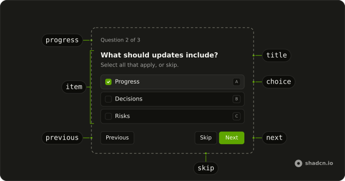
Questionnaire
├── QuestionnaireProgress
├── QuestionnaireItem
│   ├── QuestionnaireTitle
│   ├── QuestionnaireDescription
│   ├── QuestionnaireChoices
│   │   ├── QuestionnaireChoice
│   │   └── QuestionnaireInput
│   └── QuestionnaireError
└── QuestionnaireActions
    ├── QuestionnairePrevious
    ├── QuestionnaireSkip
    ├── QuestionnaireNext
    └── QuestionnaireSubmit
Usage
import type { FormEvent } from "react";
import {
  Questionnaire, QuestionnaireActions, QuestionnaireChoice,
  QuestionnaireChoices, QuestionnaireDescription, QuestionnaireError,
  QuestionnaireInput, QuestionnaireItem, QuestionnaireNext,
  QuestionnairePrevious, QuestionnaireProgress, QuestionnaireSkip,
  QuestionnaireSubmit, QuestionnaireTitle,
} from "@/components/ui/questionnaire";
const items = [
{ choices: [{ value: "delegation" }], name: "direction", required: true },
] as const;
function handleSubmit(event: FormEvent<HTMLFormElement>) {
event.preventDefault();
const answers = new FormData(event.currentTarget);
console.log(answers.get("direction"));
}<Questionnaire items={items} onSubmit={handleSubmit} className="max-w-full min-w-0">
<QuestionnaireProgress />
<QuestionnaireItem name="direction" required>
<QuestionnaireTitle>What should we prototype next?</QuestionnaireTitle>
<QuestionnaireDescription>Choose a direction.</QuestionnaireDescription>
<QuestionnaireChoices>
<QuestionnaireChoice value="delegation">Delegation</QuestionnaireChoice>
</QuestionnaireChoices>
<QuestionnaireError />
</QuestionnaireItem>
<QuestionnaireActions>
<QuestionnairePrevious />
<QuestionnaireSkip />
<QuestionnaireNext />
<QuestionnaireSubmit />
</QuestionnaireActions>
</Questionnaire>Demos
Multiple
multiple on the item turns the question into checkboxes, and the submit carries every checked value under one name. That fits a question like what to inspect, when more than one source is an honest answer. Leave the prop off when only one answer is valid, or people will tick a combination you cannot act on. Read the list back with getAll, since get returns only the first value.
Freeform
QuestionnaireInput sits in the choice list so someone can type an answer the options missed. Use it when the list is a suggestion, a strategy or a feature name, not a closed set. The typed text submits under the same name as a chosen option. If an empty custom answer is not a real answer, keep the item required.
Skip
QuestionnaireSkip stays available on an optional item and hides itself when the item is required. The constraints question can be passed, and onStatusChange reports skipped, which is not the same as never opening it. Use skip for a useful question that must not block the flow. Do not offer it on a question a later step will need.
Shortcuts
shortcuts accepts letters or numbers, and each choice grows a key. The select above the question switches that mode, including off. Letters suit an internal tool where people live on the keyboard. Leave them off for a survey that will mostly be tapped, and use Cmd or Ctrl with Enter to move forward.
Validation
required already holds Next until there is an answer, and QuestionnaireError can say so. This flow goes further: the two answers are checked together, and a public summary is rejected. item with onItemChange jumps back to the first bad question, and invalid marks it. Use that when one answer makes another illegal, not for a simple missing choice.
Controlled
item and onItemChange keep the current question name in state, and the line above the form only prints that name. Take control when something outside the questionnaire has to know where the person is, or when submit should send them back to a specific question. defaultItem is enough if you only choose where it opens.
Resume
defaultItem reopens on a later question, and defaultChecked plus defaultValue put the saved answers back. The reset button fires onReset, so a restored draft can be told apart from edits made just now. Use this when someone left a flow halfway and should not restart at the first question. Owning the current item the whole time is the controlled demo, not this one.
Conditional
The environment question stays disabled until Cloud is chosen, on the item and in the items list, so a local run never stops there. Use disabled when a follow-up only makes sense for one answer, and keep the choice in state so the list can change as they click. A question you always ask should stay enabled, even if you wish it were shorter.
Navigation State
onStatusChange reports the current item as unanswered, and Next plus Submit set disabled from that. The opacity class tied to unanswered status makes the blocked button look blocked, not merely silent. Use this when the action should look unavailable until a choice exists. required already refuses to advance, and this is the visible version of that rule.
Progress
QuestionnaireProgress can take a render function that receives the element props plus current and total. The bar here draws one segment per question and writes the count beside it. Use a custom render when the stock progress text is too quiet, or when that count has to live in a card action. The plain progress is enough on a short flow.
Animated
Each item opts into a short fade and a rise while data-active, and motion-reduce turns that off. A little motion helps when a hard swap between questions feels like a glitch, but a long travel on every Next becomes the thing people wait on. Put the classes on the item, not the root, because the root does not enter and leave.
Card
The questions live in a Card. The title passes render so it becomes a CardTitle, the description becomes a CardDescription, and progress sits in CardAction, with the buttons in the footer. Use a card when this flow is the page and should share a surface with the rest of the UI. A bare questionnaire is lighter when it already sits inside some other panel.
Dialog
The flow opens inside a Dialog from a button, and a successful submit closes it. The question title is the dialog title, so the modal keeps a name instead of an empty one. Use a dialog when the questions are a side task, such as a clarification, and the page should stay put. A card on the page fits better when the flow is why anyone opened it.
FAQ
When should I use a Questionnaire instead of a regular form?
Use a Questionnaire when people should answer one question at a time: onboarding, surveys, quizzes, or flows where the next question depends on the last answer. A regular form built with Field shows every field at once, which suits short forms and settings pages better.
How do I get the answers from a Questionnaire?
Questionnaire is a form, so handle onSubmit and read the answers with FormData, by each item's name. For an item with multiple, use formData.getAll(name), since get returns only the first answer; a skipped question submits no value at all.
How do I make a Questionnaire question required?
Set required on its QuestionnaireItem, and on the same item in items. Next and Submit then wait for an answer, QuestionnaireError says "Choose an answer to continue.", and QuestionnaireSkip hides itself on that question. The Validation demo above shows it.
How do I control which question the Ark UI Questionnaire shows?
Pass item, the current question's name, and onItemChange on Questionnaire, as in the Controlled demo. To only choose where it starts, pass defaultItem: the Resume demo uses it to reopen a saved questionnaire at the question people left off.
Does the Questionnaire support keyboard shortcuts?
Yes. Set shortcuts to letters or numbers, and each choice gets a key that picks it. Cmd or Ctrl with Enter moves to the next question, ArrowUp and ArrowDown move between answers, and ArrowLeft goes back, as the Shortcuts demo shows.
Is the Ark UI Questionnaire accessible?
Yes. Each question is a fieldset with its title as the legend, and only the active one can be reached, since the others are hidden and inert. QuestionnaireProgress is a progress bar that announces "Question 2 of 5", and errors are announced as alerts.
API Reference
Questionnaire
data-slot="questionnaire"
asChild?boolean
Use the provided child element as the default rendered element, combining their props and behavior.
className?string
Merged with the part's classes.
QuestionnaireActions
<div> data-slot="questionnaire-actions"
className?string
Merged with the part's classes.
QuestionnaireChoice
data-slot="questionnaire-choice"
asChild?boolean
Use the provided child element as the default rendered element, combining their props and behavior.
className?string
Merged with the part's classes.
QuestionnaireChoiceDescription
<span> data-slot="questionnaire-choice-description"
className?string
Merged with the part's classes.
QuestionnaireChoices
data-slot="questionnaire-choices"
asChild?boolean
Use the provided child element as the default rendered element, combining their props and behavior.
className?string
Merged with the part's classes.
QuestionnaireDescription
data-slot="questionnaire-description"
asChild?boolean
Use the provided child element as the default rendered element, combining their props and behavior.
className?string
Merged with the part's classes.
QuestionnaireError
data-slot="questionnaire-error"
asChild?boolean
Use the provided child element as the default rendered element, combining their props and behavior.
className?string
Merged with the part's classes.
QuestionnaireInput
<div> data-slot="questionnaire-input"
asChild?boolean
Use the provided child element as the default rendered element, combining their props and behavior.
className?string
Merged with the part's classes.
QuestionnaireItem
data-slot="questionnaire-item"
asChild?boolean
Use the provided child element as the default rendered element, combining their props and behavior.
className?string
Merged with the part's classes.
QuestionnaireNext
data-slot="questionnaire-next"
size?"icon-lg" | "icon-md" | "icon-sm" | "icon-xl" | "icon-xs" | "lg" | "md" | "sm" | "xl" | "xs"
The size.
- Type
"icon-lg" | "icon-md" | "icon-sm" | "icon-xl" | "icon-xs" | "lg" | "md" | "sm" | "xl" | "xs"- Default
"md"
variant?"default" | "destructive" | "ghost" | "link" | "outline" | "secondary"
The visual style.
- Type
"default" | "destructive" | "ghost" | "link" | "outline" | "secondary"- Default
"default"
asChild?boolean
Use the provided child element as the default rendered element, combining their props and behavior.
className?string
Merged with the part's classes.
data-size?string
Mirrors size.
data-variant?string
Mirrors variant.
QuestionnairePrevious
data-slot="questionnaire-previous"
size?"icon-lg" | "icon-md" | "icon-sm" | "icon-xl" | "icon-xs" | "lg" | "md" | "sm" | "xl" | "xs"
The size.
- Type
"icon-lg" | "icon-md" | "icon-sm" | "icon-xl" | "icon-xs" | "lg" | "md" | "sm" | "xl" | "xs"- Default
"md"
variant?"default" | "destructive" | "ghost" | "link" | "outline" | "secondary"
Ark default: default.
- Type
"default" | "destructive" | "ghost" | "link" | "outline" | "secondary"- Default
"outline"
asChild?boolean
Use the provided child element as the default rendered element, combining their props and behavior.
className?string
Merged with the part's classes.
data-size?string
Mirrors size.
data-variant?string
Mirrors variant.
QuestionnaireProgress
data-slot="questionnaire-progress"
asChild?boolean
Use the provided child element as the default rendered element, combining their props and behavior.
className?string
Merged with the part's classes.
QuestionnaireSkip
data-slot="questionnaire-skip"
size?"icon-lg" | "icon-md" | "icon-sm" | "icon-xl" | "icon-xs" | "lg" | "md" | "sm" | "xl" | "xs"
The size.
- Type
"icon-lg" | "icon-md" | "icon-sm" | "icon-xl" | "icon-xs" | "lg" | "md" | "sm" | "xl" | "xs"- Default
"md"
variant?"default" | "destructive" | "ghost" | "link" | "outline" | "secondary"
Ark default: default.
- Type
"default" | "destructive" | "ghost" | "link" | "outline" | "secondary"- Default
"outline"
asChild?boolean
Use the provided child element as the default rendered element, combining their props and behavior.
className?string
Merged with the part's classes.
data-size?string
Mirrors size.
data-variant?string
Mirrors variant.
QuestionnaireSubmit
data-slot="questionnaire-submit"
size?"icon-lg" | "icon-md" | "icon-sm" | "icon-xl" | "icon-xs" | "lg" | "md" | "sm" | "xl" | "xs"
The size.
- Type
"icon-lg" | "icon-md" | "icon-sm" | "icon-xl" | "icon-xs" | "lg" | "md" | "sm" | "xl" | "xs"- Default
"md"
variant?"default" | "destructive" | "ghost" | "link" | "outline" | "secondary"
The visual style.
- Type
"default" | "destructive" | "ghost" | "link" | "outline" | "secondary"- Default
"default"
asChild?boolean
Use the provided child element as the default rendered element, combining their props and behavior.
className?string
Merged with the part's classes.
data-size?string
Mirrors size.
data-variant?string
Mirrors variant.
QuestionnaireTitle
data-slot="questionnaire-title"
asChild?boolean
Use the provided child element as the default rendered element, combining their props and behavior.
className?string
Merged with the part's classes.