shadcn.io is not affiliated with official shadcn/ui
The box and its label sit on one line. The box alone is a small target, so the label has to toggle it too.
Use it when the choice waits for the form to be submitted. A Switch fits a setting that applies the moment it changes. In React, Ark UI tracks a mixed state when only some children are on.
Installation
Anatomy
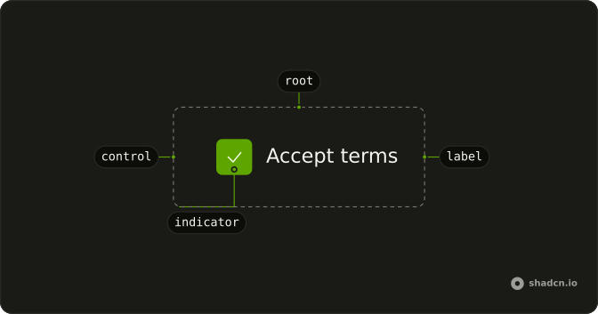
Checkbox
├── CheckboxLabel
├── checkboxVariants
└── CheckboxIndicator
Usage
import { Checkbox } from "@/components/ui/checkbox";
import { Field, FieldGroup, FieldLabel } from "@/components/ui/field";<FieldGroup className="w-fit whitespace-nowrap">
<Field orientation="horizontal">
<Checkbox name="terms" />
<FieldLabel>Accept terms</FieldLabel>
</Field>
</FieldGroup>Accessibility
- Space
- Toggle the checkbox.
Demos
Invalid
aria-invalid on the checkbox and data-invalid on the field turn on the error styling for a terms box that was left empty. The words of the error still have to live somewhere the person can read. Use the invalid state after submit, when acceptance was required and did not happen. A disabled box is not an error: it is a choice the person cannot make.
Basic
One checkbox, one label, a name for the form. That is the smallest useful version: the label is the hit target, and the name is how the value shows up on submit. Start here for a single agreement. Add a description only when the label's words are not enough to explain the consequence, and a group only when there are several related boxes.
Description
The terms box is already checked, and a second line under the label says you agree to the terms. FieldContent stacks the label and that description so the checkbox stays aligned to the first line, not the whole block. Use the extra line when the consequence is easy to miss, such as a billing change or a data share. Keep that line to the consequence, shorter than a paragraph.
Disabled
Notifications cannot be toggled. disabled is on the checkbox and data-disabled is on the field, so the label fades with the box and clicks do nothing. Use this for a preference the current plan or role does not allow, and say why nearby if it is not obvious. Hiding the row is the alternative when the choice should not even be visible.
Group
Hard disks and external disks start checked, servers does not, and the set is labeled Desktop. Each box has its own name, because these are independent choices, not a single value. Use a fieldset when several checkboxes answer one question. A Listbox is a better fit once the list is long enough that a stack of boxes becomes a chore.
Table
Each person row has a checkbox, the header checkbox selects or clears every row, and Sarah starts selected. Keep the selected ids in state, and mark the row when it is in that set, so the highlight and the box agree. Use this for bulk actions on a Table. For a handful of options that are not records, the grouped checkboxes are simpler.
Rtl
The group sets dir to rtl. The checkbox stays on the start side of the row, and the label قبول الشروط follows it, so the line reads correctly without swapping the markup. Direction belongs on the group when this block can sit inside a left-to-right page. Checking the box works the same either way.
FAQ
Should I use a Checkbox or a Switch?
Use a Checkbox for a choice that takes effect when the form is submitted, like accepting terms or picking filters. Use a Switch for a setting that applies the moment it changes, and a Radio Group when only one option can be picked.
How do I control a Checkbox's checked state in React?
Hold the checked state yourself and pass it back on every change.
Pass checked and update it in onCheckedChange, which receives { checked }. Use defaultChecked when you only need a starting value.
How do I show an indeterminate Checkbox?
Use the indeterminate state on a parent whose children are only partly checked, and compute it from the children yourself.
Set checked to "indeterminate".
How do I build a select-all Checkbox for a table?
Keep the selected row ids in a set. The header checkbox is checked when every row is selected, indeterminate when only some are, and toggles all of them when clicked. The Table demo shows the whole pattern.
How do I add a label to a Checkbox in Ark UI?
Put the Checkbox and a FieldLabel in a horizontal Field, so clicking the text toggles the box and gives a larger tap target on phones.
The field links the label to the checkbox for you.
Does the Checkbox submit with a native form?
Yes. Give it a name and it submits through a hidden input when checked, with value as the submitted value.
With React Hook Form, TanStack Form or Formisch, connect the field's value to the checked state and its change handler: the forms guide has a Checkbox demo for each.
How do I change the Checkbox size or colors?
Edit the checkbox file in your project's components/ui folder: the box, the check icon and their sizes are classes there. Its states come through as data attributes, listed in the API reference below, so you can style checked, disabled and invalid boxes with Tailwind variants.
API Reference
Checkbox
<label> data-slot="checkbox"
checked?boolean | "indeterminate"
The controlled checked state of the checkbox.
- Type
boolean | "indeterminate"
defaultChecked?boolean | "indeterminate"
The initial checked state of the checkbox when rendered. Use when you don't need to control the checked state of the checkbox.
- Type
boolean | "indeterminate"
onCheckedChange?(details: CheckedChangeDetails) → void
The callback invoked when the checked state changes.
- Type
(details: CheckedChangeDetails) → void- Parameters
details– { checked: CheckedState }- Returns
void
dir?"ltr" | "rtl"
The document's text/writing direction.
- Type
"ltr" | "rtl"- Default
"ltr"
disabled?boolean
Whether the checkbox is disabled.
form?string
The id of the form that the checkbox belongs to.
id?string
The unique identifier of the machine.
ids?object
The ids of the elements in the checkbox. Useful for composition.
- Type
{ root?: string; hiddenInput?: string; control?: string; label?: string }
invalid?boolean
Whether the checkbox is invalid.
name?string
The name of the input field in a checkbox. Useful for form submission.
readOnly?boolean
Whether the checkbox is read-only.
required?boolean
Whether the checkbox is required.
value?string
The value of checkbox input. Useful for form submission.
- Default
"on"
asChild?boolean
Use the provided child element as the default rendered element, combining their props and behavior.
className?string
Merged with the part's classes.
data-active?string
Present when active or pressed.
data-disabled?string
Present when disabled.
data-focus?string
Present when focused.
data-focus-visible?string
Present when focused with keyboard.
data-hover?string
Present when hovered.
data-invalid?string
Present when invalid.
data-readonly?string
Present when read-only.
data-required?string
Present when required.
data-state"indeterminate" | "checked" | "unchecked"
"indeterminate", "checked" or "unchecked".
- Type
"indeterminate" | "checked" | "unchecked"
CheckboxIndicator
<div> data-slot="checkbox-indicator"
indeterminate?boolean
Shows only while the checkbox is indeterminate, for the indeterminate icon.
asChild?boolean
Use the provided child element as the default rendered element, combining their props and behavior.
className?string
Merged with the part's classes.
data-active?string
Present when active or pressed.
data-disabled?string
Present when disabled.
data-focus?string
Present when focused.
data-focus-visible?string
Present when focused with keyboard.
data-hover?string
Present when hovered.
data-invalid?string
Present when invalid.
data-readonly?string
Present when read-only.
data-required?string
Present when required.
data-state"indeterminate" | "checked" | "unchecked"
"indeterminate", "checked" or "unchecked".
- Type
"indeterminate" | "checked" | "unchecked"
CheckboxGroup
<div> data-slot="checkbox-group"
value?string[]
The controlled value of the checkbox group.
defaultValue?string[]
The initial value of value when uncontrolled.
onValueChange?(value: string[]) → void
The callback to call when the value changes.
- Parameters
value– string[]- Returns
void
disabled?boolean
If true, the checkbox group is disabled.
invalid?boolean
If true, the checkbox group is invalid.
maxSelectedValues?number
The maximum number of selected values.
name?string
The name of the input fields in the checkbox group (Useful for form submission).
readOnly?boolean
If true, the checkbox group is read-only.
asChild?boolean
Use the provided child element as the default rendered element, combining their props and behavior.
className?string
Merged with the part's classes.
CheckboxGroupProvider
<div> data-slot="checkbox-group"
valueUseCheckboxGroupContext
The group provider's value.
asChild?boolean
Use the provided child element as the default rendered element, combining their props and behavior.
className?string
Merged with the part's classes.
CheckboxRootProvider
<label> data-slot="checkbox"
valueUseCheckboxReturn
What useCheckbox() returns: the state and API, made outside the component to control it.
asChild?boolean
Use the provided child element as the default rendered element, combining their props and behavior.
className?string
Merged with the part's classes.
useCheckbox
checked?boolean | "indeterminate"
The controlled checked state of the checkbox.
- Type
boolean | "indeterminate"
defaultChecked?boolean | "indeterminate"
The initial checked state of the checkbox when rendered. Use when you don't need to control the checked state of the checkbox.
- Type
boolean | "indeterminate"
onCheckedChange?(details: CheckedChangeDetails) → void
The callback invoked when the checked state changes.
- Type
(details: CheckedChangeDetails) → void- Parameters
details– { checked: CheckedState }- Returns
void
disabled?boolean
Whether the checkbox is disabled.
form?string
The id of the form that the checkbox belongs to.
id?string
The unique identifier of the machine.
ids?object
The ids of the elements in the checkbox. Useful for composition.
- Type
{ root?: string; hiddenInput?: string; control?: string; label?: string }
invalid?boolean
Whether the checkbox is invalid.
name?string
The name of the input field in a checkbox. Useful for form submission.
readOnly?boolean
Whether the checkbox is read-only.
required?boolean
Whether the checkbox is required.
value?string
The value of checkbox input. Useful for form submission.
- Default
"on"
CheckboxContext
checkedboolean
Whether the checkbox is checked.
checkedStateboolean | "indeterminate"
The checked state of the checkbox.
- Type
boolean | "indeterminate"
indeterminateboolean
Whether the checkbox is indeterminate.
setChecked(checked: CheckedState) → void
Function to set the checked state of the checkbox.
- Parameters
checked– CheckedState- Returns
void
toggleCheckedVoidFunction
Function to toggle the checked state of the checkbox.
disabled?boolean
Whether the checkbox is disabled.
focused?boolean
Whether the checkbox is focused.
With other components
Field
InputsLabel and helper text
Label
InputsClick the words
Table
DataSelect rows in bulk
Card
LayoutTerms on a card
Item
LayoutRow in a list
Button
ButtonsSubmit the selection
Related
Switch
SelectionInstant on or off
Radio Group
SelectionOnly one choice
Toggle
SelectionPressed in a toolbar
Dropdown Menu
MenusChecks in a menu
Listbox
SelectionMany rows, one widget
Tags Input
InputsChosen values as chips