shadcn.io is not affiliated with official shadcn/ui
One label stays selected in a short row, and nothing opens underneath.
Use it for a view switch or a filter when one option is enough. If each choice should reveal its own panel, use Tabs. In React, Ark UI slides the highlight to the selected item.
Installation
Anatomy
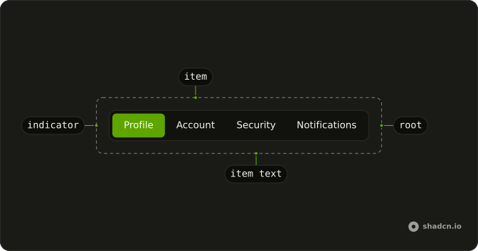
Usage
import {
  SegmentGroup, SegmentGroupItem, SegmentGroupItemText,
} from "@/components/ui/segment-group";
const SegmentGroupDemo = () => (
<SegmentGroup className="rounded-lg" defaultValue="Profile">
{items.map((item) => (
<SegmentGroupItem className="px-2 py-1.5 text-sm" key={item} value={item}>
<SegmentGroupItemText>{item}</SegmentGroupItemText>
</SegmentGroupItem>
))}
</SegmentGroup>
);
const items = ["Profile", "Account", "Security", "Notifications"];The selected SegmentGroupItem carries data-checked, the same attribute on every base and framework: style it with data-checked: (data-checked:font-medium) and the other items with not-data-checked:.
Demos
Controlled
The selected label is stored as a string, starting at Profile, and passed back as value so the highlight and the state cannot drift. Each item still has its own value, and only one of them is selected. Use control when another part of the page has to read the choice, such as a heading that names the current section. defaultValue is enough when the group is the only consumer.
Custom Indicator
The indicator is already inside the group. Tint the element whose data-slot is segment-group-indicator, here with a translucent primary, and leave Security disabled so the highlight has to skip it. Style that existing indicator rather than drawing a second pill behind the items. It still tracks the group's position variables when the selection changes.
Disabled
disabled on the group turns every item off, including the one that was selected. Nothing can be chosen, and the highlight stays where it was. Use it while a choice is shown but locked, for example until a form above it is valid. For a single option that should be unavailable, disable that item and leave the rest of the group alone.
Disabled Item
Security is disabled on its own item, and the other three still work. The current value stays on Profile, because a disabled item cannot become selected. Use a per-item lock for a plan that does not include that section, or a step the person has not reached. The disabled row stays visible so the missing choice is not a mystery.
Indicator On Hover
There is no hover prop. Point value at the item under the pointer, and commit that choice on click so it sticks after the pointer leaves. The highlight therefore previews a section before it is committed. Use the pattern for a view switch where seeing the target early helps, and skip it if a stray hover should never move the selection.
Orientation Horizontal
orientation set to horizontal is the default: the items sit in one row and the indicator moves sideways. Set it anyway when a parent might pass vertical, or when you want the direction obvious next to the column version. It suits a short list that fits the width of the page. If the labels wrap or the row gets cramped, a column is the calmer layout.
Orientation Vertical
orientation set to vertical stacks the items, and the indicator moves up and down with the selection. Each row stretches to the width of the group. Use a column when the control sits in a sidebar, or when the labels are too long for a single line. Arrow keys follow the orientation, so up and down change the selection instead of left and right.
Variant Underline
variant set to underline drops the filled pill. A horizontal group draws a bottom border, and the indicator becomes a short primary bar under the selected label. Use it when the row should feel like in-page navigation rather than a boxed control, and the choices still do not open panels. Leave variant unset for the default filled highlight.
Variant Underline Orientation Vertical
The same underline treatment in a column: orientation is vertical and variant is underline, so the border sits on the side and the indicator is a short bar beside the selected row. Use it for a settings menu that should look like a list of links but still only changes a value. The filled pill would be heavy in a tall stack of labels.
FAQ
How do I control the selected Segment Group value in React?
Keep the selected string in state and pass it back, or use defaultValue for the first item. Each SegmentGroupItem needs a value, and only one item is selected. The Controlled demo stores that string and writes it back.
Pass value, and onValueChange receives an object whose value is the next string.
How do I show a Segment Group vertically?
Set orientation to vertical on Segment Group. The items stack, and the indicator follows the selected row. The default orientation is horizontal, which keeps the items in a single row. The vertical demos show both the default indicator and the underline variant.
How do I underline a Segment Group with Ark UI?
Set variant to underline on Segment Group. A horizontal group draws a bottom border, and a vertical group draws a side border. The indicator becomes a short primary bar instead of a filled highlight. Leave variant unset for the default filled indicator.
How do I style the selected Segment Group item and its indicator?
The selected SegmentGroupItem carries data-checked on every base and framework, so data-checked: styles it and not-data-checked: the others. The indicator is already rendered inside the group. Do not add a second one. It is positioned with the CSS variables --left, --top, --width, and --height. Style the element whose data-slot is segment-group-indicator, as the Custom Indicator demo does, and the indicator moves when the selection changes.
How do I disable a Segment Group item?
Set disabled on Segment Group to disable every item, or on one SegmentGroupItem to disable that choice. The Disabled and Disabled Item demos show both. A disabled item cannot be selected, and the current value stays on an enabled item.
Should I use a Segment Group or Tabs?
Use a Segment Group for a short single choice with a sliding highlight, such as a view switcher. Use Tabs when each choice reveals its own panel. Use a Radio Group when the options need descriptions or belong in a form.
Can I use a Segment Group from the keyboard?
Yes, the items behave as radio buttons in one tab stop. The arrow keys move the selection to another item, and Tab leaves the group. A disabled item is not selected. The group only changes its value and does not open a panel.
How do I install Segment Group in React?
Run the command in the Installation section above. It adds Segment Group and its parts to your ui folder. Import from that folder when the command finishes, instead of copying the source by hand, and rerun the command later if you want the latest files. The command uses the shadcn CLI.
API Reference
SegmentGroup
<div> data-slot="segment-group"
variant?SegmentGroupVariant
The visual variant of the segment group.
- Default
"default"
asChild?boolean
Use the provided child element as the default rendered element, combining their props and behavior.
className?string
Merged with the part's classes.
data-variant?string
Mirrors variant.
SegmentGroupItem
<label> data-slot="segment-group-item"
valuestring
The item's value.
disabled?boolean
Whether the item is disabled.
invalid?boolean
Whether the item is invalid.
asChild?boolean
Use the provided child element as the default rendered element, combining their props and behavior.
className?string
Merged with the part's classes.
data-checked?string
Present when checked is set.
SegmentGroupItemText
<span> data-slot="segment-group-item-text"
asChild?boolean
Use the provided child element as the default rendered element, combining their props and behavior.
className?string
Merged with the part's classes.
SegmentGroupIndicator
<div> data-slot="segment-group-indicator"
asChild?boolean
Use the provided child element as the default rendered element, combining their props and behavior.
className?string
Merged with the part's classes.
--heightstring
The measured height, for animating open and closed.
--leftstring--topstring--widthstring
The measured width, for animating open and closed.
useSegmentGroup
variant?SegmentGroupVariant
The visual variant of the segment group.
- Default
"default"
asChild?boolean
Use the provided child element as the default rendered element, combining their props and behavior.
With other components
Field
InputsLabel the choice
Label
InputsName the group
Tooltip
OverlaysExplain one segment
Card
LayoutThe control in a panel
Separator
LayoutSpace two groups
Button
ButtonsAn action beside the choice
Related
Tabs
NavigationEach choice has a panel
Toggle Group
SelectionButtons that stay pressed
Radio Group
SelectionLabeled options in a form
Button Group
ButtonsActions, not a value
Select
SelectionThe choices stay closed
Navigation Menu
NavigationLinks, not a value