shadcn.io is not affiliated with official shadcn/ui
Pressed buttons for formatting or alignment, one at a time or several together.
Use it in a toolbar, where a form control would look out of place. When every option needs a visible label and the answer is required, use a Radio Group. In React, Ark UI makes the row a single tab stop, and the arrow keys move across the buttons.
Installation
Anatomy
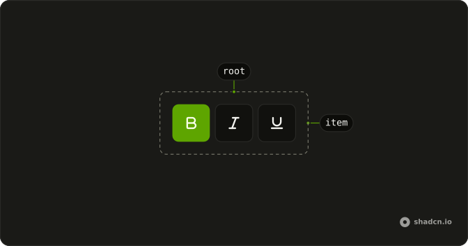
useToggleGroup
└── ToggleGroupItem
Usage
import { BoldIcon, ItalicIcon, UnderlineIcon } from "lucide-react";
import {
  ToggleGroup, ToggleGroupItem,
} from "@/components/ui/toggle-group";<ToggleGroup multiple variant="outline">
<ToggleGroupItem aria-label="Toggle bold" value="bold">
<BoldIcon aria-hidden="true" />
</ToggleGroupItem>
<ToggleGroupItem aria-label="Toggle italic" value="italic">
<ItalicIcon aria-hidden="true" />
</ToggleGroupItem>
<ToggleGroupItem aria-label="Toggle strikethrough" value="strikethrough">
<UnderlineIcon aria-hidden="true" />
</ToggleGroupItem>
</ToggleGroup>Accessibility
- Tab
- Moves focus to either the pressed item or the first item in the group.
- Space
- Activates/deactivates the item.
- Enter
- Activates/deactivates the item.
- Arrow Down
- Moves focus to the next item in the group.
- Arrow Right
- Moves focus to the next item in the group.
- Arrow Up
- Moves focus to the previous item in the group.
- Arrow Left
- Moves focus to the previous item in the group.
- Home
- Moves focus to the first item.
- End
- Moves focus to the last item.
Demos
Outline
variant set to outline draws a border around the items, here All and Missed as a small filter. One of them is pressed, starting with All. The outline reads as a single control more clearly than the default style, which has no border. Use it when the group sits on a busy surface and the buttons need an edge to hold them together.
Sizes
size is set on the group, and every item follows. The first row is sm, the second is the default md, both with the same Top, Bottom, Left, and Right labels so the difference is only height and type. Use the small size in a toolbar that is already crowded. Keep the default when the toggles are a primary control and need a comfortable target.
Spacing
spacing is the gap between items, in the same units as a Tailwind spacing step. Here it is 2, which is also the default, so the four position labels sit apart as separate buttons. Set it to 0 when they should join into one segmented control with shared borders. A wider gap helps when each item is a distinct tool rather than a slice of one choice.
Vertical
orientation set to vertical stacks the formatting buttons, with spacing of 1 and bold plus italic already pressed. More than one can stay on, which suits text styles that combine. Use a column for a narrow tool palette beside a canvas. Up and down move between the items, and the row no longer competes with the text for horizontal space.
Disabled
disabled on the group turns every button off, and none of them start pressed. Clicks and keyboard activation do nothing, and the icons fade. Use it when formatting is unavailable, such as a read-only document, rather than hiding the tools and shifting the layout. To retire one action only, disable that item and leave the rest of the group working.
Font Weight Selector
Four tiles preview Light, Normal, Medium, and Bold, and the caption names the class for the pressed weight. The group is controlled at size lg, with a gap so the tiles do not touch. Clicking the pressed tile would clear the choice, so the handler falls back to Normal and one weight always stays on. Use tiles when the option is easier to see than to read.
Rtl
dir is rtl, and the labels are Arabic for list, grid, and cards, with list pressed. The first item sits at the start of the line, which is the right side, and the outline border follows. Set the direction on the group when this control lives in a right-to-left page, even if the rest of the app is not. The pressed state does not need its own mirroring.
FAQ
How do I allow one or several selections in a Toggle Group in React?
A Toggle Group allows a single pressed item by default.
Add multiple to let several items be pressed together, as the default demo does.
How do I control the value of a Toggle Group?
Keep the selected values in state and pass them back to the group.
value is an array, even for one item; onValueChange receives details.value.
How do I keep at least one item pressed in a Toggle Group?
Keep a value when the last pressed item is clicked again; the Font Weight Selector demo falls back to Normal in its change handler.
Set deselectable to false.
How do I join or space the items of a Toggle Group?
Set spacing: 0 joins the items into one segmented control, and a number spaces them apart, as the Spacing demo does. variant="outline" and size apply to every item at once.
Is the Toggle Group accessible with the keyboard?
Yes. The group is one Tab stop; the arrow keys move between items, and Space or Enter presses the focused one. Set orientation="vertical" for a column, and the Up and Down keys move instead.
Should I use a Toggle Group or a Radio Group?
Use a Toggle Group for toolbar-style buttons, like text alignment or formatting. Use a Radio Group for a required choice in a form, with a visible label for each option.
API Reference
ToggleGroup
<div> data-slot="toggle-group"
value?string[]
The controlled selected value of the toggle group.
defaultValue?string[]
The initial selected value of the toggle group when rendered. Use when you don't need to control the selected value of the toggle group.
onValueChange?(details: ValueChangeDetails) → void
Function to call when the toggle is clicked.
- Type
(details: ValueChangeDetails) → void- Parameters
details– { value: string[] }- Returns
void
children(context: UseToggleGroupContext) → ReactNode
A function that gets context and returns what it renders.
- Type
(context: UseToggleGroupContext) → ReactNode- Parameters
context– { value: string[]; setValue: (value: string[]) → void; getItemState: (props: ItemProps) → ItemState; getRootProps: () → T["element"]; getItemProps: (props: ItemProps) → T["button"] }- Returns
ReactNode
deselectable?boolean
Whether the toggle group allows empty selection.
**Note:** This is ignored if multiple is true.
- Default
true
dir?"ltr" | "rtl"
The document's text/writing direction.
- Type
"ltr" | "rtl"- Default
"ltr"
disabled?boolean
Whether the toggle is disabled.
id?string
The unique identifier of the machine.
ids?object
The ids of the elements in the toggle. Useful for composition.
- Type
{ root?: string; item?: (value: string) → string }
loopFocus?boolean
Whether to loop focus inside the toggle group.
- Default
true
multiple?boolean
Whether to allow multiple toggles to be selected.
- Default
false
orientation?"horizontal" | "vertical"
The orientation of the toggle group.
- Type
"horizontal" | "vertical"- Default
"horizontal"
rovingFocus?boolean
Whether to use roving tab index to manage focus.
- Default
true
asChild?boolean
Use the provided child element as the default rendered element, combining their props and behavior.
className?string
Merged with the part's classes.
data-disabled?string
Present when disabled.
data-focus?string
Present when focus.
data-horizontal?stringdata-multiple?stringdata-orientation?string
The orientation of the toggle-group.
data-size?stringdata-spacing?string
Mirrors spacing.
data-variant?stringdata-vertical?stringToggleGroupItem
<button> data-slot="toggle-group-item"
valuestring
The item's value.
disabled?boolean
Whether the item is disabled.
asChild?boolean
Use the provided child element as the default rendered element, combining their props and behavior.
className?string
Merged with the part's classes.
data-disabled?string
Present when disabled.
data-focus?string
Present when focused is true.
data-orientationOrientation
The orientation of the item.
data-ownedbystring
Id of the root part.
data-pressed?string
Present when pressed.
data-state"on" | "off"
"on" or "off".
- Type
"on" | "off"
useToggleGroup
value?string[]
The controlled selected value of the toggle group.
defaultValue?string[]
The initial selected value of the toggle group when rendered. Use when you don't need to control the selected value of the toggle group.
onValueChange?(details: ValueChangeDetails) → void
Function to call when the toggle is clicked.
- Type
(details: ValueChangeDetails) → void- Parameters
details– { value: string[] }- Returns
void
deselectable?boolean
Whether the toggle group allows empty selection.
**Note:** This is ignored if multiple is true.
- Default
true
disabled?boolean
Whether the toggle is disabled.
id?string
The unique identifier of the machine.
ids?object
The ids of the elements in the toggle. Useful for composition.
- Type
{ root?: string; item?: (value: string) → string }
loopFocus?boolean
Whether to loop focus inside the toggle group.
- Default
true
multiple?boolean
Whether to allow multiple toggles to be selected.
orientation?"horizontal" | "vertical"
The orientation of the toggle group.
- Type
"horizontal" | "vertical"- Default
"horizontal"
rovingFocus?boolean
Whether to use roving tab index to manage focus.
- Default
true
With other components
Toggle
SelectionOne pressed button
Tooltip
OverlaysName an icon-only item
Separator
LayoutSplit toolbar clusters
Field
InputsLabel above the group
Kbd
TypographyShortcut in the tooltip
Textarea
InputsBar above the editor
Related
Radio Group
SelectionOne choice, form style
Switch
SelectionSettings on or off
Button Group
ButtonsActions, not pressed state
Tabs
NavigationSwitch whole views
Menubar
MenusApp-level formatting
Segment Group
SelectionA sliding selection