shadcn.io is not affiliated with official shadcn/ui
File, Edit, and View stay on screen while the document underneath changes.
Use it when those commands belong to the window, not to one action. Links that move around a marketing site belong in a Navigation Menu. In React, Ark UI keeps unavailable commands in the menu, disabled, so the row doesn't grow and shrink.
Installation
Anatomy
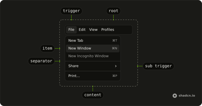
Menubar
├── MenubarMenu
│   ├── MenubarTrigger
│   └── MenubarContent
│       ├── MenubarGroup
│       │   ├── MenubarLabel
│       │   ├── MenubarItem
│       │   └── MenubarItem
│       ├── MenubarSeparator
│       ├── MenubarGroup
│       │   ├── MenubarCheckboxItem
│       │   └── MenubarCheckboxItem
│       ├── MenubarRadioGroup
│       │   ├── MenubarRadioItem
│       │   └── MenubarRadioItem
│       └── MenubarSub
│           ├── MenubarSubTrigger
│           └── MenubarSubContent
│               └── MenubarItem
└── MenubarMenu
    ├── MenubarTrigger
    └── MenubarContent
Usage
import {
  Menubar, MenubarContent, MenubarGroup, MenubarItem, MenubarMenu,
  MenubarSeparator, MenubarShortcut, MenubarTrigger,
} from "@/components/ui/menubar";<Menubar>
<MenubarMenu>
<MenubarTrigger>File</MenubarTrigger>
<MenubarContent>
<MenubarGroup>
<MenubarItem value="new-tab">
New Tab <MenubarShortcut>⌘T</MenubarShortcut>
</MenubarItem>
<MenubarItem value="new-window">New Window</MenubarItem>
</MenubarGroup>
<MenubarSeparator />
<MenubarGroup>
<MenubarItem value="share">Share</MenubarItem>
<MenubarItem value="print">Print</MenubarItem>
</MenubarGroup>
</MenubarContent>
</MenubarMenu>
</Menubar>Accessibility
- Enter
- Activate the focused control.
- Space
- Activate the focused control.
- Arrow Down
- Move down.
- Arrow Up
- Move up.
- Arrow Left
- Move left.
- Arrow Right
- Move right.
- Home
- Go to the start.
- End
- Go to the end.
Demos
Checkbox
View holds two checkbox items, bookmarks and full URLs, beside ordinary commands such as Reload. Format is only checkboxes: strikethrough, code, and superscript. Several can be on, and each keeps its checked state after the menu closes if you store it. Give plain items inset so their labels line up, and reserve checkboxes for settings rather than one-shot actions.
Radio
Profiles is a radio group, Andy, Benoit, or Luis, with Edit and Add Profile as plain items underneath. Theme is a second group: light, dark, or system, and only one item in a group stays selected. Keep commands that are not part of the choice outside the group, with inset so they line up, and use two menus so unrelated choices do not share a selection.
Submenu
File opens Share beside the item: email, messages, and notes, then Print under a separator. Edit nests Find the same way, between undo and the clipboard commands. A submenu is for a cluster that does not deserve its own top-level menu, and one extra level is usually enough. Do not put another menubar inside an item.
Icons
File leads New, Open, and Save with icons, and the shortcuts stay at the end of the row. More uses icons for Settings and Help, then a destructive Delete. The icon is decorative when the label is there, so hide it from assistive tech. Icons pay off on a menu people scan often, and the destructive variant still marks the dangerous row.
Rtl
The full bar, File through Profiles, is in Arabic. The wrapper and each menu set dir to rtl, so triggers run from the right and submenus open toward the start of the line. Checkboxes, radios, and shortcuts follow. Set the direction on the nested menus too, since a direction on the page alone can miss content that has been portaled out of the bar.
FAQ
How do I control a checkbox in a Menubar in React?
A checkbox row toggles a setting and stays in the menu, unlike a command that runs once, and each choice is its own MenubarCheckboxItem. Keep that choice in state if it should survive closing the menu. Pass checked and onCheckedChange, whose handler receives a boolean, and also pass value on the item.
How do I keep one Menubar radio item selected?
Put the choices in one MenubarRadioGroup so only one of them is selected, and leave unrelated commands, such as Edit, as MenubarItem elements beside the group. The group is the control, and the items only name the options. Pass value, and read the next string from onValueChange as details.value.
Can I operate a Menubar from the keyboard?
Yes. Arrow keys move between triggers and items, Home and End jump to the ends, and Enter or Space activates the focused control. MenubarShortcut only displays the hint you put inside it. It does not register a key listener, so those glyphs are not a shortcut system.
Should I use a Menubar or a Dropdown Menu?
Use a Menubar for a persistent row of commands, such as File and Edit. Use a Dropdown Menu for one button that opens a single menu, and a Navigation Menu for links that move around the site. A menubar item is a command unless you render it as a link yourself.
Why is my Menubar menu clipped or hidden?
Menu content is portaled, so overflow hidden on a parent does not clip it. If a dialog or another layer still covers the menu, raise the content in the menubar file under components/ui. The content is already stacked above ordinary page content. Inset lines up an item that has no icon with items that do.
How do I style a Menubar with Ark UI?
Edit the menubar file under components/ui. Triggers and items are flex rows, and MenubarItem accepts variant destructive for a dangerous command. inset on an item, label, or submenu trigger sets data-inset so the label lines up with checked rows. Shortcuts are pushed to the end of the row with a logical margin.
API Reference
Menubar
<div> data-slot="menubar"
className?string
Merged with the part's classes.
MenubarMenu
data-slot="menubar-menu"
MenubarTrigger
data-slot="menubar-trigger"
className?string
Merged with the part's classes.
MenubarContent
data-slot="menubar-content"
className?string
Merged with the part's classes.
MenubarGroup
data-slot="menubar-group"
MenubarPortal
data-slot="menubar-portal"
MenubarItem
data-slot="menubar-item"
inset?boolean
Indents it to line up with items that have an icon or indicator.
className?string
Merged with the part's classes.
data-inset?string
Mirrors inset.
data-variant?string
Mirrors variant.
MenubarCheckboxItem
data-slot="menubar-checkbox-item"
inset?boolean
Indents it to line up with items that have an icon or indicator.
className?string
Merged with the part's classes.
data-inset?string
Mirrors inset.
MenubarRadioGroup
data-slot="menubar-radio-group"
MenubarRadioItem
data-slot="menubar-radio-item"
inset?boolean
Indents it to line up with items that have an icon or indicator.
className?string
Merged with the part's classes.
data-inset?string
Mirrors inset.
MenubarLabel
data-slot="menubar-label"
inset?boolean
Indents it to line up with items that have an icon or indicator.
className?string
Merged with the part's classes.
data-inset?string
Mirrors inset.
MenubarSeparator
data-slot="menubar-separator"
className?string
Merged with the part's classes.
MenubarShortcut
data-slot="menubar-shortcut"
className?string
Merged with the part's classes.
MenubarSub
data-slot="menubar-sub"
MenubarSubTrigger
data-slot="menubar-sub-trigger"
inset?boolean
Indents it to line up with items that have an icon or indicator.
className?string
Merged with the part's classes.
data-inset?string
Mirrors inset.
MenubarSubContent
data-slot="menubar-sub-content"
className?string
Merged with the part's classes.
With other components
Dropdown Menu
MenusSame items, one trigger
Context Menu
MenusSame items, right-click
Button
ButtonsCompanion toolbar
Dialog
OverlaysPreferences from File
Kbd
TypographyShortcut next to the label
Separator
LayoutSplit groups in a menu
Related
Navigation Menu
NavigationSite nav, not commands
Command
OverlaysSearchable command palette
Sidebar
NavigationPersistent app chrome
Tabs
NavigationOpen documents under the bar
Sheet
OverlaysMobile stand-in
Bottom Navigation
NavigationThe same idea on a phone