shadcn.io is not affiliated with official shadcn/ui
The main sections of a phone app, fixed along the bottom of the screen.
Use it for the top-level sections of a small app, not every link in the product. On a wide layout, a Sidebar holds those destinations without pinning them to the screen. In React, Ark UI treats the items as tabs, so more than about five labels run together.
Installation
Anatomy
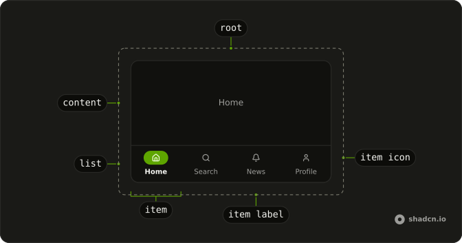
BottomNavigation
├── BottomNavigationList
├── BottomNavigationItem
├── BottomNavigationContent
└── BottomNavigationIndicator
Usage
import { BellIcon, HomeIcon, SearchIcon, UserIcon } from "lucide-react";
import {
  BottomNavigation, BottomNavigationContent, BottomNavigationItem,
  BottomNavigationItemIcon, BottomNavigationItemLabel,
  BottomNavigationList,
} from "@/components/ui/bottom-navigation";
const items = [
{ icon: HomeIcon, label: "Home", value: "home" },
{ icon: SearchIcon, label: "Search", value: "search" },
{ icon: BellIcon, label: "News", value: "news" },
{ icon: UserIcon, label: "Profile", value: "profile" },
];
const Example = () => (
<div className="relative flex h-80 w-full max-w-xs flex-col overflow-hidden rounded-xl border bg-background shadow-lg/5">
<BottomNavigation
className="flex h-full min-h-0 flex-col"
defaultValue="home"
>
{items.map((item) => (
<BottomNavigationContent
className="flex min-h-0 flex-1 items-center justify-center bg-muted"
key={item.value}
value={item.value}
>
<span className="text-muted-foreground text-sm">{item.label}</span>
</BottomNavigationContent>
))}
<BottomNavigationList className="static bg-background">
{items.map((item) => (
<BottomNavigationItem key={item.value} value={item.value}>
<BottomNavigationItemIcon>
<item.icon />
</BottomNavigationItemIcon>
<BottomNavigationItemLabel>{item.label}</BottomNavigationItemLabel>
</BottomNavigationItem>
))}
</BottomNavigationList>
</BottomNavigation>
</div>
);Accessibility
- Tab
- When focus moves onto the tabs, focuses the active trigger. When a trigger is focused, moves focus to the active content.
- Arrow Down
- Moves focus to the next trigger in vertical orientation and activates its associated content.
- Arrow Right
- Moves focus to the next trigger in horizontal orientation and activates its associated content.
- Arrow Up
- Moves focus to the previous trigger in vertical orientation and activates its associated content.
- Arrow Left
- Moves focus to the previous trigger in horizontal orientation and activates its associated content.
- Home
- Moves focus to the first trigger and activates its associated content.
- End
- Moves focus to the last trigger and activates its associated content.
- Enter
- In manual mode, when a trigger is focused, moves focus to its associated content.
- Space
- In manual mode, when a trigger is focused, moves focus to its associated content.
Demos
Controlled
Pass value and update it from the change callback when another part of the screen must read or set the active item. The line above the shell prints that value, starting at home. Use controlled state when the selection drives a route or a second panel, and defaultValue when the bar owns the selection. The content panes still match on that same value.
Disabled
disabled on a BottomNavigationItem removes that destination from the tab sequence. Profile is disabled here, while Home, Search, and News still switch their panes. Disable an item when the section exists but cannot be opened yet, such as a profile before sign-in, instead of hiding the slot and shifting the others. Avoid disabling the item that is already active, or the bar has no visible place to rest.
Icon Only
Drop the visible label when the bar is too narrow for four words, and set aria-label on each item to the section name. Home, Search, News, and Profile are then icons, and that name is all a screen reader hears. Prefer visible words whenever the row has room. The list is called Main unless you pass a different aria-label.
Root Provider
useBottomNavigation holds the tab state, and BottomNavigationRootProvider feeds it to the list and the panes. A button outside the shell calls setValue to open Profile, and a line prints the current value. Use the provider when a header, a deep link, or some other control must move the bar without living inside it. If tapping an item is the only way to switch, the root plus defaultValue is less machinery.
With Badge
A badge on the News bell shows an unread count, pinned to the icon's corner. It stays small and destructive so it reads as a count, not a second label. Put the number in the item's accessible name too, because the badge is easy to miss. Use one badge for unread work and leave the other items plain.
With Links
Each item is a link, so the bar can change the URL instead of only swapping panes. defaultValue still marks Home. Use links when each section is a real route, and plain items when a new URL would be a lie on a single screen. The content panes can stay for an in-place preview, and they are optional once the link navigates away.
FAQ
When should I use a Bottom Navigation bar?
Use it for the three to five top-level sections of a mobile-first app, such as Home, Search and Profile. On wider screens, a Sidebar or a Navigation Menu usually fits better, and for switching views inside one page, use Tabs.
How do I use Bottom Navigation items as links in React?
Render each BottomNavigationItem as your router's link with asChild, as the With Links demo does with a Next.js Link, and set the active item's value from the current route.
How do I control the active Bottom Navigation item?
Pass value and update it in onValueChange, which receives { value }, as in the Controlled demo.
defaultValue sets the item that starts active without controlling it.
Does the Bottom Navigation handle the iPhone home indicator?
Yes. The bar is fixed to the bottom of the viewport and adds the bottom safe-area inset as padding, so items stay clear of the home indicator. Add viewport-fit=cover to your viewport meta tag for the inset to apply, and leave room at the bottom of your page so content isn't hidden behind the bar.
How do I show a notification badge on a Bottom Navigation item?
Place a small Badge on the item, positioned over its icon, as the With Badge demo shows. Include the count in the item's accessible name, such as Inbox, 3 unread.
Is an icon-only Bottom Navigation accessible?
It can be: give every item an aria-label with its section name, as the Icon Only demo does, because icons alone aren't announced. The list itself is labeled Main by default; pass aria-label to name it differently.
API Reference
BottomNavigation
<div> data-slot="bottom-navigation"
value?string | null
The controlled selected tab value.
- Type
string | null
defaultValue?string | null
The initial selected tab value when rendered. Use when you don't need to control the selected tab value.
- Type
string | null
onValueChange?(details: ValueChangeDetails) → void
Callback to be called when the selected/active tab changes.
- Type
(details: ValueChangeDetails) → void- Parameters
details– { value: string }- Returns
void
activationMode?"manual" | "automatic"
The activation mode of the tabs. Can be manual or automatic
- manual: Tabs are activated when clicked or press enter key.
- automatic: Tabs are activated when receiving focus
- Type
"manual" | "automatic"- Default
"automatic"
composite?boolean
Whether the tab is composite.
deselectable?boolean
Whether the active tab can be deselected when clicking on it.
dir?"ltr" | "rtl"
The document's text/writing direction.
- Type
"ltr" | "rtl"- Default
"ltr"
hideMode?"display-none" | "activity"
How to hide content when mounted but not present.
- display-none: HTML hidden attribute. Effects stay alive.
- activity: React 19 <Activity mode="hidden">. Effects pause. Requires React 19+.
- Type
"display-none" | "activity"- Default
"display-none"
id?string
The unique identifier of the machine.
ids?object
The ids of the elements in the tabs. Useful for composition.
- Type
{ root?: string; trigger?: (value: string) → string; list?: string; content?: (value: string) → string; indicator?: string }
lazyMount?boolean
Whether to enable lazy mounting. Ark default: false.
- Default
true
loopFocus?boolean
Whether the keyboard navigation will loop from last tab to first, and vice versa.
- Default
true
navigate?((details: NavigateDetails) → void) | null
Function to navigate to the selected tab when clicking on it. Useful if tab triggers are anchor elements.
- Type
((details: NavigateDetails) → void) | null- Parameters
(details– { value: string; node: HTMLAnchorElement; href: string }- Returns
void) | null
onFocusChange?(details: FocusChangeDetails) → void
Callback to be called when the focused tab changes.
- Type
(details: FocusChangeDetails) → void- Parameters
details– { focusedValue: string }- Returns
void
orientation?"horizontal" | "vertical"
The orientation of the tabs. Can be horizontal or vertical
- horizontal: only left and right arrow key navigation will work.
- vertical: only up and down arrow key navigation will work.
- Type
"horizontal" | "vertical"- Default
"horizontal"
translations?object
Specifies the localized strings that identifies the accessibility elements and their states.
- Type
{ listLabel?: string }
unmountOnExit?boolean
Whether to unmount on exit. Ark default: false.
- Default
true
asChild?boolean
Use the provided child element as the default rendered element, combining their props and behavior.
className?string
Merged with the part's classes.
data-focus?string
Present when focused.
data-orientationstring
The orientation of the tabs.
BottomNavigationList
data-slot="bottom-navigation-list"
asChild?boolean
Use the provided child element as the default rendered element, combining their props and behavior.
className?string
Merged with the part's classes.
data-focus?string
Present when focused.
data-orientationstring
The orientation of the list.
BottomNavigationItem
data-slot="bottom-navigation-item"
asChild?boolean
Use the provided child element as the default rendered element, combining their props and behavior.
className?string
Merged with the part's classes.
data-disabled?string
Present when disabled.
data-focus?string
Present when focused.
data-orientationstring
The orientation of the trigger.
data-ownedbystring
Id of the list part.
data-selected?string
Present when selected.
data-ssr?string
Present when not rendered in the browser. Useful for ssr styling.
data-valuestring
The value of the item.
BottomNavigationContent
data-slot="bottom-navigation-content"
asChild?boolean
Use the provided child element as the default rendered element, combining their props and behavior.
className?string
Merged with the part's classes.
data-orientationstring
The orientation of the content.
data-ownedbystring
Id of the list part.
data-selected?string
Present when selected.
BottomNavigationItemIcon
<span> data-slot="bottom-navigation-item-icon"
asChild?boolean
Use the provided child element as the default rendered element, combining their props and behavior.
className?string
Merged with the part's classes.
data-focus?string
Present when focused is true.
data-orientationstring
Mirrors the orientation prop.
BottomNavigationItemLabel
<span> data-slot="bottom-navigation-item-label"
asChild?boolean
Use the provided child element as the default rendered element, combining their props and behavior.
className?string
Merged with the part's classes.
data-focus?string
Present when focused is true.
data-orientationstring
Mirrors the orientation prop.
BottomNavigationRootProvider
<div> data-slot="bottom-navigation"
valueUseTabsReturn
What useBottomNavigation() returns: the state and API, made outside the component to control it.
hideMode?"display-none" | "activity"
How to hide content when mounted but not present.
- display-none: HTML hidden attribute. Effects stay alive.
- activity: React 19 <Activity mode="hidden">. Effects pause. Requires React 19+.
- Type
"display-none" | "activity"- Default
"display-none"
lazyMount?boolean
Whether to enable lazy mounting. Ark default: false.
- Default
true
unmountOnExit?boolean
Whether to unmount on exit. Ark default: false.
- Default
true
asChild?boolean
Use the provided child element as the default rendered element, combining their props and behavior.
className?string
Merged with the part's classes.
data-focus?string
Present when focused is true.
data-orientationstring
Mirrors the orientation prop.
useBottomNavigation
BottomNavigationContext
With other components
Button
ButtonsOne destination
Badge
FeedbackA count on a tab
Avatar
MediaThe account tab
Tooltip
OverlaysName an icon tab
Sheet
OverlaysMore destinations
Dialog
OverlaysA tab that needs a decision
Related
Tabs
NavigationPanels, not routes
Navigation Menu
NavigationA bar across the top
Sidebar
NavigationThe same links on a wide screen
Breadcrumb
NavigationWhere they are
Pagination
NavigationMove through a list
Menubar
MenusCommands, not sections