shadcn.io is not affiliated with official shadcn/ui
One link covers the card, so the photo, the title, and the text all go to the same page.
Use it when the whole card is the destination and something inside must still work. If there is no second action, make the Card title an ordinary link and skip the overlay. In React, Ark UI stretches the link over the card, so a button has to sit above it.
Installation
Anatomy
Usage
import { Button } from "@/components/ui/button";
import {
  Card, CardFooter, CardHeader, CardMedia, CardTitle,
} from "@/components/ui/card";
import { LinkBox, LinkOverlay } from "@/components/ui/link-overlay";<LinkBox asChild>
<Card className="w-full max-w-xs">
<CardMedia className="h-32 bg-muted" variant="image" />
<CardHeader description="This sofa is perfect for modern tropical spaces, baroque inspired spaces.">
<LinkOverlay asChild>
<CardTitle asChild>
<a href="#">Living room Sofa</a>
</CardTitle>
</LinkOverlay>
</CardHeader>
<CardFooter className="flex-row-reverse gap-2">
<Button className="flex-1">Buy now</Button>
<Button className="flex-1" variant="outline">
Add to cart
</Button>
</CardFooter>
</Card>
</LinkBox>Accessibility
- Enter
- Activate the focused control.
- Space
- Activate the focused control.
Demos
Article
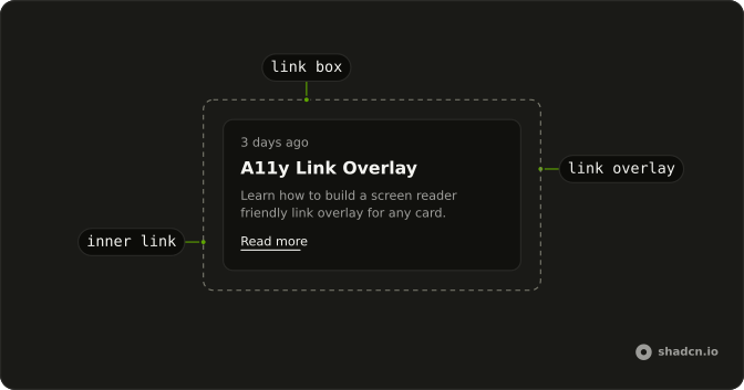
An article teaser: a timestamp, a title, a summary, and a separate Read more link. The title is the overlay, so a click on the summary still opens the piece. Read more has its own href, and the box lifts that link above the stretched layer. Use this for a feed card with one primary destination and one extra link.
With Link
The post title is an existing link, and the overlay merges onto it, so you do not add a second anchor. An inner link stays above the stretched layer and keeps its own destination. Use this when that anchor is already your router link and the overlay should only grow the hit area. The box still has to wrap the card, or the layer can cover the page.
FAQ
How do I make a whole card a Link Overlay in React?
Put LinkBox around the card and LinkOverlay on the link that should cover it. The box is positioned, and the overlay stretches a layer across that box, lifting other links above it. A button is not lifted, so position it above the layer if it must take the click. Use asChild with a single child when the box or overlay should be your card or link.
Is a Link Overlay reachable from the keyboard?
Yes, the overlay is a link, so Tab moves to it and Enter activates it. Inner links are lifted above that layer and stay in the tab order. A button stays in the tab order too, but it only receives the click if you raise it above the layer. Restyle the focus-visible ring in the component file under components/ui if the default is too strong.
Why does my Link Overlay cover more than the card?
The stretched layer is absolutely positioned against the nearest positioned ancestor. LinkBox supplies that ancestor. If you omit the box, the layer climbs to some other positioned element and can cover the page. Put LinkBox on the card, or merge it onto the card element, before you add the overlay.
What accessible name does a Link Overlay use?
The link's own text. Keep the visible title inside LinkOverlay so screen readers announce that title, not an empty hit area. If only the title should navigate, skip the overlay and use a normal link. Pair the overlay with Card when the whole card is the target, as the default demo does.
How do I style a Link Overlay with Ark UI?
Edit the link overlay file under components/ui. The box sets data-slot to link-box and the link sets data-slot to link-overlay. The focus ring uses the primary border and the ring token. Change those classes on this component rather than styling every anchor in the app.
API Reference
LinkOverlay
<a> data-slot="link-overlay"
asChild?boolean
Use the provided child element as the default rendered element, combining their props and behavior.
className?string
Merged with the part's classes.
LinkBox
<div> data-slot="link-box"
asChild?boolean
Use the provided child element as the default rendered element, combining their props and behavior.
className?string
Merged with the part's classes.
With other components
Card
LayoutThe whole card is the link
Item
LayoutA row that navigates
Badge
FeedbackA tag inside the link
Avatar
MediaA face inside the link
Button
ButtonsA second action that is not the link
Image Zoom
MediaA picture inside the card
Related
Navigation Menu
NavigationA list of links
Breadcrumb
NavigationA trail of links
Sidebar
NavigationA nav of whole-row links
Hover Card
OverlaysA preview of the destination
Frame
LayoutThe box the link covers
Announcement
FeedbackOne link across the page