shadcn.io is not affiliated with official shadcn/ui
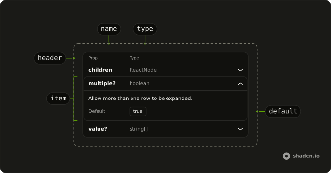
Each prop gets a row. The name and type stay visible, and the description opens with the row.
Use it for component props, not for records. For plain data, use a Table. In Solid, Ark UI expands each row, and the default and parameters stay inside it.
Installation
Anatomy
Usage
import { TypeTable, TypeTableItem } from "@/components/ui/type-table";<TypeTable defaultValue={["multiple"]}>
<TypeTableItem name="children" type="ReactNode">
TypeTableItem rows.
</TypeTableItem>
<TypeTableItem defaultValue="true" name="multiple" optional type="boolean">
Allow more than one row to be expanded.
</TypeTableItem>
<TypeTableItem name="value" optional type="string[]">
Controlled expanded item values.
</TypeTableItem>
<TypeTableItem name="defaultValue" optional type="string[]">
Uncontrolled expanded item values.
</TypeTableItem>
<TypeTableItem
name="onValueChange"
optional
parameters={[{ description: "{ value: string[] }", name: "details" }]}
returns="void"
type="(details: { value: string[] }) => void"
>
Called when expanded items change.
</TypeTableItem>
<TypeTableItem name="disabled" optional type="boolean">
Disable every row.
</TypeTableItem>
<TypeTableItem
defaultValue='"default"'
name="size"
optional
type='"default" | "compact"'
>
Row density.
</TypeTableItem>
<TypeTableItem name="className" optional type="string">
Class names on the root.
</TypeTableItem>
</TypeTable>Accessibility
- Enter
- Activate the focused control.
- Space
- Activate the focused control.
- Arrow Down
- Move to the next item when
orientationis"vertical". - Arrow Up
- Move to the previous item when
orientationis"vertical". - Arrow Right
- Move to the next item.
- Arrow Left
- Move to the previous item.
- Home
- Move to the first item.
- End
- Move to the last item.
Demos
Controlled
The open rows are stored outside the table, and the line under it prints their names, or none when everything is collapsed. The value row starts open. Hold that list when another control must open a specific prop, or when you want to remember which rows the reader had open. defaultValue is enough for a row that should start open and then be left alone.
Deprecated
The open prop is struck through and marked deprecated, with a note to use value or defaultValue instead. The other rows are current. Mark a prop this way when it still has to be documented because old code passes it, but new code should not. Removing the row is better once you are sure nobody needs the migration hint.
Disabled
The disabled row cannot be expanded. The prop is set on that item, and the description says the row cannot be opened. Use it for a prop you want listed but not explained inline, or for a row that is not meaningful in the current context. Disabling the whole table locks every row, which is rarely what a docs page wants.
Optional
id is required and has no optional mark, while label and disabled are optional and disabled shows a default of false. The label's description says it falls back to id. Mark optional on anything a caller can omit, and put the default in defaultValue when there is one. A required prop with no default should look different, or people will assume they can skip it.
Single
multiple is false, so opening one row closes whichever row was open before. The value, disabled, and className props are the sample. Use a single open row when the descriptions are long and two of them would push the next prop off the screen. Leave the default, which allows several open rows, when readers compare props.
Size Compact
size compact tightens the rows, so a long prop list takes less vertical space. The sample is value, disabled with a default of false, and an optional className. Use the compact size in a narrow sidebar or under a heading that already has a lot of content. The default size is easier to read when the table is the main thing on the page.
FAQ
What is the Type Table used for?
It documents the props of a component or the options of a function: one row per prop with its name and type, which expands to show its description, default and parameters. It is what this site's API Reference sections are built from.
How do I document a prop in the Type Table?
Add a TypeTableItem with its name and type, and write the description as its children. Set defaultValue for the default, and optional or deprecated to mark it, as the Optional and Deprecated demos do.
How do I show a function's parameters and return type?
Pass parameters, a list of each parameter's name and description, and returns with the return type to the TypeTableItem. The expanded row lists them under the description.
How do I control which Type Table rows are open?
Several rows can be open at once by default; set multiple to false to keep one open, as the Single demo does. Open rows by default with defaultValue, or control them with value and onValueChange, as the Controlled demo does.
How do I make the Type Table more compact?
Set size="compact" for tighter rows, as the Size Compact demo does. Rename the first column with nameColumn, for example to Attribute for a list of data attributes.
API Reference
TypeTable
data-slot="type-table"
value?string[]
The controlled value of the expanded accordion items.
defaultValue?string[]
The initial value of the expanded accordion items. Use when you don't need to control the value of the accordion.
onValueChange?(details: ValueChangeDetails) → void
The callback fired when the state of expanded/collapsed accordion items changes.
- Type
(details: ValueChangeDetails) → void- Parameters
details– { value: string[] }- Returns
void
collapsible?boolean
Whether an accordion item can be closed after it has been expanded. Ark default: false.
- Default
true
dir?"ltr" | "rtl"
The document's text/writing direction.
- Type
"ltr" | "rtl"- Default
"ltr"
disabled?boolean
Whether the accordion items are disabled.
hideMode?"display-none" | "activity"
How to hide content when mounted but not present.
- display-none: HTML hidden attribute. Effects stay alive.
- activity: React 19 <Activity mode="hidden">. Effects pause. Requires React 19+.
- Type
"display-none" | "activity"- Default
"display-none"
id?string
The unique identifier of the machine.
ids?object
The ids of the elements in the accordion. Useful for composition.
- Type
{ root?: string; item?: (value: string) → string; itemContent?: (value: string) → string; itemTrigger?: (value: string) → string }
lazyMount?boolean
Whether to enable lazy mounting.
- Default
false
multiple?boolean
Allow more than one row to be expanded.
- Default
true
nameColumn?string
Label for the first column.
- Default
"Prop"
onFocusChange?(details: FocusChangeDetails) → void
The callback fired when the focused accordion item changes.
- Type
(details: FocusChangeDetails) → void- Parameters
details– { value: string | null }- Returns
void
size?"default" | "compact"
Row density. Compact reduces trigger padding.
- Type
"default" | "compact"- Default
"default"
unmountOnExit?boolean
Whether to unmount on exit.
- Default
false
asChild?(props: ParentProps) => JSX.Element
Render your own element: a function that gets the part's props to spread on it.
- Type
(props: ParentProps) => JSX.Element
class?string
Merged with the part's classes.
data-size?string
Mirrors size.
TypeTableItem
<div> data-slot="type-table-name"
namestring
Name in the first column. Also the item value unless value is set.
typestring
Type in the second column.
children?JSX.Element
Description shown when the row is open.
defaultValue?string
Shown as Default in the open panel.
deprecated?boolean
Strike the name.
- Default
false
disabled?boolean
Whether the accordion item is disabled.
optional?boolean
Renders ? after the name.
- Default
false
parameters?TypeTableParameter[]
Parameter list when the type is a function.
returns?JSX.Element
Return type shown in the open panel.
typeDescription?JSX.Element
Full type signature in the open panel. Overrides the truncated column type.
typeDescriptionLink?string
Optional href for the type in the second column.
value?string
Unique accordion value. Defaults to name.
- Default
name
asChild?(props: ParentProps) => JSX.Element
Render your own element: a function that gets the part's props to spread on it.
- Type
(props: ParentProps) => JSX.Element
class?string
Merged with the part's classes.