shadcn.io is not affiliated with official shadcn/ui
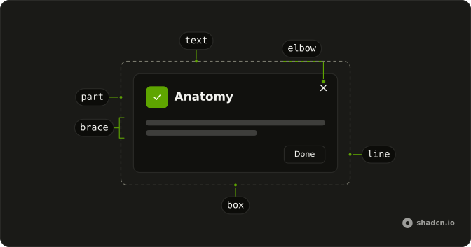
Draw each part of a component on a fixed canvas and label it.
Use it on a docs page when the structure is what you need to explain. Prop rows under the figure belong in a Type Table. In Solid, Ark UI takes its colors from the theme, so a dark page doesn't need a second image.
Installation
Anatomy
Usage
import {
  Anatomy, AnatomyCheck, AnatomyPart, AnatomyText,
} from "@/components/ui/anatomy";<Anatomy brand title="Checkbox anatomy">
<AnatomyPart
box
height={120}
name="root"
rx={16}
width={600}
x={300}
y={255}
>
<AnatomyPart
height={56}
name="control"
rx={10}
side="start"
tone="emphasis"
width={56}
x={32}
y={32}
>
<AnatomyCheck size={24} />
</AnatomyPart>
<AnatomyPart
height={120}
name="label"
side="bottom"
width={460}
x={104}
y={0}
>
<AnatomyText fontSize={40}>Checkbox Label</AnatomyText>
</AnatomyPart>
</AnatomyPart>
</Anatomy>Demos
Accordion
The accordion page uses this figure. The root is the card, a brace groups the open item with its trigger and content, and the closed section below calls the chevron out with an elbow. Drawing open and closed together shows the parts that only exist in one state. Nested parts are placed inside their parent, so moving the card moves both sections.
Action Bar
The action bar figure shows a count, then Edit, Export, and Archive under a brace, a separator on an elbow, Delete in the emphasis tone, and a close mark. Unlabeled parts are still drawn, so the bar looks like the component while only the interesting pieces are named. Use a brace for a region and an elbow when the part is too thin for a straight line.
Toc
The table of contents figure names the root, the title, the indicator, the current item, and a link. The current row is emphasized, the indicator is the short bar at the start, and the link callout uses an elbow on a quieter row. Unlabeled bars fill out the list so it looks like the real sidebar. Set label to false when a part is there for shape only.
FAQ
What is the Anatomy component for?
It draws labeled part diagrams for component documentation: each part is a box with its name and a callout line, on a 1200 by 630 canvas. The Accordion, Action Bar and Toc demos are the diagrams used on this site.
How do I position parts in an Anatomy diagram?
Give each AnatomyPart its x, y, width and height in canvas units. A part nested in another is placed relative to its parent, so you can move a whole group by moving the outer part. side puts the label on the top, bottom, start or end.
What callout styles does the Anatomy diagram support?
callout on AnatomyPart takes line, brace or elbow, and align moves the label along its side. Set label to false to draw a part without a label, box for an outlined container, and tone="emphasis" to highlight the part you're explaining.
Does the Anatomy diagram follow my theme and dark mode?
Yes. Its colors are built from your theme's tokens, such as --muted, --background and --border, so it follows light and dark mode with the rest of the page. Pass colors to use fixed colors of your own.
Does the Anatomy component support right-to-left layouts?
Yes. It reads the direction from the locale, and in right-to-left it mirrors each part's position, label side and corners, so start and end stay logical. Pass dir to override it for one diagram.
Is the Anatomy diagram accessible to screen readers?
The SVG is labeled by its title, Component anatomy by default, so give each diagram a specific one such as Checkbox anatomy. Part names are drawn as text, but describe the structure in the page's prose too, since a diagram isn't a substitute for it.
API Reference
Anatomy
brand?boolean | string
Draws the site's name in a corner (true), or this text.
- Type
boolean | string- Default
false
colors?object
The figure's colors: the stage's bg, the parts' surface, emphasis
and border, their text (fg, emphasisFg), the callouts' line and
label, and the boxes' outline. The theme's when unset.
- Type
{ bg: string; border?: string; emphasis: string; emphasisFg?: string; fg: string; label?: string; labelBg?: string; line: string; outline: string; surface: string }
dir?AnatomyDir
The reading direction: rtl mirrors every part's x and callout. The
locale's when unset.
share?boolean
Renders the share card's figure: a bare SVG with fixed colors and fonts, for images.
- Default
false
title?string
The figure's accessible title.
- Default
"Component anatomy"
class?string
Merged with the part's classes.
ANATOMY_HEIGHT
ANATOMY_WIDTH
AnatomyPart
align?AnatomyAlign
Where along its side the callout's label sits.
- Default
"center"
box?boolean
Draws a dashed box around the part; its children's callouts start at its edge.
- Default
false
callout?AnatomyCallout
How the label points at the part: a line, a brace along its edge, or an
elbow.
- Default
"line"
height?number
The part's height. The rest of its parent's below y when unset.
label?string | false
The callout's text: name when unset, none when false.
- Type
string | false
name?string
The part's name, its label when label is unset.
rx?number | AnatomyCorners
The corner radius, or one per corner (tl, tr, br, bl).
- Type
number | AnatomyCorners
side?AnatomySide
The side the callout's label sits on: top, bottom, start or end.
- Default
"top"
tone?AnatomyTone
Fills the part: surface, outlined like a card, or emphasis to pick it
out. Unfilled when unset.
width?number
The part's width. The rest of its parent's after x when unset.
x?number
The part's left edge, from its parent's (mirrored in rtl).
- Default
0
y?number
The part's top edge, from its parent's.
- Default
0
AnatomyText
align?"start" | "center" | "end"
Where the text sits in its part: from the start edge (after padX),
the center, or before the end edge.
- Type
"start" | "center" | "end"- Default
"start"
fontSize?number
The text's size, in the figure's units.
- Default
26
fontWeight?number
The text's weight.
- Default
500
muted?boolean
Draws it softer, for secondary copy: descriptions, placeholders.
- Default
false
padX?number
The space between the text and its part's edge.
- Default
24
AnatomyChevron
<path>
direction"down" | "up"
Which way it points: down or up.
- Type
"down" | "up"
align?"center" | "end"
Where it sits in its part: the center, or the end.
- Type
"center" | "end"- Default
"end"
size?number
The size.
- Default
18
AnatomyCheck
<path>
size?number
The size.
- Default
18
AnatomyX
<path>
size?number
The size.
- Default
16
AnatomyContext
With other components
Keyboard Table
DocsKeys beside the diagram
Type Table
DocsProps under the figure
Table of Contents
NavigationJump to a part
Prose
TypographyThe caption around it
Frame
LayoutA box for the figure
Card
LayoutThe figure on a surface