shadcn.io is not affiliated with official shadcn/ui
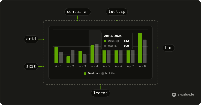
Give each series a name and a color. The tooltip and the legend reuse them, so you don't style every graph by hand.
Use it when the graph should use the same colors as the rest of the interface. A Table is the better view when people need the exact rows, not the shape of them. In React, Ark UI turns each config color into a variable the series can read, and the page still owns the data.
Installation
Anatomy
Usage
import { type MouseEvent, useMemo, useState } from "react";
import { Bar, BarChart, CartesianGrid, XAxis } from "recharts";
import {
  Card, CardContent, CardDescription, CardHeader, CardTitle,
} from "@/components/ui/card";
import {
  type ChartConfig, ChartContainer, ChartTooltip, ChartTooltipContent,
  type CustomTooltipProps,
} from "@/components/ui/chart";
export const description = "An interactive bar chart";
const chartData = [
{ date: "2024-04-01", desktop: 222, mobile: 150 },
{ date: "2024-04-02", desktop: 97, mobile: 180 },
{ date: "2024-04-03", desktop: 167, mobile: 120 },
{ date: "2024-04-04", desktop: 242, mobile: 260 },
{ date: "2024-04-05", desktop: 373, mobile: 290 },
{ date: "2024-04-06", desktop: 301, mobile: 340 },
{ date: "2024-04-07", desktop: 245, mobile: 180 },
{ date: "2024-04-08", desktop: 409, mobile: 320 },
{ date: "2024-04-09", desktop: 59, mobile: 110 },
{ date: "2024-04-10", desktop: 261, mobile: 190 },
{ date: "2024-04-11", desktop: 327, mobile: 350 },
{ date: "2024-04-12", desktop: 292, mobile: 210 },
{ date: "2024-04-13", desktop: 342, mobile: 380 },
{ date: "2024-04-14", desktop: 137, mobile: 220 },
{ date: "2024-04-15", desktop: 120, mobile: 170 },
{ date: "2024-04-16", desktop: 138, mobile: 190 },
{ date: "2024-04-17", desktop: 446, mobile: 360 },
{ date: "2024-04-18", desktop: 364, mobile: 410 },
{ date: "2024-04-19", desktop: 243, mobile: 180 },
{ date: "2024-04-20", desktop: 89, mobile: 150 },
{ date: "2024-04-21", desktop: 137, mobile: 200 },
{ date: "2024-04-22", desktop: 224, mobile: 170 },
{ date: "2024-04-23", desktop: 138, mobile: 230 },
{ date: "2024-04-24", desktop: 387, mobile: 290 },
{ date: "2024-04-25", desktop: 215, mobile: 250 },
{ date: "2024-04-26", desktop: 75, mobile: 130 },
{ date: "2024-04-27", desktop: 383, mobile: 420 },
{ date: "2024-04-28", desktop: 122, mobile: 180 },
{ date: "2024-04-29", desktop: 315, mobile: 240 },
{ date: "2024-04-30", desktop: 454, mobile: 380 },
];
const chartConfig = {
desktop: {
color: "var(--chart-2)",
label: "Desktop",
},
mobile: {
color: "var(--chart-1)",
label: "Mobile",
},
views: {
label: "Page Views",
},
} satisfies ChartConfig;
type ActiveChart = "desktop" | "mobile";
const formatTickLabel = (value: string) => {
const date = new Date(value);
return date.toLocaleDateString("en-US", {
day: "numeric",
month: "short",
});
};
const formatTooltipLabel = (value: unknown) =>
new Date(String(value)).toLocaleDateString("en-US", {
day: "numeric",
month: "short",
year: "numeric",
});
const renderTooltipContent = (props: CustomTooltipProps) => (
<ChartTooltipContent
{...props}
className="w-[150px]"
labelFormatter={formatTooltipLabel}
nameKey="views"
/>
);
const ChartDemo = () => {
const [activeChart, setActiveChart] = useState<ActiveChart>("desktop");
const total = useMemo(
() => ({
desktop: chartData.reduce((acc, curr) => acc + curr.desktop, 0),
mobile: chartData.reduce((acc, curr) => acc + curr.mobile, 0),
}),
[]
);
const handleActiveChartClick = (event: MouseEvent<HTMLButtonElement>) => {
const { chart } = event.currentTarget.dataset;
if (chart === "desktop" || chart === "mobile") {
setActiveChart(chart);
}
};
return (
<Card className="py-0 pb-4">
<CardHeader className="flex flex-col items-stretch border-b p-0! sm:flex-row">
<div className="flex flex-1 flex-col justify-center gap-1 px-6 pt-4 pb-3 sm:py-0!">
<CardTitle>Bar Chart - Interactive</CardTitle>
<CardDescription>
Showing total visitors for the last 3 months
</CardDescription>
</div>
<div className="flex">
{(["desktop", "mobile"] as const).map((chart) => (
<button
className="relative z-30 flex flex-1 flex-col justify-center gap-1 border-t px-6 py-4 text-left even:border-l data-[active=true]:bg-muted/50 sm:border-t-0 sm:border-l sm:px-8 sm:py-6"
data-active={activeChart === chart}
data-chart={chart}
key={chart}
onClick={handleActiveChartClick}
type="button"
>
<span className="text-muted-foreground text-xs">
{chartConfig[chart].label}
</span>
<span className="font-bold text-lg leading-none sm:text-3xl">
{total[chart].toLocaleString()}
</span>
</button>
))}
</div>
</CardHeader>
<CardContent className="px-2 sm:p-6">
<ChartContainer
className="aspect-auto h-[250px] w-full"
config={chartConfig}
>
<BarChart
accessibilityLayer
data={chartData}
margin={{
left: 12,
right: 12,
}}
>
<CartesianGrid vertical={false} />
<XAxis
axisLine={false}
dataKey="date"
minTickGap={32}
tickFormatter={formatTickLabel}
tickLine={false}
tickMargin={8}
/>
<ChartTooltip content={renderTooltipContent} />
<Bar dataKey={activeChart} fill={`var(--color-${activeChart})`} />
</BarChart>
</ChartContainer>
</CardContent>
</Card>
);
};
Demos
Example
Six months and two bar series, with no axis and no grid, is the smallest chart that still proves the wiring. ChartContainer takes config, and each bar fills from the color variable that config creates for that series. Add a grid or an axis once the bars are the right data. Leave accessibilityLayer on so the plotted points can be reached from the keyboard.
Grid
CartesianGrid with vertical lines turned off draws horizontal guides behind the same two series. Add them when the bar heights are close and a faint reference helps, not when the plot is already crowded. The lines do not label months. Those still live only in the data, so give the container a real height or the guides have nothing to cross.
Axis
XAxis makes the months readable. It reads the month key, shortens each tick to three letters, and drops the axis line and tick line so the type stays quiet, with tickMargin under the bars. Add the axis when the category is not obvious from a legend, and skip it on a sparkline beside a labeled number. The horizontal grid stays, because ticks without guides are harder to compare.
Example Tooltip
ChartTooltip with ChartTooltipContent shows the month and both series when a bar is hovered or focused. Render that content under ChartContainer, because it reads labels from config and cannot resolve them outside. Add a tooltip once two series share a category and the axis labels are short. The default marker is a dot, and this is the chart that is ready to put on a page.
Legend
ChartLegend with ChartLegendContent names Desktop and Mobile under the plot, using labels and colors from config. Add it when both series are visible and the colors are not obvious, and keep the tooltip, because a legend names the series while a tooltip names the point. Skip the legend if a header already says which series is active. It sits at the bottom by default, so leave the container tall enough.
Tooltip
These cards are the tooltip chrome, not a live chart: the label, the series name, the value, and the marker. One keeps the label with two rows and a dot, another hides the label for a dashed marker, and a single series tucks the label beside a line. Set indicator to dot, line, or dashed when the default card is too tall or should match a line chart.
Rtl
Arabic month names and series labels, with dir set to rtl on ChartContainer. The axis is reversed, so the first month starts on the right and the bars follow the reading order. The tooltip maps each key back to the full month, because the tick keeps only three characters. Set dir on the container itself, or the legend and tooltip can stay left to right while the page flips.
FAQ
How do I color a series in a Chart in React?
Give ChartContainer a config entry for each data key, with a label and a color. That color is written as --color- plus the key, and the series reads it, for example var(--color-desktop). Installation also defines --chart-1 through --chart-5, and those tokens swap in the dark theme. For a custom light and dark pair, set theme instead of one color.
How do I add a tooltip to a Chart?
Render ChartTooltip inside the Recharts chart and set its content to ChartTooltipContent, as the Tooltip demo does. Keep that content under ChartContainer. It reads the config from that context and throws outside it. indicator defaults to dot, or use line or dashed. hideLabel hides the title, and nameKey chooses which config entry names the row.
Why is my Chart the wrong size?
ChartContainer defaults to a 16:9 box. Set a height, or aspect-auto with a fixed height, through a class, as the usage does. The container also gives Recharts a size before it is measured, so the first paint is not an empty hole. The chart still needs a parent with a real width. A flex child without a width collapses it.
How do I make a Chart accessible?
Set accessibilityLayer on the Recharts chart, as the examples do, so the plotted points can be reached from the keyboard. Name every series with label in config. The tooltip and the legend reuse those labels, so color is not the only way to tell series apart. Do not put the only description of the data inside the graphic.
How do I show a legend on a Chart?
Add ChartLegend and set its content to ChartLegendContent, as the Legend demo does. Labels and icons come from config. hideIcon leaves the color swatch. nameKey picks which key to look up, and it defaults to the series data key. verticalAlign follows the Recharts legend and defaults to bottom. That adds space above the legend. top adds space below it.
Can I render a Chart from a server component?
The chart file is a client component. It holds context and Recharts measures the DOM. Import it into a server page. You do not mark that page as a client just to render a static chart. Add a client boundary in your file when the data or the active series lives in state, as the interactive usage does. It depends on recharts.
How do I install Chart in React?
Run the command in the Installation section above. It adds the chart parts to your ui folder, installs recharts, and defines --chart-1 through --chart-5 for light and dark. Pass those tokens, or any other color, through config. The container turns them into --color- variables for the series.
The command uses the shadcn CLI.
API Reference
ChartContainer
configChartConfig
Each series by its data key: its label, an icon, and a color (or a
theme color per light and dark), read by the tooltip and legend and set
as --color-<key>.
className?string
Merged with the part's classes.
ChartStyle
<style>
configChartConfig
The chart config whose colors it writes as --color-<key> variables.
idstring
The element's id.
ChartTooltip
ChartTooltipContent
<div>
color?string
The indicator's color, in place of each item's.
formatter?Formatter
Renders each item's row, given its value, name, item, index and the payload.
hideIndicator?boolean
Whether each item's color indicator is hidden.
- Default
false
hideLabel?boolean
Whether the label above the items is hidden.
- Default
false
indicator?"dashed" | "dot" | "line"
The indicator's shape: dot, line or dashed.
- Type
"dashed" | "dot" | "line"- Default
"dot"
labelClassName?string
Classes for the label.
labelFormatter?( label: TooltipContentProps<number, string>["label"], payload: TooltipContentProps<number, string>["payload"] ) → React.ReactNode
Renders the label, given it and the payload.
- Type
( label: TooltipContentProps<number, string>["label"], payload: TooltipContentProps<number, string>["payload"] ) → React.ReactNode- Parameters
label– TooltipContentProps<numberstring>["label"]payload– TooltipContentProps<numberstring>["payload"]- Returns
React.ReactNode
labelKey?string
The key in the chart config or the payload the label comes from.
nameKey?string
The key in the payload each item's name comes from.
className?string
Merged with the part's classes.
ChartLegend
className?string
Merged with the part's classes.
ChartLegendContent
<div>
hideIcon?boolean
Hides each series' icon (from config), leaving its color swatch.
- Default
false
nameKey?string
The key in each legend item's data to look its label up by in config.
Defaults to the item's dataKey.
payload?LegendPayload[]
The legend's items, passed by Recharts' Legend.
verticalAlign?LegendProps["verticalAlign"]
Where the legend sits, passed by Recharts' Legend: top pads it below,
bottom above.
- Default
"bottom"
className?string
Merged with the part's classes.