shadcn.io is not affiliated with official shadcn/ui
A small window over the page. You can drag the header, resize from the edges, and minimize it without blocking the page.
Use it when a tool should stay beside the work. A task that has to finish before anything else is a Dialog. In Solid, Ark UI portals the window and remembers its position and size.
Installation
Anatomy
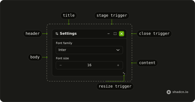
FloatingPanelTrigger
FloatingPanelContent
└── FloatingPanelContent
FloatingPanelHeader
FloatingPanelBody
FloatingPanelTitle
FloatingPanelResizeTrigger
FloatingPanelDragTrigger
FloatingPanelStageTrigger
FloatingPanelCloseTrigger
FloatingPanelControl
Usage
import { createListCollection } from "@ark-ui/solid/collection";
import { Settings2Icon, XIcon } from "lucide-solid";
import { Button } from "@/components/ui/button";
import { Field, FieldLabel } from "@/components/ui/field";
import {
  FloatingPanel, FloatingPanelBody, FloatingPanelCloseTrigger,
  FloatingPanelContent, FloatingPanelControl, FloatingPanelFooter,
  FloatingPanelHeader, FloatingPanelMaximize, FloatingPanelMinimize,
  FloatingPanelRestore, FloatingPanelTitle, FloatingPanelTrigger,
} from "@/components/ui/floating-panel";
import {
  NumberInput, NumberInputDecrement, NumberInputGroup,
  NumberInputIncrement, NumberInputInput,
} from "@/components/ui/number-input";
import {
  Select, SelectContent, SelectItem, SelectTrigger, SelectValue,
} from "@/components/ui/select";
const FloatingPanelDemo = () => (
<FloatingPanel defaultSize={{ width: 360, height: 300 }}>
<FloatingPanelTrigger
asChild={(props) => (
<Button {...props()} variant="outline">Open</Button>
)}
/>
<FloatingPanelContent>
<FloatingPanelHeader>
<Settings2Icon />
<FloatingPanelTitle>Settings</FloatingPanelTitle>
<FloatingPanelControl>
<FloatingPanelMinimize />
<FloatingPanelMaximize />
<FloatingPanelRestore />
<FloatingPanelCloseTrigger
asChild={(props) => (
<Button {...props()} aria-label="Close" size="icon-xs">
<XIcon aria-hidden />
</Button>
)}
/>
</FloatingPanelControl>
</FloatingPanelHeader>
<FloatingPanelBody>
<Field>
<FieldLabel>Font family</FieldLabel>
<Select collection={collection} defaultValue={["Inter"]}>
<SelectTrigger class="w-full">
<SelectValue />
</SelectTrigger>
<SelectContent>
{collection.items.map((item) => (
<SelectItem item={item} key={item}>
{item}
</SelectItem>
))}
</SelectContent>
</Select>
</Field>
<Field>
<FieldLabel>Font size</FieldLabel>
<NumberInput class="w-full" defaultValue="16">
<NumberInputGroup>
<NumberInputDecrement />
<NumberInputInput />
<NumberInputIncrement />
</NumberInputGroup>
</NumberInput>
</Field>
</FloatingPanelBody>
<FloatingPanelFooter>
<Button variant="outline">Save</Button>
</FloatingPanelFooter>
</FloatingPanelContent>
</FloatingPanel>
);
const collection = createListCollection({
items: ["Inter", "Roboto", "Helvetica", "Geist"],
});
Accessibility
- Enter
- Activate the focused control.
- Space
- Activate the focused control.
- Arrow Left
- Move left.
- Arrow Right
- Move right.
- Arrow Up
- Move up.
- Arrow Down
- Move down.
- Home
- Go to the start.
- End
- Go to the end.
Demos
Controlled Position
position is in state, and the arrow buttons nudge it by 20 on each axis. Dragging the header writes the same state, so the readout and the window agree. Control position when something outside moves the panel, or when you show the coordinates. Omit position when the panel should track a drag itself, and expect a blank readout until the first move.
Controlled Size
size starts at a width of 360 and a height of 200. Shrink and Grow change it, and dragging an edge writes back through the size callback. Control size when a button must set the rect, not only the pointer. defaultSize is enough when you only care about the opening box, and nothing here sets minSize or maxSize, so the buttons can push it quite small.
Custom Spacing
The --space variable on FloatingPanelContent is the padding shared by the header, the body, and the footer. This one tightens it on a narrow screen and loosens it from the small breakpoint up. Change the variable once, because padding each part yourself fights that layout. It does not move the window or change its size.
FAQ
How do I control a Floating Panel's position in Solid?
Keep the position in state and pass it back so a drag and your own buttons stay in sync. Omit it when the panel should track position itself, and use defaultPosition only for the starting point. Set persistRect to keep that rect after the panel closes.
onPositionChange receives details.position, with x and y, and you pass that object as position.
How do I control the size of a Floating Panel?
Pass width and height on size when state should own the rect, and write the next size back from the resize callback. Use defaultSize when you only need a start, as in Usage, which starts at a width of 360 and a height of 300. minSize and maxSize clamp the drag.
onSizeChange receives details.size, with width and height.
How do I open a Floating Panel from state in Solid?
Pass the boolean back as open when a parent should show or hide the panel. Leave open unset for an uncontrolled panel, and use defaultOpen for the first state only. Closed content unmounts, so set lazyMount and unmountOnExit to false when form fields must stay mounted.
onOpenChange receives details.open.
How do I minimize or maximize a Floating Panel?
Use FloatingPanelMinimize, FloatingPanelMaximize, and FloatingPanelRestore in the header. They switch the stage among minimized, maximized, and default, and the restore icon follows the current stage. The content exposes data-minimized and data-maximized for styling. Dragging uses the header, which is the drag handle, unless you set draggable to false.
Does Escape close a Floating Panel?
No, Escape leaves a Floating Panel open unless you set closeOnEscape. The Accessibility section lists the keys that do apply: arrows move the panel, and Home and End jump. The panel is portaled and uses z-50, so overflow on a parent does not clip it. Set resizable to false on FloatingPanelContent to drop the edge handles.
How do I change the spacing inside a Floating Panel?
Padding comes from the --space variable on the content. Header, body, and footer all read it, so change --space on FloatingPanelContent once, as the Custom Spacing demo does, instead of padding each part. The positioner places the window with --x, --y, --width, and --height.
How do I install Floating Panel in Solid?
Run the command in the Installation section above. It adds Floating Panel to your ui folder, including the trigger, content, header, body, footer, and the stage and close controls. Install from that section rather than pasting a partial tree, so the parts and their dependencies stay together. The command uses the shadcn CLI.
API Reference
FloatingPanel
data-slot="floating-panel"
open?boolean
The controlled open state of the panel.
defaultOpen?boolean
The initial open state of the panel when rendered. Use when you don't need to control the open state of the panel.
- Default
false
onOpenChange?(details: OpenChangeDetails) → void
Function called when the panel is opened or closed.
- Type
(details: OpenChangeDetails) → void- Parameters
details– { open: boolean }- Returns
void
position?object
The controlled position of the panel.
- Type
{ x: number; y: number }
defaultPosition?object
The initial position of the panel when rendered. Use when you don't need to control the position of the panel.
- Type
{ x: number; y: number }
onPositionChange?(details: PositionChangeDetails) → void
Function called when the position of the panel changes via dragging.
- Type
(details: PositionChangeDetails) → void- Parameters
details– { position: Point }- Returns
void
size?object
The size of the panel.
- Type
{ width: number; height: number }
defaultSize?object
The default size of the panel.
- Type
{ width: number; height: number }
onSizeChange?(details: SizeChangeDetails) → void
Function called when the size of the panel changes via resizing.
- Type
(details: SizeChangeDetails) → void- Parameters
details– { size: Size }- Returns
void
allowOverflow?boolean
Whether the panel should be strictly contained within the boundary when dragging. Ark default: true.
- Default
!inPreview
closeOnEscape?boolean
Whether the panel should close when the escape key is pressed.
dir?"ltr" | "rtl"
The document's text/writing direction.
- Type
"ltr" | "rtl"- Default
"ltr"
disabled?boolean
Whether the panel is disabled.
draggable?boolean
Whether the panel is draggable.
- Default
true
finalFocusEl?() → HTMLElement | null
Element to receive focus when the panel is closed. By default, the trigger element is focused.
- Type
() → HTMLElement | null- Returns
HTMLElement | null
getAnchorPosition?(details: AnchorPositionDetails) → Point
Function that returns the initial position of the panel when it is opened. If provided, will be used instead of the default position.
- Type
(details: AnchorPositionDetails) → Point- Parameters
details– { triggerRect: DOMRect | null; boundaryRect: DOMRect | null }- Returns
Point
getBoundaryEl?() → HTMLElement | null
The boundary of the panel. Useful for recalculating the boundary rect when the it is resized.
- Type
() → HTMLElement | null- Returns
HTMLElement | null
gridSize?number
The snap grid for the panel.
- Default
1
hideMode?"display-none" | "activity"
How to hide content when mounted but not present.
- display-none: HTML hidden attribute. Effects stay alive.
- activity: React 19 <Activity mode="hidden">. Effects pause. Requires React 19+.
- Type
"display-none" | "activity"- Default
"display-none"
id?string
The unique identifier of the machine.
ids?object
The ids of the elements in the floating panel. Useful for composition.
- Type
{ trigger?: string; positioner?: string; content?: string; title?: string; header?: string }
initialFocusEl?() → HTMLElement | null | false
Element to receive focus when the panel is opened. Defaults to the panel content.
Return false to skip moving focus, or null to use the default.
- Type
() → HTMLElement | null | false- Returns
HTMLElement | null | false
lazyMount?boolean
Whether to enable lazy mounting. Ark default: false.
- Default
true
lockAspectRatio?boolean
Whether the panel is locked to its aspect ratio.
maxSize?object
The maximum size of the panel.
- Type
{ width: number; height: number }
minSize?object
The minimum size of the panel.
- Type
{ width: number; height: number }
onPositionChangeEnd?(details: PositionChangeDetails) → void
Function called when the position of the panel changes via dragging ends.
- Type
(details: PositionChangeDetails) → void- Parameters
details– { position: Point }- Returns
void
onSizeChangeEnd?(details: SizeChangeDetails) → void
Function called when the size of the panel changes via resizing ends.
- Type
(details: SizeChangeDetails) → void- Parameters
details– { size: Size }- Returns
void
onStageChange?(details: StageChangeDetails) → void
Function called when the stage of the panel changes.
- Type
(details: StageChangeDetails) → void- Parameters
details– { stage: Stage }- Returns
void
persistRect?boolean
Whether the panel size and position should be preserved when it is closed.
resizable?boolean
Whether the panel is resizable.
- Default
true
restoreFocus?boolean
Whether to restore focus to the trigger when the panel is closed.
- Default
true
skipAnimationOnMount?boolean
Whether to allow the initial presence animation.
- Default
false
strategy?"absolute" | "fixed"
The strategy to use for positioning.
- Type
"absolute" | "fixed"- Default
"fixed"
translations?object
The translations for the floating panel.
- Type
{ minimize?: string; maximize?: string; restore?: string }
unmountOnExit?boolean
Whether to unmount on exit. Ark default: false.
- Default
true
asChild?(props: ParentProps) => JSX.Element
Render your own element: a function that gets the part's props to spread on it.
- Type
(props: ParentProps) => JSX.Element
FloatingPanelTrigger
<button> data-slot="floating-panel-trigger"
asChild?(props: ParentProps) => JSX.Element
Render your own element: a function that gets the part's props to spread on it.
- Type
(props: ParentProps) => JSX.Element
data-dragging?string
Present when in the dragging state.
data-state"open" | "closed"
"open" or "closed".
- Type
"open" | "closed"
FloatingPanelPositioner
<div> data-slot="floating-panel-positioner"
asChild?(props: ParentProps) => JSX.Element
Render your own element: a function that gets the part's props to spread on it.
- Type
(props: ParentProps) => JSX.Element
--heightstring
The height of the element.
--widthstring
The width of the element.
--xstring
The x position for transform.
--ystring
The y position for transform.
--z-indexstring
The z-index value.
FloatingPanelContent
<div> data-slot="floating-panel-content"
resizable?boolean
Enable resizable panel.
- Default
true
asChild?(props: ParentProps) => JSX.Element
Render your own element: a function that gets the part's props to spread on it.
- Type
(props: ParentProps) => JSX.Element
class?string
Merged with the part's classes.
data-behind?string
Present when not topmost.
data-dragging?string
Present when in the dragging state.
data-maximized?string
Present when maximized.
data-minimized?string
Present when minimized.
data-staged?string
Present when not in default stage.
data-state"open" | "closed"
"open" or "closed".
- Type
"open" | "closed"
data-topmost?string
Present when topmost.
--heightstring
The measured height, for animating open and closed.
--widthstring
The measured width, for animating open and closed.
--xstring
The horizontal position.
--ystring
The vertical position.
FloatingPanelHeader
<div>
asChild?(props: ParentProps) => JSX.Element
Render your own element: a function that gets the part's props to spread on it.
- Type
(props: ParentProps) => JSX.Element
class?string
Merged with the part's classes.
data-behind?string
Present when not topmost.
data-dragging?string
Present when in the dragging state.
data-maximized?string
Present when maximized.
data-minimized?string
Present when minimized.
data-staged?string
Present when not in default stage.
data-topmost?string
Present when topmost.
--spacestringFloatingPanelBody
<div> data-slot="floating-panel-body"
scrollFade?boolean
Add a fade effect to the scroll area.
- Default
false
asChild?(props: ParentProps) => JSX.Element
Render your own element: a function that gets the part's props to spread on it.
- Type
(props: ParentProps) => JSX.Element
class?string
Merged with the part's classes.
data-dragging?string
Present when in the dragging state.
data-maximized?string
Present when maximized.
data-minimized?string
Present when minimized.
data-staged?string
Present when not in default stage.
--spacestringFloatingPanelTitle
<h2> data-slot="floating-panel-title"
asChild?(props: ParentProps) => JSX.Element
Render your own element: a function that gets the part's props to spread on it.
- Type
(props: ParentProps) => JSX.Element
class?string
Merged with the part's classes.
FloatingPanelResizeTrigger
<div> data-slot="floating-panel-resize-trigger"
axis"s" | "w" | "e" | "n" | "sw" | "nw" | "se" | "ne"
The axis of the resize handle.
- Type
"s" | "w" | "e" | "n" | "sw" | "nw" | "se" | "ne"
asChild?(props: ParentProps) => JSX.Element
Render your own element: a function that gets the part's props to spread on it.
- Type
(props: ParentProps) => JSX.Element
data-axisstring
Mirrors the axis prop.
data-disabled?string
Present when disabled.
data-placement?string
The placement of the resizetrigger.
FloatingPanelDragTrigger
<div> data-slot="floating-panel-drag-trigger"
asChild?(props: ParentProps) => JSX.Element
Render your own element: a function that gets the part's props to spread on it.
- Type
(props: ParentProps) => JSX.Element
data-disabled?string
Present when disabled.
FloatingPanelStageTrigger
<button> data-slot="floating-panel-stage-trigger"
stage"minimized" | "maximized" | "default"
The stage of the panel.
- Type
"minimized" | "maximized" | "default"
asChild?(props: ParentProps) => JSX.Element
Render your own element: a function that gets the part's props to spread on it.
- Type
(props: ParentProps) => JSX.Element
data-stagestring
The stage of the stagetrigger.
FloatingPanelCloseTrigger
<button> data-slot="floating-panel-close-trigger"
asChild?(props: ParentProps) => JSX.Element
Render your own element: a function that gets the part's props to spread on it.
- Type
(props: ParentProps) => JSX.Element
FloatingPanelControl
<div>
asChild?(props: ParentProps) => JSX.Element
Render your own element: a function that gets the part's props to spread on it.
- Type
(props: ParentProps) => JSX.Element
class?string
Merged with the part's classes.
data-disabled?string
Present when disabled.
data-maximized?string
Present when maximized.
data-minimized?string
Present when minimized.
data-stagestring
The stage of the control.
data-staged?string
Present when not in default stage.
FloatingPanelMinimize
<button>
stage"minimized" | "maximized" | "default"
The stage of the panel.
- Type
"minimized" | "maximized" | "default"- Default
minimized
asChild?(props: ParentProps) => JSX.Element
Render your own element: a function that gets the part's props to spread on it.
- Type
(props: ParentProps) => JSX.Element
data-stagestring
The stage of the stagetrigger.
FloatingPanelMaximize
<button>
stage"minimized" | "maximized" | "default"
The stage of the panel.
- Type
"minimized" | "maximized" | "default"- Default
maximized
asChild?(props: ParentProps) => JSX.Element
Render your own element: a function that gets the part's props to spread on it.
- Type
(props: ParentProps) => JSX.Element
data-stagestring
The stage of the stagetrigger.
FloatingPanelRestore
<button>
clickEffect?boolean
Apply a click effect to the button.
- Default
true
isLoading?boolean
Show a loading indicator.
- Default
false
asChild?(props: ParentProps) => JSX.Element
Render your own element: a function that gets the part's props to spread on it.
- Type
(props: ParentProps) => JSX.Element
class?string
Merged with the part's classes.
data-stagestring
The stage of the stagetrigger.
FloatingPanelFooter
<div> data-slot="floating-panel-footer"
asChild?(props: ParentProps) => JSX.Element
Render your own element: a function that gets the part's props to spread on it.
- Type
(props: ParentProps) => JSX.Element
class?string
Merged with the part's classes.
--spacestringuseFloatingPanel
open?boolean
The controlled open state of the panel.
defaultOpen?boolean
The initial open state of the panel when rendered. Use when you don't need to control the open state of the panel.
- Default
false
onOpenChange?(details: OpenChangeDetails) → void
Function called when the panel is opened or closed.
- Type
(details: OpenChangeDetails) → void- Parameters
details– { open: boolean }- Returns
void
position?object
The controlled position of the panel.
- Type
{ x: number; y: number }
defaultPosition?object
The initial position of the panel when rendered. Use when you don't need to control the position of the panel.
- Type
{ x: number; y: number }
onPositionChange?(details: PositionChangeDetails) → void
Function called when the position of the panel changes via dragging.
- Type
(details: PositionChangeDetails) → void- Parameters
details– { position: Point }- Returns
void
size?object
The size of the panel.
- Type
{ width: number; height: number }
defaultSize?object
The default size of the panel.
- Type
{ width: number; height: number }
onSizeChange?(details: SizeChangeDetails) → void
Function called when the size of the panel changes via resizing.
- Type
(details: SizeChangeDetails) → void- Parameters
details– { size: Size }- Returns
void
allowOverflow?boolean
Whether the panel should be strictly contained within the boundary when dragging.
- Default
true
closeOnEscape?boolean
Whether the panel should close when the escape key is pressed.
dir?"ltr" | "rtl"
The document's text/writing direction.
- Type
"ltr" | "rtl"- Default
"ltr"
disabled?boolean
Whether the panel is disabled.
draggable?boolean
Whether the panel is draggable.
- Default
true
finalFocusEl?() → HTMLElement | null
Element to receive focus when the panel is closed. By default, the trigger element is focused.
- Type
() → HTMLElement | null- Returns
HTMLElement | null
getAnchorPosition?(details: AnchorPositionDetails) → Point
Function that returns the initial position of the panel when it is opened. If provided, will be used instead of the default position.
- Type
(details: AnchorPositionDetails) → Point- Parameters
details– { triggerRect: DOMRect | null; boundaryRect: DOMRect | null }- Returns
Point
getBoundaryEl?() → HTMLElement | null
The boundary of the panel. Useful for recalculating the boundary rect when the it is resized.
- Type
() → HTMLElement | null- Returns
HTMLElement | null
gridSize?number
The snap grid for the panel.
- Default
1
id?string
The unique identifier of the machine.
ids?object
The ids of the elements in the floating panel. Useful for composition.
- Type
{ trigger?: string; positioner?: string; content?: string; title?: string; header?: string }
initialFocusEl?() → HTMLElement | null | false
Element to receive focus when the panel is opened. Defaults to the panel content.
Return false to skip moving focus, or null to use the default.
- Type
() → HTMLElement | null | false- Returns
HTMLElement | null | false
lockAspectRatio?boolean
Whether the panel is locked to its aspect ratio.
maxSize?object
The maximum size of the panel.
- Type
{ width: number; height: number }
minSize?object
The minimum size of the panel.
- Type
{ width: number; height: number }
onPositionChangeEnd?(details: PositionChangeDetails) → void
Function called when the position of the panel changes via dragging ends.
- Type
(details: PositionChangeDetails) → void- Parameters
details– { position: Point }- Returns
void
onSizeChangeEnd?(details: SizeChangeDetails) → void
Function called when the size of the panel changes via resizing ends.
- Type
(details: SizeChangeDetails) → void- Parameters
details– { size: Size }- Returns
void
onStageChange?(details: StageChangeDetails) → void
Function called when the stage of the panel changes.
- Type
(details: StageChangeDetails) → void- Parameters
details– { stage: Stage }- Returns
void
persistRect?boolean
Whether the panel size and position should be preserved when it is closed.
resizable?boolean
Whether the panel is resizable.
- Default
true
restoreFocus?boolean
Whether to restore focus to the trigger when the panel is closed.
- Default
true
strategy?"absolute" | "fixed"
The strategy to use for positioning.
- Type
"absolute" | "fixed"- Default
"fixed"
translations?object
The translations for the floating panel.
- Type
{ minimize?: string; maximize?: string; restore?: string }