shadcn.io is not affiliated with official shadcn/ui
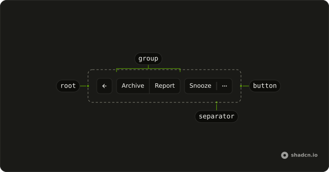
Several actions under one shared border, in a row or a stack. Pressing one does not leave it selected.
Use it for actions that belong together, like Archive and Snooze on a toolbar. If one option should stay selected, use a Toggle Group. In Solid, Ark UI shares the border between them, and each one is still a button.
Installation
Anatomy
Usage
import {
  ArchiveIcon, ArrowLeftIcon, CalendarPlusIcon, ClockIcon,
  ListFilterIcon, MailCheckIcon, MoreHorizontalIcon, TagIcon,
  Trash2Icon,
} from "lucide-solid";
import { createSignal } from "react";
import { Button } from "@/components/ui/button";
import { ButtonGroup } from "@/components/ui/button-group";
import {
  Menu, MenuContent, MenuGroup, MenuItem, MenuRadioGroup, MenuRadioItem,
  MenuSeparator, MenuSub, MenuSubContent, MenuSubTrigger, MenuTrigger,
} from "@/components/ui/menu";
const ButtonGroupDemo = () => {
const [label, setLabel] = createSignal("personal");
const handleLabelChange = (details: { value: string }) => {
setLabel(details.value);
};
return (
<ButtonGroup>
<ButtonGroup class="hidden sm:flex">
<Button aria-label="Go Back" size="icon-md" variant="outline">
<ArrowLeftIcon aria-hidden="true" />
</Button>
</ButtonGroup>
<ButtonGroup>
<Button variant="outline">Archive</Button>
<Button variant="outline">Report</Button>
</ButtonGroup>
<ButtonGroup>
<Button variant="outline">Snooze</Button>
<Menu>
<MenuTrigger
asChild={(props) => (
<Button {...props()} aria-label="More Options" size="icon-md" variant="outline">
<MoreHorizontalIcon aria-hidden="true" />
</Button>
)}
/>
<MenuContent class="w-40">
<MenuGroup>
<MenuItem value="mark-as-read">
<MailCheckIcon aria-hidden="true" />
Mark as Read
</MenuItem>
<MenuItem value="archive">
<ArchiveIcon aria-hidden="true" />
Archive
</MenuItem>
</MenuGroup>
<MenuSeparator />
<MenuGroup>
<MenuItem value="snooze">
<ClockIcon aria-hidden="true" />
Snooze
</MenuItem>
<MenuItem value="add-to-calendar">
<CalendarPlusIcon aria-hidden="true" />
Add to Calendar
</MenuItem>
<MenuItem value="add-to-list">
<ListFilterIcon aria-hidden="true" />
Add to List
</MenuItem>
<MenuSub>
<MenuSubTrigger>
<TagIcon aria-hidden="true" />
Label As...
</MenuSubTrigger>
<MenuSubContent>
<MenuRadioGroup
onValueChange={handleLabelChange}
value={label}
>
<MenuRadioItem value="personal">Personal</MenuRadioItem>
<MenuRadioItem value="work">Work</MenuRadioItem>
<MenuRadioItem value="other">Other</MenuRadioItem>
</MenuRadioGroup>
</MenuSubContent>
</MenuSub>
</MenuGroup>
<MenuSeparator />
<MenuGroup>
<MenuItem value="trash" variant="destructive">
<Trash2Icon aria-hidden="true" />
Trash
</MenuItem>
</MenuGroup>
</MenuContent>
</Menu>
</ButtonGroup>
</ButtonGroup>
);
};
Accessibility
- Enter
- Activate the focused control.
- Space
- Activate the focused control.
- Arrow Down
- Move down.
- Arrow Up
- Move up.
- Arrow Left
- Move left.
- Arrow Right
- Move right.
- Home
- Go to the start.
- End
- Go to the end.
Demos
Orientation
Plus and minus stacked, not side by side, with orientation set to vertical and an accessible name of Media controls. Use a vertical group for a tight pair of icon actions, like zoom, where a horizontal row would waste the width. Name the group, because the icons have no visible text. The default orientation is the horizontal toolbar.
Size
Three rows: small, the default height, and large, each ending in a plus icon at the matching icon size. Size is not a prop of the group. Set size on every button, including icon-sm, icon-md, or icon-lg for the icon-only one. Mix heights in one group and the shared border looks broken.
Nested
A plus button in one group and a message field in another, wrapped by an outer group so there is a gap between them. Nest when you want separate clusters rather than one continuous border. The inner field is an input group with a voice icon and a tooltip. Use a single group when every control should share the same edge.
Separator
Copy and Paste, divided by ButtonGroupSeparator, on small secondary buttons. The separator is a line inside the shared border, not a gap. Use it when two actions are related but should not look like one button. For space between unrelated clusters, nest groups instead of adding a divider.
Split
A secondary button, a separator, then a plus icon button. The labeled action is the main one, and the compact control beside it is a different action, here add. The separator keeps the two hit areas distinct. Give the icon an accessible name when you copy this, because a plus alone is not a label.
Input
A text field and a search icon button in one group. The input grows into the leftover space, and the button keeps its own width. Use this for search or submit glued to the field. The icon button is named with aria-label Search, which you should keep, because the magnifying glass is not text.
Input Group
A pill-shaped composer: a plus button in its own cluster, then a message field with a voice control at the end. Turning voice on disables the text field and switches the placeholder to a recording prompt. The voice button lives in an Input Group, with a tooltip, and the outer group only joins that field to the plus.
Dropdown
Follow is the main button. The chevron beside it opens a menu of mute, mark as read, report, block, share, copy, and a destructive delete. Use a split like this when one action is common and the rest are occasional. The menu trigger is another button in the group, so it picks up the shared border.
Select
A currency Select, an amount field, and a send icon, joined so they read as one money control. The select shows the symbol, dollars by default, and the list also offers euro and pound. The amount is a text input limited to digits. Nest the select with the input, and keep send in a neighboring group, when the submit should sit slightly apart.
Popover
Copilot is the labeled button. The chevron opens a Popover with a task description and a note that a pull request will be opened. Use this when the extra action needs a small form, not a list of menu items. The popover anchors to the end of the group, and the text area is where the task is described.
Rtl
The same toolbar as the first preview, with archive, report, snooze, and the more menu, dir set to rtl, and Arabic labels. The back arrow rotates so it still points along the reading direction. Labeling a thread stays in a submenu. Use this to check that the joined borders and the menu still open on the correct side.
FAQ
How do I stack a Button Group vertically in Solid?
Set orientation to vertical on Button Group. The default is horizontal. The root sets data-orientation to match, and shared borders square the corners that touch. Size is not a group prop. Set size on each Button, as the Size demo does. For a vertical group of icon buttons, name the group with aria-label, as the Orientation demo does.
How do I divide buttons inside a Button Group?
Put ButtonGroupSeparator between the buttons. Its orientation defaults to vertical, which is the divider for a horizontal row. Use a horizontal separator only if the group itself is vertical. Nest one Button Group inside another when you want space between clusters instead of one shared border, as the Nested demo does.
Does a Button Group move focus with the arrow keys?
No. It is a group of separate controls, not one composite widget. Tab moves from button to button, and Enter or Space activates the focused button. The group does not handle Arrow keys, Home, or End. A menu opened from the group uses the keys in the Accessibility section. For a choice that stays selected, use Toggle Group.
How do I put an input or a menu in a Button Group?
Place the Input, Select, or menu trigger inside the group, as the Input, Select, and Dropdown demos do. An input in the group grows into the leftover space. Give an icon-only button its own aria-label. The group does not name its children. ButtonGroupText is the static label, for a prefix that is not a button.
When should I use a Button Group instead of a Toggle Group?
Use Button Group for related actions that do not share a value, such as archive and snooze side by side. Use Toggle Group when one or more options stay pressed. Button Group does not track a value or a pressed state. Pair it with a menu when one of the actions needs a longer list, as the Dropdown demo does.
How do I restyle a Button Group?
Edit components/ui/button-group. The root has role group, sets data-orientation, and raises the focused child so the focus ring is not covered by the shared border. Pass a class for a one-off width. Do not remove the shared-border treatment if the controls should still read as one group. Separators stay on ButtonGroupSeparator.
How do I install Button Group in Solid?
Run the command in the Installation section above. It adds Button Group, ButtonGroupText, and ButtonGroupSeparator to your ui folder. Buttons, inputs, and menus are separate installs. Add those from their own pages when a demo uses them.
The command uses the shadcn CLI.
API Reference
ButtonGroup
<div> data-slot="button-group"
orientation?"horizontal" | "vertical"
Lays the buttons out in a row (horizontal) or a column (vertical),
their touching corners squared and borders shared.
- Type
"horizontal" | "vertical"- Default
"horizontal"
asChild?(props: ParentProps) => JSX.Element
Render your own element: a function that gets the part's props to spread on it.
- Type
(props: ParentProps) => JSX.Element
class?string
Merged with the part's classes.
data-orientation?string
Mirrors orientation.
ButtonGroupText
<div> data-slot="button-group-text"
asChild?(props: ParentProps) => JSX.Element
Render your own element: a function that gets the part's props to spread on it.
- Type
(props: ParentProps) => JSX.Element
class?string
Merged with the part's classes.
ButtonGroupSeparator
data-slot="button-group-separator"
orientation?"horizontal" | "vertical"
The orientation of the separator. Ark default: horizontal.
- Type
"horizontal" | "vertical"- Default
"vertical"
asChild?(props: ParentProps) => JSX.Element
Render your own element: a function that gets the part's props to spread on it.
- Type
(props: ParentProps) => JSX.Element
class?string
Merged with the part's classes.
With other components
Button
ButtonsThe actions you fuse
Dropdown Menu
MenusChevron for extra actions
Input
InputsSearch plus submit
Select
SelectionCurrency next to amount
Popover
OverlaysForm beside the action
Input Group
InputsAddons inside the field
Related
Toggle Group
SelectionPressed state instead
Toggle
SelectionOne on or off
Separator
LayoutLine between sections
Tooltip
OverlaysName an icon button
Pagination
NavigationPrevious and next
Segment Group
SelectionOne choice stays selected