shadcn.io is not affiliated with official shadcn/ui
Kaleidoscope Shader draws a radial bloom with no hard edges: blue spiral arms wind outward through a hot-pink disc, a white-hot core flares and fades, and crimson rings pulse out toward black corners. Three wave fields, each turning its own way, interfere under a six-armed spiral and a falloff that breathes every three seconds; a WGSL fragment shader on WebGPU computes every pixel each frame, and the colors are overdriven on purpose, so the center clips to white.
Use it behind a music or event page, a "now playing" card, or a launch that wants a vivid glow at the center. Despite the name it has no mirror segments: for true mirrored symmetry, use Truchet Kaleidoscope Shader, or the Kaleidoscope background for jewel-toned glass in plain CSS, with no GPU. It runs only while it's on screen, holds a still frame with reduced motion, and shows a radial gradient of the same colors in browsers without WebGPU.
Installation
Usage
import {
  KaleidoscopeShader,
} from "@/components/ui/kaleidoscope-shader";<KaleidoscopeShader className="flex min-h-[32rem] items-center justify-center">
<div className="rounded-full bg-black/60 px-8 py-4">
<h1 className="text-5xl font-semibold text-white">Ship faster</h1>
</div>
</KaleidoscopeShader>Kaleidoscope Shader is a container: your content sits on top of the bloom, in normal flow. It fills its own box, so give it a height or content. For a backdrop behind the whole page, render it empty with className="fixed inset-0 -z-10". The core turns white, so white text needs a dark glass pill, like the bg-black/60 one above, or a place off-center, toward the black corners.
Demos
Ember
primaryColor sets the spiral arms and the glow, and accentColor the rings that pulse outward; where they meet, they mix. Here orange arms in a crimson halo turn it into a sun. Both are overdriven, so any color blows out toward white at the core: deep, saturated colors with one strong channel, like these and the default blue, keep their hue best, and pale ones wash out. glow sets how wide the white core is.
In a card
The bloom scales with its box. glow={0.5} shrinks the white core so the swirl shows at card size, speed={0.6} calms it, and quality={0.5} renders at half resolution: it's all soft glow, so you can't tell, and the GPU does a quarter of the work.
Performance
About 0.1 ms of GPU time a frame at 1280×720 on an M2 Max laptop: a dozen sines and cosines per pixel, with no loops. Slower GPUs take several times longer, and quality={0.5} renders a quarter of the pixels with no visible change. The animation stops when the shader scrolls out of view, and the browser pauses it in a hidden tab. Every shader on a page shares one GPU device and one frame loop, and vgpu (about 50 KB gzipped) loads only when the first one mounts.
Browser support
The shader needs WebGPU: Chrome and Edge, Safari 26 and later, and Firefox on Windows and macOS. Elsewhere, and until the first frame, the box shows a radial gradient of the same colors, so the layout never jumps. data-state on the root reads unsupported there, if you want to style around it. See Shader Canvas.
Accessibility
The bloom is decoration: it's hidden from assistive tech and lets every click through to your content. With reduced motion it draws one still frame, a cyan pinwheel inside the pink disc, and stops. Nothing flashes: the glow breathes by a tenth over three seconds, and the rings take six seconds to pulse out. The core is white and the corners black, so no text color reads everywhere on it bare: a bg-black/60 panel keeps white text above 5.7:1 over the whole frame, and bg-black/70 above 8.5:1.
FAQ
Is it a real kaleidoscope?
No: it has no mirror segments. It's a spiral bloom made of three wave fields that turn at different speeds, under a six-armed spiral, so it reads as a soft, symmetric swirl. For mirrored symmetry, use Truchet Kaleidoscope Shader.
How do I recolor it?
primaryColor is the spiral arms and the glow, and accentColor the rings and the outer halo. They take any CSS color, var(--primary) included, and follow a theme switch. Where they overlap they mix, so blue and red make the default pink.
Why is the center white?
The colors are overdriven, several times brighter than the screen can show, and clip to white where the glow is strongest. That's the look. glow sets how wide the white core is: 0 removes it and shows the swirl underneath, and 2 makes it a wide white sun.
Can I calm it down?
speed scales time for everything: 0.5 halves the turning, the breathing and the rings, and 0 holds the current frame. glow={0.5} softens the core. paused holds the frame too, and time draws one fixed moment, in seconds.
API Reference
KaleidoscopeShader
data-slot="kaleidoscope-shader"
accentColor?string
The rings that pulse outward and the outer halo, mixed with the main color into pink. Any CSS color. @default "#ff1c39".
- Default
"#ff1c39"
fallback?string
What shows until the first frame and in browsers without WebGPU: a CSS
background value (gradients, sizes, a colour) that looks like the
shader. It can use the colour props' --shader-<field> variables.
glow?number
The bright core's glow, from 0 (none: the swirl shows through) to 2 (a wide white-hot core). @default 1.
- Default
1
interactive?boolean
Whether u.pointer follows the pointer. @default false.
paused?boolean
Holds the current frame. @default false.
primaryColor?string
The main color: the spiral arms and the glow. It's overdriven, so it blows out to white at the core. Any CSS color. @default "#1c39ff".
- Default
"#1c39ff"
quality?number
Render scale, from 0.25 to 1, of the screen's pixels (capped at 2×). @default 1.
speed?number
Animation speed: 1 is normal, 0 holds the frame. @default 1.
time?number
A fixed moment, in seconds: draws it and doesn't animate.
render?ReactElement | ((props: object, state: object) => ReactElement)
Replace the host element or compose it with another component.
- Type
ReactElement | ((props: object, state: object) => ReactElement)
className?string
Forwarded to the part.
Related
- Pro
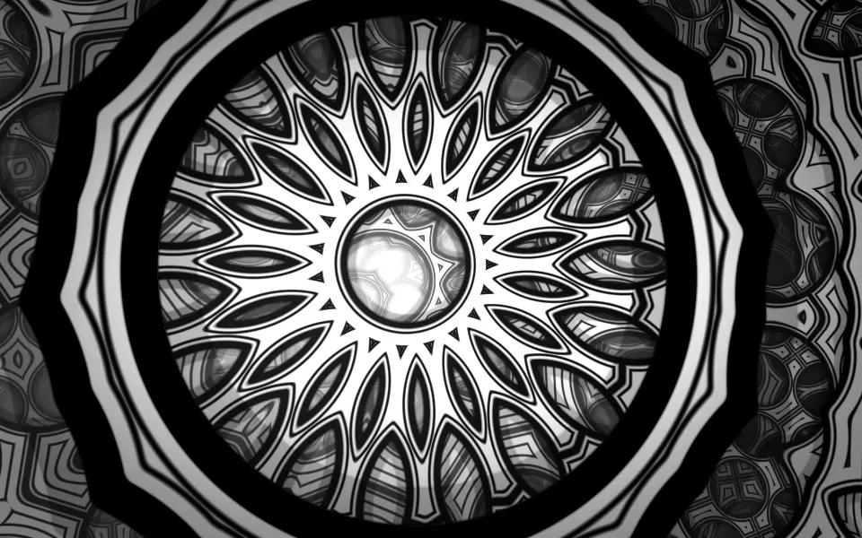
Truchet Kaleidoscope Shader
Patterns & tilingsTrue mirrored symmetry, in line art
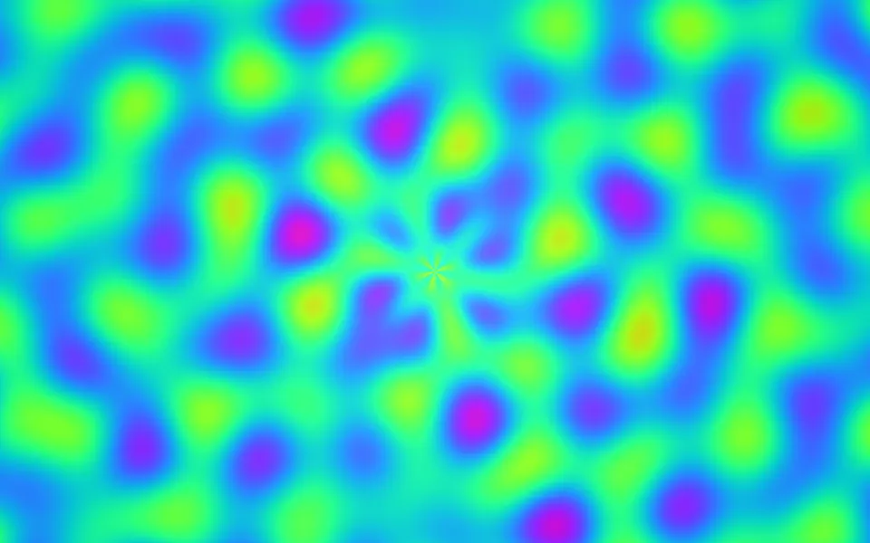
Plasma Shader
Flow & gradientsFull-spectrum blobs, free and lighter
- Pro
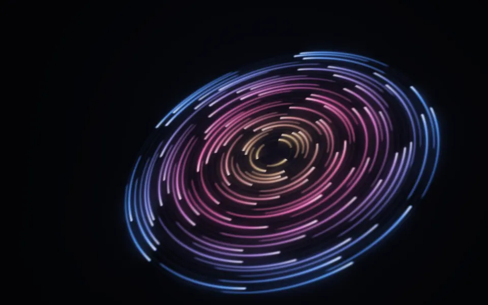
Cosmic Discs Shader
SpaceRings of light orbiting a center
- Pro
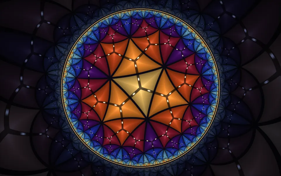
Poincaré Disc Animation Shader
GeometryMirrored glass tiles in a disc
- Pro
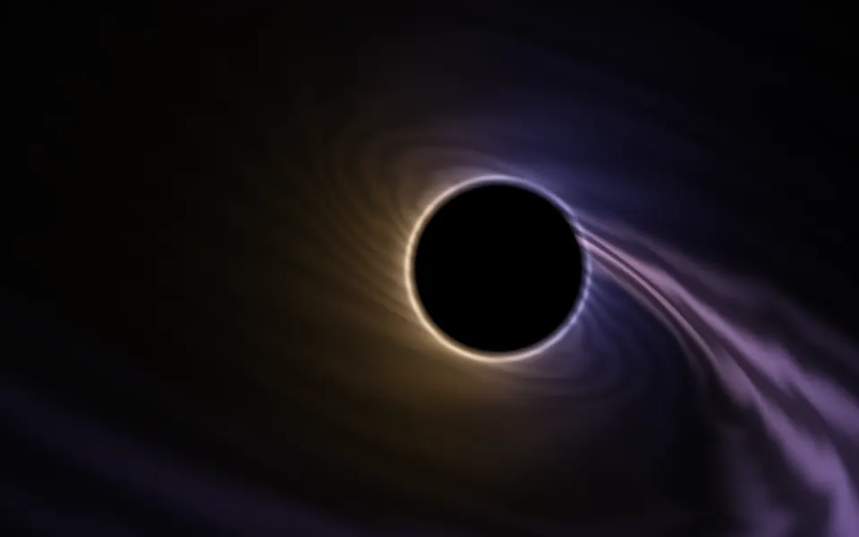
Singularity Shader
SpaceA calmer focal point beside your copy
- Pro
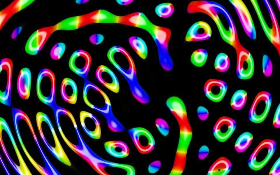
Ripples in Black Shader
Water & landscapesLoud neon for a music page