shadcn.io is not affiliated with official shadcn/ui
Shaders
ProCosmic Discs Shader for React
A disc of light drawn on the GPU: dozens of thin rings, tipped back in perspective, broken into glowing arcs that orbit the center, gold to pink to blue. For React with Base UI, when a hero, a music or launch page, or a product intro needs a striking piece of motion beside its copy.
Cosmic Discs Shader draws a flat disc of light seen at an angle. Dozens of thin concentric rings are each broken into a few glowing arcs, like comets with a bright head and a fading tail, and every ring orbits the center at its own pace, the inner ones faster, as in a real orbiting disc. The rings shade from gold at the center through pink to blue at the rim, with a soft halo around each lit arc, on near-black. A WGSL fragment shader on WebGPU traces each pixel's ray onto the tipped disc, so the perspective is real: the near side's rings are wider apart than the far side's.
Use it beside a headline in a hero, behind a music, event or launch page, or in a product intro: the disc sits right of center in wide boxes, leaving room on the left for copy, and centers itself in narrow ones. For a black hole's ring of fire instead, use Accretion Shader or Singularity Shader; for planets on orbits in plain CSS, with no GPU, the Orbits background. It runs only while it's on screen, holds a still frame with reduced motion, and shows a CSS gradient of the same rings in browsers without WebGPU.
Installation
Usage
import { CosmicDiscsShader } from "@/components/ui/cosmic-discs-shader";<CosmicDiscsShader className="flex min-h-[32rem] items-center">
<h1 className="max-w-xs px-10 text-5xl font-semibold text-white">
Ship faster
</h1>
</CosmicDiscsShader>Cosmic Discs Shader is a container: your content sits on top of the disc, in normal flow. It fills its own box, so give it a height or content. For a backdrop behind the whole page, render it empty with className="fixed inset-0 -z-10". The background is near-black in both color schemes, so use white or light text, on the left third of a wide box, where the disc doesn't reach.
Demos
Monochrome
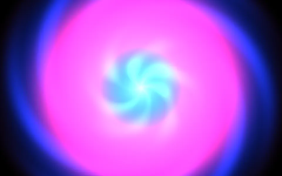
innerColor, middleColor and outerColor set the three colors the rings shade through, from the center out; here white fades to cyan. rings={14} spaces the rings out, arcLength={0.35} shortens the arcs into sparks, tilt={0.8} tips the disc nearly edge-on, and intensity={1.5} makes up for the thinner lines.
In a card
In a narrow box the disc centers itself and shrinks to fit. tilt={0.25} turns it almost to face you, like a record, and rings={20} keeps the arcs legible at the smaller size.
Performance
About 1.6 ms of GPU time a frame at 1280×720 on an M2 Max laptop with the default 28 rings (1.3 ms median); slower GPUs take several times longer. The cost grows with rings. The rings are fine lines, so it keeps full quality; quality={0.5} renders a quarter of the pixels but softens the lines. The animation stops when the shader scrolls out of view, and the browser pauses it in a hidden tab. Every shader on a page shares one GPU device and one frame loop, and vgpu loads only when the first one mounts.
Browser support
The shader needs WebGPU: Chrome and Edge, Safari 26 and later, and Firefox on Windows and macOS. Elsewhere, and until the first frame, the box shows a CSS gradient of soft rings in the same three colors, which follows your color props, so the layout never jumps. data-state on the root reads unsupported there, if you want to style around it. See Shader Canvas.
Accessibility
The disc is decoration: it's hidden from assistive tech and lets every click through to your content. With reduced motion it draws one still frame of the disc and stops. Nothing flashes: the arcs glide along their rings, and an arc passes any one point at most about 0.7 times a second at the default speed. White text reaches 4.5:1 on 99.8% of the left third of a wide box, measured over 20 seconds of frames, and on 93% of the disc itself, where the bright arcs cross it; keep text off the disc, or put it on a panel.
FAQ
How are the rings made?
For each pixel, the shader finds where its ray meets the tipped disc, then how far that point is from the center and at what angle. Each ring is a thin band at one distance, with a soft halo, and the angle decides which parts of it are lit: a ring is cut into one to six arcs, more toward the rim, each bright at its head and fading behind.
How do I change the arcs?
arcLength sets how much of each ring is lit, from short sparks at 0.1 to closed rings at 1. The number of arcs per ring is fixed, picked per ring, from one near the center to up to six at the rim, and each ring's speed and starting place are its own.
How is the 3D tilt done, and can I change it?
It's a real perspective view of a flat disc: a camera looks at it from a few units away, and tilt tips it back, from 0 (facing you, round) to 1 (almost edge-on, a thin ellipse). The near side's rings are wider apart, as they would be on a real disc. The view is also turned, so the disc's long axis rises to the right.
How do I change the number of rings?
rings takes 1 to 40. Fewer rings are spaced further apart, so each arc reads on its own; more make a dense, glowing disc. The cost grows with the count.
Credits
Inspired by a cosmic discs shader (opens in a new tab) by Xor on Shadertoy, a tilted disc of spinning, glowing arcs. This is a new shader written from a description of that look, not a port: the ray–disc projection, the orbit speeds, the comet-shaped arcs and their halos, the palette and the code are ours. The hash is lowbias32 by Chris Wellons, in the public domain.
API Reference
CosmicDiscsShader
data-slot="cosmic-discs-shader"
arcLength?number
How much of each ring is lit, from 0.1 (short sparks) to 1 (closed rings). @default 0.6.
- Default
0.6
fallback?string
What shows until the first frame and in browsers without WebGPU: a CSS
background value (gradients, sizes, a colour) that looks like the
shader. It can use the colour props' --shader-<field> variables.
innerColor?string
The rings near the centre. Any CSS colour. @default "#ffcf6b".
- Default
"#ffcf6b"
intensity?number
The glow's strength, from 0.3 (dim) to 2 (blazing). @default 1.
- Default
1
interactive?boolean
Whether u.pointer follows the pointer. @default false.
middleColor?string
The rings halfway out. Any CSS colour. @default "#ff4d9d".
- Default
"#ff4d9d"
outerColor?string
The outer rings and the haze around the disc. Any CSS colour. @default "#3d7bff".
- Default
"#3d7bff"
paused?boolean
Holds the current frame. @default false.
quality?number
Render scale, from 0.25 to 1, of the screen's pixels (capped at 2×). @default 1.
rings?number
How many rings, from 1 to 40. @default 28.
- Default
28
speed?number
Animation speed: 1 is normal, 0 holds the frame. @default 1.
tilt?number
How far the disc is tipped back, from 0 (facing you) to 1 (almost edge-on). @default 0.6.
- Default
0.6
time?number
A fixed moment, in seconds: draws it and doesn't animate.
render?ReactElement | ((props: object, state: object) => ReactElement)
Replace the host element or compose it with another component.
- Type
ReactElement | ((props: object, state: object) => ReactElement)
className?string
Forwarded to the part.
Related
- Pro
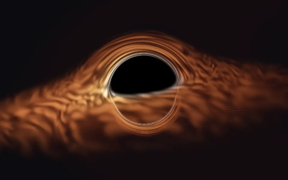
Accretion Shader
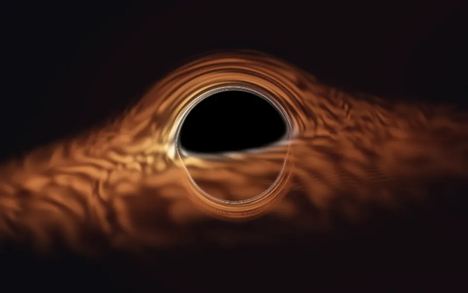
SpaceA black hole's ring of fire
- Pro
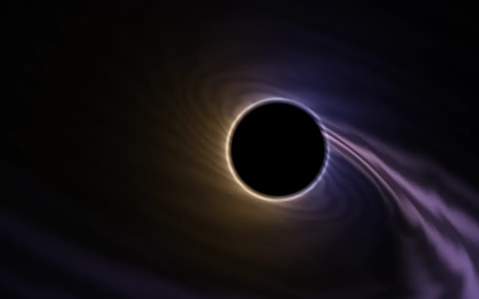
Singularity Shader
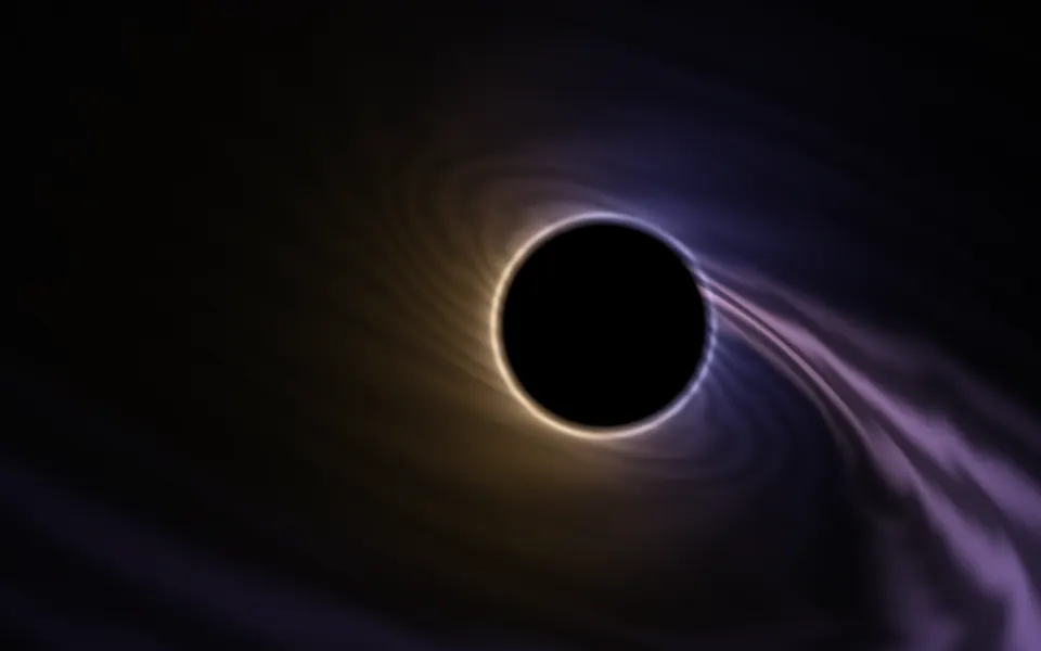
SpaceA flat black hole, beside your copy
- Pro
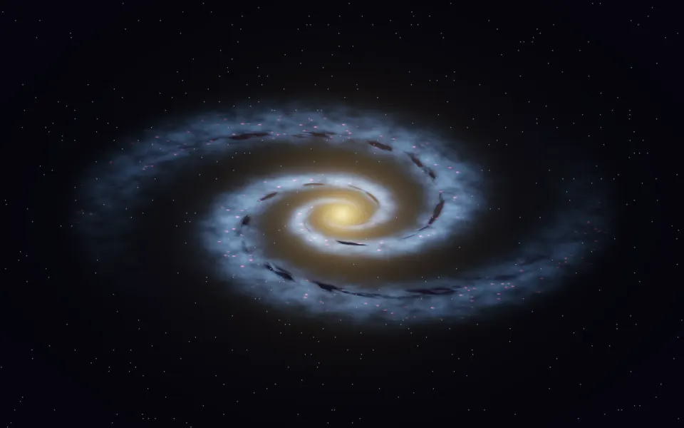
Spiral Galaxy Shader
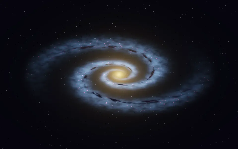
SpaceThe arms of a galaxy, turning
- Pro
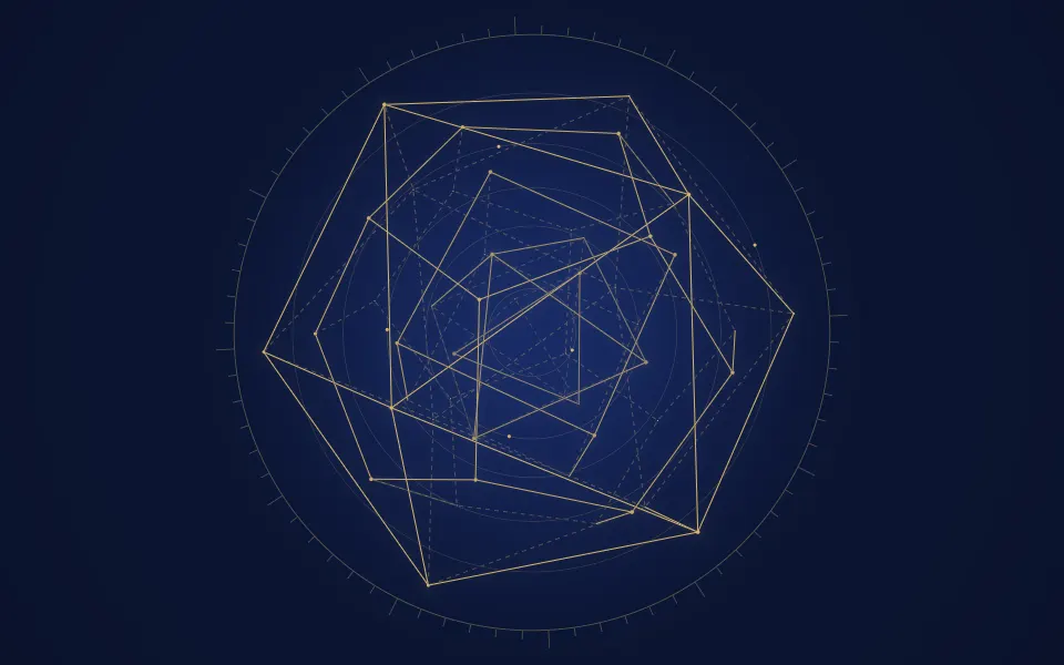
Platonic Solids Shader
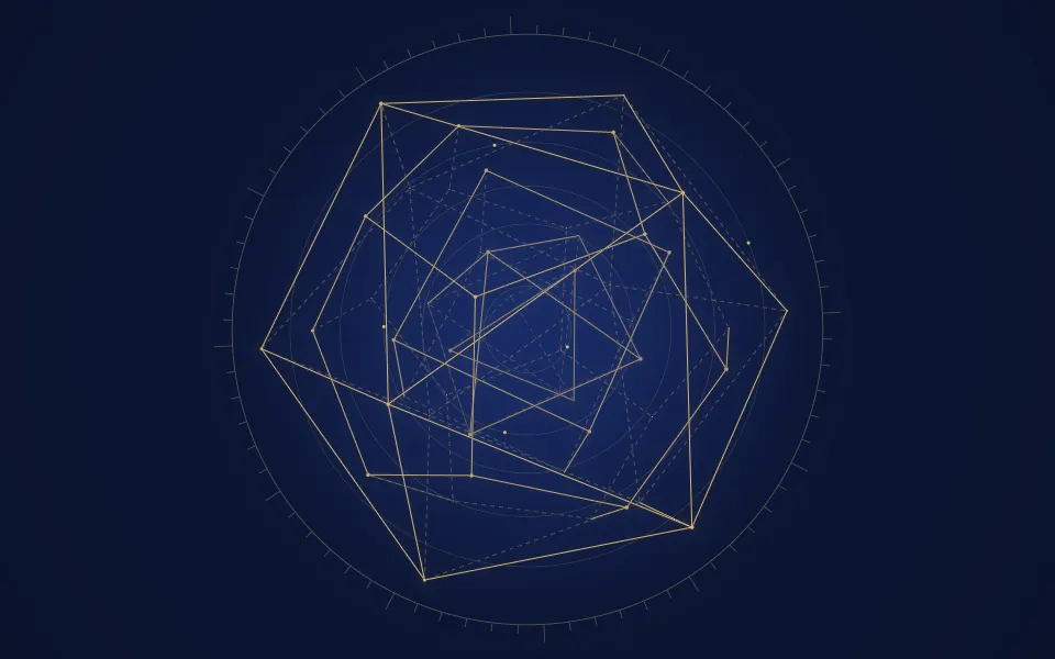
GeometryFine orbit rings, like an astrolabe
- Pro
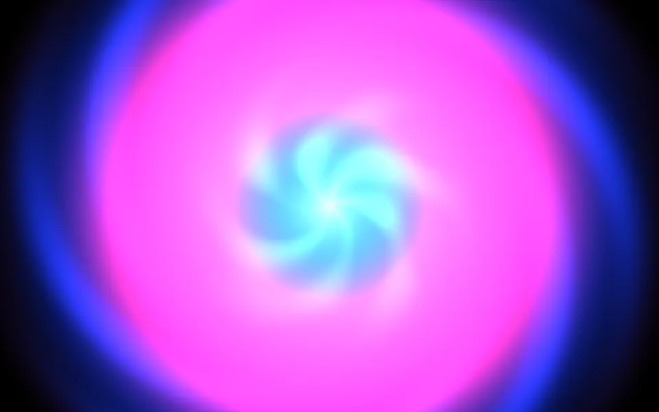
Kaleidoscope Shader
Patterns & tilingsA bloom that holds the center
- Pro
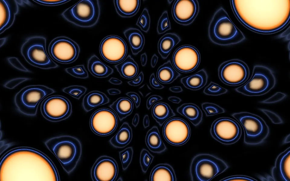
Sphere Field Shader
Tunnels & 3DGlowing lights rushing past