shadcn.io is not affiliated with official shadcn/ui
Shaders
ProOp Art Bulge Shader for React
A Vasarely-style op-art checkerboard drawn on the GPU: slow spheres drift under the grid and swell it toward you, squares magnified on top and squeezed at the rims. For React with Base UI, when a design studio, an art page or a bold launch wants a black-and-white illusion.
Op Art Bulge Shader draws a black-and-white checkerboard in the spirit of Victor Vasarely's Vega paintings, with three spheres drifting slowly underneath it. Where a sphere passes, the grid swells toward you: the squares on top grow to twice their size, the ones around the rim are squeezed thin, and a light from the top left shades each dome, so the flat page seems to balloon out. Each swelling is a smooth radial warp of the grid, with no crease where it meets the flat part, and the squares are filtered over each pixel, so even the squeezed rims stay crisp instead of shimmering. A WGSL fragment shader on WebGPU draws every pixel each frame, for about a fifth of a millisecond of GPU time.
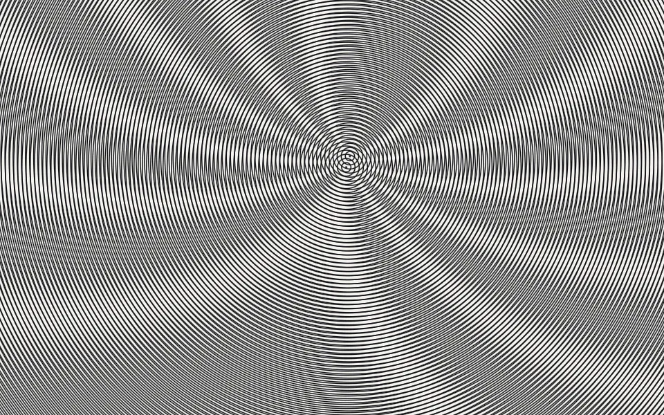
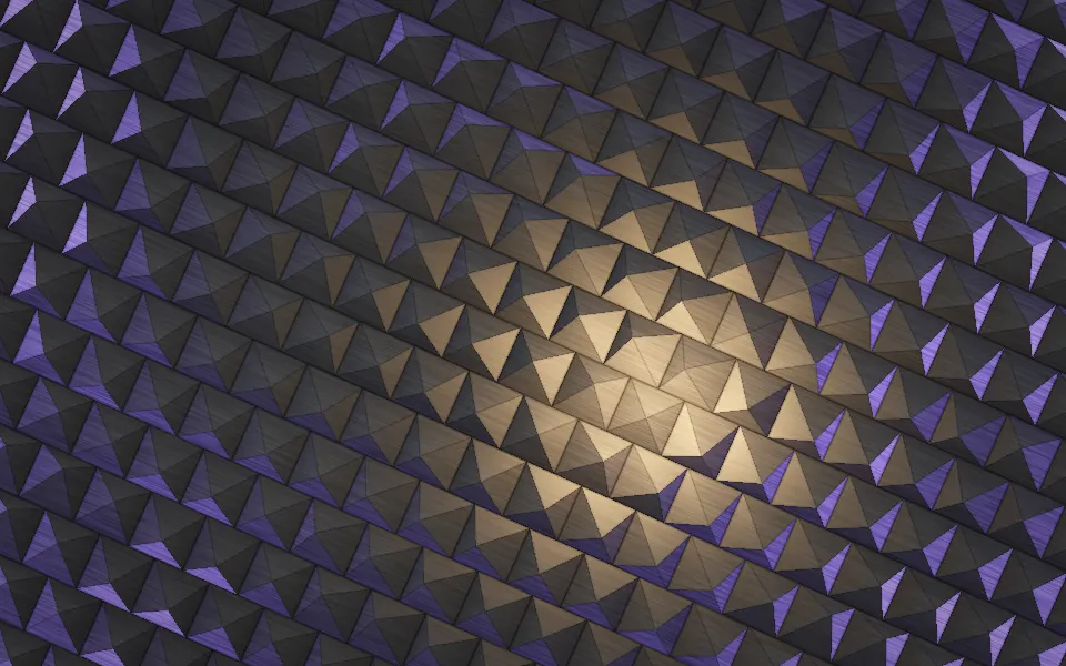
Use it behind a design studio's hero, an art or architecture page, a 404 or a launch that wants a bold, graphic illusion. For two gratings beating into soft fringes instead, use Moire Shader; for a studded surface of lit metal pyramids, Pyramid Pattern Shader. With interactive, the pointer pushes one more sphere through the grid. It runs only while it's on screen, holds a still frame with reduced motion, and shows a CSS checkerboard in the same two colors in browsers without WebGPU.
Installation
Usage
import { OpArtBulgeShader } from "@/components/ui/op-art-bulge-shader";<OpArtBulgeShader className="flex min-h-[32rem] items-center justify-center">
<div className="rounded-xl bg-white/70 px-8 py-6">
<h1 className="text-5xl font-semibold text-black">Ship faster</h1>
</div>
</OpArtBulgeShader>Op Art Bulge Shader is a container: your content sits on top of the grid, in normal flow. It fills its own box, so give it a height or content. For a backdrop behind the whole page, render it empty with className="fixed inset-0 -z-10". Every square flips between ink and paper, so no text color reads on it bare: put copy on a panel, like the bg-white/70 one above, which keeps black text above 10:1 everywhere, or a bg-black/60 one for white text, above 5.7:1.
Demos
Themed dots
pattern="dots" swaps the squares for round dots, which stretch into ovals around each rim. inkColor="var(--foreground)" and paperColor="var(--background)" take your theme's colors, so the grid flips with a switch between light and dark, and spheres={2} leaves more of it flat.
In a card
spheres={1} keeps a single sphere drifting, and interactive lets the pointer push one more: it swells in under the pointer, follows it across the card and sinks back flat when the pointer leaves. Touch is ignored, so on phones only the drifting sphere moves. pattern="stripes" with cellSize={16} draws fine vertical stripes, which bow around the swelling like a Bridget Riley print.
Performance
About 0.2 ms of GPU time a frame at 1280×720 on an M2 Max laptop; slower GPUs take several times longer. Each sphere is a few lines of arithmetic, with no loops over the grid, so spheres, cellSize and pattern barely change the cost. Keep quality at 1: the edges are sharp and the shader is cheap enough not to need less. The animation stops when the shader scrolls out of view, and the browser pauses it in a hidden tab. Every shader on a page shares one GPU device and one frame loop, and vgpu (about 50 KB gzipped) loads only when the first one mounts.
Browser support
The shader needs WebGPU: Chrome and Edge, Safari 26 and later, and Firefox on Windows and macOS. Elsewhere, and until the first frame, the box shows a flat CSS checkerboard in the same two colors with two faint rings where spheres would be, so the layout never jumps. data-state on the root reads unsupported there, if you want to style around it. See Shader Canvas.
Accessibility
The grid is decoration: it's hidden from assistive tech and lets every click through to your content. With reduced motion it draws one still frame and stops. Nothing flashes: each sphere takes half a minute or more to cross the box, and at the default speed no spot turns from ink to paper and back more than twice a second; even at speed={3} only a few pixels on the squeezed rims, where the squares blur to gray, pass three. High-contrast patterns in motion can still bother people with pattern sensitivity, stripes most of all: for a calmer backdrop, lower intensity or speed, or bring the ink and paper colors closer together. A bg-white/70 panel keeps black text above 10:1 on it, and a bg-black/60 panel keeps white text above 5.7:1.
FAQ
How does the grid swell?
Each sphere warps the plane around its center: inside its radius, a pixel looks up the grid closer to the center than it really is, so the squares on top are magnified, up to twice their size at the default intensity, and those near the rim are squeezed to make up for it. The warp eases to nothing at the rim, so the swelling joins the flat grid without a crease, and the overlapping spheres simply warp one after the other.
How do I make the bulge stronger or flatter?
intensity sets how far the spheres swell, from 0 (a flat checkerboard) through 1 (squares twice as big on top) to 2 (as deep as the effect goes, with tight rims). It scales the shading with it, so a low intensity is also a quieter, flatter picture.
Can I use dots or stripes instead of squares?
Yes: pattern is "checker", "dots" or "stripes". Dots stretch into ovals around each rim, and vertical stripes bow around the swelling. cellSize sets the size of one square, dot cell or stripe, in CSS pixels, so the grid looks the same on every screen.
Can I change the colors?
Yes: inkColor is the dark squares and paperColor the light ones. They take any CSS color, var(--primary) included, and follow a theme switch. The shading darkens both a little on the side away from the light, so keep enough contrast between them for the illusion to hold.
API Reference
OpArtBulgeShader
data-slot="op-art-bulge-shader"
cellSize?number
The size of one square, in CSS pixels, from 16 to 96. @default 36.
- Default
36
fallback?string
What shows until the first frame and in browsers without WebGPU: a CSS
background value (gradients, sizes, a colour) that looks like the
shader. It can use the colour props' --shader-<field> variables.
inkColor?string
The dark squares. Any CSS colour. @default "#121212".
- Default
"#121212"
intensity?number
How far the spheres swell out of the grid, from 0 (flat) to 2 (deep, with tight rims). @default 1.
- Default
1
interactive?boolean
Whether u.pointer follows the pointer. @default false.
- Default
false
paperColor?string
The light squares. Any CSS colour. @default "#f3f0e8".
- Default
"#f3f0e8"
pattern?keyof typeof PATTERNS
What the grid is made of: "checker" squares, round "dots" or vertical "stripes". @default "checker".
- Default
"checker"
paused?boolean
Holds the current frame. @default false.
quality?number
Render scale, from 0.25 to 1, of the screen's pixels (capped at 2×). @default 1.
speed?number
Animation speed: 1 is normal, 0 holds the frame. @default 1.
spheres?number
How many spheres drift through the grid, from 0 to 4. @default 3.
- Default
3
time?number
A fixed moment, in seconds: draws it and doesn't animate.
render?ReactElement | ((props: object, state: object) => ReactElement)
Replace the host element or compose it with another component.
- Type
ReactElement | ((props: object, state: object) => ReactElement)
className?string
Forwarded to the part.
Related
- Pro
Moire Shader
GeometryTwo gratings beating into fringes
- Pro
Pyramid Pattern Shader
Patterns & tilingsA studded surface of lit metal
- Pro
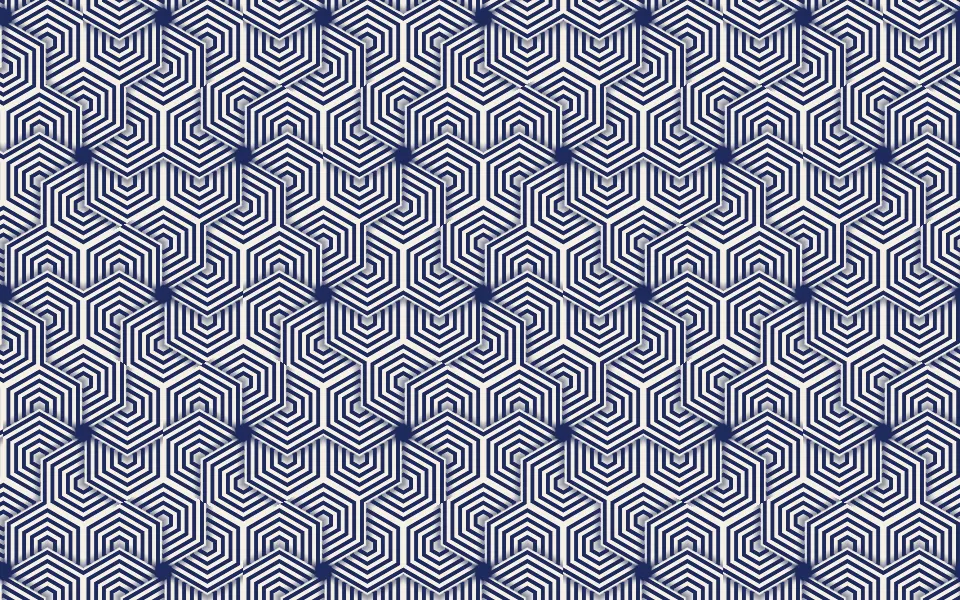
Hexagon Grid Pattern Shader
Patterns & tilingsOp-art blocks on a hex grid
- Pro
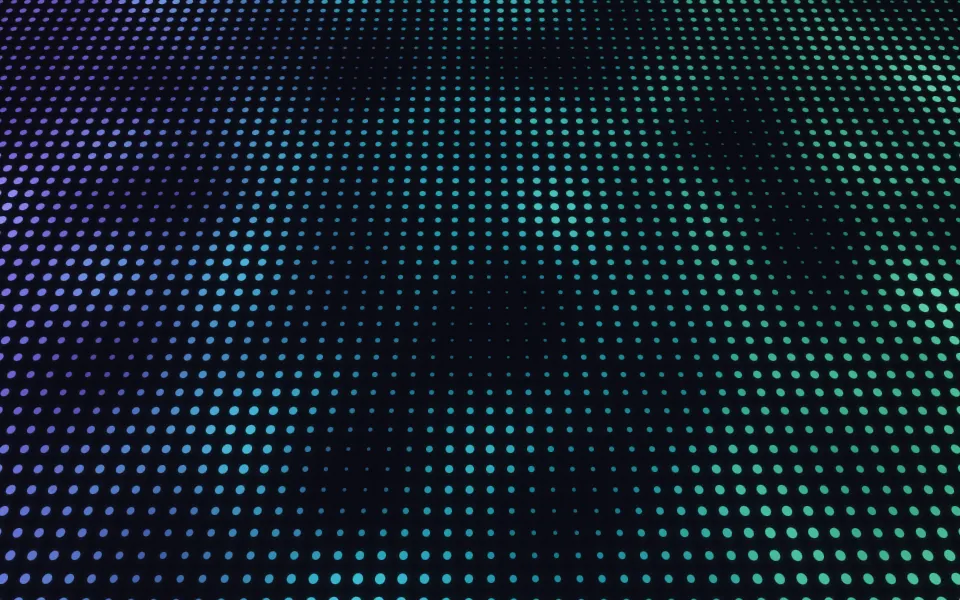
Breathing Dots Shader
GeometryA sheet that dimples under the pointer
- Pro
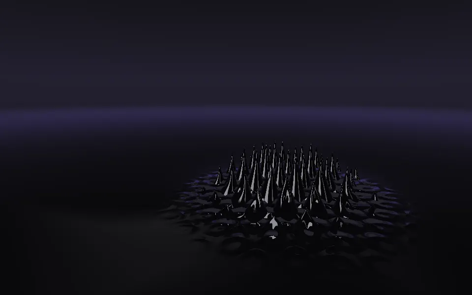
Ferrofluid Shader
Flow & gradientsA surface the pointer pulls into spikes
- Pro
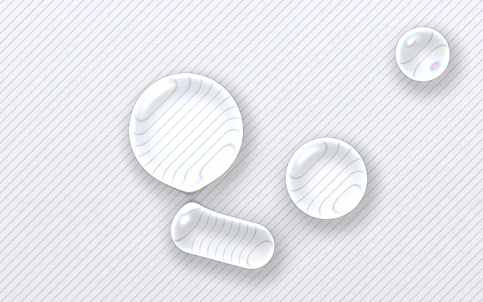
Liquid Glass Shader
Light & glassLenses that magnify a ruled page