shadcn.io is not affiliated with official shadcn/ui
Press once and it stays on, like bold or bookmark in a toolbar. Press again and it turns off.
Use a toggle when the button itself is the state. A feature you turn on for the whole account is a Switch. In Vue, Ark UI provides the pressed style.
Installation
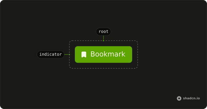
Anatomy
Usage
<script setup lang="ts">
import { BookmarkIcon } from "lucide-vue-next";
import { Toggle } from "@/components/ui/toggle";
</script>
<template>
  <Toggle aria-label="Toggle bookmark" size="sm" variant="outline">
    <BookmarkIcon
      aria-hidden="true"
      class="group-aria-pressed/toggle:fill-foreground"
    />
    Bookmark
  </Toggle>
</template>
Accessibility
- Space
- Toggle the pressed state.
- Enter
- Toggle the pressed state.
Demos
Outline
Italic and Bold, each with an icon and a word, and variant set to outline so the resting state has a border. Use the outline when the toggle sits on a busy toolbar and the borderless default would disappear. Both can be pressed at once, because these are separate toggles, not a group that forces a single choice.
Text
Italic with an icon and a visible word, on the default variant, which has no border until it is pressed. Use the word beside the icon when the action is not obvious from the glyph alone. The aria-label still names the action for assistive tech. If you only have room for the icon, drop the word and keep that label.
Sizes
Small, default, and large, all outline, using size values sm, md, and lg. md is what you get if you omit the prop. Pick a smaller toggle for a dense toolbar and a large one when the control is a primary target on a touch layout. The pressed treatment stays the same at every size.
Disabled
Two toggles that cannot be pressed, one on the default variant and one outline, both with disabled. The muted look follows the variant you started from, so the outline toggle stays outlined. Use this when the action does not apply yet, such as bold with an empty selection, not to hide a control that is broken.
Rtl
The bookmark toggle from the first preview, with dir set to rtl and an Arabic label. The icon still fills when the toggle is pressed. The word sits on the right, which is the start in this direction. Use this to check that the pressed icon and the label do not collide in a right-to-left toolbar.
FAQ
How do I control a Toggle in Vue?
Keep the pressed state in state and pass it back to the Toggle; use the default prop when you only need the starting state.
Bind it with v-model:pressed, or listen to @pressed-change, which receives the new boolean.
What is the difference between a Toggle and a Switch?
A Toggle is a button that stays pressed, like Bold in a text editor toolbar, and is announced as a pressed button. A Switch turns a setting on or off, like Wi-Fi. Use Toggle Group for a row of related toggles.
How do I make an outline Toggle?
Set variant="outline" for a bordered Toggle, as the Outline demo does; the default variant is borderless with a transparent background. The pressed style comes from the data-state attribute in both.
How do I change the size of a Toggle?
Set size to sm, md (the default) or lg, as the Sizes demo does. For an icon-only Toggle, keep the icon alone inside it and add an aria-label.
How do I make an icon-only Toggle accessible?
Give it an aria-label that names the action, such as "Toggle bold": screen readers announce it with its pressed state. Mark the icon aria-hidden="true" so it is not read twice.
API Reference
Toggle
<button> data-slot="toggle"
pressed?boolean
The pressed state of the toggle. Two-way with v-model:pressed.
defaultPressed?boolean
The default pressed state of the toggle.
disabled?boolean
Whether the toggle is disabled.
size?"sm" | "md" | "lg"
The size.
- Type
"sm" | "md" | "lg"- Default
"md"
variant?"default" | "ghost" | "outline"
The visual style.
- Type
"default" | "ghost" | "outline"- Default
"default"
asChild?boolean
Use the provided child element as the default rendered element, combining their props and behavior.
class?string
Merged with the part's classes.
@pressed-change(pressed: boolean) → void
Event handler called when the pressed state of the toggle changes.
- Parameters
pressed– boolean- Returns
void
data-disabled?string
Present when disabled.
data-pressed?string
Present when pressed.
data-state"on" | "off"
"on" or "off".
- Type
"on" | "off"
ToggleIndicator
data-slot="toggle-indicator"
fallback?VNode
The fallback content to render when the toggle is not pressed.
asChild?boolean
Use the provided child element as the default rendered element, combining their props and behavior.
class?string
Merged with the part's classes.
data-disabled?string
Present when disabled.
data-pressed?string
Present when pressed.
data-state"on" | "off"
"on" or "off".
- Type
"on" | "off"
useToggle
pressed?boolean
The pressed state of the toggle. Two-way with v-model:pressed.
defaultPressed?boolean
The default pressed state of the toggle.
disabled?boolean
Whether the toggle is disabled.
@pressed-change(pressed: boolean) → void
Event handler called when the pressed state of the toggle changes.
- Parameters
pressed– boolean- Returns
void
With other components
Toggle Group
SelectionSeveral stay in one row
Tooltip
OverlaysLabel an icon-only toggle
Button
ButtonsMix actions with state
Separator
LayoutSplit a formatting bar
Kbd
TypographyShortcut next to it
Textarea
InputsBar above the editor
Related
Switch
SelectionSettings on or off
Checkbox
SelectionA form value instead
Button Group
ButtonsJoined action buttons
Menubar
MenusApp-level formatting
Dropdown Menu
MenusExtra actions nearby
Toggle Tooltip
ButtonsThe hint opens on click