shadcn.io is not affiliated with official shadcn/ui
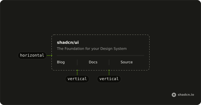
A one-pixel line in the border color, placed between two regions.
Use it when two regions should look separate and a gap is too quiet. A Card is clearer when the whole block is one object. In Vue, Ark UI collapses a vertical rule when the parent has no height.
Installation
Anatomy
Usage
<script setup lang="ts">
import { Separator } from "@/components/ui/separator";
</script>
<template>
  <div class="flex max-w-sm flex-col gap-4 text-sm">
    <div class="flex flex-col gap-1.5">
      <div class="font-medium leading-none">shadcn/ui</div>
      <div class="text-muted-foreground">
        The Foundation for your Design System
      </div>
    </div>
    <Separator />
    <div>
      A set of beautifully designed components that you can customize, extend,
      and build on.
    </div>
  </div>
</template>
Demos
Vertical
orientation set to vertical draws a one-pixel column that stretches to the parent's height. This strip gives the line that height and splits Blog, Docs, and Source. Use it between items on one line, and give the parent a height or the rule collapses. The horizontal default would run under each word instead of standing between them.
Menu
Vertical rules between two-line items: Settings, Account, and Help, each with a short description. Help hides on a narrow width, and its separator hides with it, so the row does not end on a dangling line. Use this for a header cluster that is not itself a menu. Inside a popup, use that popup's separator so the gap matches the items.
List
Horizontal rules between definition rows, name on the start side and a muted value on the end. Use them in a metadata list or on invoice lines, where a gap is too quiet to show that a row ended. Skip the rule after the last item, because a trailing line implies another row. If every row is already a card, the extra line is noise.
Rtl
The same title and paragraph, with dir set to rtl and Arabic for the subtitle and body. The horizontal line still spans the width. Direction does not flip orientation, and a horizontal rule is not mirrored. A vertical separator in that row still needs a parent height, which is the thing to recheck when physical margins were doing the spacing.
FAQ
How do I make a vertical Separator in Vue?
Set orientation to vertical. The line is one pixel wide and stretches to the height of its parent, so the parent needs a height, as the Vertical demo does. The default orientation is horizontal, and that line spans the full width of its container.
When should a Separator be hidden from assistive tech with Ark UI?
Use a Separator between real regions, such as sections of text or groups in a toolbar. When the line is only a visual border, a border utility is clearer than an extra element. The element has role separator, so it is announced. Prefer a border utility when the line is only visual.
How do I change the Separator color or thickness?
Edit the separator file under components/ui. The color is the border token, and the thickness is one pixel. Horizontal lines use the full width, and vertical lines use the full height of the parent. Change those classes rather than wrapping the line in extra markup.
Should I use a Separator or a border?
Use a Separator when the gap between two pieces of content should be explicit. Use a border utility for a card edge, a divider under a heading, or any line that is purely visual. A border does not add an element that assistive tech might announce.
Does a Separator follow right-to-left text?
Yes, a horizontal Separator still spans the width, and a vertical one still needs a parent height. The Rtl demo shows the line in a right-to-left page. You do not swap the orientation for direction, and the line color and thickness stay the same.
How do I install Separator in Vue?
Run the command in the Installation section above. It adds Separator to your ui folder. Import from that folder when the command finishes, instead of copying the source by hand, and rerun the command later if you want the latest files. The command uses the shadcn-vue CLI.
API Reference
Separator
<div> data-slot="separator"
orientation?"horizontal" | "vertical"
The orientation of the separator.
- Type
"horizontal" | "vertical"- Default
"horizontal"
asChild?boolean
Use the provided child element as the default rendered element, combining their props and behavior.
class?string
Merged with the part's classes.
data-orientation?string
Mirrors orientation.
With other components
Breadcrumb
NavigationCrumbs in a trail
Dropdown Menu
MenusDivide item groups
Button Group
ButtonsSplit button rule
Card
LayoutHeader from the body
Field
InputsBreak between groups
Item
LayoutRows in a list