shadcn.io is not affiliated with official shadcn/ui
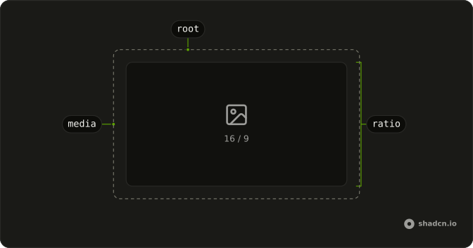
The box holds its shape while an image or video loads, so the text under it doesn't jump.
Use it for media that should stay widescreen, square, or portrait. If they need to choose a crop, use an Image Cropper. In Vue, Ark UI only holds the box, and a ratio with no width collapses.
Installation
Anatomy
Usage
<script setup lang="ts">
import { AspectRatio } from "@/components/ui/aspect-ratio";
</script>
<AspectRatio className="w-full max-w-sm rounded-lg bg-muted" ratio={16 / 9}>
  <img
    alt="Photo"
    className="absolute inset-0 size-full rounded-lg object-cover grayscale dark:brightness-20"
    height={900}
    src="https://avatar.vercel.sh/shadcn1"
    width={1600}
  />
</AspectRatio>
Demos
Square
ratio is 1, so the frame is as tall as it is wide, capped near 12rem, and the image is pulled to the edges and cropped with object-cover. Use a square for avatars, album art, or product tiles in a grid, where a landscape frame would leave uneven gaps. Omitting ratio already means a square. Set it when that choice should be obvious next to other frames.
Portrait
ratio is 9 divided by 16, in a column about 10rem wide, with the same cover crop turned tall. Use portrait for stories, phone screenshots, or poster art. A 16 by 9 frame would cut the subject the wrong way or leave bands on the sides. The ratio still needs a width from the layout, and it does not invent one.
Rtl
A 16 by 9 frame inside a figure with dir set to rtl, and an Arabic caption under it. The photo does not flip, but the caption and its alignment do. Use this when the media sits in a right-to-left article and the caption has to share that direction. The shape is still width divided by height, and direction does not change the ratio.
FAQ
How do I set the Aspect Ratio in Vue?
Pass ratio as width divided by height. 16 / 9 is a widescreen frame, 9 / 16 is a portrait frame, and 1 is a square. The default is a square when you omit ratio. The child should fill the box. The usage places the image absolutely, inset on every side, at full size, with object-cover.
Why does my image ignore the Aspect Ratio?
The ratio is on the wrapper, not on the image. An image with only width and height attributes keeps its intrinsic size and can spill out of the frame. The root is already positioned, so make the image cover that box the way the usage does. Also give the wrapper a width. A ratio does not invent a width by itself.
How do I style an Aspect Ratio?
Edit components/ui/aspect-ratio, or pass a class for one case, such as a full width, a max width, or rounded corners. The root is positioned so the media can cover the frame. Change ratio when the shape is wrong. A class on the image only affects the media, not the frame around it.
The ratio is stored in the --ratio custom property, and the aspect-ratio utility reads that variable.
Can an Aspect Ratio wrap video or a map?
Yes. It only reserves a box. Put one child in it, such as a video or an iframe, and make that child fill the box the same way the image does. It does not crop, zoom, or play media. For a crop tool use Image Cropper. For a zoomable picture use Image Zoom.
How do I change an Aspect Ratio at a breakpoint?
ratio is a single number, so the frame does not switch by itself when the viewport changes. Keep one ratio and let the width come from a class, such as a full width with a max width. If the shape must change, render the ratio that matches the layout. The component does not take a list of ratios.
API Reference
AspectRatio
<div> data-slot="aspect-ratio"
ratio?number
Width divided by height, such as 16 / 9.
- Default
1
asChild?boolean
Use the provided child element as the default rendered element, combining their props and behavior.
class?string
Merged with the part's classes.
--ratiostring