shadcn.io is not affiliated with official shadcn/ui
Short text beside a title, for a status, a count, or a category.
Use it when a word or two is enough to scan. A sentence with a cause and a next step is an Alert. In Vue, Ark UI keeps the text on one line, so a long phrase looks wrong.
Installation
Anatomy
Usage
<script setup lang="ts">
import { Badge } from "@/components/ui/badge";
</script>
<template>
  <div class="flex w-full flex-wrap justify-center gap-2">
    <Badge>Badge</Badge>
    <Badge variant="secondary">Secondary</Badge>
    <Badge variant="destructive">Destructive</Badge>
    <Badge variant="outline">Outline</Badge>
  </div>
</template>
Demos
Variants
Default, secondary, destructive, outline, and ghost in one row. variant carries the meaning: destructive for a failure, outline when the badge should stay quiet, ghost when it should nearly disappear in a toolbar. Stay with these before you add a class. The hero is the same set without ghost.
Icon
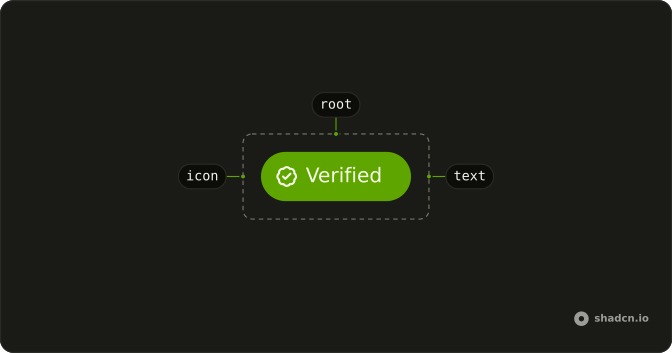
A check sits before Verified, and a bookmark sits after Bookmark. Set data-icon to inline-start or inline-end so the icon mirrors in a right-to-left line, which a left margin will not do. Hide the icon from assistive tech when the word already says the thing. One icon is enough on a badge this small.
Spinner
Deleting and Generating each include a spinner, so the badge means work still running. The spinner takes data-icon like any other icon, at the start or the end. Destructive fits a removal in progress, and secondary fits generation that is not a failure. When the work ends, drop the spinner or the badge, because a label that spins forever reads as a stuck control.
Link
Open Link is both the badge and the anchor, with an arrow at the end. Styles move onto the link, so the hit target and the color are the same element. Use that only to navigate to another page. A filter that toggles is a button or a toggle, and the address should be a real URL rather than a hash that goes nowhere.
Colors
Blue, green, sky, purple, and red come from classes on the badge, not from a new variant. Use that for a one-off category, a team or a tag, when none of the variants match the meaning. Leave destructive and the others for semantics, and do not recolor those. Pair a light background with dark text, plus the dark-mode pair, or the badge vanishes on a dark page.
Rtl
Arabic labels, including Verified with the check on the starting side and a bookmark on the ending side. dir set to rtl on the row is what makes inline-start and inline-end swap. A left margin on the icon stays on the left, and the word order looks broken. Run this check before a translated UI ships, with the real strings, not with English text and a direction attribute.
FAQ
What Badge variants are available in Ark UI?
variant takes default, secondary, outline, ghost, link, destructive, info, success or warning. size is sm, md or lg, and pill rounds it fully. The Variants demo shows them side by side.
How do I make a Badge a link in Vue?
Pass as-child and put an a or a RouterLink inside: the badge's styles move onto it.
Use a real URL, not #, as in the Link demo.
How do I give a Badge a custom color?
Add classes for the color, such as bg-violet-100 text-violet-700 dark:bg-violet-950 dark:text-violet-300, as the Colors demo does. Keep the variants for meaning, such as destructive for errors, and use classes for one-off colors.
How do I make a Badge with a number accessible?
Put the noun next to the number, such as 3 unread, or give the badge an aria-label such as 3 unread messages. A bare number gives screen reader users no idea what is being counted.
Why doesn't my Badge text wrap?
The badge is whitespace-nowrap on purpose, so it stays one short line. Shorten the text; for a sentence, use an Alert or plain text instead.
API Reference
Badge
<span> data-slot="badge"
pill?boolean
Fully rounded corners.
- Default
false
size?"lg" | "md" | "sm"
The size.
- Type
"lg" | "md" | "sm"- Default
"md"
variant?"default" | "destructive" | "ghost" | "info" | "link" | "outline" | "secondary" | "success" | "warning"
The visual style.
- Type
"default" | "destructive" | "ghost" | "info" | "link" | "outline" | "secondary" | "success" | "warning"- Default
"default"
asChild?boolean
Use the provided child element as the default rendered element, combining their props and behavior.
class?string
Merged with the part's classes.
data-pill?string
Present when pill is set.
data-size?string
Mirrors size.
data-variant?string
Mirrors variant.