shadcn.io is not affiliated with official shadcn/ui
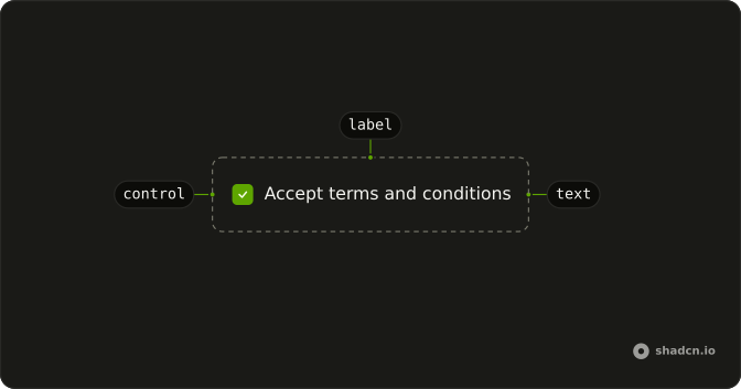
The text next to a control names it, and clicking that text activates the control too.
Use it when that one line is the whole field. Help text or an error belongs in Field, which already associates its own caption. In Vue, Ark UI ties the text to the control by id, or by wrapping the control in the caption.
Installation
Anatomy
Usage
<script setup lang="ts">
import { Checkbox } from "@/components/ui/checkbox";
import { Label } from "@/components/ui/label";
</script>
<template>
  <div class="flex items-center gap-2">
    <Checkbox id="terms" />
    <Label for="terms">Accept terms and conditions</Label>
  </div>
</template>
For form fields, prefer Field and FieldLabel.
Demos
Rtl
The row sets dir to rtl, so the checkbox and the Arabic caption trade places and stay together. The caption still points at that checkbox. Use this when one control should follow a right-to-left parent without flipping the whole document. The caption has no physical left or right margin, so set dir on the row, not on the caption alone.
FAQ
How do I associate a Label with a control in Vue?
Point the caption at the control, or wrap the control so a click on the text focuses or toggles it. For help text or an error, prefer Field and FieldLabel, which associate the caption for you. Set htmlFor to the control's id, as the usage does with a checkbox.
When should I use Field instead of a Label?
Use Label for one caption beside a control, such as a checkbox. Use Field when that control also needs a description, an error, or a stacked layout. FieldLabel already ties the caption to the control, so do not add your own id pairing inside Field. Label itself stores no form value.
Why does a disabled control not update the Label?
The cursor changes only when a preceding sibling with the peer class is disabled. Checkbox includes that class, so place it before the label, matching the usage. A parent marked data-disabled also makes the label ignore pointer events, if that parent is a group. The label does not have its own disabled prop.
Can a Label wrap its control instead of using an id?
Yes. A label that contains the control is associated by nesting, so you can skip the id. Use the id pairing when the caption and the control are siblings, which is what the usage shows. Keep the caption close to the control either way so the relationship is obvious on screen.
Does a Label follow a right-to-left page?
Yes. The label is a flex row without physical left or right margins, so it follows its parent's direction. The Rtl demo sets direction on the row and the caption stays with the checkbox. Set direction on a parent whenever this row should flip without flipping the whole document.
How do I style a Label with Ark UI?
Edit the label file under components/ui. The element sets data-slot to label and uses a flex row with the peer and group disabled treatments. Add a class at the call site for one-off spacing instead of copying the component. The caption color follows the surrounding text, so set a text color there when one label should differ.
API Reference
Label
<label> data-slot="label"
asChild?boolean
Use the provided child element as the default rendered element, combining their props and behavior.
class?string
Merged with the part's classes.
With other components
Field
InputsLabel, description, and error
Input
InputsName the text field
Checkbox
SelectionClick the words
Radio Group
SelectionOne label per option
Switch
SelectionSettings row caption
Textarea
InputsName the long field
Related
Select
SelectionCaption the dropdown
Native Select
SelectionNative dropdown caption
Input Group
InputsLabel plus addons
Slider
ControlsName the range
Hint
FeedbackA note beside the caption
Tooltip
OverlaysExplain the caption