shadcn.io is not affiliated with official shadcn/ui
The text field shares its border with an icon, a prefix, or a button.
Use it when that extra piece belongs to the field, like a currency mark or a copy button. A row of buttons on their own is a Button Group. In Vue, Ark UI focuses the input when the addon is clicked, unless the click hits a button.
Installation
Anatomy
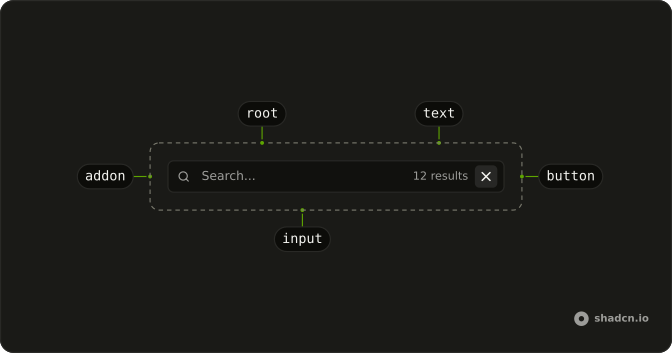
Usage
<script setup lang="ts">
import { SearchIcon } from "lucide-vue-next";
import {
  InputGroup, InputGroupAddon, InputGroupInput,
} from "@/components/ui/input-group";
</script>
<template>
  <InputGroup class="max-w-xs">
    <InputGroupInput placeholder="Search..." />
    <InputGroupAddon>
      <SearchIcon aria-hidden="true" />
    </InputGroupAddon>
    <InputGroupAddon align="inline-end">12 results</InputGroupAddon>
  </InputGroup>
</template>
Accessibility
- Enter
- Activate the focused control.
- Space
- Activate the focused control.
Demos
Inline Start
align set to inline-start puts the addon on the leading side of the field, which is also what you get if you omit it. A search icon ahead of the placeholder is the usual reason to spell that out. The side is logical, so a right-to-left page places the icon on the right.
Inline End
align set to inline-end parks the addon after the text, on the trailing edge. A password field uses it for an eye icon, which should not sit in front of the characters being typed. The edge follows writing direction, so the icon stays at the end in Arabic as well as English.
Block Start
align set to block-start stacks the addon above the control, as a header rather than a side chip. One field puts a Full Name caption over a single line, and another puts a filename plus a copy button over a code textarea. Use the top edge when the addon names the whole control, not a piece of the value.
Block End
align set to block-end sits under the control, where a footer belongs. An amount field can show USD there, and a comment box can show a character count with a Post button at the end of the row. Use the bottom edge for a note about what was just typed, not for a prefix.
Icon
Icons in the addon say what the field wants before the placeholder does: search, mail, or a card number. Keep them aria-hidden when a label already names the field, and put a second icon on the trailing side for a status mark. If the glyph should act on click, make it a button instead of a bare icon.
Text
Text addons are characters that belong to the value but are not typed, such as a dollar sign with USD, a URL scheme with a domain, or a company email suffix. InputGroupText renders that string, including a remaining-character count under a textarea. Use text for a unit or a domain, and an icon when the addon is only a hint.
Button
InputGroupButton belongs in the addon when a click should do more than focus the field. A read-only URL gets a copy button that swaps to a check for two seconds, and a rounded field opens a popover from an info button while a star toggles favorite. A third field ends in a Search label. Use plain text when nothing in the addon is clickable.
Kbd
A shortcut hint sits on the trailing edge, next to the search icon, so the field shows both its job and its key. Kbd draws the command-K mark, and because that hint is not a button, a click still focuses the input. Skip it on a phone layout where the shortcut does not exist. The field label stays the accessible name.
Dropdown
A menu in the addon is a choice about the field, not the value itself. A filename ends in a more-actions button for settings, copy path, and open location, while a search ends in Search In and a short list of places. The trigger is an InputGroupButton, so the click opens the menu instead of only focusing the input.
Spinner
A spinner in the addon means the field is busy, and it should disappear when the request finishes. Searching and processing place Spinner at one end. Saving pairs it with a short status word, and refreshing uses a spinning loader plus a please-wait note on the other side. Keep the placeholder specific so the icon is not the only clue.
Textarea
A small code editor wants both block edges. The top row carries the filename with refresh and copy buttons, and the bottom row carries a cursor readout with Run. Borders on those addons separate the bars from the code. Use both edges for an editor, and only the footer for a comment box.
Custom
Bring your own element only when InputGroupInput and InputGroupTextarea cannot do the job. This textarea grows with its content and sets data-slot to input-group-control so the group focus ring still applies, with Submit at block-end. The built-in parts already carry that slot. Without it, the control never picks up the group's focus styles.
Rtl
The search field, the busy states, and the comment box return with dir set to rtl and Arabic copy. Inline addons follow writing direction, so the icon leads from the right and the results note sits on the trailing edge. The comment footer uses a logical margin so Post stays at the end. Set dir on the surrounding form, or the label beside the group keeps going the other way.
FAQ
How do I place an addon in an Input Group?
Set align on InputGroupAddon to inline-start, inline-end, block-start, or block-end, and inline start is the default. The addon sets data-align to that value, so inline sides sit beside the control and block sides sit above or below it, which is how the Textarea demo places its captions. The sides are logical, so the Rtl demo flips them with the page.
Why does clicking an Input Group addon focus the field?
The addon looks for an input in the group and focuses it, unless the click landed on a button, which is why a text or icon addon acts as part of the field. It looks for an input, not a textarea, so a click will not focus InputGroupTextarea. Use InputGroupInput for a one-line control, and put buttons in the addon when the click should do something else.
How do I use a custom control inside an Input Group?
Prefer InputGroupInput or InputGroupTextarea so the control gets data-slot input-group-control. A foreign element, such as the textarea in the Custom demo, needs that same data-slot or it misses the group's focus styles. InputGroupButton defaults to type button and variant ghost, so it does not submit the form. Its size defaults to xs.
How do I change the height of an Input Group with Ark UI?
The group is a row that grows to the width of its container, and it grows taller when it contains a textarea. Addons do not set the height on their own, so match the control and the group so the borders line up, and edit the Input Group file if the shared padding is wrong for every group.
Pass size as sm, md, or lg on InputGroup, and the root sets data-size.
How do I restyle an Input Group?
Edit the Input Group file in your ui folder. The root uses data-slot input-group, each addon uses input-group-addon, and the control uses input-group-control. Focus and invalid treatments live in those shared styles, so change them once. Keep role group on the root and the addon so the pieces are announced together.
How do I install Input Group in Vue?
Run the command in the Installation section above. It adds InputGroup, InputGroupAddon, InputGroupInput, InputGroupTextarea, and the button and text parts to your ui folder. Install from that section rather than pasting a partial tree, and use Input instead when the field does not need addons. The command uses the shadcn-vue CLI.
API Reference
InputGroup
<div> data-slot="input-group"
size?"sm" | "md" | "lg"
The size.
- Type
"sm" | "md" | "lg"- Default
"md"
asChild?boolean
Use the provided child element as the default rendered element, combining their props and behavior.
class?string
Merged with the part's classes.
data-size?string
Mirrors size.
InputGroupAddon
<div> data-slot="input-group-addon"
align?"block-end" | "block-start" | "inline-end" | "inline-start"
Where it sits in the group: inline-start or inline-end beside the
input, block-start or block-end above or below it.
- Type
"block-end" | "block-start" | "inline-end" | "inline-start"- Default
"inline-start"
asChild?boolean
Use the provided child element as the default rendered element, combining their props and behavior.
class?string
Merged with the part's classes.
data-align?string
Mirrors align.
InputGroupButton
data-slot="input-group-button"
clickEffect?boolean
Apply a click effect to the button.
- Default
true
isLoading?boolean
Show a loading indicator.
- Default
false
pill?boolean
Fully rounded corners.
- Default
false
size?"icon-sm" | "icon-xs" | "sm" | "xs"
The size.
- Type
"icon-sm" | "icon-xs" | "sm" | "xs"- Default
"xs"
variant?"default" | "destructive" | "ghost" | "link" | "outline" | "secondary"
Ark default: default.
- Type
"default" | "destructive" | "ghost" | "link" | "outline" | "secondary"- Default
"ghost"
asChild?boolean
Use the provided child element as the default rendered element, combining their props and behavior.
class?string
Merged with the part's classes.
data-size?string
Mirrors size.
InputGroupText
<span> data-slot="input-group-text"
asChild?boolean
Use the provided child element as the default rendered element, combining their props and behavior.
class?string
Merged with the part's classes.
InputGroupInput
data-slot="input-group-control"
size?"lg" | "md" | "sm"
The size.
- Type
"lg" | "md" | "sm"- Default
"md"
asChild?boolean
Use the provided child element as the default rendered element, combining their props and behavior.
class?string
Merged with the part's classes.
InputGroupTextarea
data-slot="input-group-control"
autoresize?boolean
Whether the textarea should autoresize.
- Default
false
asChild?boolean
Use the provided child element as the default rendered element, combining their props and behavior.
class?string
Merged with the part's classes.
With other components
Input
InputsThe field inside
Textarea
InputsMulti-line groups
Button
ButtonsCompact group actions
Kbd
TypographyShortcut on the end
Dropdown Menu
MenusFilter or model picker
Spinner
FeedbackLoading in an addon
Related
Field
InputsLabel around the group
Tooltip
OverlaysHelp on an icon button
Popover
OverlaysInfo next to the prefix
Button Group
ButtonsFuse whole controls
Command
OverlaysSearch that opens a palette
Tags Input
InputsSeveral values in one field