shadcn.io is not affiliated with official shadcn/ui
A numeric field with buttons that step the value up and down. Typing still works.
Use it when the value has a minimum, a maximum, or a fixed step. A free-form amount with only a symbol beside it is an Input. In Vue, Ark UI keeps the value in range and steps it with the buttons.
Installation
Anatomy
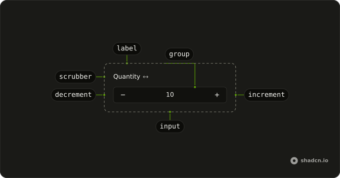
NumberInput
├── NumberInputInput
├── NumberInputGroup
├── NumberInputValueText
├── NumberInputIncrement
├── NumberInputDecrement
└── NumberInputScrubber
    └── NumberInputLabel
Usage
<script setup lang="ts">
import {
  NumberInput, NumberInputDecrement, NumberInputGroup,
  NumberInputIncrement, NumberInputInput,
} from "@/components/ui/number-input";
</script>
<template>
  <NumberInput class="w-full max-w-48" defaultValue="1">
    <NumberInputGroup>
      <NumberInputDecrement />
      <NumberInputInput />
      <NumberInputIncrement />
    </NumberInputGroup>
  </NumberInput>
</template>
Accessibility
- Arrow Up
- Increments the value of the number input by a predefined step.
- Arrow Down
- Decrements the value of the number input by a predefined step.
- Shift+Arrow Up
- Increments the value of the number input by the
largeStepamount. - Shift+Arrow Down
- Decrements the value of the number input by the
largeStepamount. - Alt+Arrow Up
- Increments the value of the number input by the
smallStepamount. - Alt+Arrow Down
- Decrements the value of the number input by the
smallStepamount. - Home
- Sets the value of the number input to its minimum allowed value.
- End
- Sets the value of the number input to its maximum allowed value.
- Enter
- Submits the value entered in the number input.
- Space
- Activate the focused control.
Demos
Controlled
The number lives in your state, starting at 1, and the line under the field only settles once it reads 3. Hold value when another part of the screen depends on it, or when you want to refuse a change before it sticks. The callback hands you a string, so a cleared field stays empty instead of becoming zero. Leave it uncontrolled if nothing else needs to read the number.
Disabled
disabled locks the field and both step buttons. Use it for a quantity the current plan or permission cannot change, while still showing the number that would have been edited. It is not a read-only caption: the control stays in the form, it just will not take input. Pair it with nearby text that says why it is off, or people will keep hitting the buttons.
Field Only
The group holds the input and nothing else. Drop the increment and decrement buttons when the row is narrow, like a table cell or a toolbar, and people will type the number. You still get a numeric field rather than a text box that only looks like one. If the step is awkward to type, put the buttons back.
Formatted
formatOptions takes Intl.NumberFormat options. Here the style is currency and the currency is USD, so 19 shows as dollars while the stored value stays a number. Use it for money or percents when the field should speak the format, not when you only want a symbol painted beside the box. A prefix you design yourself belongs in an input group instead.
Invalid
invalid is the error paint, before or after submit. Turn it on when the number fails a rule the field itself does not know, such as a stock check, and put the reason in a description next to it. The prop does not block typing or stepping. It only marks the control, so the message has to say what is wrong.
Mouse Wheel
allowMouseWheel lets a scroll over the focused field step the value. It stays off unless you set it, because a page scroll that crosses the input should not change a quantity. Turn it on in a tool panel where the pointer is already on the control and a wheel nudge is faster than the buttons. Leave it off in a long form.
Range
min is 0 and max is 10, with 5 as the start. The buttons stop at the ends, and a typed value outside that span is pulled back in. Set both when a percentage, a rating, or a small count cannot leave a known band. A step still applies inside the band, and if you only need to block negatives, a minimum is enough.
Scrub
NumberInputScrubber wraps the Quantity label, and dragging across it moves the value, the gesture design tools use when tiny plus and minus buttons are the slow path. Keep the buttons for people who click or use a keyboard. The scrubber is an extra handle, not a replacement for the field. Skip it where a drag fights page scrolling.
Size Lg
size set to lg raises the field and the step buttons. Pick the large size when this number is the main control on the screen, or when a coarse pointer makes the default hit area feel mean. It is the same component, not a different widget. Match it to other large fields in the form so the row does not jump.
Size Md
md is the default size, shown on its own so you can compare it with the small and large fields. Leave size unset in most forms. It lines up with the usual input height. Reach for another size only when the surrounding density actually changes, not to make one field look more important than its label.
Size Sm
size set to sm tightens the field for a toolbar, a table, or a side panel with too many rows. The buttons shrink with it, so do not use the small size as the only control on a phone. If the number is rare and the chrome should get out of the way, this is the one. Keep a visible label, because the shorter box is easy to miss.
Step
Two fields, one with step of 5 and one with step of 0.1. The first jumps in whole units, which fits inventory, and the second moves in tenths, which fits a measurement. The buttons move by that step, so pick one people can predict. A step of 7 on a price looks broken even when the math is right.
With Field
The number sits in a Field with the label Quantity and a description that says 0 to 100. min and max match that sentence. Use Field when the number needs a label, a hint, and later an error, instead of a placeholder that disappears as soon as someone types. The description is the place for the range, so do not hide it in an accessible name only.
With Input Group
The number sits in an Input Group with a euro sign before it and EUR after it, and there are no step buttons. The field has its own accessible name, because the symbols are not a label. Use this when the unit is chrome and formatOptions would force a locale currency format you do not want. The group is layout, and the number input holds the value.
FAQ
How do I control the Number Input value in Vue?
Bind v-model on NumberInput. It holds the value as a string, so an empty field stays empty instead of turning into 0; convert it with Number() when you save it.
See the Controlled demo above.
How do I set a minimum, maximum and step on the Number Input?
Set min, max and step on NumberInput. The increment and decrement buttons stop at the bounds and move by step, and a value typed outside the range is clamped back into it. The Range and Step demos show both.
How do I format the Number Input as currency or a percentage?
Pass formatOptions, which takes Intl.NumberFormat options: { style: "currency", currency: "USD" } shows dollars and { style: "percent" } a percentage. The Formatted demo above shows one.
Can the Number Input change with the mouse wheel?
Yes: set allowMouseWheel on NumberInput, and scrolling over the focused field steps the value. It's off by default so that scrolling the page past a field never changes a value by accident.
How do I use the Ark UI Number Input in a form?
Give NumberInput a name, and its value submits with the form.
Wrap it in Field for a label, a description and an error message, as in the With Field demo.
How do I let people drag to change the Number Input value?
Add NumberInputScrubber, usually around the label: dragging across it scrubs the value up and down by step. The Scrub demo above puts one on the label.
API Reference
NumberInput
<div> data-slot="number-field"
value?string
The controlled value of the input. Two-way with v-model.
defaultValue?string
The initial value of the input when rendered. Use when you don't need to control the value of the input.
allowMouseWheel?boolean
Whether to allow mouse wheel to change the value.
allowOverflow?boolean
Whether to allow the value overflow the min/max range.
- Default
true
clampValueOnBlur?boolean
Whether to clamp the value when the input loses focus (blur).
- Default
true
dir?"ltr" | "rtl"
The document's text/writing direction.
- Type
"ltr" | "rtl"- Default
"ltr"
disabled?boolean
Whether the number input is disabled.
focusInputOnChange?boolean
Whether to focus input when the value changes.
- Default
true
form?string
The associate form of the input element.
formatOptions?Intl.NumberFormatOptions
The options to pass to the Intl.NumberFormat constructor.
id?string
The unique identifier of the machine.
ids?object
The ids of the elements in the number input. Useful for composition.
- Type
{ root?: string; label?: string; input?: string; incrementTrigger?: string; decrementTrigger?: string; scrubber?: string }
inputMode?"text" | "tel" | "numeric" | "decimal"
Hints at the type of data that might be entered by the user. It also determines the type of keyboard shown to the user on mobile devices
- Type
"text" | "tel" | "numeric" | "decimal"- Default
"decimal"
invalid?boolean
Whether the number input value is invalid.
largeStep?number
The amount to increment or decrement the value by when the Shift key is held.
- Default
10 * step
locale?string
The current locale. Based on the BCP 47 definition.
- Default
"en-US"
max?number
The maximum value of the number input.
- Default
Number.MAX_SAFE_INTEGER
min?number
The minimum value of the number input.
- Default
Number.MIN_SAFE_INTEGER
name?string
The name attribute of the number input. Useful for form submission.
pattern?string
The pattern used to check the <input> element's value against.
- Default
"-?[0-9]*(.[0-9]+)?"
readOnly?boolean
Whether the number input is readonly.
required?boolean
Whether the number input is required.
smallStep?number
The amount to increment or decrement the value by when the Alt key is held.
- Default
step / 10
spinOnPress?boolean
Whether to spin the value when the increment/decrement button is pressed.
- Default
true
step?number
The amount to increment or decrement the value by.
- Default
1
translations?object
Specifies the localized strings that identifies the accessibility elements and their states.
- Type
{ valueText?: (value: string) → string; incrementLabel?: string; decrementLabel?: string }
asChild?boolean
Use the provided child element as the default rendered element, combining their props and behavior.
class?string
Merged with the part's classes.
@value-change(details: ValueChangeDetails) → void
Function invoked when the value changes.
- Type
(details: ValueChangeDetails) → void- Parameters
details– { value: string; valueAsNumber: number }- Returns
void
@focus-change(details: FocusChangeDetails) → void
Function invoked when the number input is focused.
- Type
(details: FocusChangeDetails) → void- Parameters
details– { focused: boolean }- Returns
void
@value-commit(details: ValueChangeDetails) → void
Function invoked when the value is committed (when the input is blurred or the Enter key is pressed).
- Type
(details: ValueChangeDetails) → void- Parameters
details– { value: string; valueAsNumber: number }- Returns
void
@value-invalid(details: ValueInvalidDetails) → void
Function invoked when the value overflows or underflows the min/max range.
- Type
(details: ValueInvalidDetails) → void- Parameters
details– { reason: ValidityState }- Returns
void
data-disabled?string
Present when disabled.
data-focus?string
Present when focused.
data-invalid?string
Present when invalid.
data-scrubbing?string
Present when scrubbing is true.
data-size?string
Mirrors size.
NumberInputLabel
<label>
asChild?boolean
Use the provided child element as the default rendered element, combining their props and behavior.
data-disabled?string
Present when disabled.
data-focus?string
Present when focused.
data-invalid?string
Present when invalid.
data-required?string
Present when required.
data-scrubbing?string
Present when scrubbing is true.
NumberInputInput
<input> data-slot="number-field-input"
size?"lg" | "md" | "sm"
The size.
- Type
"lg" | "md" | "sm"- Default
"md"
asChild?boolean
Use the provided child element as the default rendered element, combining their props and behavior.
class?string
Merged with the part's classes.
data-disabled?string
Present when disabled.
data-invalid?string
Present when invalid.
data-scrubbing?string
Present when scrubbing is true.
NumberInputGroup
<div> data-slot="number-field-group"
asChild?boolean
Use the provided child element as the default rendered element, combining their props and behavior.
class?string
Merged with the part's classes.
data-disabled?string
Present when disabled.
data-focus?string
Present when focused.
data-invalid?string
Present when invalid.
data-scrubbing?string
Present when scrubbing is true.
NumberInputIncrement
<button> data-slot="number-field-increment"
asChild?boolean
Use the provided child element as the default rendered element, combining their props and behavior.
class?string
Merged with the part's classes.
data-disabled?string
Present when disabled.
data-scrubbing?string
Present when scrubbing is true.
NumberInputDecrement
<button> data-slot="number-field-decrement"
asChild?boolean
Use the provided child element as the default rendered element, combining their props and behavior.
class?string
Merged with the part's classes.
data-disabled?string
Present when disabled.
data-scrubbing?string
Present when scrubbing is true.
NumberInputScrubber
<div> data-slot="number-field-scrubber"
asChild?boolean
Use the provided child element as the default rendered element, combining their props and behavior.
class?string
Merged with the part's classes.
data-disabled?string
Present when disabled.
data-scrubbing?string
Present when scrubbing is true.
useNumberInput
value?string
The controlled value of the input. Two-way with v-model.
defaultValue?string
The initial value of the input when rendered. Use when you don't need to control the value of the input.
allowMouseWheel?boolean
Whether to allow mouse wheel to change the value.
allowOverflow?boolean
Whether to allow the value overflow the min/max range.
- Default
true
clampValueOnBlur?boolean
Whether to clamp the value when the input loses focus (blur).
- Default
true
disabled?boolean
Whether the number input is disabled.
focusInputOnChange?boolean
Whether to focus input when the value changes.
- Default
true
form?string
The associate form of the input element.
formatOptions?Intl.NumberFormatOptions
The options to pass to the Intl.NumberFormat constructor.
id?string
The unique identifier of the machine.
ids?object
The ids of the elements in the number input. Useful for composition.
- Type
{ root?: string; label?: string; input?: string; incrementTrigger?: string; decrementTrigger?: string; scrubber?: string }
inputMode?"text" | "tel" | "numeric" | "decimal"
Hints at the type of data that might be entered by the user. It also determines the type of keyboard shown to the user on mobile devices
- Type
"text" | "tel" | "numeric" | "decimal"- Default
"decimal"
invalid?boolean
Whether the number input value is invalid.
largeStep?number
The amount to increment or decrement the value by when the Shift key is held.
- Default
10 * step
locale?string
The current locale. Based on the BCP 47 definition.
- Default
"en-US"
max?number
The maximum value of the number input.
- Default
Number.MAX_SAFE_INTEGER
min?number
The minimum value of the number input.
- Default
Number.MIN_SAFE_INTEGER
name?string
The name attribute of the number input. Useful for form submission.
pattern?string
The pattern used to check the <input> element's value against.
- Default
"-?[0-9]*(.[0-9]+)?"
readOnly?boolean
Whether the number input is readonly.
required?boolean
Whether the number input is required.
smallStep?number
The amount to increment or decrement the value by when the Alt key is held.
- Default
step / 10
spinOnPress?boolean
Whether to spin the value when the increment/decrement button is pressed.
- Default
true
step?number
The amount to increment or decrement the value by.
- Default
1
translations?object
Specifies the localized strings that identifies the accessibility elements and their states.
- Type
{ valueText?: (value: string) → string; incrementLabel?: string; decrementLabel?: string }
@value-change(details: ValueChangeDetails) → void
Function invoked when the value changes.
- Type
(details: ValueChangeDetails) → void- Parameters
details– { value: string; valueAsNumber: number }- Returns
void
@focus-change(details: FocusChangeDetails) → void
Function invoked when the number input is focused.
- Type
(details: FocusChangeDetails) → void- Parameters
details– { focused: boolean }- Returns
void
@value-commit(details: ValueChangeDetails) → void
Function invoked when the value is committed (when the input is blurred or the Enter key is pressed).
- Type
(details: ValueChangeDetails) → void- Parameters
details– { value: string; valueAsNumber: number }- Returns
void
@value-invalid(details: ValueInvalidDetails) → void
Function invoked when the value overflows or underflows the min/max range.
- Type
(details: ValueInvalidDetails) → void- Parameters
details– { reason: ValidityState }- Returns
void
With other components
Field
InputsLabel and error
Label
InputsName the number
Slider
ControlsDrag the same value
Button
ButtonsStep up and down
Input Group
InputsA unit beside the number
Tooltip
OverlaysThe allowed range
Related
Input
InputsAny text
Circular Slider
ControlsTurn the same value
Date Input
DatesA date in segments
Select
SelectionA few named amounts
Native Select
SelectionThe platform list
Rating
SelectionA small score