shadcn.io is not affiliated with official shadcn/ui
A dashed area and a browse button that list the files you picked. Nothing is sent until your own code uploads them.
Use it to collect files in the browser before submit. A file already uploading or stored, with progress and remove, is an Attachment. In Vue, Ark UI keeps the accepted list for your submit handler.
Installation
Anatomy
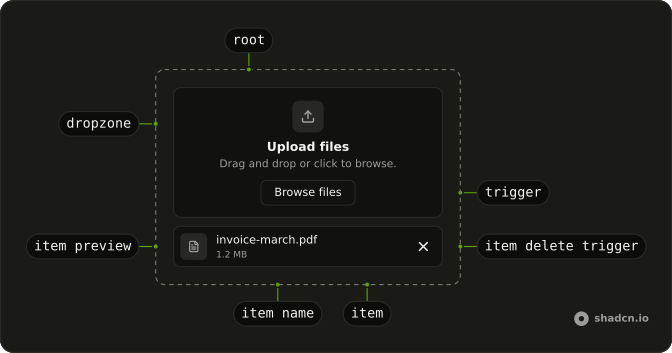
FileUpload
├── FileUploadDropzone
├── FileUploadItem
│   ├── FileUploadItemDeleteTrigger
│   ├── FileUploadItemGroup
│   ├── FileUploadItemName
│   ├── FileUploadItemPreview
│   │   └── FileUploadItemPreviewImage
│   └── FileUploadItemSize
├── FileUploadLabel
├── FileUploadTrigger
└── FileUploadClearTrigger
Usage
<script setup lang="ts">
import { Button } from "@/components/ui/button";
import {
  FileUpload, FileUploadDescription, FileUploadDropzone,
  FileUploadDropzoneIcon, FileUploadHelper, FileUploadList,
  FileUploadTitle, FileUploadTrigger,
} from "@/components/ui/file-upload";
import { Separator } from "@/components/ui/separator";
</script>
<template>
  <FileUpload class="mx-auto w-full max-w-xs">
    <FileUploadDropzone>
      <FileUploadDropzoneIcon />
      <FileUploadTitle>Drop files here</FileUploadTitle>
      <div class="flex items-center justify-center gap-2">
        <Separator />
        <FileUploadDescription>or</FileUploadDescription>
        <Separator />
      </div>
      <FileUploadTrigger as-child>
        <Button>Browse files</Button>
      </FileUploadTrigger>
      <FileUploadHelper>
        You can upload up to 2 files at a time.
      </FileUploadHelper>
    </FileUploadDropzone>
    <FileUploadList />
  </FileUpload>
</template>
Accessibility
- Enter
- Activate the focused control.
- Space
- Activate the focused control.
Demos
Accepted File Types
accept is limited to PNG and JPEG, and a helper line under the title says so. Other types are rejected and never appear in the list, which is a bad surprise if the only hint was the system file dialog. Set accept to the types the server will actually take. The helper is what a person reads before they drop a photo from their camera roll.
Clear Trigger
The trash button in the corner is FileUploadClearTrigger, and one activation removes every accepted file, which is the way out after dropping the wrong folder. Each row can still delete itself. Add a clear-all control when the list can grow past a couple of files. For one required file, the per-item delete is enough and a second trash icon is clutter.
Custom Preview
Only images are accepted, and the stock list is replaced by a four-column grid of thumbnails, each with a delete button on the corner, built from acceptedFiles on useFileUpload. Do this when a row of icon, name, and size is the wrong shape, which is most photo pickers. Pass each file to FileUploadItem through file, and keep FileUploadList when the default row is fine.
Custom Spacing
The dropzone class sets --space to spacing step 4, and to step 6 from the medium breakpoint. Dialogs and popovers on this site use that token for inset, so a zone can share the same scale instead of a one-off padding utility. Put padding classes on FileUploadDropzone if the dashed box itself needs to grow. The icon, the title, and the list under the zone stay put.
Directory Upload
directory on the root makes the trigger open a folder picker rather than a file picker, and the button reads Select Folder. This is for a project directory or a batch of scans that already live together. It works in WebKit browsers, so do not rely on it as the only path. For a few loose files, leave directory off and use an ordinary trigger.
Dropzone
The dashed target is the whole control: an icon, a short title, and the file list. There is no separate browse button, because clicking the zone opens the picker. Use that when a second button would repeat the same action. Add FileUploadTrigger when you want an obvious labeled button, or set disableClick on the dropzone if it should only accept a drop.
Media Capture
capture is environment, so the button asks for the camera facing away from the user, and the label is Take a picture. Use user for the front camera. This fits a phone step where the file should be a new photo, not one already in the library. Where the browser has no camera, you still get a file picker.
Multiple Files
maxFiles is 5, and the helper says you can upload up to 5 at a time. The default cap is 1, so a second file is rejected if you forget the prop. Raise it for a ticket with several attachments, or a listing with several photos. The helper tells people the number, since the prop alone is invisible until someone hits it.
Trigger
There is no drop zone: FileUploadTrigger is an outline button with a paperclip, and the chosen files list underneath. Use a bare trigger when the upload sits beside a comment box, where a large dashed region would take over the form. The list still names what was picked. Drag and drop can stay available, or turn allowDrop off if the button should be the only way in.
With Field
The upload is wrapped in a Field whose label is Upload images, and the dropzone itself is only the icon because that label already names the control. Use this when the picker is one question among others and needs the same label association as the text fields. A title inside the dashed box would repeat the label. The list still renders under the zone.
FAQ
How do I limit what a File Upload accepts in Vue?
Set accept to the types you allow, such as image/png,image/jpeg or image/*, as the Accepted File Types demo does. maxFiles defaults to 1. Raise it for several files. maxFileSize and minFileSize are limits in bytes. A file that fails those rules is rejected and is not added to the accepted list.
How do I read the files a File Upload accepted?
The root keeps the accepted files. Use defaultAcceptedFiles for a starting list, or control the list with acceptedFiles. Rejected files are reported separately, so a bad file does not look like a successful choice.
Listen to @file-accept, @file-change, and @file-reject. Each event receives the details for that change.
Does File Upload send files to a server?
No. It only collects files in the browser. Set name when those files should ride along with a normal form submit, through the hidden input the root renders. Otherwise upload them yourself from the accepted list. Attachment shows a file that is already uploading or uploaded. It is not the picker.
Can File Upload take a folder or a camera?
Set directory to accept a folder. That only works in WebKit browsers. Set capture to user or environment to open a camera, as the Media Capture demo does. allowDrop defaults to true. Set it to false when the field should not take a drop. disableClick on FileUploadDropzone leaves opening the picker to FileUploadTrigger.
How do I remove a file from a File Upload?
FileUploadClearTrigger clears every file, as the Clear Trigger demo does. Inside a custom item, FileUploadItemDeleteTrigger removes that file. FileUploadList is the ready-made list. For your own layout, map the accepted files into FileUploadItem and pass each one as file, as the Custom Preview demo does.
How do I style a File Upload while a file is dragged over it?
The root and the dropzone set data-dragging during the drag, and data-invalid when the field is invalid. data-disabled and data-readonly follow disabled and readOnly. Edit components/ui/file-upload to change the dashed border, the icon, or the dragging color. Pass a class for a one-off width.
Can I use File Upload from the keyboard?
Yes. FileUploadTrigger is a button. Enter or Space activates it and opens the file picker, which matches the Accessibility section. The same keys activate clear and delete. Drag and drop has no keyboard path, so keep a trigger. The dropzone itself is clickable unless you set disableClick.
How do I install File Upload in Vue?
Run the command in the Installation section above. It adds the root, dropzone, trigger, list, and item parts to your ui folder. The root already includes the hidden file input, so you do not add that input yourself. Pair it with Field when it needs a label, as the With Field demo does. The command uses the shadcn-vue CLI.
API Reference
FileUpload
<div> data-slot="file-upload"
accept?Record<string, string[]> | FileMimeType | FileMimeType[]
The accept file types.
- Type
Record<string, string[]> | FileMimeType | FileMimeType[]
acceptedFiles?File[]
The controlled accepted files.
allowDrop?boolean
Whether to allow drag and drop in the dropzone element.
- Default
true
capture?"user" | "environment"
The default camera to use when capturing media.
- Type
"user" | "environment"
defaultAcceptedFiles?File[]
The default accepted files when rendered. Use when you don't need to control the accepted files of the input.
dir?"ltr" | "rtl"
The document's text/writing direction.
- Type
"ltr" | "rtl"- Default
"ltr"
directory?boolean
Whether to accept directories, only works in webkit browsers.
disabled?boolean
Whether the file input is disabled.
id?string
The unique identifier of the machine.
ids?object
The ids of the elements. Useful for composition.
- Type
{ root?: string; dropzone?: string; hiddenInput?: string; trigger?: string; label?: string; item?: (id: string) → string; itemName?: (id: string) → string; itemSizeText?: (id: string) → string; itemPreview?: (id: string) → string; itemDeleteTrigger?: (id: string) → string }
invalid?boolean
Whether the file input is invalid.
locale?string
The current locale. Based on the BCP 47 definition.
- Default
"en-US"
maxFiles?number
The maximum number of files.
- Default
1
maxFileSize?number
The maximum file size in bytes.
- Default
Infinity
minFileSize?number
The minimum file size in bytes.
- Default
0
name?string
The name of the underlying file input.
preventDocumentDrop?boolean
Whether to prevent the drop event on the document.
- Default
true
readOnly?boolean
Whether the file input is read-only.
required?boolean
Whether the file input is required.
transformFiles?(files: File[]) → Promise<File[]>
Function to transform the accepted files to apply transformations.
- Type
(files: File[]) → Promise<File[]>- Parameters
files– File[]- Returns
Promise<File[]>
translations?object
The localized messages to use.
- Type
{ dropzone?: string; itemPreview?: (file: File) → string; deleteFile?: (file: File) → string }
validate?(file: File, details: FileValidateDetails) → FileError[] | null
Function to validate a file.
- Type
(file: File, details: FileValidateDetails) → FileError[] | null- Parameters
file– Filedetails– { acceptedFiles: File[]; rejectedFiles: FileRejection[] }- Returns
FileError[] | null
asChild?boolean
Use the provided child element as the default rendered element, combining their props and behavior.
class?string
Merged with the part's classes.
@file-accept(details: FileAcceptDetails) → void
Function called when the file is accepted.
- Type
(details: FileAcceptDetails) → void- Parameters
details– { files: File[] }- Returns
void
@file-change(details: FileChangeDetails) → void
Function called when the value changes, whether accepted or rejected.
- Type
(details: FileChangeDetails) → void- Parameters
details– { acceptedFiles: File[]; rejectedFiles: FileRejection[] }- Returns
void
@file-reject(details: FileRejectDetails) → void
Function called when the file is rejected.
- Type
(details: FileRejectDetails) → void- Parameters
details– { files: FileRejection[] }- Returns
void
data-disabled?string
Present when disabled.
data-dragging?string
Present when in the dragging state.
data-readonly?string
Present when read-only.
FileUploadDropzone
<div> data-slot="file-upload-dropzone"
disableClick?boolean
Whether to disable the click event on the dropzone.
asChild?boolean
Use the provided child element as the default rendered element, combining their props and behavior.
class?string
Merged with the part's classes.
data-disabled?string
Present when disabled.
data-dragging?string
Present when in the dragging state.
data-invalid?string
Present when invalid.
data-readonly?string
Present when read-only.
FileUploadItem
<li> data-slot="file-upload-item"
fileFile
The file it's for.
asChild?boolean
Use the provided child element as the default rendered element, combining their props and behavior.
class?string
Merged with the part's classes.
data-disabled?string
Present when disabled.
data-typestring
The type of the item.
FileUploadItemDeleteTrigger
<button> data-slot="file-upload-item-delete-trigger"
asChild?boolean
Use the provided child element as the default rendered element, combining their props and behavior.
data-disabled?string
Present when disabled.
data-readonly?string
Present when read-only.
data-typestring
The type of the item.
FileUploadItemGroup
<ul> data-slot="file-upload-item-group"
type?"accepted" | "rejected"
Which files it lists: accepted or rejected.
- Type
"accepted" | "rejected"
asChild?boolean
Use the provided child element as the default rendered element, combining their props and behavior.
data-disabled?string
Present when disabled.
data-type?string
The type of the item.
FileUploadItemName
<div> data-slot="file-upload-item-name"
asChild?boolean
Use the provided child element as the default rendered element, combining their props and behavior.
class?string
Merged with the part's classes.
data-disabled?string
Present when disabled.
data-typestring
The type of the item.
FileUploadItemPreview
<div> data-slot="file-upload-item-preview"
type?string
The file type to match against. Matches all file types by default.
- Default
".*"
asChild?boolean
Use the provided child element as the default rendered element, combining their props and behavior.
class?string
Merged with the part's classes.
data-disabled?string
Present when disabled.
data-typestring
The type of the item.
FileUploadItemPreviewImage
<img> data-slot="file-upload-item-preview-image"
asChild?boolean
Use the provided child element as the default rendered element, combining their props and behavior.
class?string
Merged with the part's classes.
data-disabled?string
Present when disabled.
data-typestring
The type of the item.
FileUploadItemSize
<div> data-slot="file-upload-item-size"
asChild?boolean
Use the provided child element as the default rendered element, combining their props and behavior.
class?string
Merged with the part's classes.
data-disabled?string
Present when disabled.
data-typestring
The type of the item.
FileUploadTrigger
<button> data-slot="file-upload-trigger"
asChild?boolean
Use the provided child element as the default rendered element, combining their props and behavior.
data-disabled?string
Present when disabled.
data-invalid?string
Present when invalid.
data-readonly?string
Present when read-only.
FileUploadClearTrigger
<button> data-slot="file-upload-clear-trigger"
asChild?boolean
Use the provided child element as the default rendered element, combining their props and behavior.
data-disabled?string
Present when disabled.
data-readonly?string
Present when read-only.
FileUploadDropzoneIcon
<div> data-slot="file-upload-dropzone-icon"
asChild?boolean
Use the provided child element as the default rendered element, combining their props and behavior.
class?string
Merged with the part's classes.
data-disabled?string
Present when disabled is true.
data-dragging?string
Present when dragging is true.
data-readonly?string
Present when readOnly is true.
FileUploadTitle
<div> data-slot="file-upload-title"
asChild?boolean
Use the provided child element as the default rendered element, combining their props and behavior.
class?string
Merged with the part's classes.
data-disabled?string
Present when disabled is true.
data-dragging?string
Present when dragging is true.
data-readonly?string
Present when readOnly is true.
FileUploadDescription
<div> data-slot="file-upload-description"
asChild?boolean
Use the provided child element as the default rendered element, combining their props and behavior.
class?string
Merged with the part's classes.
data-disabled?string
Present when disabled is true.
data-dragging?string
Present when dragging is true.
data-readonly?string
Present when readOnly is true.
FileUploadHelper
<div> data-slot="file-upload-dropzone-helper"
asChild?boolean
Use the provided child element as the default rendered element, combining their props and behavior.
class?string
Merged with the part's classes.
data-disabled?string
Present when disabled is true.
data-dragging?string
Present when dragging is true.
data-readonly?string
Present when readOnly is true.
FileUploadList
<li>
asChild?boolean
Use the provided child element as the default rendered element, combining their props and behavior.
class?string
Merged with the part's classes.
data-disabled?string
Present when disabled.
data-typestring
The type of the item.
FileUploadRootProvider
<div> data-slot="file-upload-root-provider"
valueUseFileUploadReturn
What useFileUpload() returns: the state and API, made outside the component to control it.
asChild?boolean
Use the provided child element as the default rendered element, combining their props and behavior.
data-disabled?string
Present when disabled is true.
data-dragging?string
Present when dragging is true.
data-readonly?string
Present when readOnly is true.
useFileUpload
accept?Record<string, string[]> | FileMimeType | FileMimeType[]
The accept file types.
- Type
Record<string, string[]> | FileMimeType | FileMimeType[]
acceptedFiles?File[]
The controlled accepted files.
allowDrop?boolean
Whether to allow drag and drop in the dropzone element.
- Default
true
capture?"user" | "environment"
The default camera to use when capturing media.
- Type
"user" | "environment"
defaultAcceptedFiles?File[]
The default accepted files when rendered. Use when you don't need to control the accepted files of the input.
directory?boolean
Whether to accept directories, only works in webkit browsers.
disabled?boolean
Whether the file input is disabled.
id?string
The unique identifier of the machine.
ids?object
The ids of the elements. Useful for composition.
- Type
{ root?: string; dropzone?: string; hiddenInput?: string; trigger?: string; label?: string; item?: (id: string) → string; itemName?: (id: string) → string; itemSizeText?: (id: string) → string; itemPreview?: (id: string) → string; itemDeleteTrigger?: (id: string) → string }
invalid?boolean
Whether the file input is invalid.
locale?string
The current locale. Based on the BCP 47 definition.
- Default
"en-US"
maxFiles?number
The maximum number of files.
- Default
1
maxFileSize?number
The maximum file size in bytes.
- Default
Infinity
minFileSize?number
The minimum file size in bytes.
- Default
0
name?string
The name of the underlying file input.
preventDocumentDrop?boolean
Whether to prevent the drop event on the document.
- Default
true
readOnly?boolean
Whether the file input is read-only.
required?boolean
Whether the file input is required.
transformFiles?(files: File[]) → Promise<File[]>
Function to transform the accepted files to apply transformations.
- Type
(files: File[]) → Promise<File[]>- Parameters
files– File[]- Returns
Promise<File[]>
translations?object
The localized messages to use.
- Type
{ dropzone?: string; itemPreview?: (file: File) → string; deleteFile?: (file: File) → string }
validate?(file: File, details: FileValidateDetails) → FileError[] | null
Function to validate a file.
- Type
(file: File, details: FileValidateDetails) → FileError[] | null- Parameters
file– Filedetails– { acceptedFiles: File[]; rejectedFiles: FileRejection[] }- Returns
FileError[] | null
@file-accept(details: FileAcceptDetails) → void
Function called when the file is accepted.
- Type
(details: FileAcceptDetails) → void- Parameters
details– { files: File[] }- Returns
void
@file-change(details: FileChangeDetails) → void
Function called when the value changes, whether accepted or rejected.
- Type
(details: FileChangeDetails) → void- Parameters
details– { acceptedFiles: File[]; rejectedFiles: FileRejection[] }- Returns
void
@file-reject(details: FileRejectDetails) → void
Function called when the file is rejected.
- Type
(details: FileRejectDetails) → void- Parameters
details– { files: FileRejection[] }- Returns
void