shadcn.io is not affiliated with official shadcn/ui
Multi-line text for a comment, a bio, or a support note. It starts at a few lines.
Use it when the answer needs more than one line. A name, an email, or a search that must stay one line is an Input. In Vue, Ark UI renders a native textarea, so the value submits with the form.
Installation
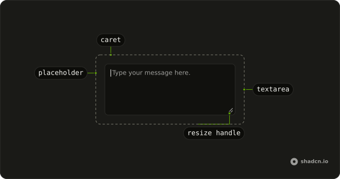
Anatomy
Usage
<script setup lang="ts">
import { Textarea } from "@/components/ui/textarea";
</script>
const TextareaDemo = () => (
  <Textarea className="max-w-xs" placeholder="Type your message here." />
);
Demos
Field
A placeholder disappears the moment someone types, so it cannot be the name of the field. Put the textarea in a Field with a label of Message and a description between the label and the box, where it stays visible and gets announced. Anything a person fills in more than once should look like this, not like a bare box.
Disabled
Set disabled on both the textarea and the Field around it, so typing stops, the cursor changes, and the label picks up the disabled styling too. Use it when the message depends on an earlier choice, or the viewer is not allowed to edit. A dim border that still accepts focus feels broken, because the prop is what actually blocks input.
Invalid
After a bad submit, set invalid on the Field and aria-invalid on the textarea so the border and focus ring go destructive. The line underneath is the reason, and it should be the real one from your check, not a generic failure. FieldError is the better slot when that sentence should exist only while the field is invalid, while a description stays on screen the whole time.
Button
A note with Send under it is the smallest message form: the textarea is the only field, and the button sits outside the box. Use the stack when sending that text is the whole action. When the button should live in the corner of the field, an input group is the composition, not a gap under the box.
Rtl
Comments in Arabic, with dir set to rtl on the field, so the label, the caret, and the helper share a start edge. rows is 4 so there is room for a sentence rather than the short default. Set direction here or on the document, and skip physical padding that pins the text to the left.
FAQ
How do I make a Textarea grow with its content in Vue?
It already does in browsers that support field-sizing: the Textarea has the field-sizing-content class, so it grows with its text from a minimum height of min-h-16.
Set autoresize for browsers without field-sizing; it resizes with script.
How do I set a maximum height on a Textarea?
Add a max height class, for example max-h-40: the Textarea grows up to it and then scrolls. Add resize-none too if people should not drag the corner to resize it.
How do I add a label and help text to a Textarea?
Put it in a Field with a FieldLabel above it and a FieldDescription under it, as the Field demo does, so screen readers read the label with the Textarea.
The Field links the label and description to it for you.
How do I show a validation error on a Textarea?
Set aria-invalid on it, or mark its Field invalid, as the Invalid demo does: the border and focus ring turn destructive. Show the message with a FieldError under it so it is announced.
How do I limit and count characters in a Textarea?
Set maxLength to stop typing past the limit. Keep the value in state and show its length next to the limit, for example "120 / 280", in the FieldDescription.
API Reference
Textarea
<textarea> data-slot="textarea"
autoresize?boolean
Whether the textarea should autoresize.
- Default
false
asChild?boolean
Use the provided child element as the default rendered element, combining their props and behavior.
class?string
Merged with the part's classes.