shadcn.io is not affiliated with official shadcn/ui
A card holds a title, the text under it, and the actions that belong with them.
Use it when one subject should stand on its own, like a login. For repeating rows, such as files or settings, use an Item. In Vue, Ark UI adds no open or close behavior.
Installation
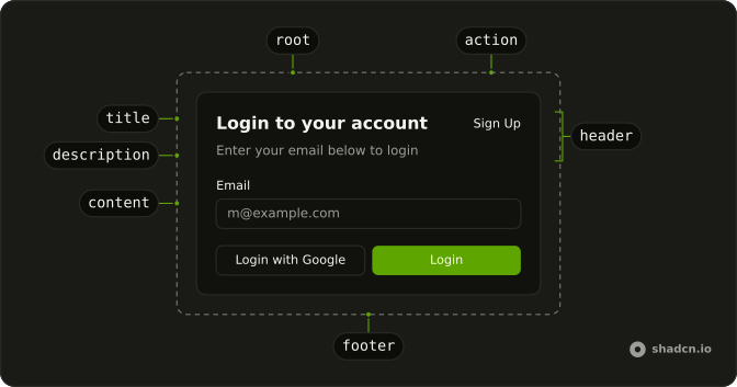
Anatomy
Usage
<script setup lang="ts">
import { Button } from "@/components/ui/button";
import {
  Card, CardAction, CardContent, CardDescription, CardFooter,
  CardHeader, CardTitle,
} from "@/components/ui/card";
import { Field, FieldLabel } from "@/components/ui/field";
import { Input } from "@/components/ui/input";
</script>
<template>
  <Card class="w-full max-w-sm">
    <CardHeader>
      <CardTitle>Login to your account</CardTitle>
      <CardDescription>
        Enter your email below to login to your account
      </CardDescription>
      <CardAction>
        <Button variant="link">Sign Up</Button>
      </CardAction>
    </CardHeader>
    <CardContent>
      <form>
        <div class="flex flex-col gap-6">
          <Field class="gap-2">
            <FieldLabel>Email</FieldLabel>
            <Input placeholder="m@example.com" required type="email" />
          </Field>
          <Field class="gap-2">
            <div class="flex items-center">
              <FieldLabel>Password</FieldLabel>
              <a
                class="ml-auto inline-block text-sm underline-offset-4 hover:underline"
                href="#"
              >
                Forgot your password?
              </a>
            </div>
            <Input required type="password" />
          </Field>
        </div>
      </form>
    </CardContent>
    <CardFooter class="flex-col gap-2">
      <Button class="w-full" type="submit">
        Login
      </Button>
      <Button class="w-full" variant="outline">
        Login with Google
      </Button>
    </CardFooter>
  </Card>
</template>
Accessibility
- Enter
- Activate the focused control.
- Space
- Activate the focused control.
Demos
Small
size="sm" tightens the padding and the type for a card that is a side note rather than the page, such as this feature pitch with two buttons. Use it in a grid of offers or for a hint on a settings screen, and keep the default size when the card holds a form. A one-off gap, rather than the small preset, is what the spacing demo is for.
Spacing
--card-spacing sets the gaps and the insets for the header, the body, and the footer together. The toggle moves the same login card from 16px to 32px. Turn it up when the default rhythm is too tight for a marketing card, and down when an admin panel feels padded. size="sm" is the preset, and this variable is the manual knob.
Edge To Edge
The terms block uses negative margins from --card-spacing, so the text runs to the card border while the footer keeps its inset. That suits a scrollable agreement, a table, or a map that should not look padded. The image demo is the other full-bleed case, and it only applies when the picture is the first child. Use the margins when the bleed sits lower, above the footer.
Image
An image as the first child drops the top padding and rounds with the card. This cover carries a badge in CardAction and one footer button, the shape of a media tile whose picture is the header. A full-width block should use the negative margin from the edge-to-edge demo, not a pretend first child. Any dimming, like the scrim on this photo, is your own element.
Rtl
dir="rtl" on the card flips the login: the sign-up action stays at the end, and the forgot-password link uses a logical margin so it does not stick to the physical right. Use the attribute when this card is an island of Arabic or Hebrew on a left-to-right page. A whole form should inherit from Direction rather than repeating dir on every surface.
FAQ
What are the parts of a Card?
Card is the surface; inside it go CardHeader with CardTitle, CardDescription and an optional CardAction, then CardContent and CardFooter. CardMedia holds an image or an icon. Use only the parts you need: a header and content is a complete card.
How do I put a button or badge in the top corner of a Card?
Put it in CardAction inside CardHeader: the header turns into two columns and keeps the action at the end, next to the title and description. Keep quick actions such as a menu there, and the main action, such as Save, in CardFooter.
How do I add an edge-to-edge image to a Card?
Make the img the card's first child, before the header: the card drops its top padding and rounds the image's corners, as in the Image demo. For a full-width block further down, use negative margins based on --card-spacing, as in the Edge To Edge demo.
How do I make a whole Card clickable?
Put a link on the title and stretch it over the card with a Link Overlay, or wrap the card in a link. Avoid buttons inside a clickable card: two things competing for the same click confuse readers and produce invalid HTML.
Should I use a Card or an Item for a list?
Use an Item for rows in a list, such as files or settings, each with media, a title and an action. A Card is a section of its own, so a page usually has a few cards, not dozens stacked like rows.
API Reference
Card
<div> data-slot="card"
size?"default" | "sm"
The size.
- Type
"default" | "sm"- Default
"default"
asChild?boolean
Use the provided child element as the default rendered element, combining their props and behavior.
class?string
Merged with the part's classes.
data-size?string
Mirrors size.
CardMedia
<div> data-slot="card-media"
variant?"default" | "icon" | "image"
The visual style.
- Type
"default" | "icon" | "image"- Default
"default"
asChild?boolean
Use the provided child element as the default rendered element, combining their props and behavior.
class?string
Merged with the part's classes.
data-variant?string
Mirrors variant.
CardHeader
<div> data-slot="card-header"
description?string
The description of the card.
title?string
The title of the card.
asChild?boolean
Use the provided child element as the default rendered element, combining their props and behavior.
class?string
Merged with the part's classes.
CardTitle
<h2> data-slot="card-title"
asChild?boolean
Use the provided child element as the default rendered element, combining their props and behavior.
class?string
Merged with the part's classes.
CardDescription
<p> data-slot="card-description"
asChild?boolean
Use the provided child element as the default rendered element, combining their props and behavior.
class?string
Merged with the part's classes.
CardAction
<div> data-slot="card-action"
asChild?boolean
Use the provided child element as the default rendered element, combining their props and behavior.
class?string
Merged with the part's classes.
CardContent
<div> data-slot="card-content"
asChild?boolean
Use the provided child element as the default rendered element, combining their props and behavior.
class?string
Merged with the part's classes.
CardFooter
<div> data-slot="card-footer"
asChild?boolean
Use the provided child element as the default rendered element, combining their props and behavior.
class?string
Merged with the part's classes.
With other components
Button
ButtonsLogin, save, cancel
Input
InputsFields in the body
Label
InputsCaption on a field
Badge
FeedbackFeatured in the header
Avatar
MediaFace in the header
Field
InputsSettings in a box
Related
Item
LayoutOne row, not a box
Empty
FeedbackNothing in the card
Skeleton
FeedbackWhile the card loads
Hover Card
OverlaysPreview on hover
Aspect Ratio
LayoutImage on top
Frame
LayoutA border without the parts