shadcn.io is not affiliated with official shadcn/ui
The list scrolls inside a fixed box, so the page does not grow with it.
Use it for a menu, a log, or a tag list, and leave the page scroll alone. Slides that should snap belong in a Carousel. In Vue, put the height on the area or Ark UI will not scroll it.
Installation
Anatomy
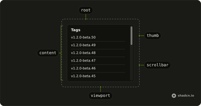
ScrollArea
├── ScrollAreaViewport
├── ScrollAreaContent
├── ScrollAreaScrollbar
│   └── ScrollAreaThumb
└── ScrollAreaCorner
Usage
<script setup lang="ts">
import { Fragment } from "react";
import { ScrollArea } from "@/components/ui/scroll-area";
import { Separator } from "@/components/ui/separator";
</script>
const tags = Array.from({ length: 50 }).map(
  (_, i, a) => `v1.2.0-beta.${a.length - i}`
);

const ScrollAreaDemo = () => (
  <ScrollArea className="h-72 w-48 rounded-md border">
    <div className="p-4">
      <h4 className="mb-4 font-medium text-sm leading-none">Tags</h4>
      {tags.map((tag) => (
        <Fragment key={tag}>
          <div className="text-sm">{tag}</div>
          <Separator className="my-2" />
        </Fragment>
      ))}
    </div>
  </ScrollArea>
);
Accessibility
- Enter
- Activate the focused item.
Demos
Horizontal
Three artworks and their captions sit in one row that does not wrap, inside a box narrower than the row. The extra width is the scroll range, so the bar runs along the inline axis. Use a horizontal area for a filmstrip or a logo line that must stay one row tall. If the items should snap from one to the next, free scrolling is the wrong feel.
Rtl
The same tag list, with an Arabic heading and dir set to rtl on the area. Rows and the heading align to the start, and the box is still a fixed height, so it scrolls for the same reason the default does. Direction does not turn a vertical list into a horizontal one. Set dir because the page is right-to-left, not to move the bar for decoration.
FAQ
Why will my Scroll Area in Vue not scroll?
A Scroll Area only scrolls when its box is smaller than the content. Set a height on Scroll Area itself, as the usage does, or a max height. If the height is on an inner element instead, the area grows with the content and the bar never appears. The same rule applies to width for a sideways strip.
How do I scroll a Scroll Area sideways with Ark UI?
Give the area a bounded width and make the content wider than that box, as the Horizontal demo does. Keep the row from wrapping so the extra width becomes scroll range. Both bars are already rendered, so you do not add another one. Set scrollFade when the edges should fade while more content is offscreen.
How do I style the Scroll Area thumb?
Edit the scroll-area file under components/ui, where the root is data-slot scroll-area. Keep color changes in that file so the scrolling region matches the rest of the theme. The thumb is data-slot scroll-area-thumb, so change its color and thickness there. The bar fades until hover or scrolling.
How do I keep the Scroll Area scrollbar visible?
Visibility depends on the base, so check which one you installed before adding props that another base does not have. The bar is transparent until the pointer is over it or the area is scrolling. That behavior is in the scrollbar classes, not a type prop.
When should I use a Scroll Area instead of overflow?
Use Scroll Area when the bar should match the theme inside a bounded box, such as a list or a menu. A plain overflow region is enough for a normal page section. Scroll Area does not replace the page scroll. It only scrolls its own box.
Does a Scroll Area follow right-to-left text?
Yes, the Rtl demo places a Scroll Area in a right-to-left page. Give it the same height or width you would in a left-to-right page. Horizontal overflow still follows the content. You do not need a second component for direction.
How do I install Scroll Area in Vue?
Run the command in the Installation section above. It adds Scroll Area to your ui folder. Import from that folder when the command finishes, instead of copying the source by hand, and rerun the command later if you want the latest files. The command uses the shadcn-vue CLI.
API Reference
ScrollArea
<div> data-slot="scroll-area"
dir?"ltr" | "rtl"
The document's text/writing direction.
- Type
"ltr" | "rtl"- Default
"ltr"
id?string
The unique identifier of the machine.
ids?object
The ids of the scroll area elements.
- Type
{ root?: string; viewport?: string; content?: string; scrollbar?: string; thumb?: string }
scrollFade?boolean
Fades the content out at the edges it can still scroll to.
- Default
false
asChild?boolean
Use the provided child element as the default rendered element, combining their props and behavior.
class?string
Merged with the part's classes.
data-overflow-x?string
Present when the content overflows the x-axis.
data-overflow-y?string
Present when the content overflows the y-axis.
--corner-heightstring
The height of the Root.
--corner-widthstring
The width of the Root.
--thumb-heightstring
The height of the slider thumb.
--thumb-widthstring
The width of the slider thumb.
ScrollAreaViewport
<div> data-slot="scroll-area-viewport"
asChild?boolean
Use the provided child element as the default rendered element, combining their props and behavior.
data-at-bottom?string
Present when scrolled to the bottom edge.
data-at-left?string
Present when scrolled to the left edge.
data-at-right?string
Present when scrolled to the right edge.
data-at-top?string
Present when scrolled to the top edge.
data-overflow-x?string
Present when the content overflows the x-axis.
data-overflow-y?string
Present when the content overflows the y-axis.
data-ownedbystring
Id of the root part.
--scroll-area-overflow-x-endstring
The distance from the horizontal end edge in pixels.
--scroll-area-overflow-x-startstring
The distance from the horizontal start edge in pixels.
--scroll-area-overflow-y-endstring
The distance from the vertical end edge in pixels.
--scroll-area-overflow-y-startstring
The distance from the vertical start edge in pixels.
ScrollAreaContent
<div> data-slot="scroll-area-content"
asChild?boolean
Use the provided child element as the default rendered element, combining their props and behavior.
data-overflow-x?string
Present when the content overflows the x-axis.
data-overflow-y?string
Present when the content overflows the y-axis.
ScrollAreaScrollbar
<div> data-slot="scroll-area-scrollbar"
orientation?"horizontal" | "vertical"
The axis it scrolls: horizontal or vertical.
- Type
"horizontal" | "vertical"
asChild?boolean
Use the provided child element as the default rendered element, combining their props and behavior.
class?string
Merged with the part's classes.
data-dragging?string
Present when in the dragging state.
data-hover?string
Present when hovered.
data-orientation?string
The orientation of the scrollbar.
data-overflow-x?string
Present when the content overflows the x-axis.
data-overflow-y?string
Present when the content overflows the y-axis.
data-scrolling?string
Present when scrolling.
ScrollAreaThumb
<div> data-slot="scroll-area-thumb"
asChild?boolean
Use the provided child element as the default rendered element, combining their props and behavior.
data-dragging?string
Present when in the dragging state.
data-hover?string
Present when hovered.
data-orientation?string
The orientation of the thumb.
ScrollAreaCorner
<div> data-slot="scroll-area-corner"
asChild?boolean
Use the provided child element as the default rendered element, combining their props and behavior.
data-hover?string
Present when hovered.
data-overflow-x?string
Present when the content overflows the x-axis.
data-overflow-y?string
Present when the content overflows the y-axis.
data-ownedbystring
Id of the root part.
data-state"hidden" | "visible"
"hidden" or "visible".
- Type
"hidden" | "visible"
useScrollArea
id?string
The unique identifier of the machine.
ids?object
The ids of the scroll area elements.
- Type
{ root?: string; viewport?: string; content?: string; scrollbar?: string; thumb?: string }