shadcn.io is not affiliated with official shadcn/ui
Every option stays on the page, so people can compare them and pick one or several. The stored value is an array even when only one row can be chosen.
Use it when comparing the options is the actual task. A Select is the better fit when those options should stay closed until someone opens them. In Vue you pass the collection and render each row, and Ark UI moves focus between them.
Installation
Anatomy
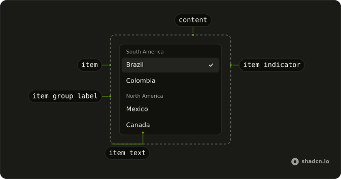
ListboxRoot
├── ListboxLabel
├── ListboxInput
├── ListboxItem
│   ├── ListboxItemText
│   ├── ListboxItemIndicator
│   └── ListboxItemGroup
│       └── ListboxItemGroupLabel
├── ListboxContent
└── ListboxValueText
Usage
<script setup lang="ts">
import { createListCollection } from "@ark-ui/react/collection";
import {
  Listbox, ListboxContent, ListboxItem, ListboxItemIndicator,
  ListboxItemText,
} from "@/components/ui/listbox";
</script>
const Example = () => (
  <Listbox
    className="w-full max-w-64"
    collection={collection}
    defaultValue={["br"]}
  >
    <ListboxContent>
      {collection.items.map((item) => (
        <ListboxItem item={item} key={item.value}>
          <ListboxItemText>{item.label}</ListboxItemText>
          <ListboxItemIndicator />
        </ListboxItem>
      ))}
    </ListboxContent>
  </Listbox>
);

const collection = createListCollection({
  items: [
    { label: "Brazil", value: "br" },
    { label: "Mexico", value: "mx" },
    { label: "Ireland", value: "ie" },
  ],
});Accessibility
- Arrow Up
- Move up.
- Arrow Down
- Move down.
- Arrow Left
- Move left.
- Arrow Right
- Move right.
- Home
- Go to the start.
- End
- Go to the end.
- Enter
- Activate the focused item.
- Ctrl+A
- Select all.
- Space
- Activate the focused item.
- Escape
- Clear the selection.
Demos
Controlled
The parent keeps the selected sizes, and the line under the list reacts when Large is among them. Hold the value yourself when a price, a preview, or the next step depends on the pick. defaultValue is enough when the list is the only thing that needs to know.
Disabled
Nothing in the list can be focused or chosen, but the countries stay readable. Set disabled on the whole listbox when an earlier answer is missing, or when the form is locked after submit. A single plan the person cannot buy is a different problem: mark that item, and leave the rest of the list working.
Disabled Item
Enterprise is still in the list and cannot be selected, because disabled is set on that entry in the collection rather than on the row. People can see the plan they are not allowed to pick. Use this for a permission, a sold-out tier, or a prerequisite that has not been met, and keep Free, Pro, and Custom active.
Grid
Twenty emoji sit in five columns, and the arrow keys move across a row before they drop to the next. A grid collection carries the column count so focus does not get stuck at the visual edge. Use it for glyphs, colors, or reactions, where a single vertical list would make a short option look like a paragraph.
Grouping
Brazil and Colombia sit under South America, Mexico and Canada under North America. The collection groups by region, and each group has a label that is not itself selectable. Reach for groups when a long list has categories people already know. With only a few rows, the headings are noise and a flat list is easier to scan.
Horizontal
Album covers run in a row, with orientation set to horizontal, so left and right change the selection and the row can scroll. Each item shows the title, the artist, and a check once it is chosen. Use a horizontal list for covers, swatches, or chips. Plain text still reads better stacked vertically.
Image Explorer
Picking a name updates the panel beside the list: the title and a short caption for that place. The list is narrow and the panel takes the rest of the width, which is the layout you want when the option is an asset, not just a label. Drop the real image into that panel. A grid is enough when the thumbnail itself is the choice.
Selection Extended
A click replaces the selection. Holding Command or Ctrl adds another country, which is selectionMode set to extended, and the note above the list says so. Use it for file-style lists where a plain click should not wipe earlier picks. If every click should toggle, multiple mode does not ask anyone to hold a key.
Selection Multiple
Each click toggles a country and leaves the others selected. selectionMode is multiple, so there is no modifier key to learn. That matches filters, labels, and any set people treat like a stack of checkboxes. Extended mode is the one to use when a single click should collapse the selection back to one item.
Selection None
New file, Edit file, and Delete file are commands, not choices, and selectionMode none means activating a row does not leave it checked. Each row has an icon, a one-line description, and a shortcut, and Delete uses the destructive style. Use this when the list is a menu of actions. If the point is to remember what was picked, turn selection back on.
Transfer List
Available and Selected are two lists, with Brazil and Ireland starting available and Mexico already selected. Multi-select on one side, then the arrow moves those countries across, and the button stays disabled until that side has a selection. Use a transfer when membership is the task. A single multiple list is less machinery for a short set.
With Description
Under each country is a second line, the language and the region, in smaller muted text. The check still marks the selection. Add that line when the label is ambiguous, and keep it to one short sentence so the row does not turn into a card. A flag is enough when the extra meaning is a mark, not a sentence.
With Filter
A text field above the list narrows the countries as someone types, ignoring case. When the query matches nothing, the list says no results instead of going blank. Add a filter once scanning is slower than typing a few letters. If the list should also close after a choice, the popover variant is the same idea with a button in front of it.
With Icon
A flag sits in front of the country name, and the check stays at the end of the row. The icon is ordinary content, not a separate prop. Use one when a mark helps people find the row faster than the word does. Skip it when the picture only repeats what the label already says.
With Popover
The countries stay behind a button that shows the current value, or a placeholder before anything is chosen. Opening it reveals a search field and the list, and choosing a country closes the popover. Use this when you want listbox selection without a permanently open list. A Combobox is the more direct tool when typing, not browsing, is how people pick.
FAQ
How do I control a Listbox value in Vue?
Keep the selection as an array of item values, even for a single item, and pass it back to Listbox, or use defaultValue when the list should own it. Build options with createListCollection, pass collection, and render each entry as ListboxItem with the item prop. Bind it with v-model, or pass value and listen to @value-change, which receives details.value.
How do I select more than one Listbox item?
Set selectionMode to multiple so each click toggles an item without a modifier key. Use extended when Ctrl or Command should add to the selection, as the extended demo describes. none turns selection off. The default is single, and the value is still an array of strings in every mode.
How do I disable one Listbox item?
Set disabled on that object in the collection, not as a prop of ListboxItem. The row is marked data-disabled and ignores pointer events. Set disabled on Listbox itself when the whole list should be inert. Disabled entries stay visible, so people can still read the option that is unavailable.
Can I use a Listbox from the keyboard?
Yes, arrow keys move between items, Home and End jump to the ends, and Enter or Space activates the focused item. Escape clears the selection, and Ctrl+A selects all when more than one item is allowed. Set orientation to horizontal for a row, or typeahead when letter keys should jump to a matching label.
How do I filter a Listbox?
Filter the collection before you pass it to Listbox. useListCollection takes a filter from useFilter, and calling filter with the input text updates collection.items, with ListboxEmpty when nothing matches. The field sits outside the list, so use a Combobox when the search should live in a popup.
How do I style a Listbox with Ark UI?
Edit the listbox file under components/ui. Items set data-highlighted while focused and data-state to checked when selected. ListboxItem variant is default or destructive. For a grid, pass a collection from createGridCollection and set the content's --column-count custom property to that collection's column count.
How do I install Listbox in Vue?
Run the command in the Installation section on this page, which adds Listbox and its item parts to your ui folder. Import them from that folder and pass a collection from createListCollection, which is Ark UI on every target because this listbox is built on Ark UI. The command uses the shadcn-vue CLI.
API Reference
Listbox
<div> data-slot="listbox"
value?string[]
The controlled keys of the selected items. Two-way with v-model.
defaultValue?string[]
The initial default value of the listbox when rendered. Use when you don't need to control the value of the listbox.
- Default
[]
collectionListCollection<T>
The collection of items.
- Type
ListCollection<T>
defaultHighlightedValue?string | null
The initial value of the highlighted item when opened. Use when you don't need to control the highlighted value of the listbox.
- Type
string | null
deselectable?boolean
Whether to disallow empty selection.
dir?"ltr" | "rtl"
The document's text/writing direction.
- Type
"ltr" | "rtl"- Default
"ltr"
disabled?boolean
Whether the listbox is disabled.
disallowSelectAll?boolean
Whether to disallow selecting all items when meta+a is pressed.
highlightedValue?string | null
The controlled key of the highlighted item.
- Type
string | null
id?string
The unique identifier of the machine.
ids?object
The ids of the elements in the listbox. Useful for composition.
- Type
{ root?: string; content?: string; label?: string; item?: (id: string | number) → string; itemGroup?: (id: string | number) → string; itemGroupLabel?: (id: string | number) → string }
loopFocus?boolean
Whether to loop the keyboard navigation through the options.
- Default
false
orientation?"horizontal" | "vertical"
The orientation of the listbox.
- Type
"horizontal" | "vertical"- Default
"vertical"
scrollToIndexFn?(details: ScrollToIndexDetails) → void
Function to scroll to a specific index.
- Type
(details: ScrollToIndexDetails) → void- Parameters
details– { index: number; immediate?: boolean; getElement: () → HTMLElement | null }- Returns
void
selectionMode?"single" | "multiple" | "none" | "extended"
How multiple selection should behave in the listbox.
- single: The user can select a single item.
- multiple: The user can select multiple items without using modifier keys.
- extended: The user can select multiple items by using modifier keys.
- Type
"single" | "multiple" | "none" | "extended"- Default
"single"
selectOnHighlight?boolean
Whether to select the item when it is highlighted.
typeahead?boolean
Whether to enable typeahead on the listbox.
asChild?boolean
Use the provided child element as the default rendered element, combining their props and behavior.
class?string
Merged with the part's classes.
@value-change(details: ValueChangeDetails<T>) → void
The callback fired when the selected item changes.
- Type
(details: ValueChangeDetails<T>) → void- Parameters
details– ValueChangeDetails<T>- Returns
void
@highlight-change(details: HighlightChangeDetails<T>) → void
The callback fired when the highlighted item changes.
- Type
(details: HighlightChangeDetails<T>) → void- Parameters
details– HighlightChangeDetails<T>- Returns
void
@select(details: SelectionDetails) → void
Function called when an item is selected.
- Type
(details: SelectionDetails) → void- Parameters
details– { value: string }- Returns
void
data-disabled?string
Present when disabled.
data-orientation"horizontal" | "vertical"
The orientation of the listbox.
- Type
"horizontal" | "vertical"
ListboxItem
<div> data-slot="listbox-item"
itemT
The item to render.
highlightOnHover?boolean
Whether to highlight the item on hover.
variant?"default" | "destructive"
The visual style.
- Type
"default" | "destructive"- Default
"default"
asChild?boolean
Use the provided child element as the default rendered element, combining their props and behavior.
class?string
Merged with the part's classes.
data-disabled?string
Present when disabled.
data-highlighted?string
Present when highlighted.
data-layoutstring
Mirrors layout.
data-orientation"horizontal" | "vertical"
The orientation of the item.
- Type
"horizontal" | "vertical"
data-selected?string
Present when selected.
data-state"checked" | "unchecked"
"checked" or "unchecked".
- Type
"checked" | "unchecked"
data-valueboolean
The value of the item.
data-variant?string
Mirrors variant.
ListboxItemText
<span> data-slot="listbox-item-text"
asChild?boolean
Use the provided child element as the default rendered element, combining their props and behavior.
class?string
Merged with the part's classes.
data-disabled?string
Present when disabled.
data-highlighted?string
Present when highlighted.
data-state"checked" | "unchecked"
"checked" or "unchecked".
- Type
"checked" | "unchecked"
ListboxItemIndicator
<div> data-slot="listbox-item-indicator"
asChild?boolean
Use the provided child element as the default rendered element, combining their props and behavior.
class?string
Merged with the part's classes.
data-state"checked" | "unchecked"
"checked" or "unchecked".
- Type
"checked" | "unchecked"
ListboxItemGroup
<div> data-slot="listbox-item-group"
heading?string
The heading of the listbox item group.
asChild?boolean
Use the provided child element as the default rendered element, combining their props and behavior.
class?string
Merged with the part's classes.
data-disabled?string
Present when disabled.
data-empty?string
Present when the content is empty.
data-orientation"horizontal" | "vertical"
The orientation of the item.
- Type
"horizontal" | "vertical"
ListboxItemGroupLabel
<div> data-slot="listbox-item-group-label"
asChild?boolean
Use the provided child element as the default rendered element, combining their props and behavior.
class?string
Merged with the part's classes.
ListboxContent
<div> data-slot="listbox-content"
asChild?boolean
Use the provided child element as the default rendered element, combining their props and behavior.
class?string
Merged with the part's classes.
data-activedescendantstring
Mirrors ariaActiveDescendant.
data-empty?string
Present when the content is empty.
data-layoutstring
Mirrors layout.
data-orientation"horizontal" | "vertical"
The orientation of the content.
- Type
"horizontal" | "vertical"
--column-countstringListboxValueText
<span> data-slot="listbox-value-text"
placeholder?string
Text to display when no value is listboxed.
asChild?boolean
Use the provided child element as the default rendered element, combining their props and behavior.
class?string
Merged with the part's classes.
data-disabled?string
Present when disabled.
ListboxEmpty
<div> data-slot="listbox-empty"
asChild?boolean
Use the provided child element as the default rendered element, combining their props and behavior.
class?string
Merged with the part's classes.
ListboxShortcut
data-slot="listbox-shortcut"
asChild?boolean
Use the provided child element as the default rendered element, combining their props and behavior.
data-disabled?string
Present when disabled is true.
data-orientation"horizontal" | "vertical"
Mirrors the orientation prop.
- Type
"horizontal" | "vertical"
useListbox
value?string[]
The controlled keys of the selected items. Two-way with v-model.
defaultValue?string[]
The initial default value of the listbox when rendered. Use when you don't need to control the value of the listbox.
- Default
[]
collectionListCollection<T>
The collection of items.
- Type
ListCollection<T>
defaultHighlightedValue?string | null
The initial value of the highlighted item when opened. Use when you don't need to control the highlighted value of the listbox.
- Type
string | null
deselectable?boolean
Whether to disallow empty selection.
disabled?boolean
Whether the listbox is disabled.
disallowSelectAll?boolean
Whether to disallow selecting all items when meta+a is pressed.
highlightedValue?string | null
The controlled key of the highlighted item.
- Type
string | null
id?string
The unique identifier of the machine.
ids?object
The ids of the elements in the listbox. Useful for composition.
- Type
{ root?: string; content?: string; label?: string; item?: (id: string | number) → string; itemGroup?: (id: string | number) → string; itemGroupLabel?: (id: string | number) → string }
loopFocus?boolean
Whether to loop the keyboard navigation through the options.
- Default
false
orientation?"horizontal" | "vertical"
The orientation of the listbox.
- Type
"horizontal" | "vertical"- Default
"vertical"
scrollToIndexFn?(details: ScrollToIndexDetails) → void
Function to scroll to a specific index.
- Type
(details: ScrollToIndexDetails) → void- Parameters
details– { index: number; immediate?: boolean; getElement: () → HTMLElement | null }- Returns
void
selectionMode?"single" | "multiple" | "none" | "extended"
How multiple selection should behave in the listbox.
- single: The user can select a single item.
- multiple: The user can select multiple items without using modifier keys.
- extended: The user can select multiple items by using modifier keys.
- Type
"single" | "multiple" | "none" | "extended"- Default
"single"
selectOnHighlight?boolean
Whether to select the item when it is highlighted.
typeahead?boolean
Whether to enable typeahead on the listbox.
@value-change(details: ValueChangeDetails<T>) → void
The callback fired when the selected item changes.
- Type
(details: ValueChangeDetails<T>) → void- Parameters
details– ValueChangeDetails<T>- Returns
void
@highlight-change(details: HighlightChangeDetails<T>) → void
The callback fired when the highlighted item changes.
- Type
(details: HighlightChangeDetails<T>) → void- Parameters
details– HighlightChangeDetails<T>- Returns
void
@select(details: SelectionDetails) → void
Function called when an item is selected.
- Type
(details: SelectionDetails) → void- Parameters
details– { value: string }- Returns
void
With other components
Field
InputsLabel the list
Item
LayoutOne option
Input
InputsFilter the rows
Scroll Area
LayoutA long list
Checkbox
SelectionMulti-select marks
Empty
FeedbackNo matches
Related
Select
SelectionThe list opens in a popup
Combobox
SelectionType to filter a popup
Command
OverlaysSearch actions
Native Select
SelectionThe platform menu
Radio Group
SelectionEvery option visible, one choice
Dropdown Menu
MenusActions, not a value